Finding the Right Paint Color

Finding the Right Paint Color

Every once in a while, we feel the need to change up the colors in our home. Painting is one of the most fun ways to add something new to an existing space! But then the questions come: How do I choose the right color? What is the best way to test them out? How do I make sure my paint color doesn't pull the wrong accent colors?

Well, today we met with Kim—one of our amazing designers—to get some answers. Here's what she said:

Read More

Caring for Your Bed Sheets

We've spoken on the subject of caring for your bed sheets before, but it's been awhile and with The White Sale going on we thought we'd do a quick refresher! First off, if you want your sheets to last longer and maintain their comfort, it's important you buy good quality sheets to begin with. Don't be fooled by fancy sheet jargon such as "Egyptian Cotton" and "Thread Count" and assume you're getting a high quality product. If the deal sounds too good to be true, it probably is.

However, you also shouldn't be led to believe that you have to pay an arm and a leg for true comfort. We've done our fair share of research and testing and while we won't bore you with the details of that today, we encourage you to check out our post on "Our Favorite Bed Sheets" here.

Once you've found the perfect sheet set, it's important you properly care for them to not only maintain their comfort, but to make sure you really get your money's worth out of them!

Of course, the manufacturer's care instructions are a good place to start, but we've found that these few tips almost always fall in line:

1. Wash your sheets separately - Never wash your sheets with other laundry, especially with things that contain polyester or have abrasive materials like zippers that can damage the fabric.

2. Don't overload your washing machine - This will cause the fibers to break down from excessive agitation. Your sheets should be able to easily move about in your washer.

3. Wash in warm water - Avoid washing your sheets in hot water as this will only cause your sheets to shrink (especially if you have linen sheets). Choose a cycle that uses warm water to wash and a cold water rinse.

4. Only use mild detergents - It's best to use a mild liquid detergent (like Woollite or The Laundress), and unless your sheets are very soiled, use only half the recommended amount of detergent.

5. Avoid bleaches and other whiteners - Bleaches and other whiteners will only break down the fibers in your sheets and, believe it or not, cause them to turn yellow.

6. Air dry or tumble dry on low heat - If you have the patience for it, line drying your sheets is best. Otherwise, tumble dry on a low heat setting until slightly damp.

7. Do not over-dry - Remove your sheets promptly from dryer while slightly damp to minimize wrinkles and avoid shrinkage.

8. Smooth or iron out wrinkles - Most cotton or linen sheets can be pressed with an iron at a high temperature setting if desired. Otherwise, lay slightly damp sheets on your bed and smooth out any wrinkles.

Currently all of our sheets are 20% off during The White Sale! If you have questions on what sheets are best for you, any one of our stylists can point you in the right direction. You can even do a little testing for yourself while you're here!

Hurry in because the sale ends Saturday!

Living the Hygge Life

Are the cold winter months getting you down? We've got the remedy to the winter blues: making a hygge home! Hygge (pronounced hue-gah) is a Danish word that means finding genuine joy in making the ordinary things in life beautiful. In design lingo, it's all about turning your home into a personal cozy haven.

There's no one word in English to describe hygge, but here are a few that get close: coziness, contentedness, comfort, and simplicity. How perfect does that sound on a rainy or snowy day?

Here are some examples of hygge items for your home that you can find in our online store!

Fight the cold when you get up in the mornings and keep your toes warm with this extra soft Mongolian Lamb Rug. Maybe it will make waking up a little easier, even if that Alpaca Throw Blanket wants you to stay in bed!

This deliciously soft Sable Throw by Alice Lane will turn any living room or bedroom into the coziest place in your home.

The Hampton Cream Big Pillows are a perfect way to make your bed more comfortable than you've ever imagined. You'll never want to leave.


The Morris Lantern by Alice Lane will add the perfect amount of light and warmth to any room. It's the perfect remedy for the drab gray outside.

The Bourbon Vanille Candle from Alice Lane will make your house smell so yummy and throw in a pretty little sparkle.

Remember, there are so many ways to live the hygge life. Do whatever makes you feel cozy, and your home will become the perfect place to hide out from the cold!

Runways to Rooms: Tidy Tibi

This clean and simple look by Tibi would look so great in a bedroom! Here's how we did it.

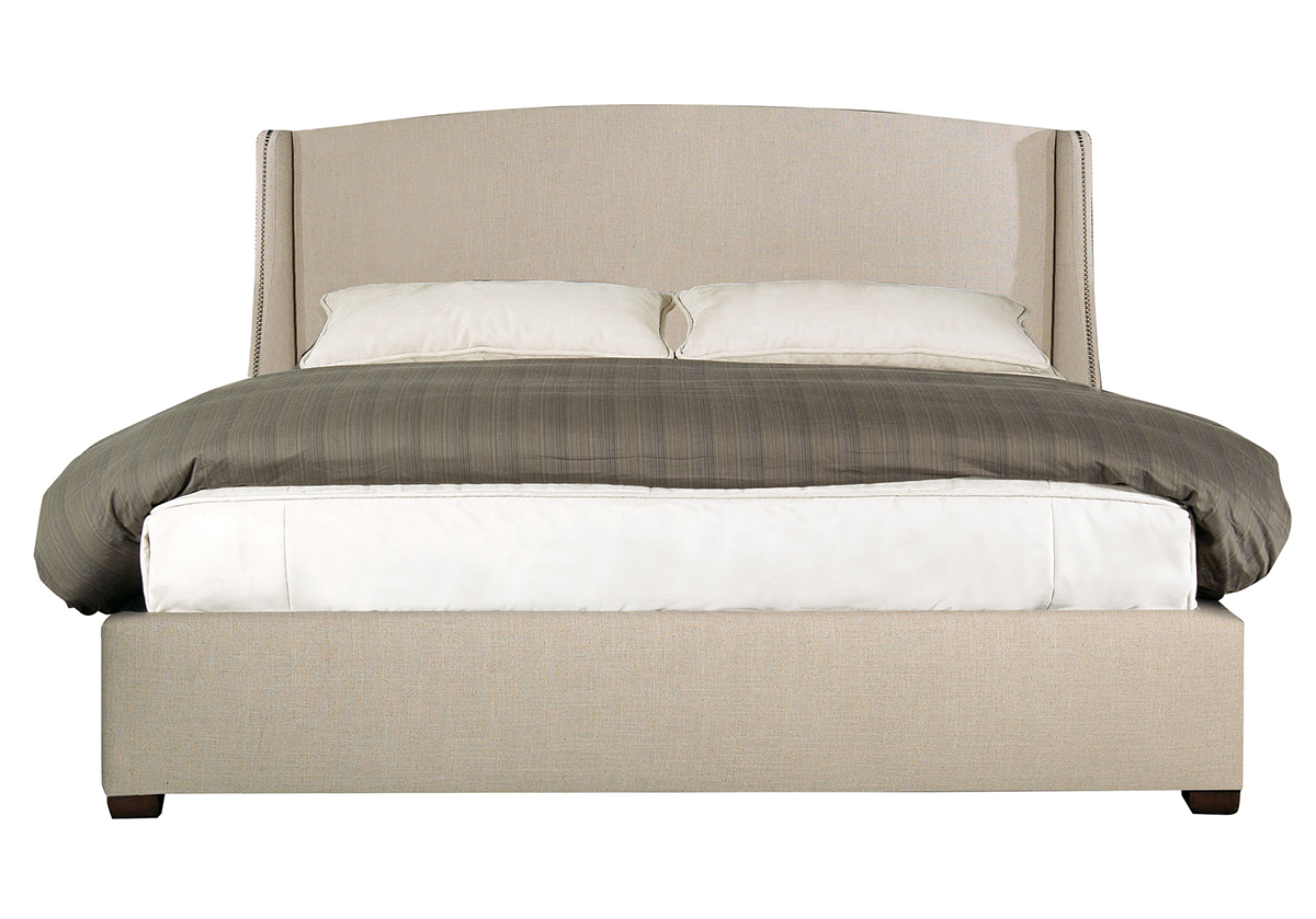
We took our Connor Bed with it's simple lines and organic colors and paired it with...

Our Antwerp Coverlet to bring in that muted sea green color.

We chose the Marlow Matchstick Pedestal as a side table, echoing the model's hourglass figure.


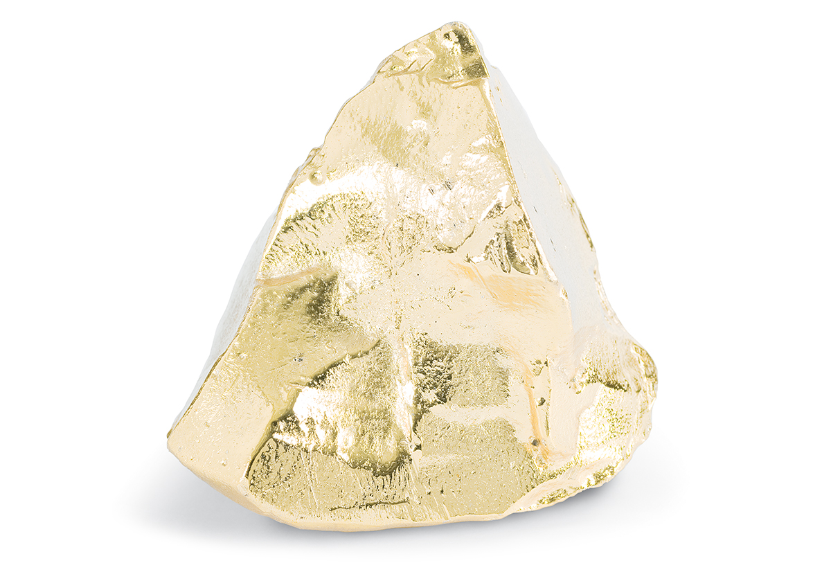
We added the decorative Gold Nugget to match her earring and to add that little golden glow to the room. (And because who wouldn't want a gold nugget in their bedroom?)

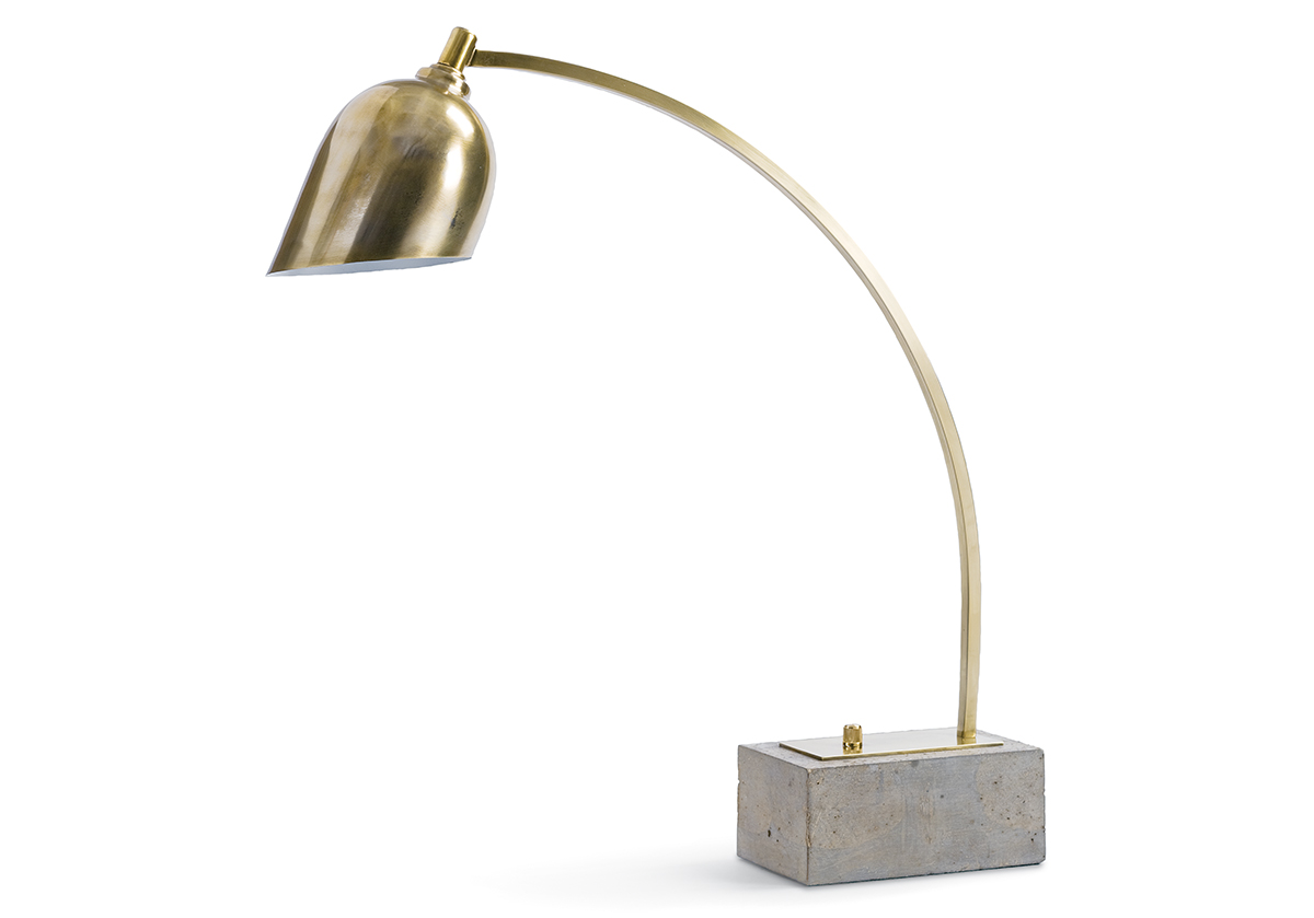
The Eureka Task Lamp brings in a little bit of the runway with its concrete base and the lines of the model's zipper.

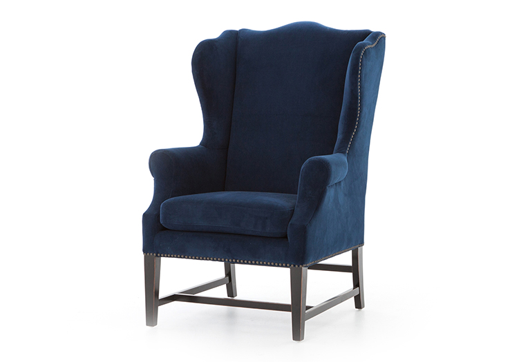
And lastly, we chose our Navy Wing Chair to tie the room together with its studded upholstery.

Power of a Statement Chair

Just like Bonnie Taylor taught us, everyone needs a hero. And when it comes to decorating, so does every room. When designing a space, it's important to establish what you want that "hero" piece to be early on. Maybe it's some abstract artwork or a colorful rug, but whatever it is, it should be eye-catching! Using an accent chair as your main statement piece is the perfect way to add functional style into your home; and don't you just love walking into a room and instantly thinking, "Man, I want to sit in THAT chair!" A great chair can be a powerful jumping block into great design!

23-Wong-Residence2-768x1024

15 Brady

While finding a great chair is really of one of those "you'll know it when you see it" scenarios, there are a few things we believe can make a chair truly great:

1. Silhouette - A chair that has a unique shape will always catch your eye.

2. Frame - A chair is only as good as it's frame. An exposed or sculptural-like frame can be a major "wow" factor.

3. Novelty - It goes without saying that any chair that makes you take a double-look is making a statement. Sometimes it's fun to dive completely off the deep end and go for something even a little bizarre.

4. Color/Pattern - Sometimes the only thing your chair needs is some really awesome upholstery. Take a traditional silhouette and frame and dress it in a colorful print and you've got yourself a statement piece!

Our Five Favorite House Plants

Earlier this month we had the opportunity to visit Studio 5 again and share some design tips with their viewers. They asked us to talk about a current trending topic: House Plants! Oddly enough, we've become quite the experts in this field (is "plant lady" a term?) as we've done our fair share of exploring the best plants for your home. In case you missed that segment, we thought we'd share a little bit more about that here on the blog today. So...here are our top 5 favorite house plants and what makes them so great! Citrus Tree 1 Fern 2 Olive Tree 1 Orchid1

1. Fiddle Leaf Fig - It's the current trend setter of the plant world and it's not hard to see why. Even if it is a little high-maintenance (needs a lot of indirect sunlight!), it's definitely high-style! Perfect for adding a little height to your space and bringing in that breath of fresh air.

2. Citrus Tree - When you need a little color, a citrus tree is the perfect plant. It bares bright fruit that is sure to make you smile, and it’s a perfectly functional plant too! You literally get to enjoy the fruits of your labor with this one.

3. Black Olive Tree - If you're looking for a tree with a more familiar silhouette, the olive tree is the one for you! It's the perfect in-door plant to match your transitional style, and out beats that dusty old ficus any day. It needs plenty of overhead space to grow, making it great to use in rooms with vaulted ceilings.

4. Orchid - It’s classic and timeless. If you’re one that enjoys blooms over leafy greens, the orchid is the perfect house plant for you. Its low maintenance nature (plop in 2 ice cubes once a week!) and small size makes it’s the perfect plant for your bathroom, kitchen, or entry.

5. Fern - Another classic, but this time with a facelift! Plant it in a bold stylish vase for a fresh look that won’t look like your grandmother’s fern. They're inexpensive, low-maintenance, and can be found just about anywhere. Can't go wrong!

Top 5 Favorite Houseplants_Alice Lane Home Collection


Our Favorite Coffee Tables

The coffee table. It tends to hold more accessories than cups of coffee, but what we would ever do without them! People shopping our showroom frequently ask about coffee tables and how to select the right one for their space. What it really comes down to is simple math and a lot of style. Let's get the boring (but important) part out of the way shall we...the math. A good rule of thumb is to allow at least 19" between your coffee table and other furnishings to provide ample walking space. That will help you determine exactly how large of a coffee table you can use. Next, the top of your coffee table should be about the same height as the cushion of your sofa. If you're going for a more modern look, a lower coffee table can do just the trick, but you want to avoid having your coffee table higher than your seating. 20150625_AliceLaneHome_ModerneManor-9861_Edit

3 & Cover Rose

We thought we'd share some of our favorite (and best-selling) coffee tables that work great in different types of spaces...

1. Hampton Coffee Table - It's your traditional coffee table shape and size, but has so much style that your space will feel modern and sophisticated. Pairs great with your standard sized sofa and provides plenty of surface space with out being too heavy.

2. Campaign Cocktail Table - Its perfectly petite frame makes it the perfect coffee table for tight spaces. What your living room lacks in square footage can easily be made up for with big style. And this table has it!

3. Hobson Cocktail Table - This large, square, double-tiered coffee table is our favorite! It provides plenty of surface space and helps fill-in the empty hole you tend to get in the middle of large living rooms. Perhaps our favorite feature though is the plethora of decor it holds! A stylists dream...

4. Morello Oval Cocktail Table - Some spaces need a little extra wiggle room between furnishings. An oval or round shaped coffee table is the perfect solution. It allows you to easy navigate between things without making you feel boxed in. The curved lines and sleek metal frame of this beauty make it the perfect centerpiece.

5. Trimbelle Cocktail Table - Need something with a little more versatility? This white onyx coffee table can act as an ottoman, is perfect for entertaining, and even adds a little sparkle to your space. It entirely functional and incredibly stylish. Win!

Alice Lane Home_Our Favorite Coffee Tablesb

Hopefully this helps inspire you in your quest for the perfect coffee table. Come shop our large selection of tables and see how we style them in our showroom for more ideas. And don't forget, all furniture is currently 20% off during The Very Best Sale going on now!

Best of Houzz 2016

You know when you're browsing through your social media channels and fall down a rabbit hole that inevitably leads you to browsing beautiful pictures of homes on Houzz.com? Admit it...we've all been there. Houzz is one of the many websites we visit regularly to keep up on trends, share our design projects, and search for inspiration. So you can imagine our excitement when we were awarded "Best of Houzz 2016" this past week! Best Of Houzz 2016_ Alice Lane Home Collection

It's an honor to be selected among the top 3% of Houzz home pros for upholding standards of excellence. This is the 4th year in a row we've been awarded with this title, and it feels pretty darn good to know we continue to be top leaders in design.

Next time you find yourself on Houzz.com, be sure to check out our profile page where you'll now see a new shiny "Best of Houzz 2016" green badge. You can also view all of our recent design projects there. And if you see something you like or have any questions, don't be afraid to reach out to us! We do our best to answer all your questions about our designs and we'd love to help you in the process of making your home your favorite place on earth.

Color in the Kitchen

Last week we were tickled pink to see the kitchen of our Lakeside Loft project spotlighted on BHG.com as an unexpected way to add color to your kitchen (check out the full article online here if you missed it!). Of course, we're all for adding color in unexpected ways, and these indigo kitchen cabinets are just one example of that. So, we thought we'd do our own take on 5 Ways to Add Color to Your Kitchen... LindsaySalazar.com-10

While we love a white kitchen as much as anyone, it's nice to see a kitchen that has a little color! Here we opted to paint all the bottom cabinets an indigo blue (Indigo Batik by Sherwin Williams to be exact). It's a fun contrast to the white cabinets and white subway tile above, and definitely eye catching!

Suzannehallhome Meikel Reece _143-2 Here we painted this cupboard a country green and it's just the right amount of color in this little kitchenette. If you want to keep your cabinets a classic white, consider painting a cupboard, sideboard, or pantry door instead. This colorful barn door not only adds architectural interest, but gives the kitchen personality!

_mg_2016_nicolehillgerulat

If you're not quite ready to make the plunge into painting cabinets, try lining your cabinets with a paper or fabric for a fun pop of color. Here we lined the backs of these glass cabinets with an orange grass-cloth paper in a trellis print. All of the sudden those white dishes just pop! As a bonus, it can make even the simplest of cabinets look expensive and custom.

12-Ashworth-682x1024-2

A colored back splash is a great way to add color in an otherwise neutral kitchen. If you're looking for a way to set your kitchen apart from all the other white kitchens out there, find a unique tile that speaks to who you are. As a tip, try taking the tile all the way up the wall where allowed. It will intensify the color and make your kitchen look grandeur.

LindsaySalazar.com-78

If you're looking for a quick fix, try incorporating colorful dishes, food, and accessories. They can transform your colorless kitchen into something entirely new. We love to fill jars and bowls with fresh fruits and vegetables (which just so happens to be incredibly convenient to do in a kitchen), and fill shelves with cookbooks. It's appropriate, practical, and colorful!

Rules of Scale: Drapery

We've been talking a lot about proper scale lately, and while drapery may seem like one of those overly-talked about subjects, we will keep pounding this in your head until the entire world gets it right! It's a simple rule, but surprisingly draperies are one of the easiest things to get wrong. You can blame the shelf-stocked curtains found at most retailers for that. But before we go pointing any more fingers, let's start by going back to the basics...shall we? Summers_Bedroom_001

_MG_3687

AL BB Meikel22

Here's what you need to consider when buying and hanging drapery for your windows:

1. Rod Placement - Choke that sucker up as high as you can! Whether you have 8 or 11 foot ceilings, your rod should be placed just below your ceiling or crown molding. This draws the eye up, giving the illusion that your ceiling is taller than it actually is. A common mistake is to hang your rod just above your window casing...don't do this! Your window will appear squatty and short...and no one likes looking that way.

2. Hanging Drapes - Your rod should also extend a good foot or two beyond the width of your window when allowed. This allows you to hang your drapery over your wall instead of over your window. By hanging the bulk of your fabric over the walls, it not only allows more sunlight to stream through your windows when opened, but once again makes your windows appear larger.

3. Panel Length - This is where we blame store-bought curtains for making it so easy to go so wrong! Most drapery panels are sold in a standard 84" length, and you'll find that there simply isn't enough fabric to take you all the way to the ground. As a result, you end up either lowering your rod or letting your drapery hang like a terrible pair of flood pants. Don't do it! It may take a little customizing, but buy a longer length panel (96" or 108" are usually available) and properly hem them to barely kiss the ground. A tailored drape makes all the difference!

4. Fullness - Even if you got 1,2, and 3 right...it would all be for naught if you didn't have the right fullness. Your drapes should look functional, like they would actually cover the window when closed. A good rule of thumb is that each panel should be at least 1 to 1 1/2 times the width of the window. This will make your drapery look more generous and full whether opened or closed.

Alice Lane Home_Rules of Scale_Drapery

Rules of Scale: Table Lamps

Finding the right scale of table lamp is almost as difficult as finding the right size bra (ladies...you know what we're talking about). What looks like the perfect size in store can suddenly seem way too small when you get it home! Just like any good clothing purchase usually begins with a proper fitting, so should your table lamp purchase! Alice Lane Home_Rules of Scale_Table Lamp 1

Alice Lane Home_Rules of Scale_Table Lamp 2

Here are some quick "Rules of Scale" for you to keep in mind on your next quest for the perfect table lamp:

1. Lamp Height - A good rule of thumb is to find a table lamp that is approximately 30" tall from the bottom of the base to the top of the shade/finial. Without getting too mathematical, the top of the lamp should be between 58" and 64" from the ground. And with most end tables and bed side tables being around 28" tall, that leaves you with at least a good 30" to work with. Measure the height of your table and plan accordingly.

2. Eye Level - If you got the math right in #1, then your lamp shade will sit at about eye-level. This not only protects your eye from the blaring light of the bulb, but it also allows the light to perfectly illuminate everything below (like that book you stayed up all night reading). Test out sitting on your bed or sofa and measure where eye-level is for you. That will help you determine if you need a tall base and short shade, or visa versa.

3. Lamp Width - While we usually take the stance that bigger is better, it's also important to know your limits. Measure the width of your table and find a lamp that is no more than half that. You don't want a lamp that is too narrow, but you also don't want the lamp shade to be hanging over the edge!

4. Light - When it really comes down to it, your lamp needs to be functional. Make sure that it's large enough to radiate light where it's needed. Will you be using it to perform nightly tasks, or are you simply looking for extra ambient lighting? Defining it's purpose will help you pin down the perfect one!

Alice Lane Home_Rules of Scale_Table Lamps Available for purchase at Wonderland by Alice Lane:  Pineapple Refraction Table Lamp - $157

We want to know...

We get requests for an online store almost daily, and while your pleas have gone unanswered they most certainly has not gone unheard! We're thrilled to say that YES...an online store is finally in the works! But before you can shop to your hearts conent, we need to know...what do you want!? We pride ourselves in curating beautiful collections of home furnishings and decor, and our main goal moving online is to provide you with that same high-quality experience our customers have in store. We also want to make sure that we offer you the products you want! So, please take a few minutes of your time to complete this short survey that will help us better understand your needs {and wants!}. Then sit back and {anxiously} relax while we get to work! Online Store Survey

https://www.surveymonkey.com/r/8PTWVZN

Happy Birthday Alice Lane - 7 Years!

Happy Birthday to us! Seven years ago our little home furnishings boutique was born and a magical journey began. To think that we now have two home furnishings stores in Salt Lake and Orem, and are working with design clients across the continent is incredible! In celebration of all things Alice Lane, we're offering 20% off your entire purchase, all day long. So come to Alice Lane Home Collection in Salt Lake or Wonderland by Alice Lane in Orem, UT and help us celebrate! Getting older has never felt so good. Birthday Flyer_Instagram and Blog-01

Rules of Scale: Sofa Throw Pillows

Nothing will cheapen the look of your sofa more than a dinky set of under-scaled throw pillows. It's a common faux pas, but hopefully with a little help from us it will be a mistake you never make! The thing is...people like pillows. And while you might think you're packing in more comfort by using half a dozen small pillows, you're actually taking up valuable real-estate and making your sofa look smaller than it really is. Alice Lane Home_Rules of Scale_Sofa Pillows

To make your sofa look softer, generous and more gracious, follow these 3 simple rules of thumb to achieve the right scale of pillows on your sofa:

1. Go big! Avoid using too many small pillows and instead use fewer larger pillows that will fill up the space but keep things from looking cluttered.

2. Layer larger pillows in the back. Using a 22" to 26" pillow will really help to fill in the gaps and add plenty of comfort. You might even catch us throwing in a Euro now and again!

3. Stack a smaller pillow in the front. When we say smaller, we really mean about 20" or larger. By stacking a smaller pillow in front of your large pillow you're also adding dimension on top of comfort. A perfect combination.

Alice Lane Home_Rules of Scale_Sofa Throw Pillows

Items available at Alice Lane Home Collection: Tobacco Mohair Pillow 22x22 - $286 | Gray Tangdon Pillow 20x20 - $374

9 Different Ways to Lay Subway Tiles

No tile has passed through the centuries of interior design with as much admiration as that of the subway. Perhaps one of the reasons is how incredible versatile it is! Regardless of it's scale, a subway tile can be laid in array of patterns that fall on both ends of the design spectrum: modern or traditional. We're sharing 9 of our favorite ways to lay subway tiles that will leave your imagination running wild with possibilities! hole-in-one parade home | alice lane home collection | colors: white and gray

Vertical Subway

augusta parade home | alice lane home collection

Alice Lane Home_9 Different Ways To Lay Subway Tiles

1. Running Bond | 2. Herringbone | 3. Horizontal Subway | 4. Diagonal Subway | 5. Basket Weave | 6. Vertical Stack | 7. Horizontal Stack | 8. Vertical Subway | 9. Diagonal Herringbone

4 Tips For Layering Art

Before you whip out a hammer and nails and attempt to tackle the brain-crunching task of perfectly spacing and hanging a gallery art wall in your home, try the stress-free "lean & layer" look instead. Layering art is definitely nothing new, but it has most certainly found its way back into the spotlight. We love how layered art looks like an authentic collection of beautiful pieces curated over time. Alice Lane Home_Layred Art in Desk

IMG_2635

Here are 4 tips on how to layer art for the best look:

1. Use a variety of sizes - Layer a variety of square, portrait, and landscape art in an array of sizes to keep things loose and organic. Avoid layering art of similar shape and size as this will only cover up the art behind.

2. Mix up the frames - Unless you're going for a super formal look, we suggest mixing up the color and style of frames. This help's to define each layer and makes each piece stand out from the rest.

3. Use complimenting art - Avoid using "sets" of art that are sold together and instead find unique pieces that compliment each other. This will give you that "collected" look, like you've hand picked each and every piece. Because you have!

4. Put in unexpected places - We love to layer art in unexpected places like on a mantle, in a bookshelf, or on a desk. Find that special place where you can view and admire your collection often!

Alice Lane Home_How To Layer Art

Art available for purchase at Alice Lane Home Collection in SLC,  UT & Wonderland by Alice Lane in Orem, UT