Capitol Heights

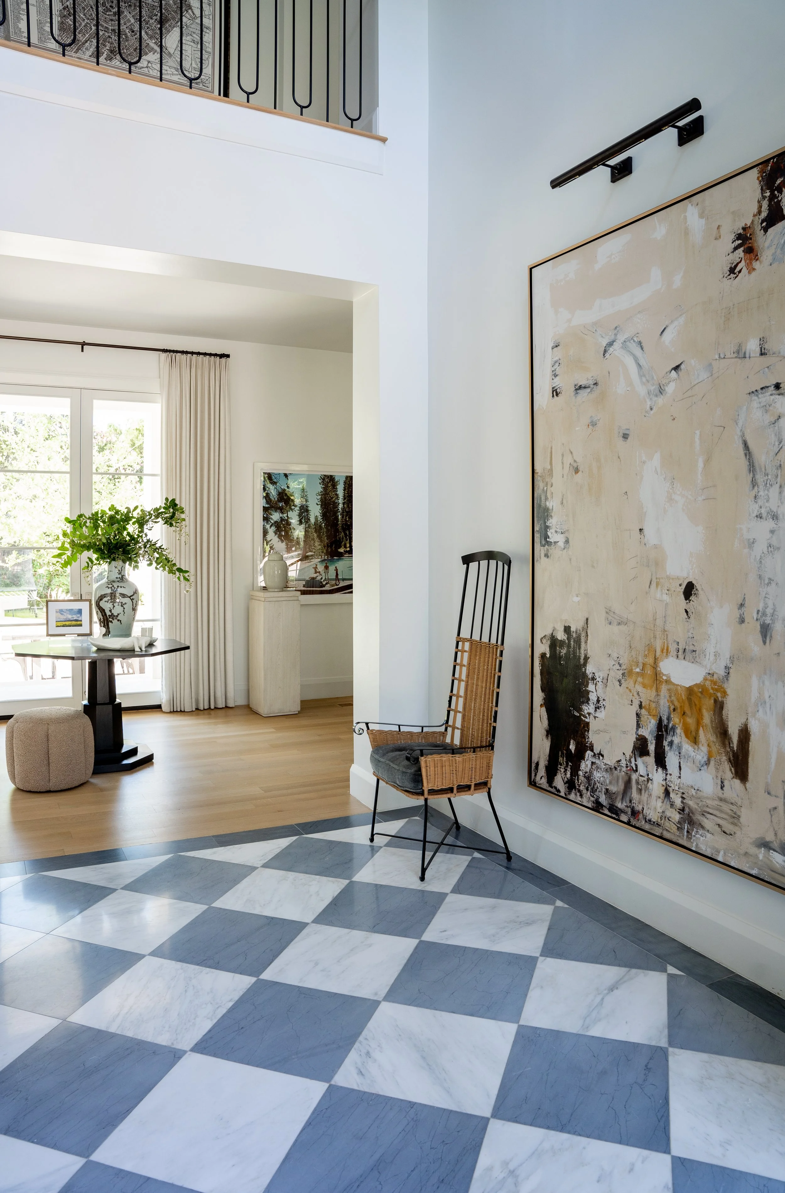
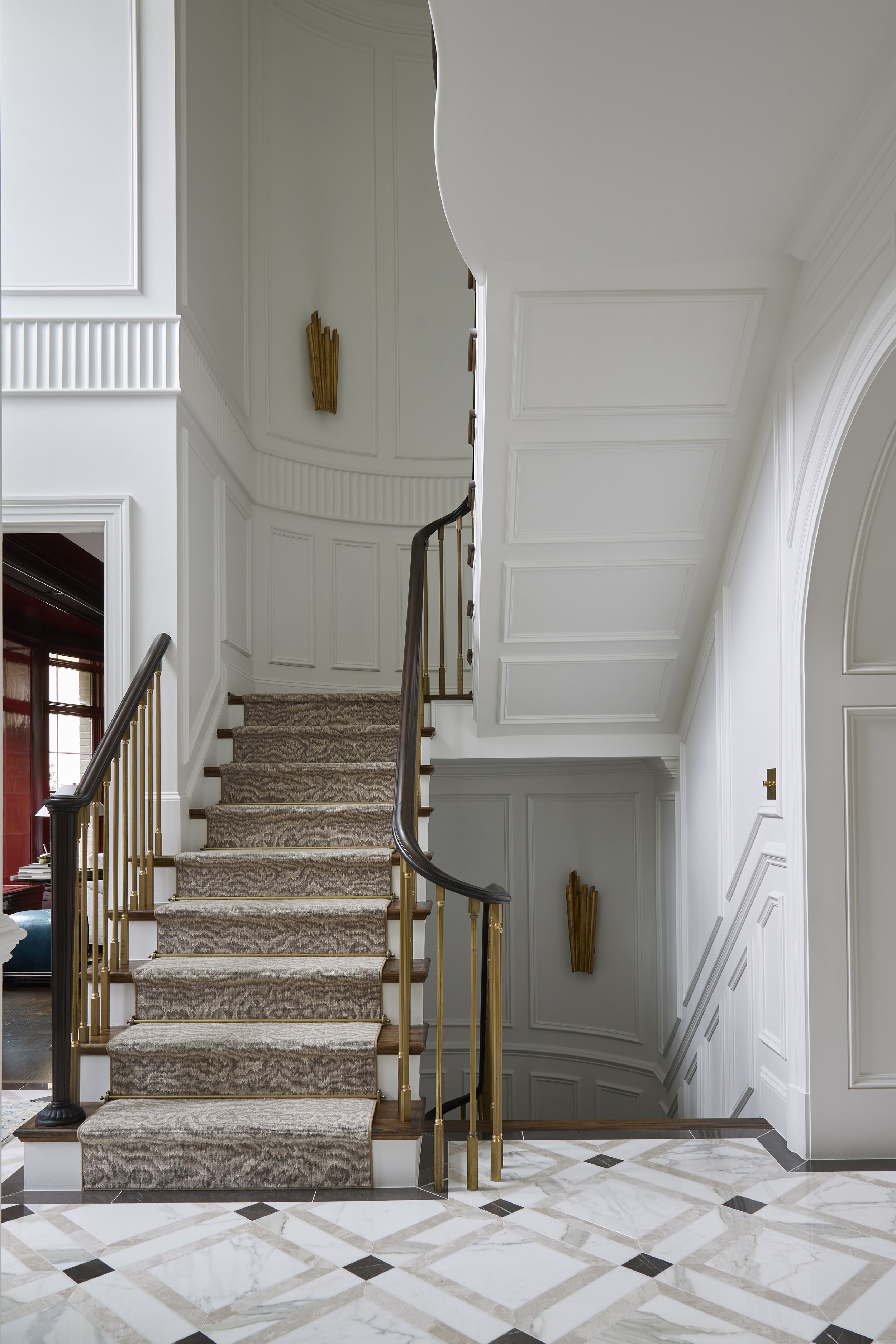
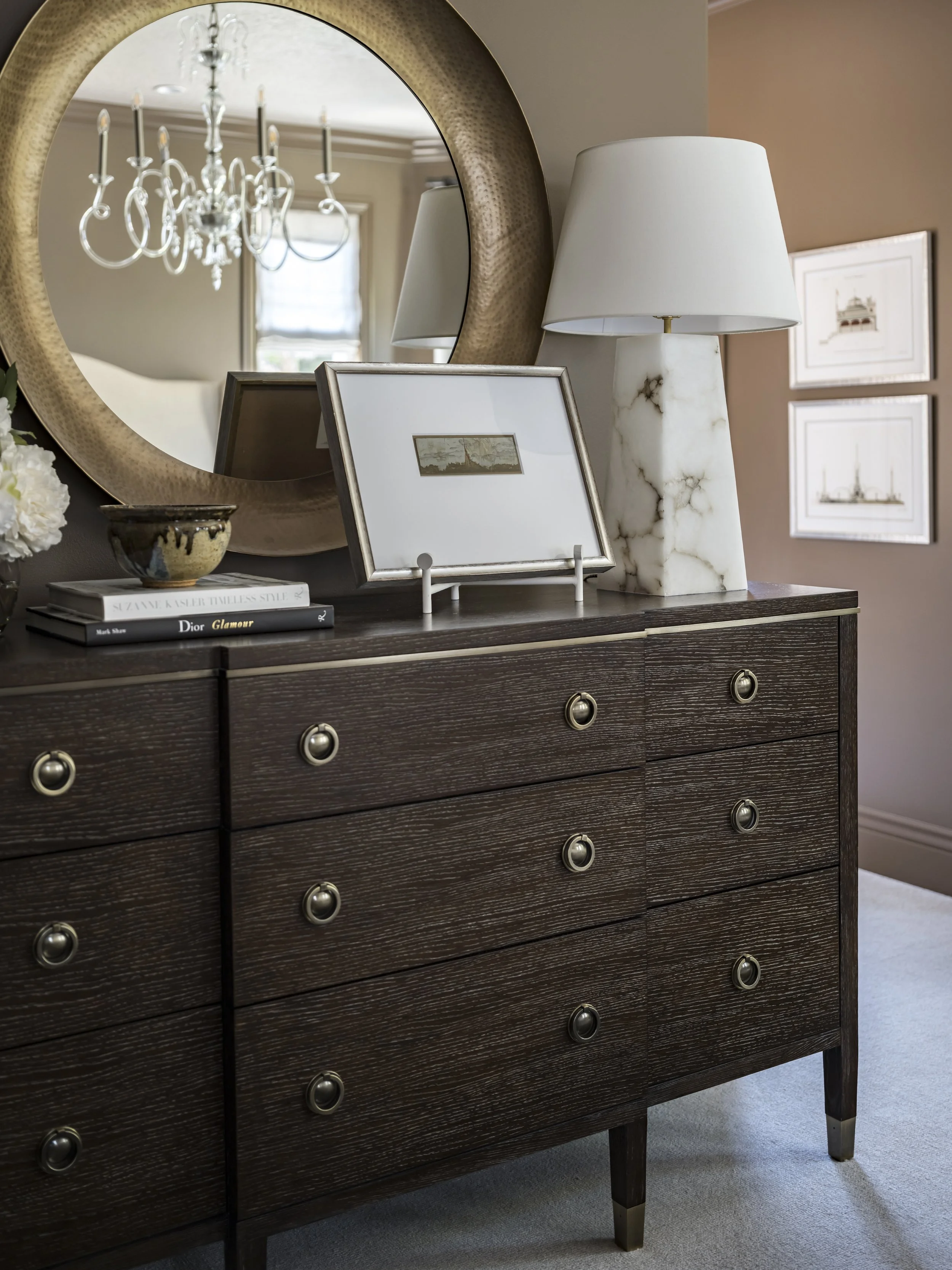
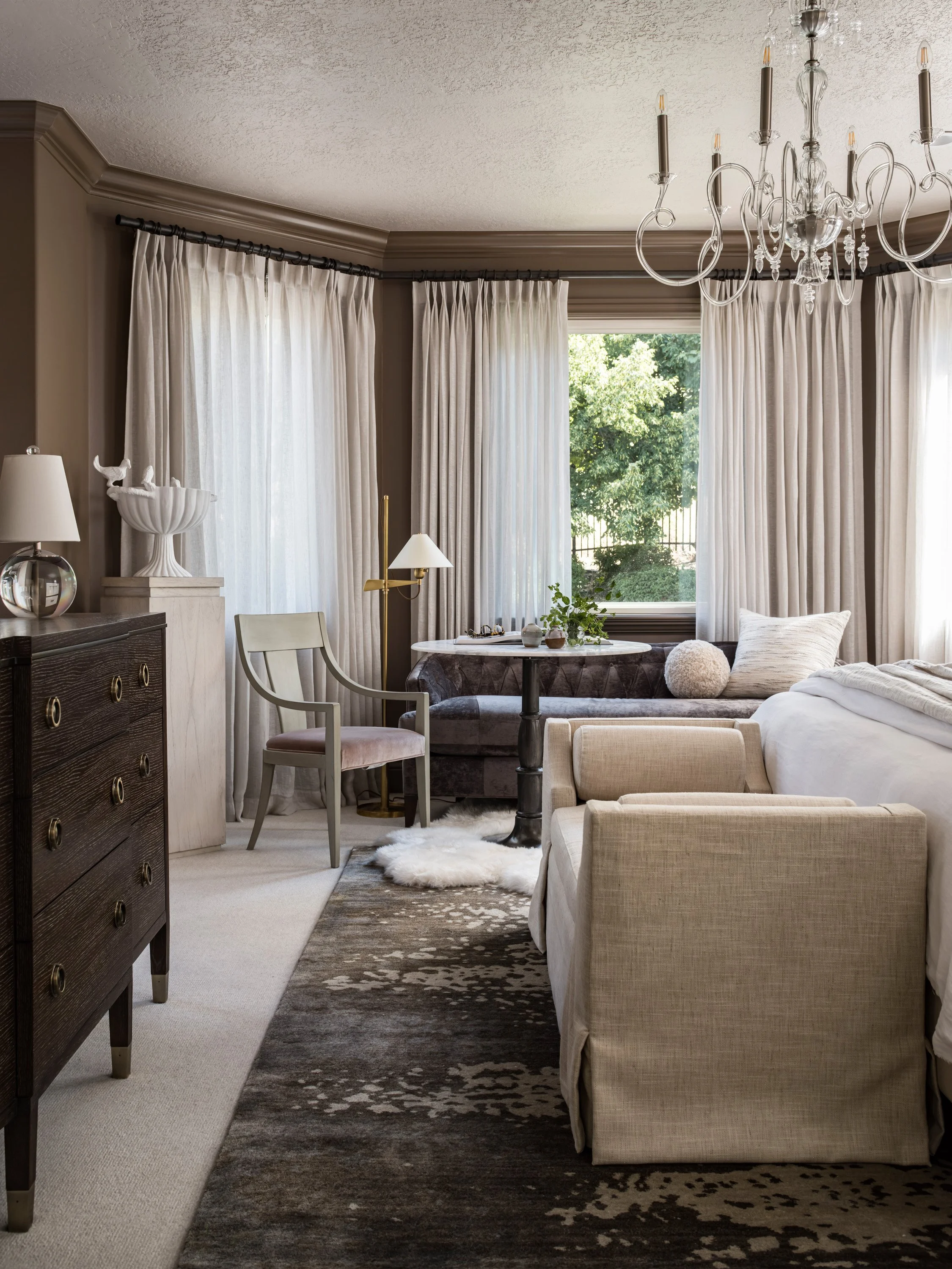
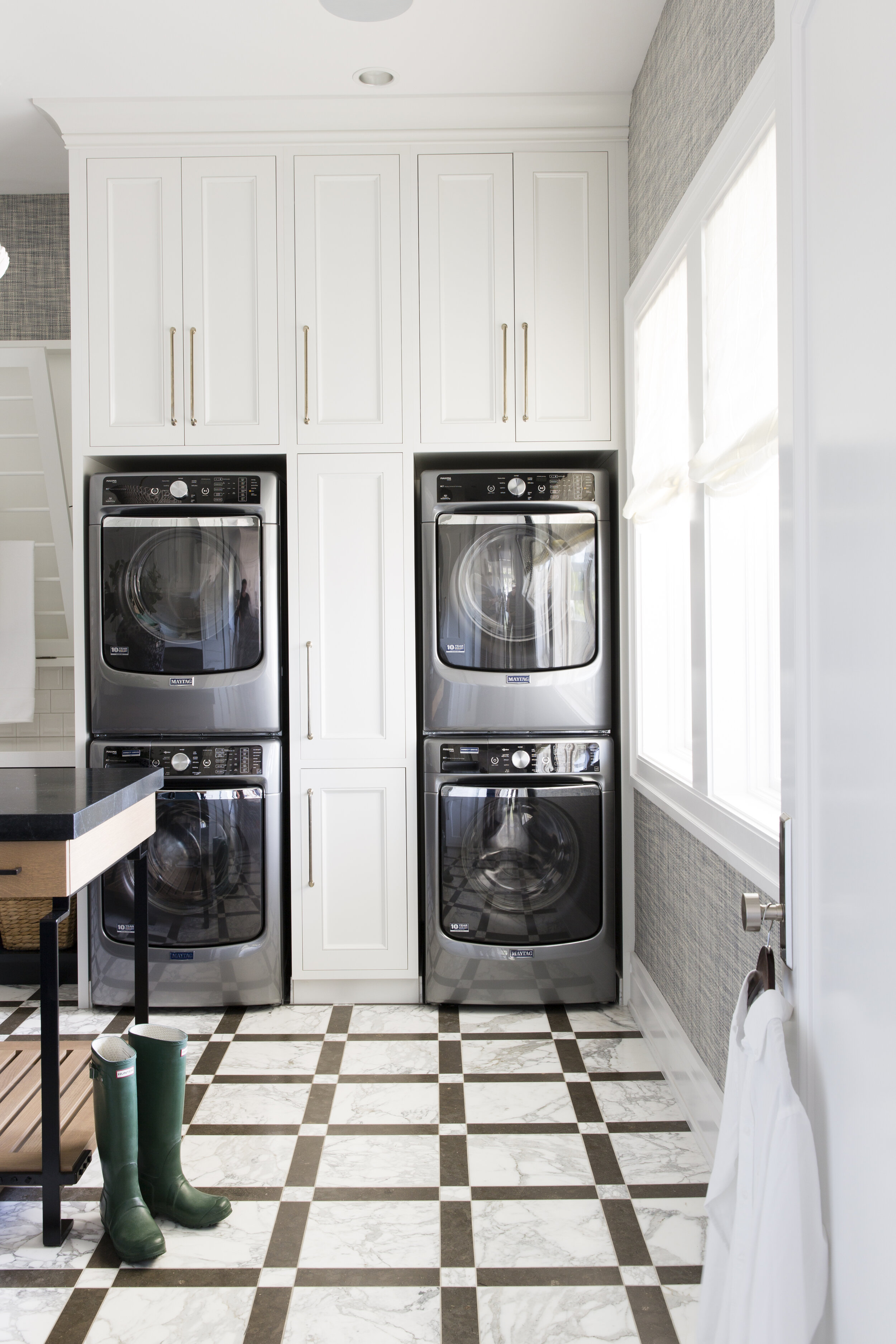
Located in Washington D.C., this beautiful family home was given new life. Inspired by traditional designs, but craving a never-before-seen fresh look, we created something new. Welcome to Capitol Heights.

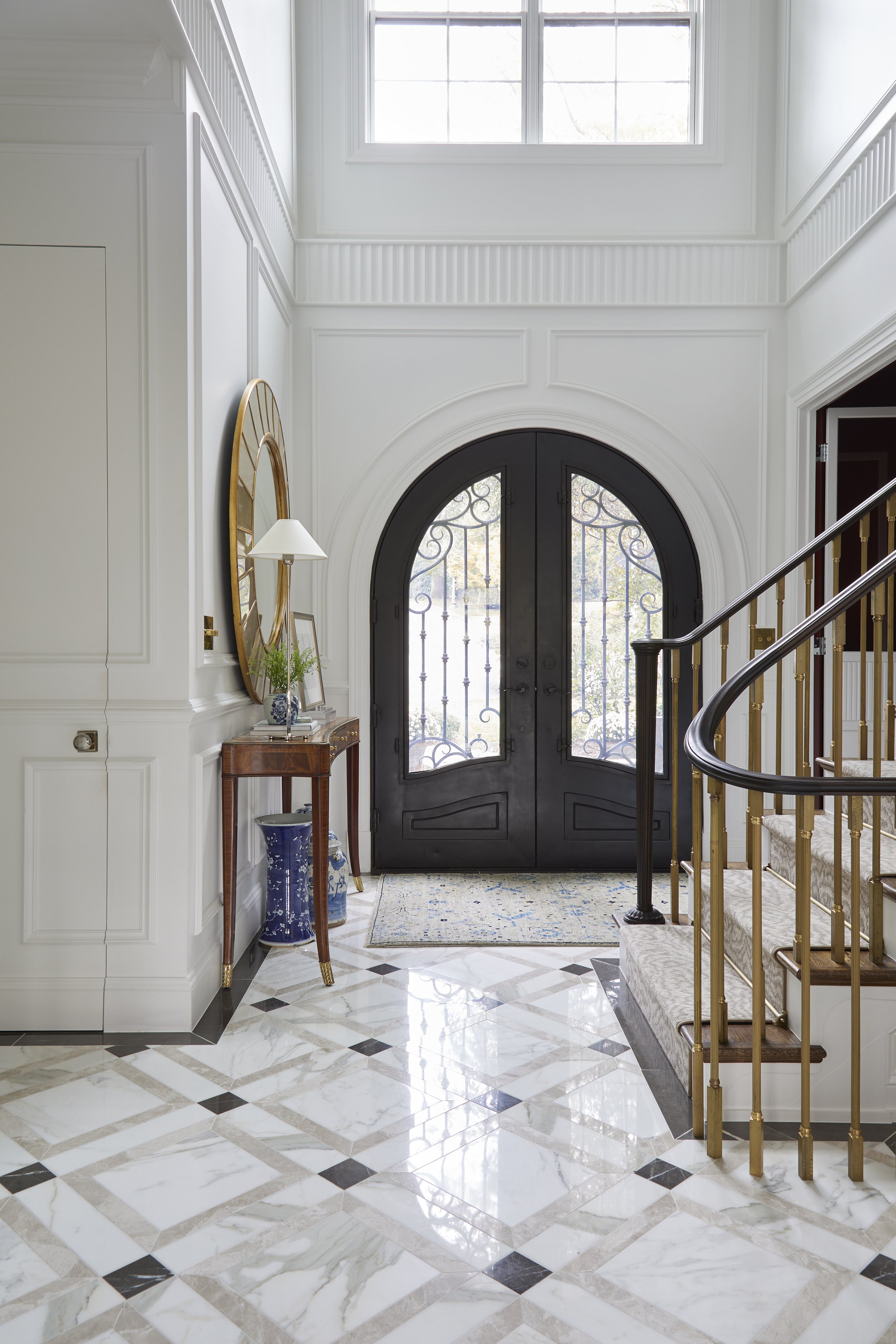
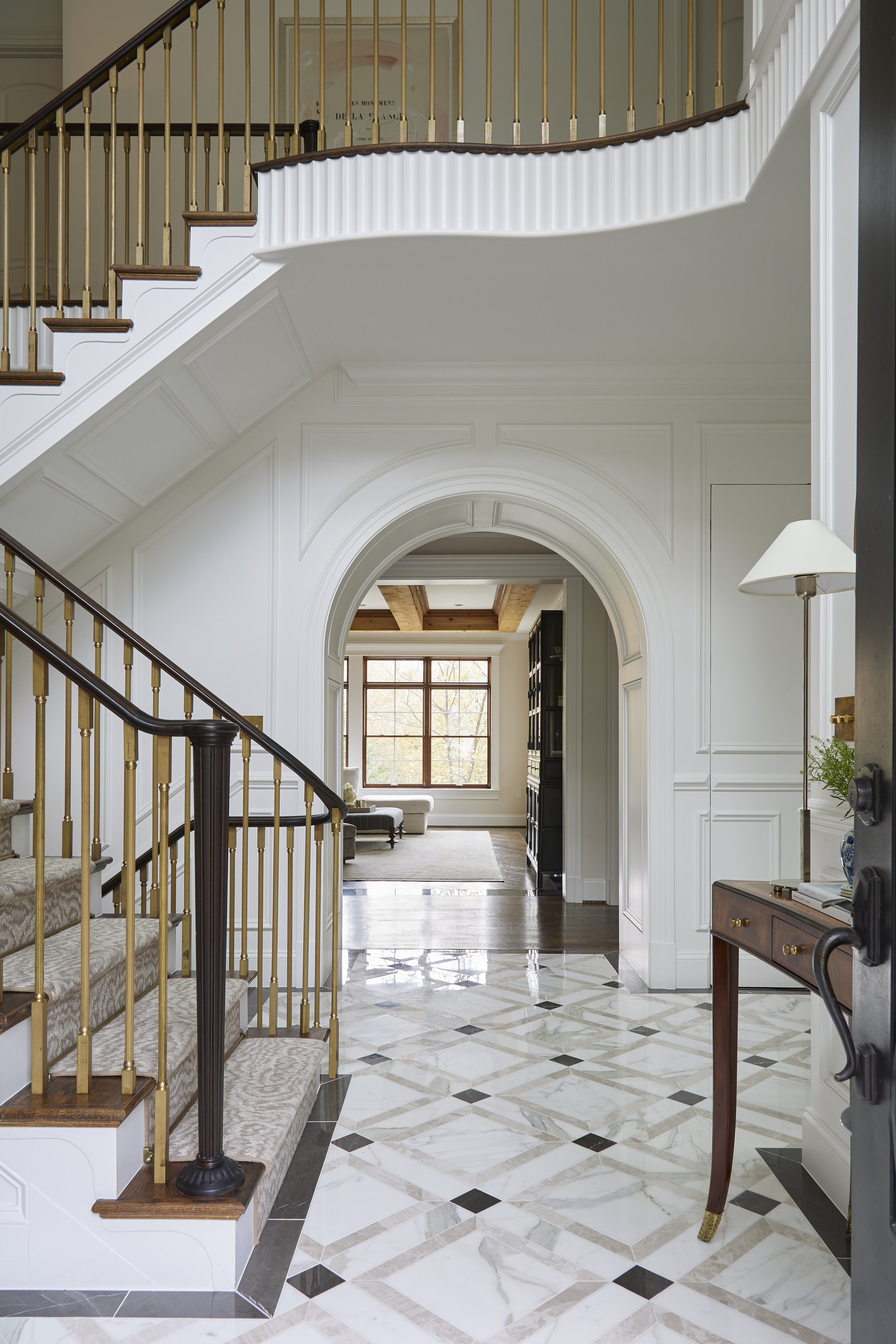
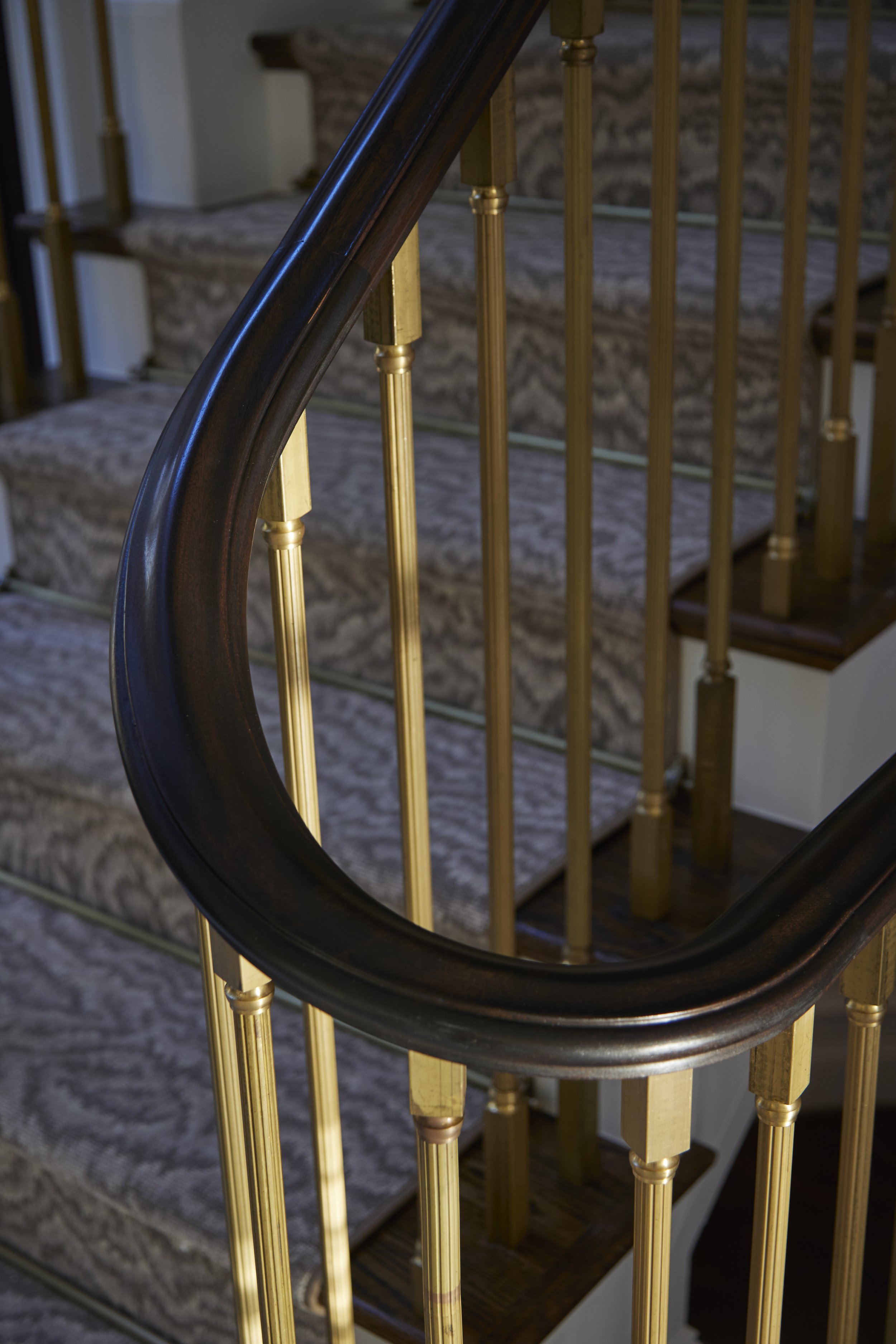
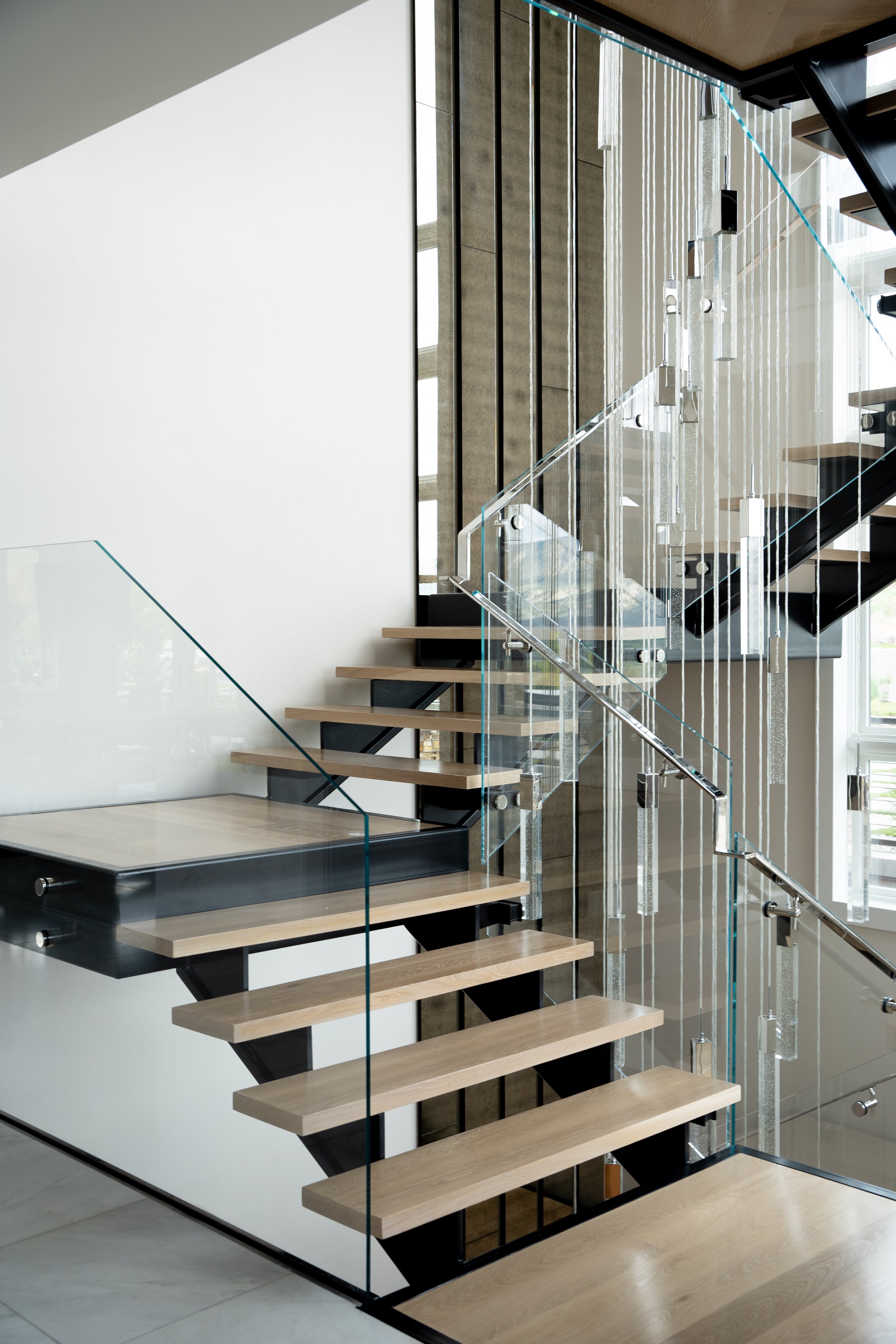
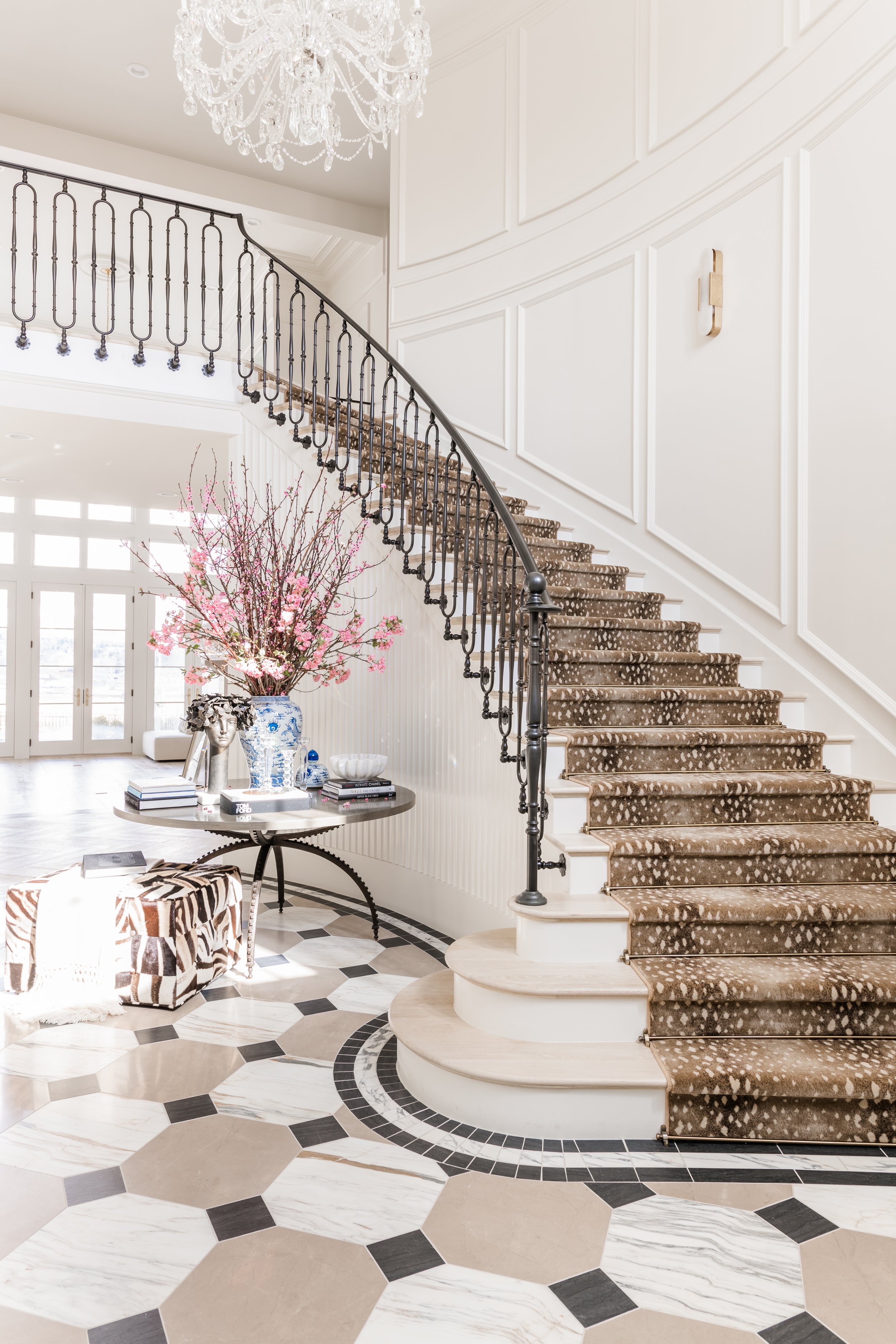
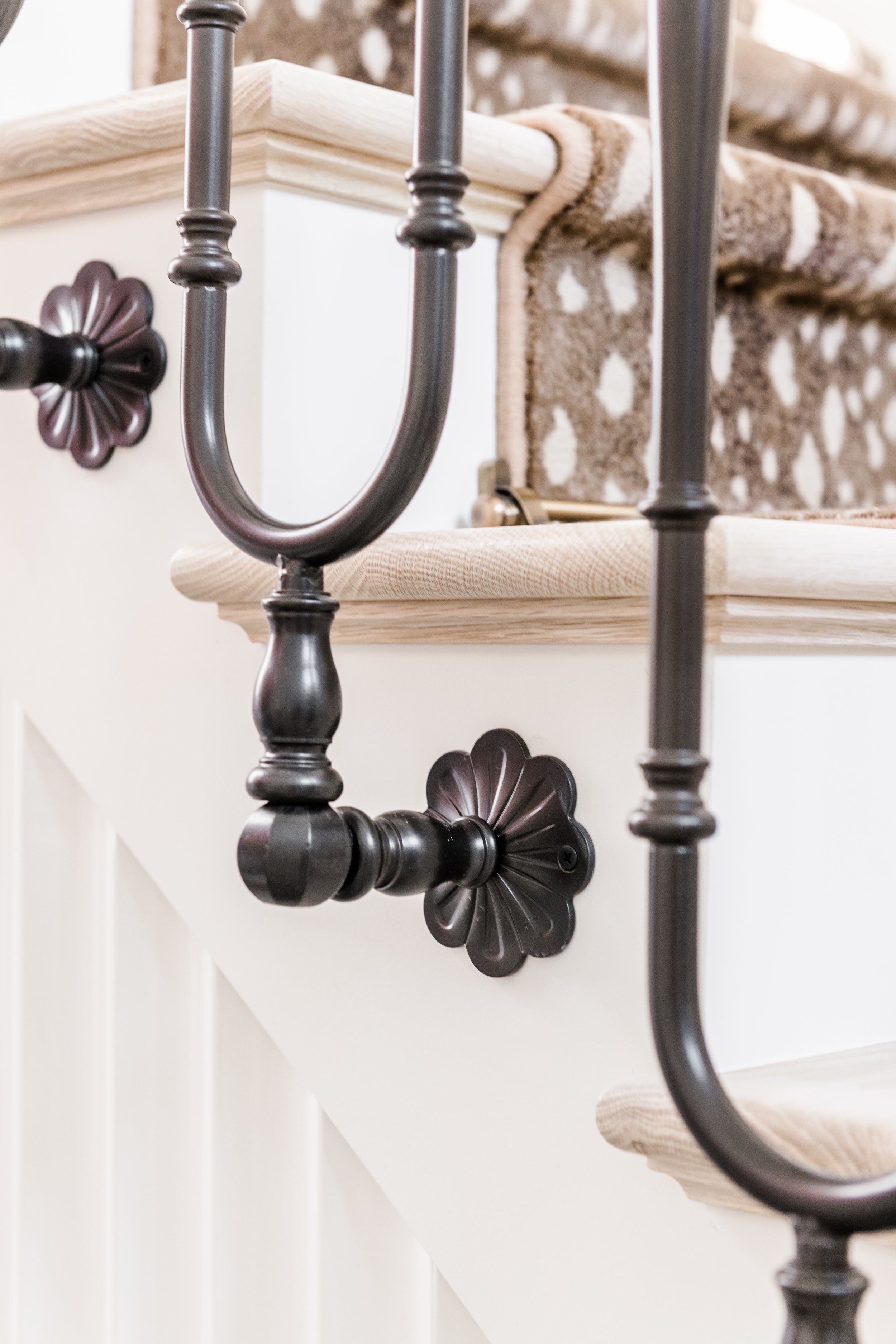
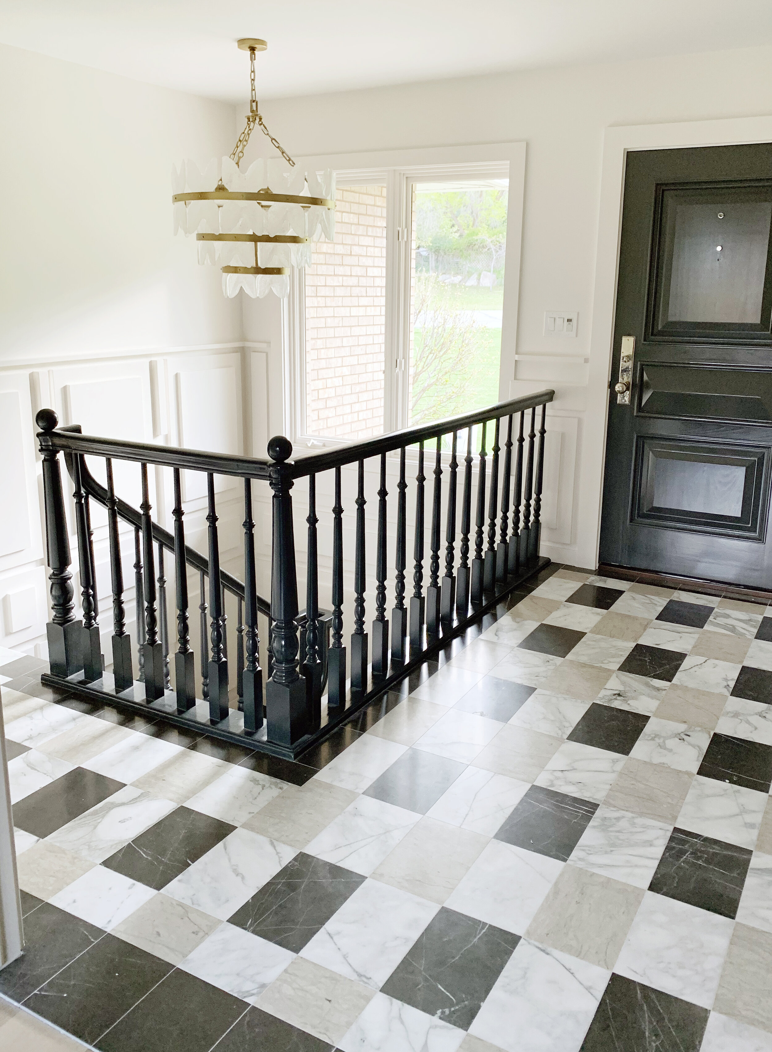
Then entryway is one of our favorite spaces. The floor boasts three different colors of marble, in a beautiful repetition, and set an angle. This look is space expanding, enlarging the look of the entry. Our heroes are the artisan-made bronze railing, trailing up the staircase, and reeded accents rimming the space between the door and ceiling for added texture and dimension.

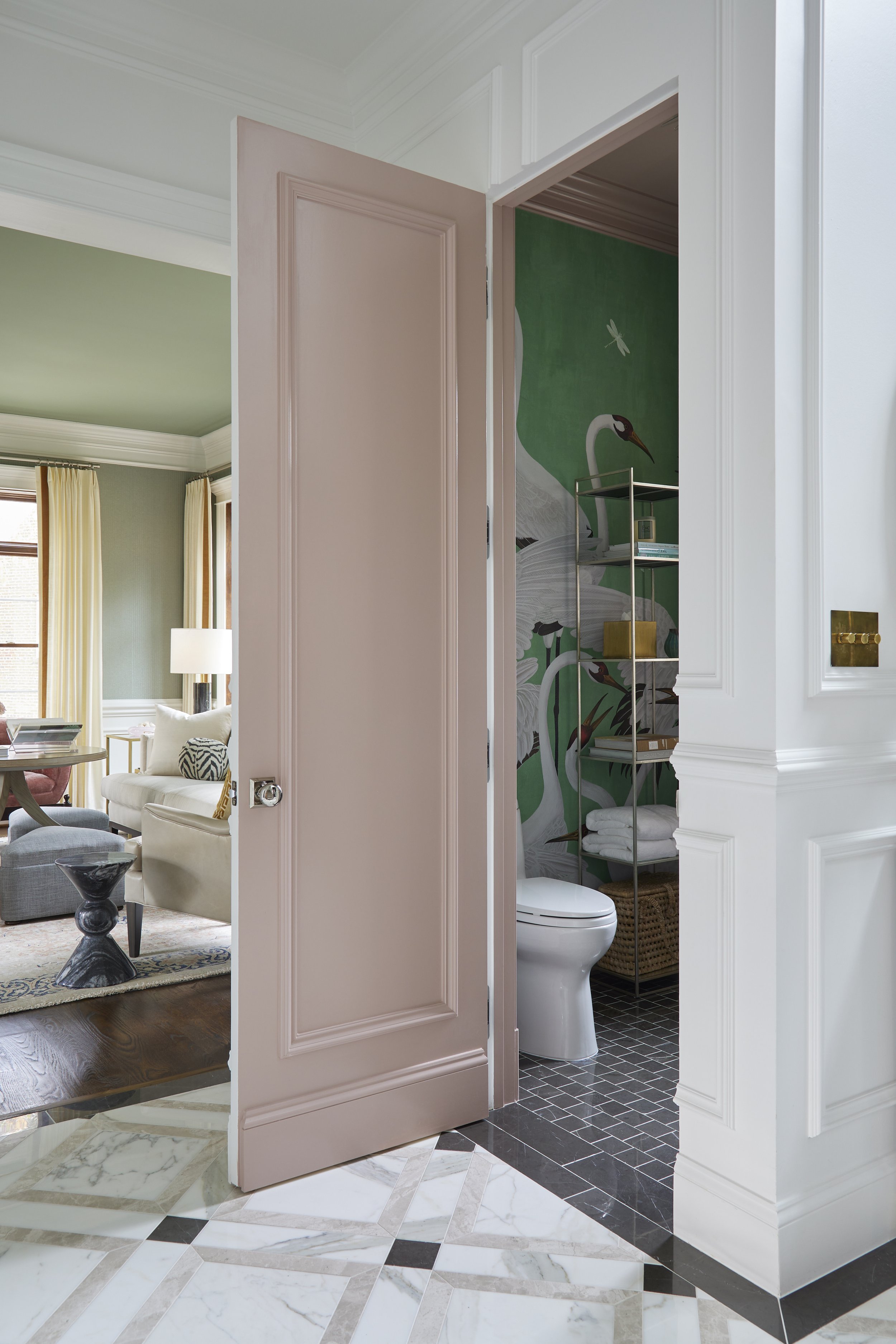
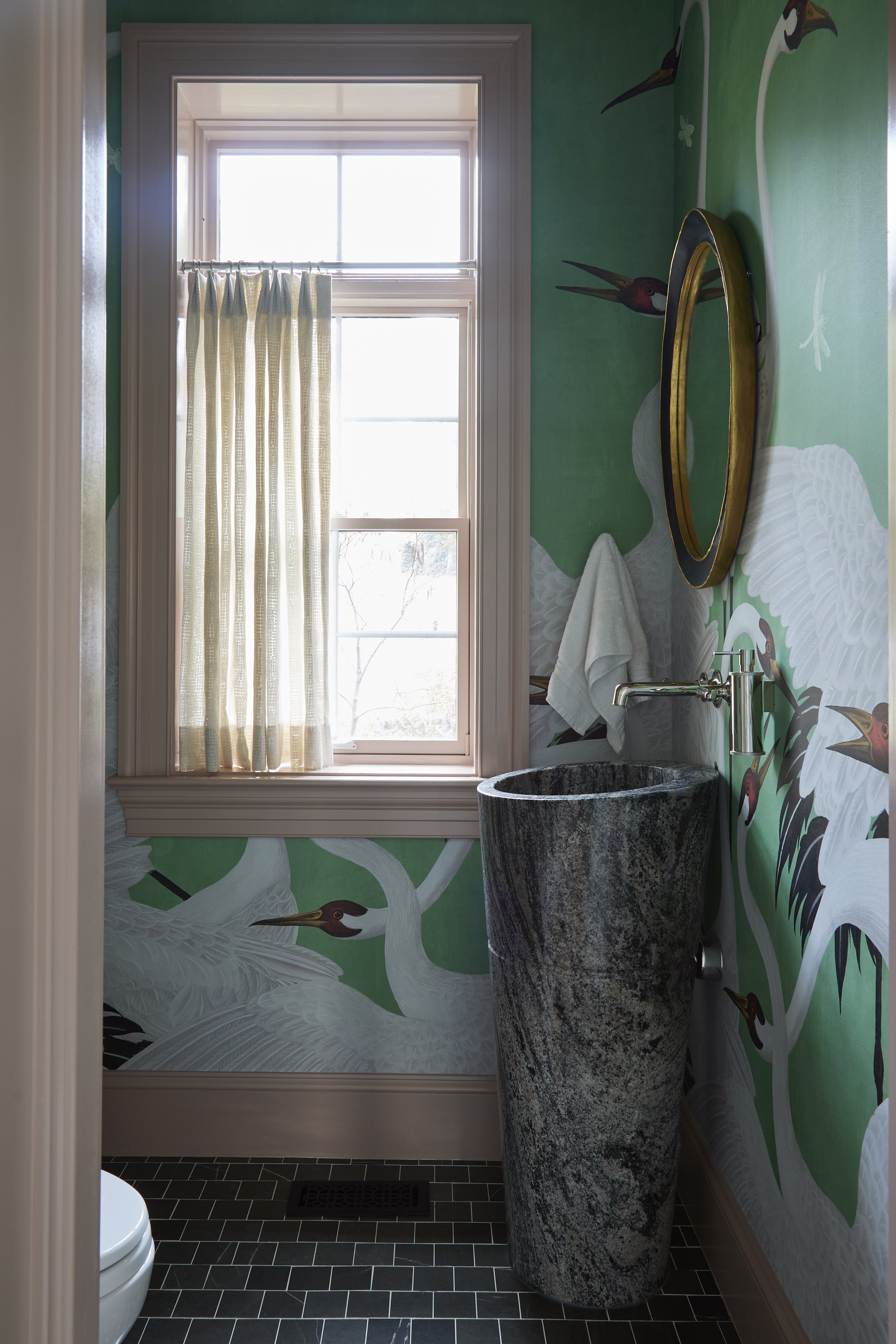
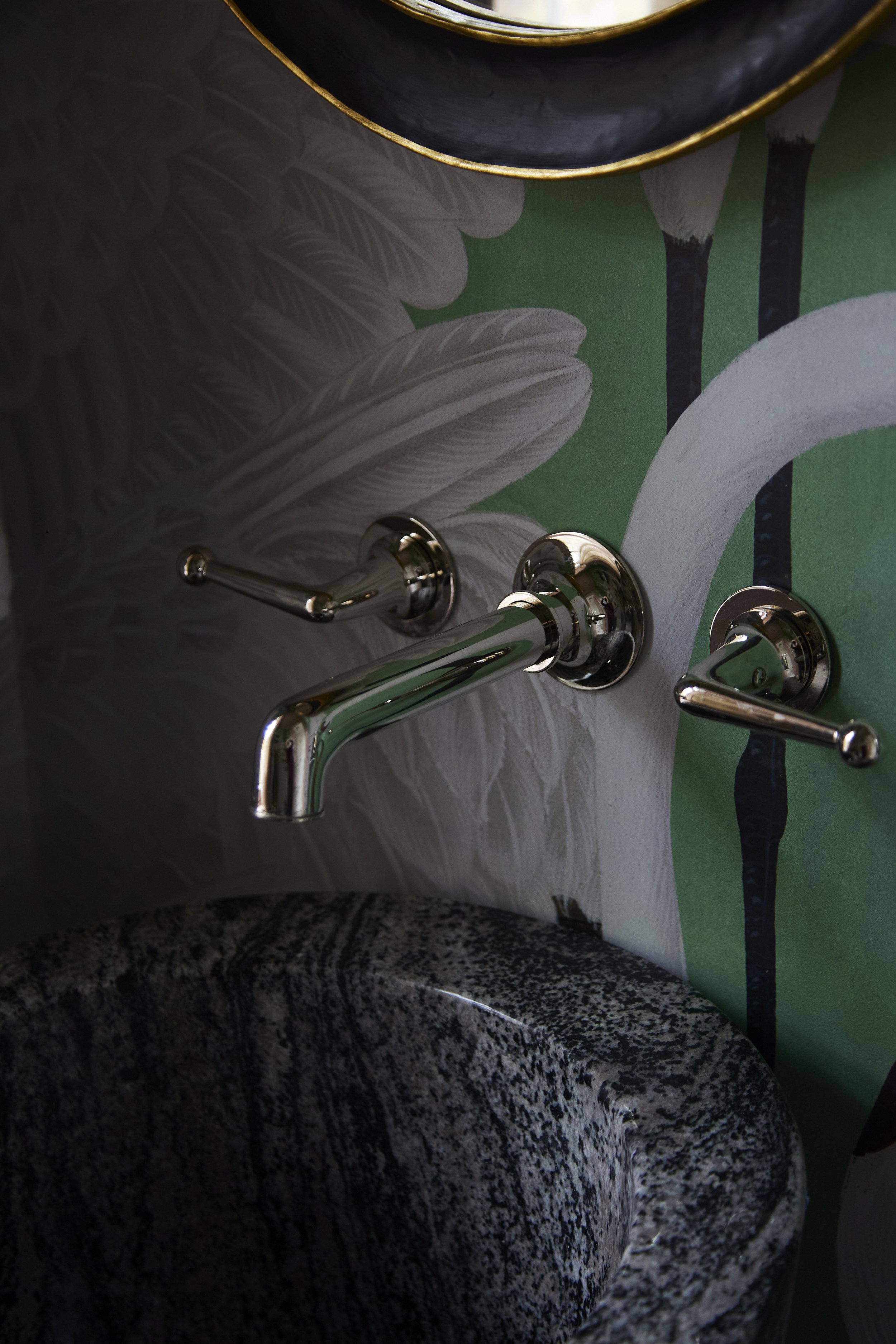
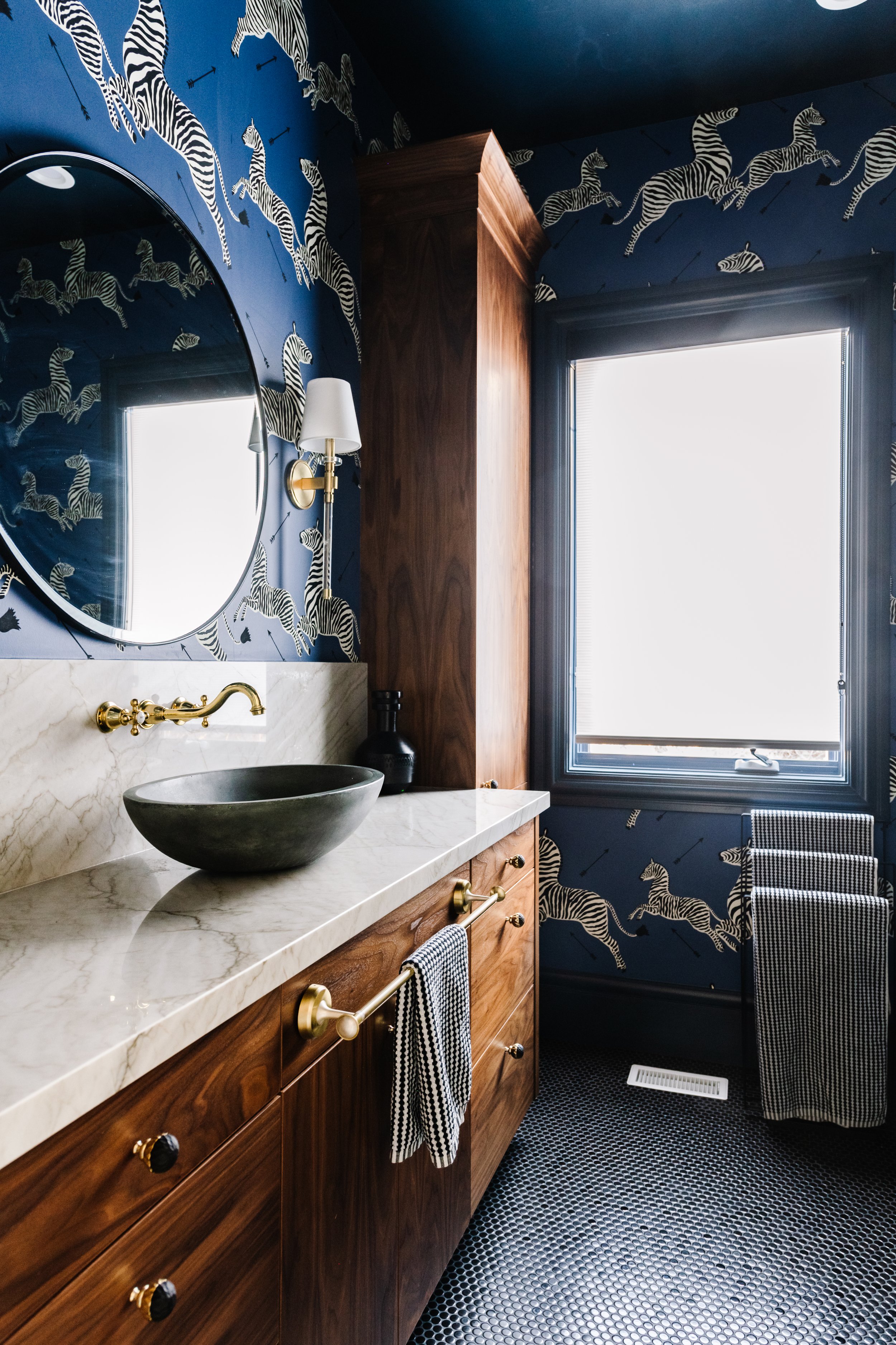
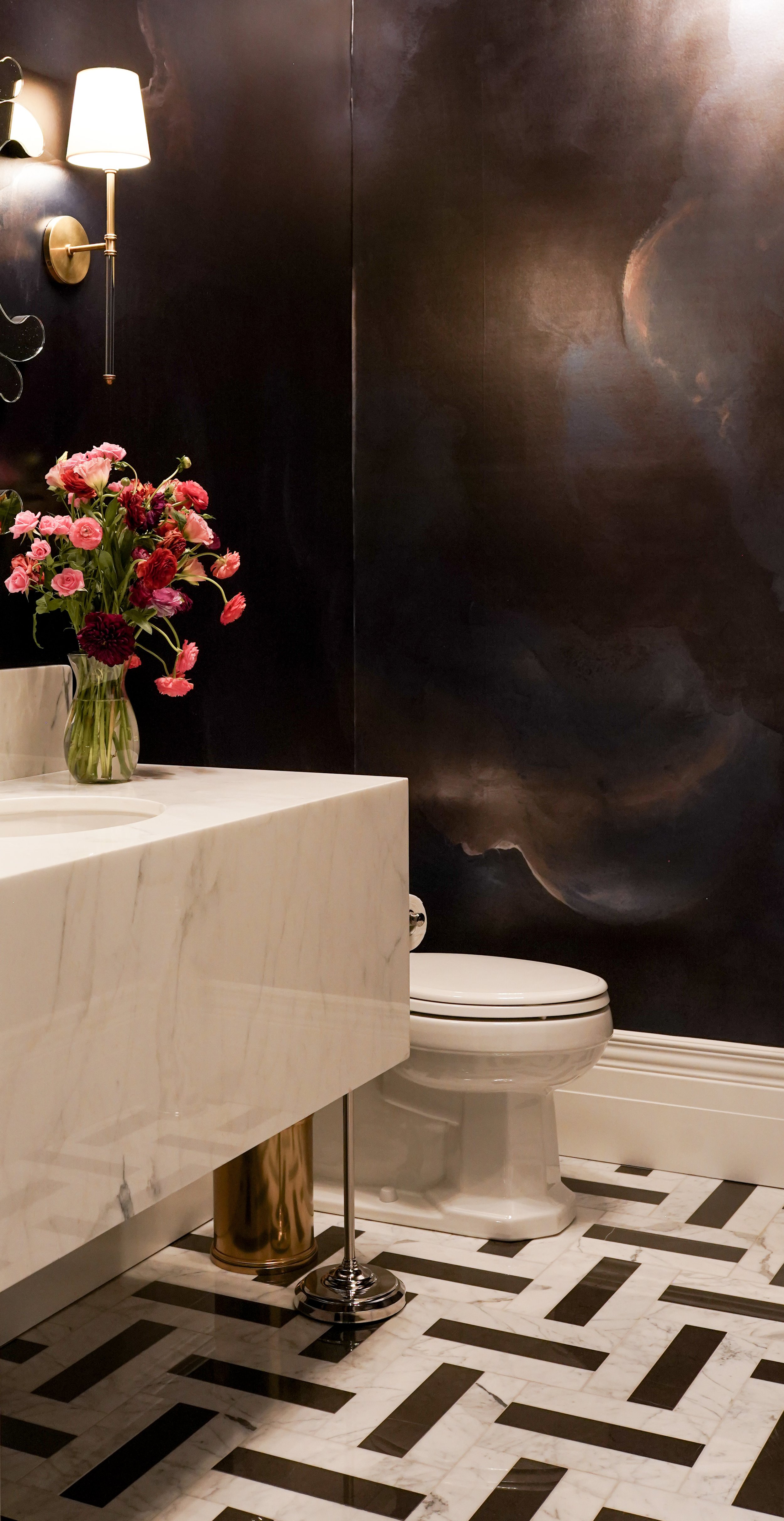
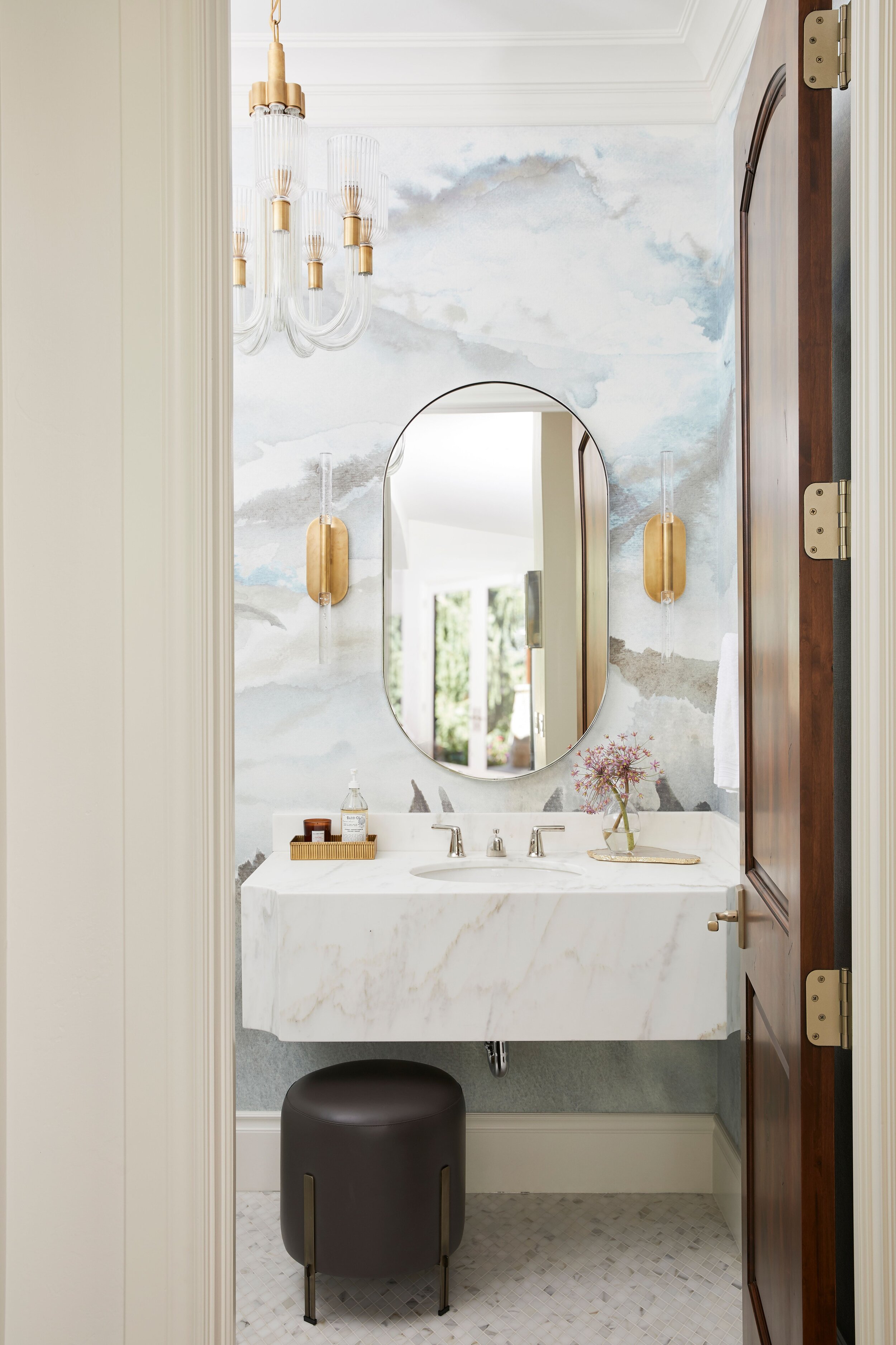
Right off the entry, an almost hidden door encloses a vibrant powder bath. The door is paneled to match the wall, seamlessly blending into the surrounding space. Completely covered in mint Gucci Crane wallpaper, the powder bath is an experience. Showcasing brick stacked marble, a statement sink, and rounded mirror.

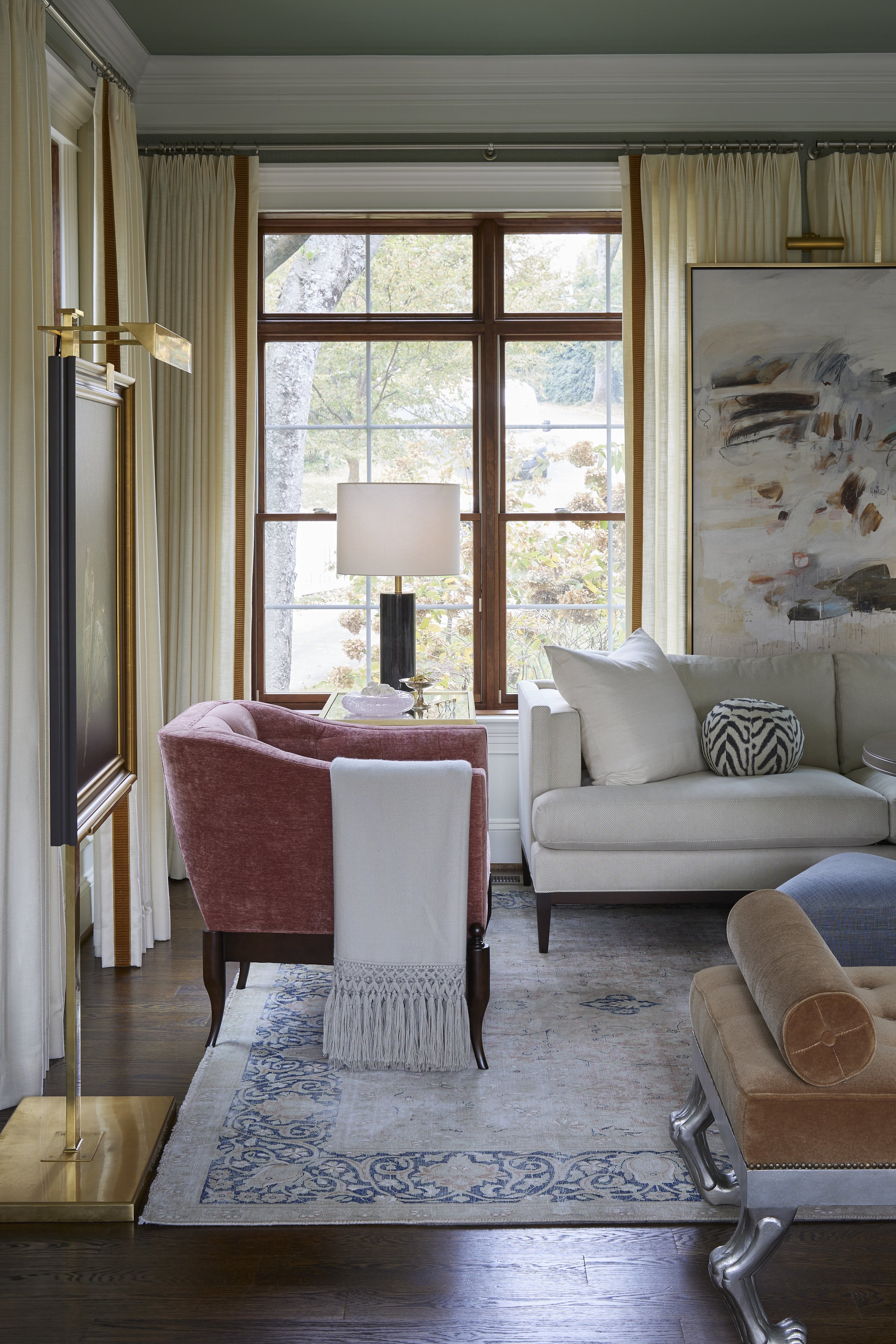
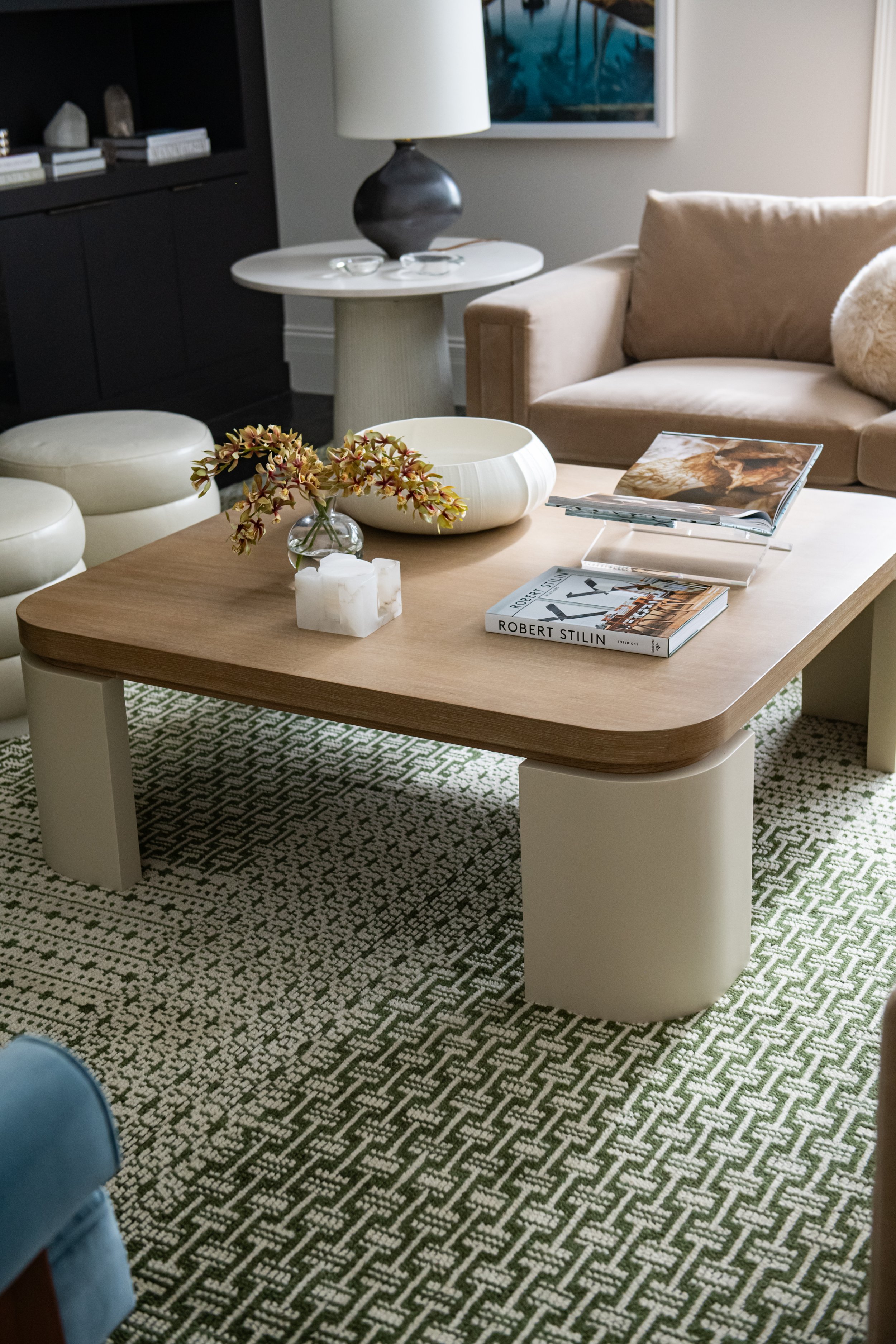
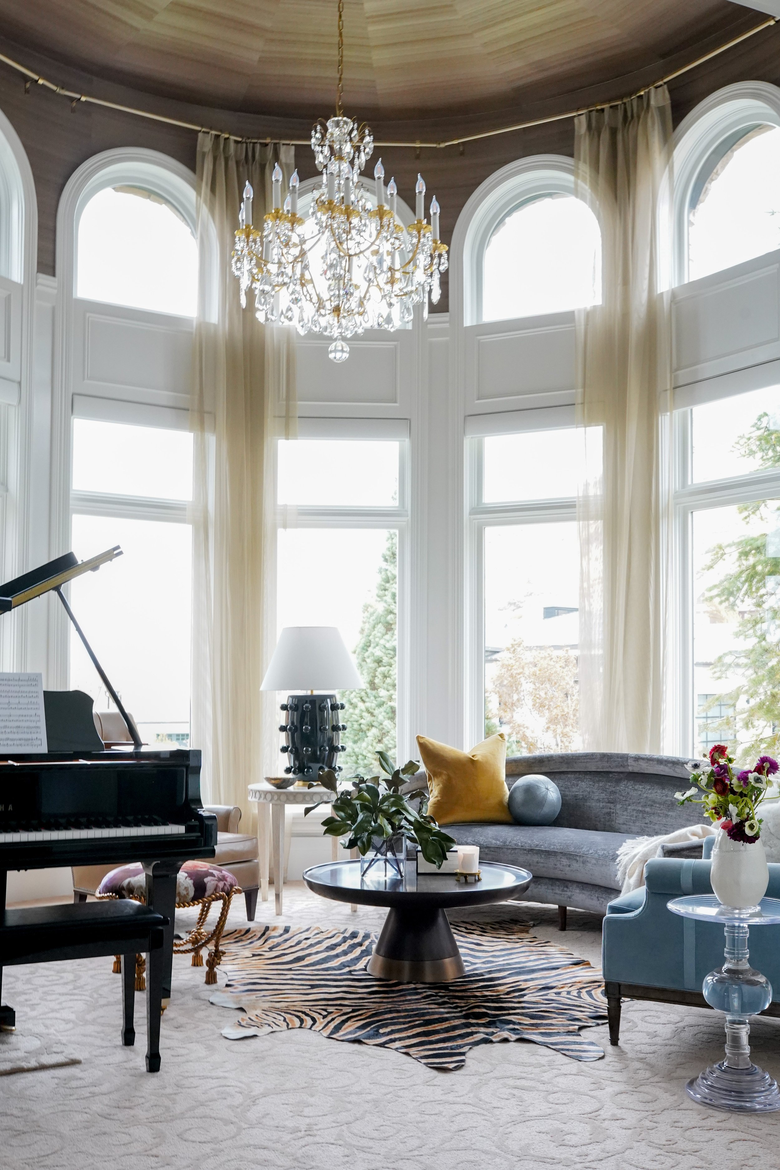
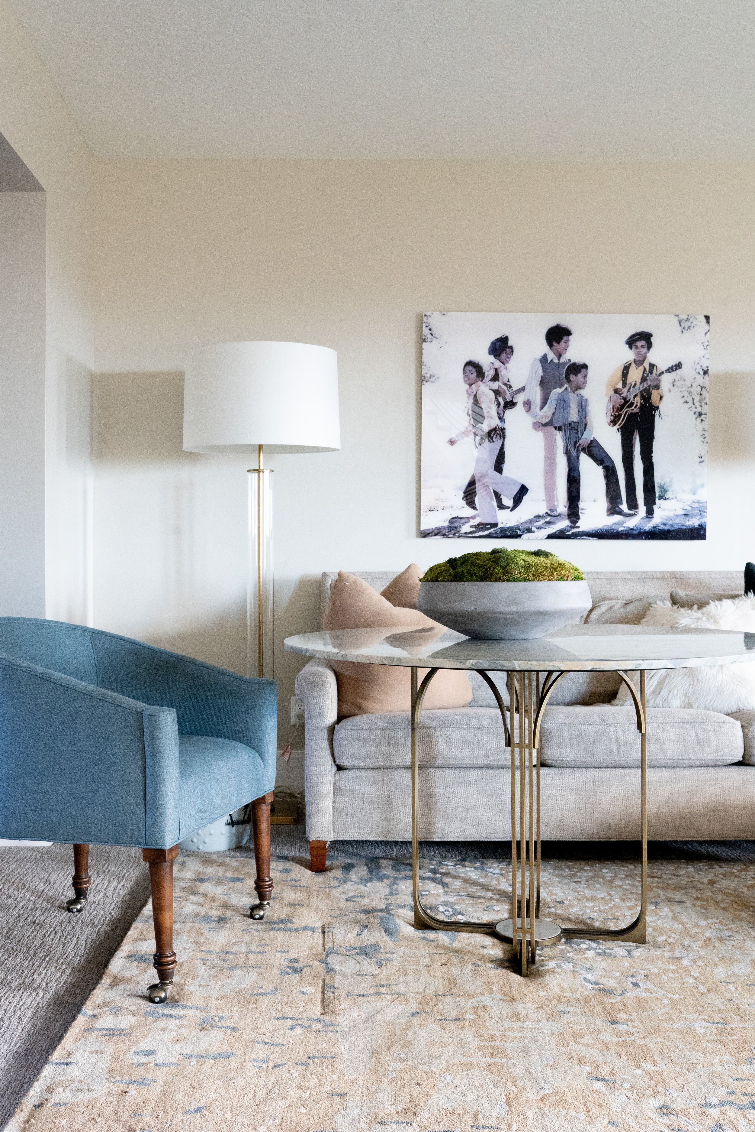
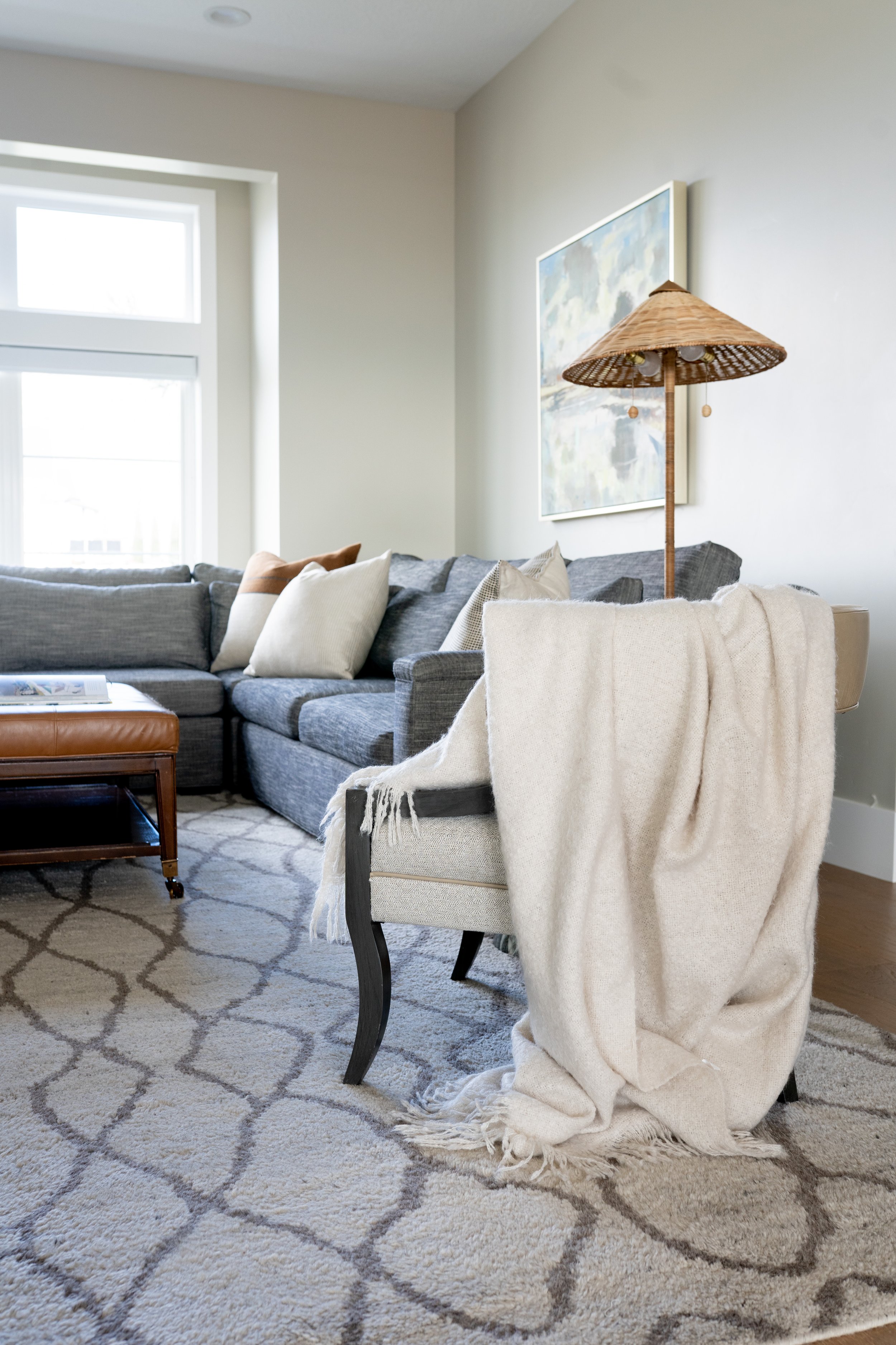
A lesson on layering, their living room gives causal sophistication with gold-lined drapes framing mounted artwork. We opted for a center hall table instead of a coffee table, this elevated surface provides the ideal space for games or working. It is an unexpected, fresh addition that gives an elegant touch.

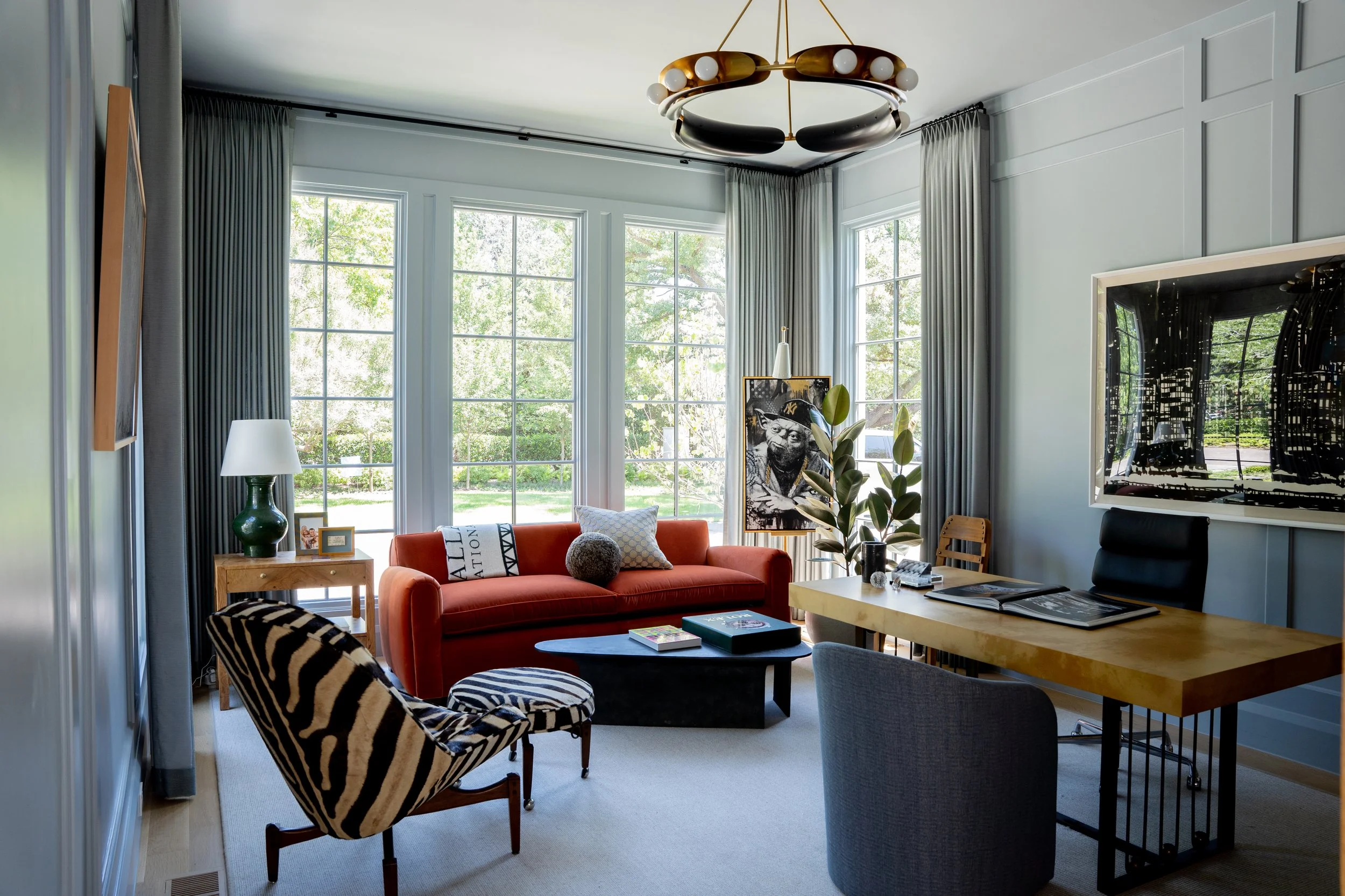
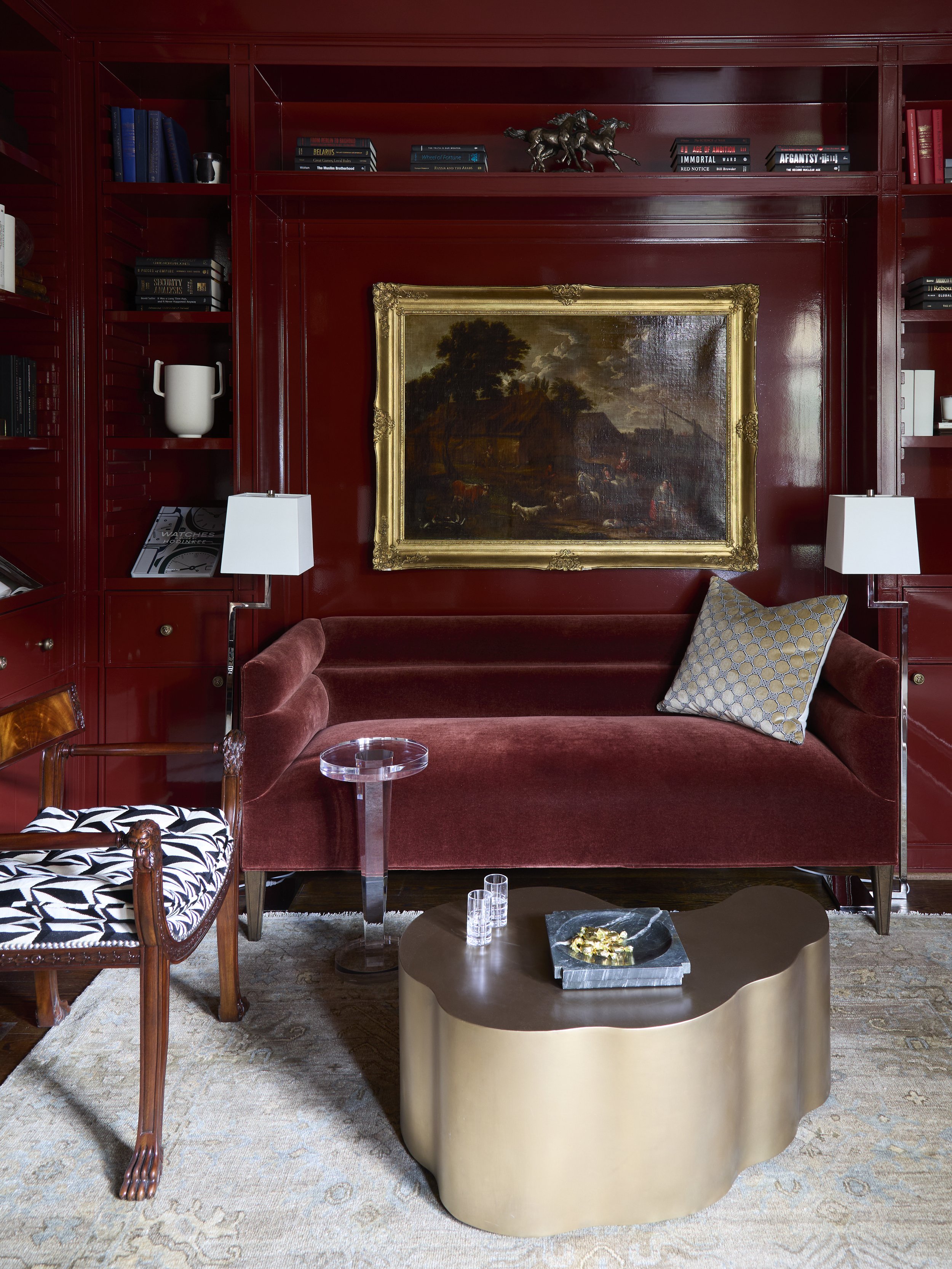
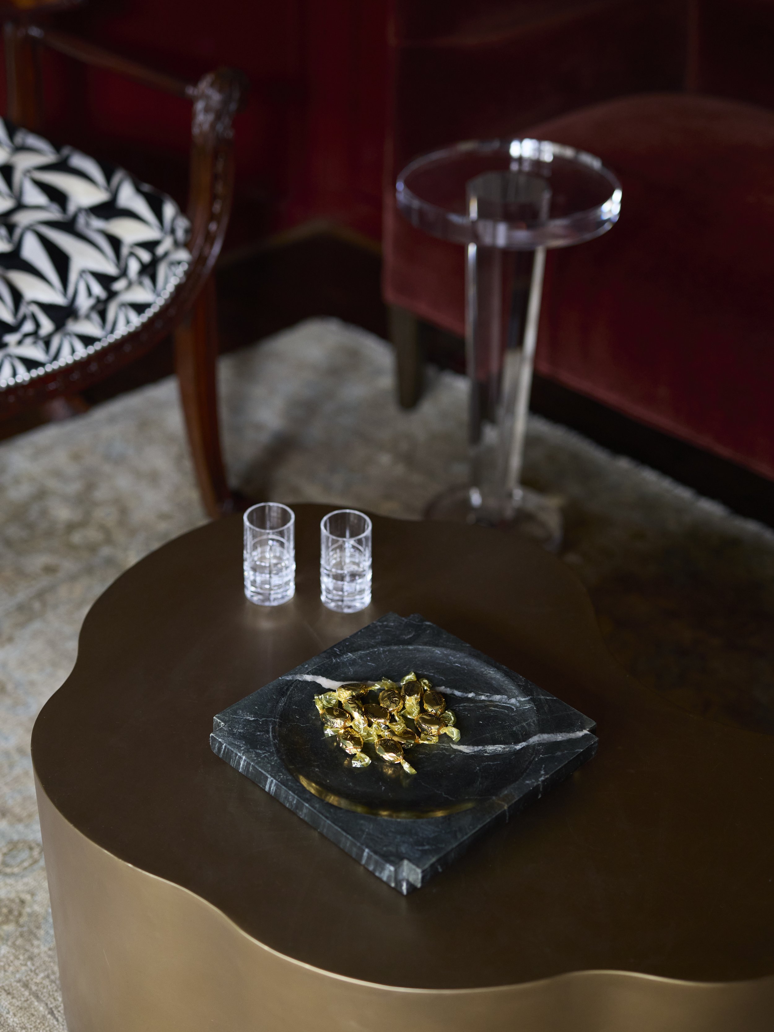
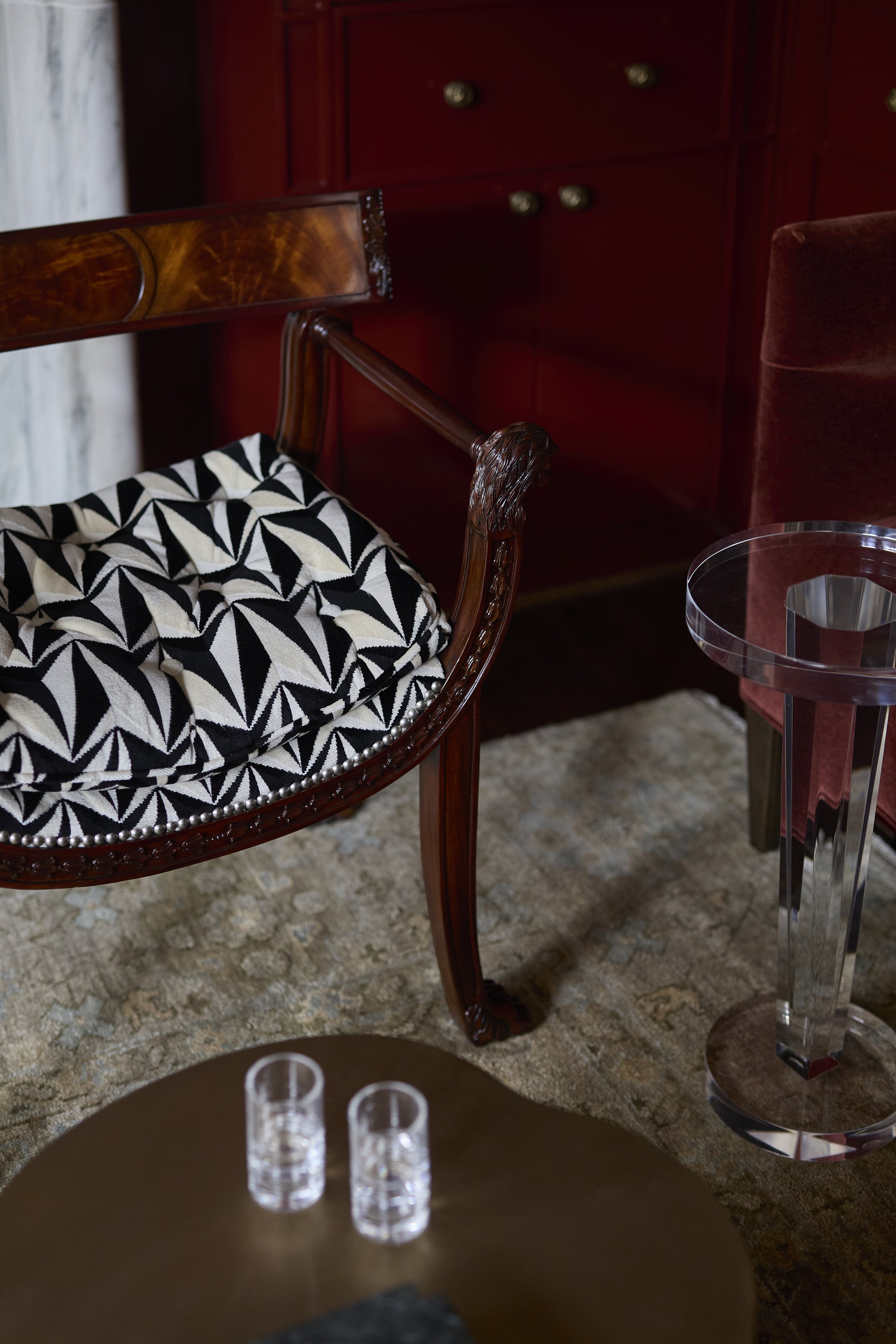
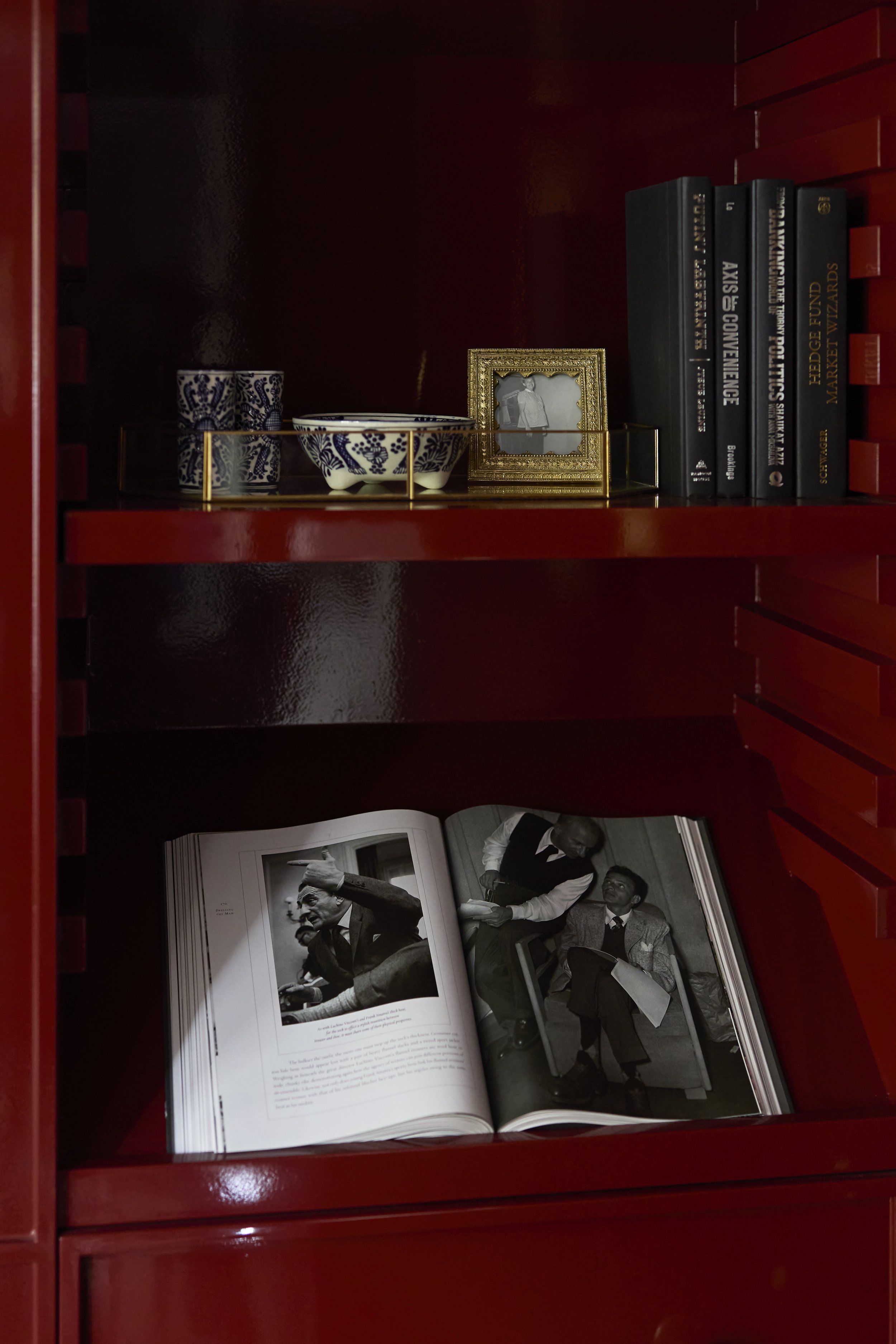
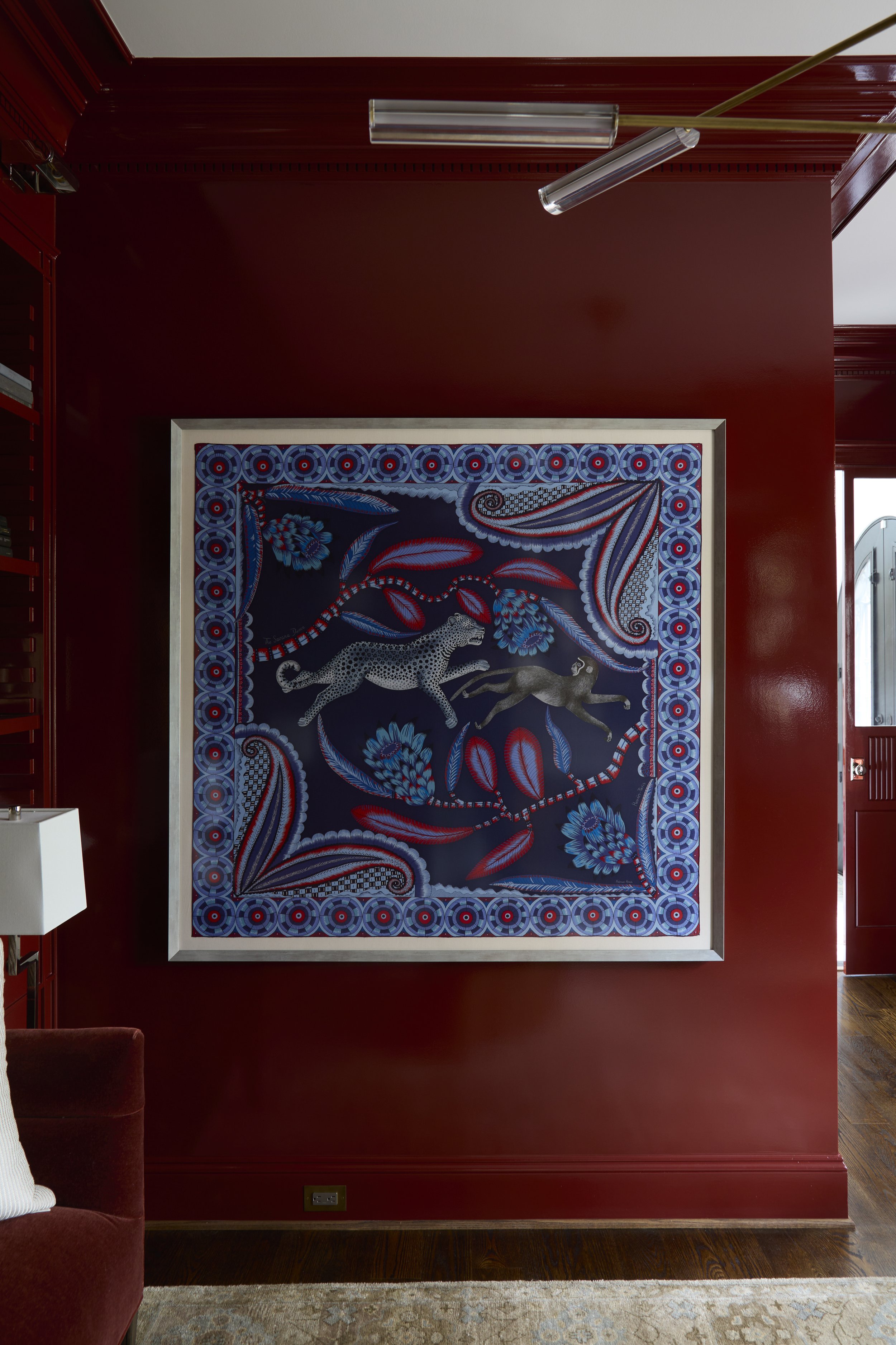
A bold move, the Library is easily a focal point in the home. Lacquered in a striking red, it becomes an immersive experience. A stunning original artwork is displayed above a comfortable sofa. We also added a mirrored bar shelf, beautifully providing visual depth and interest.

House of Flora

Welcome to House of Flora. A remodel driven by contrast, with a focus on color and art, we created something new.

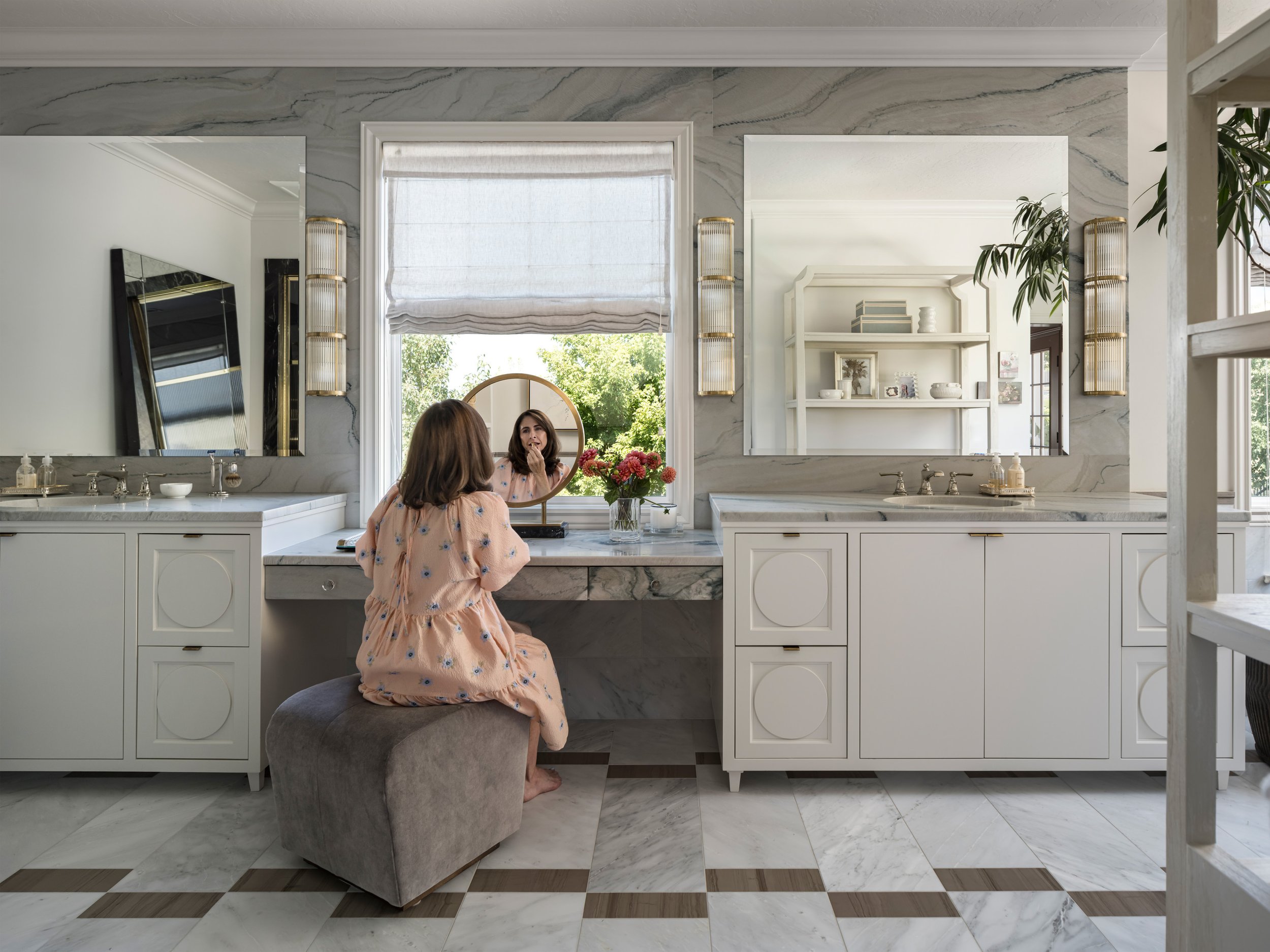
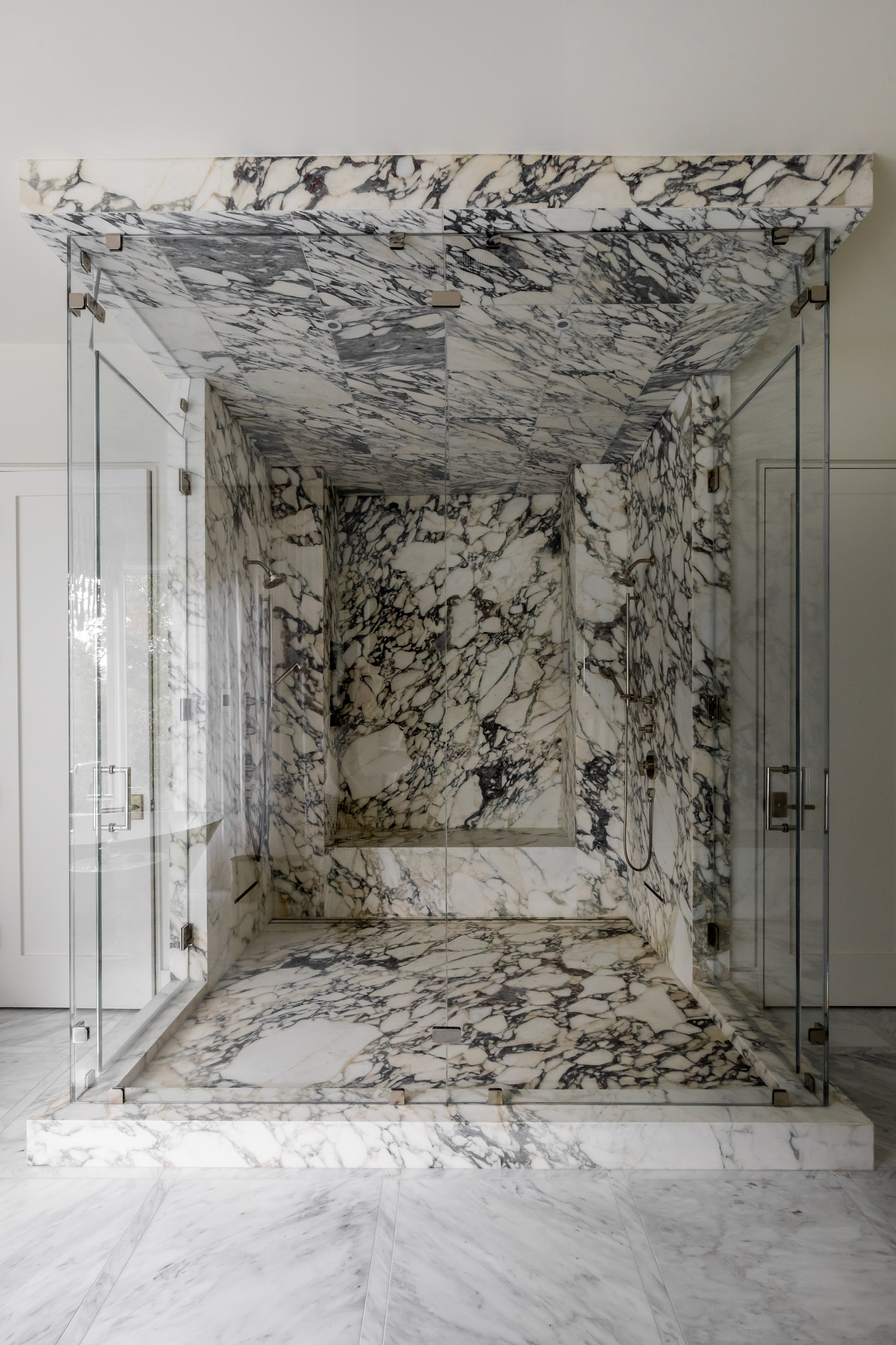
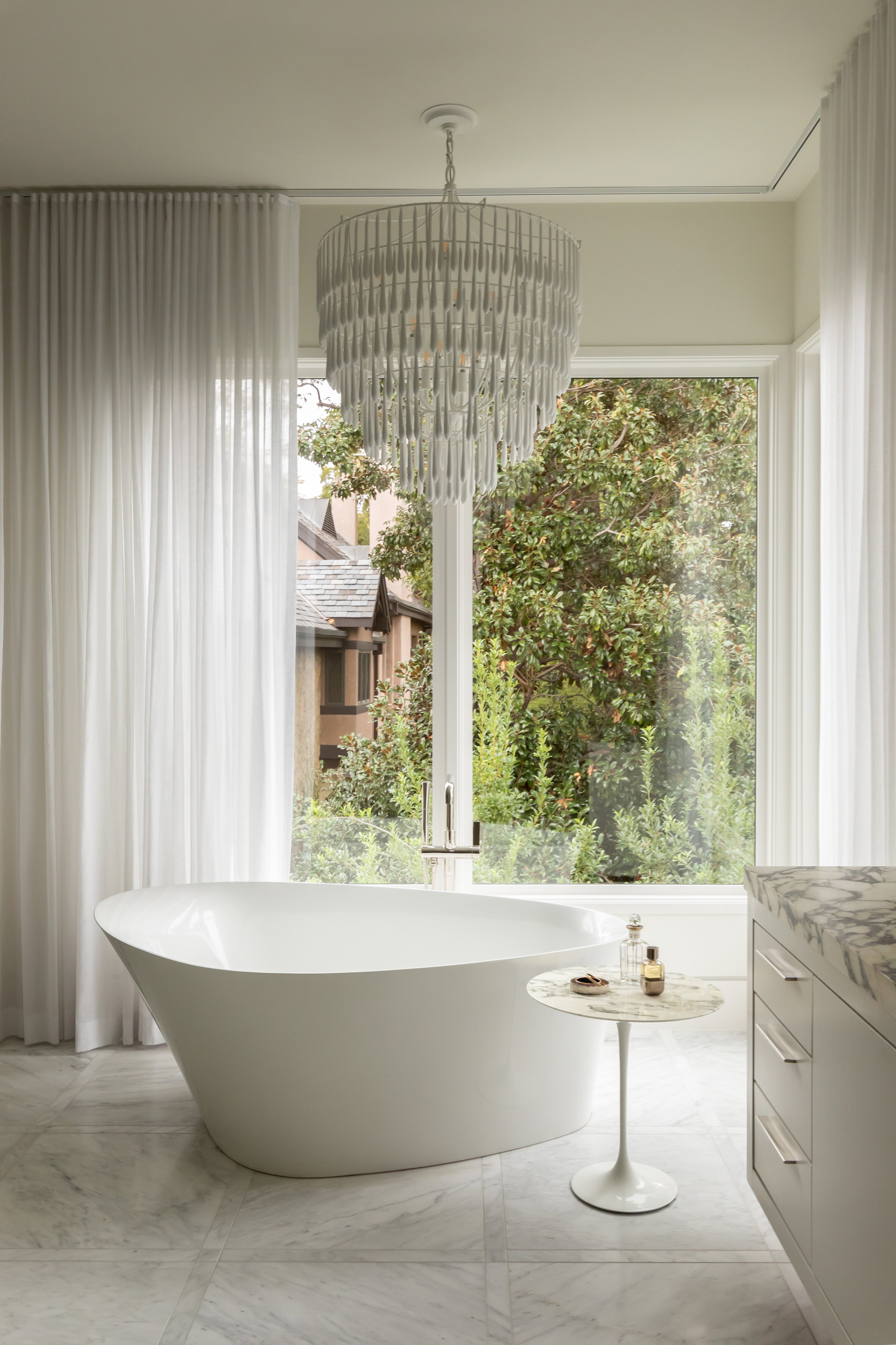
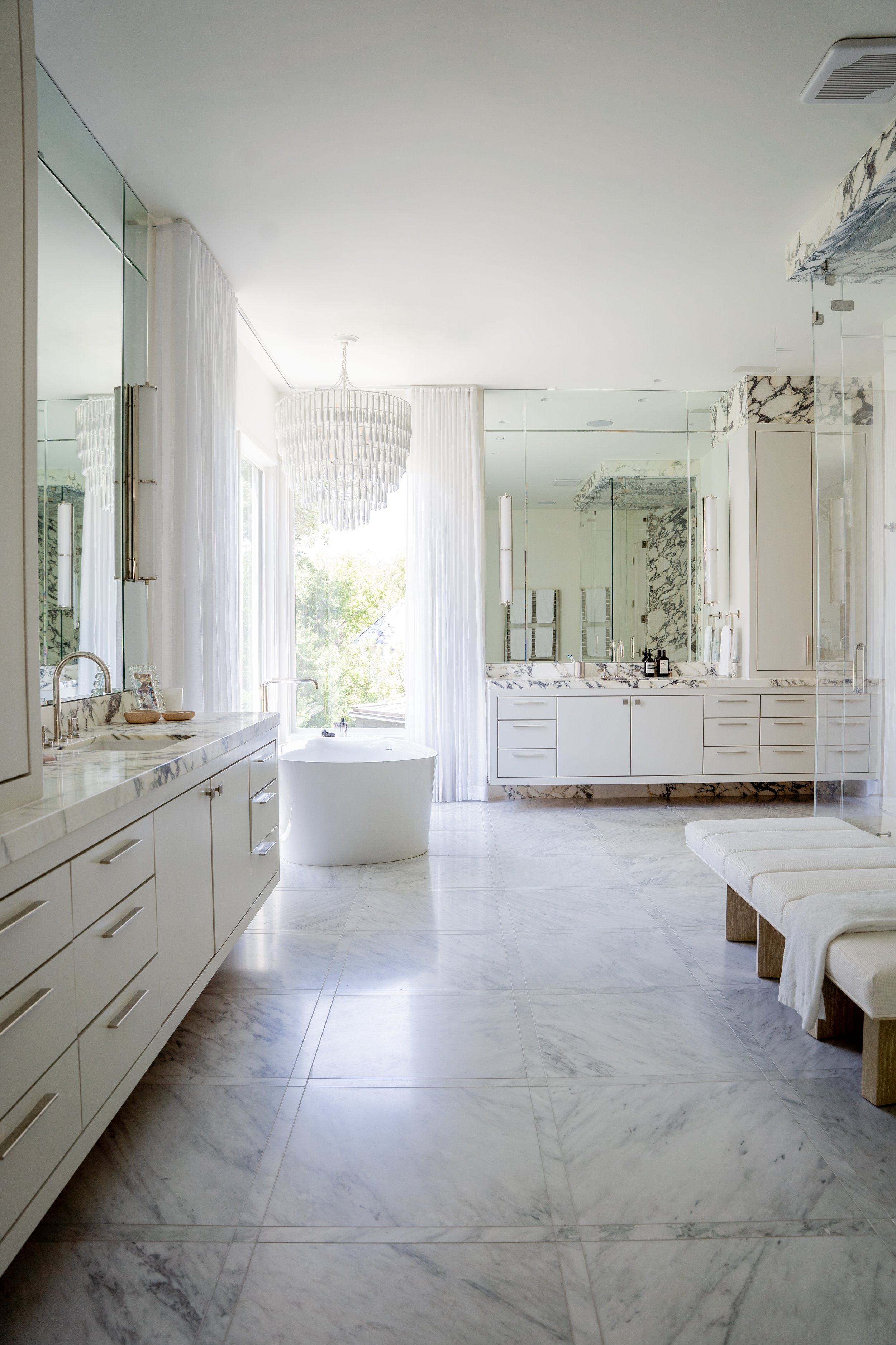
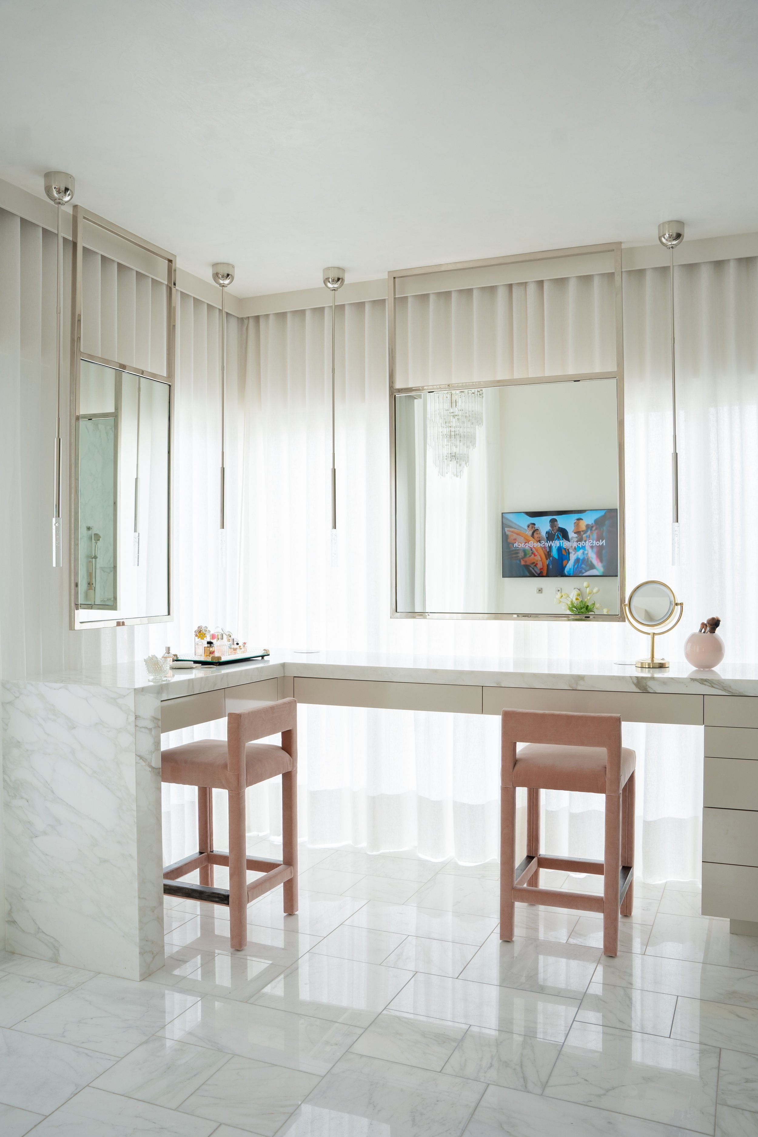
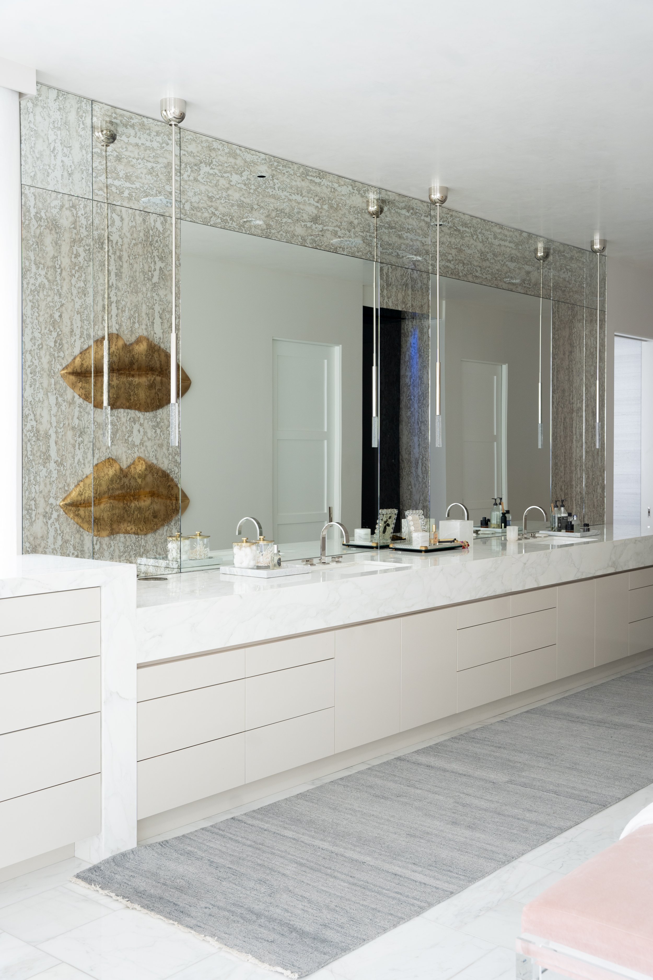
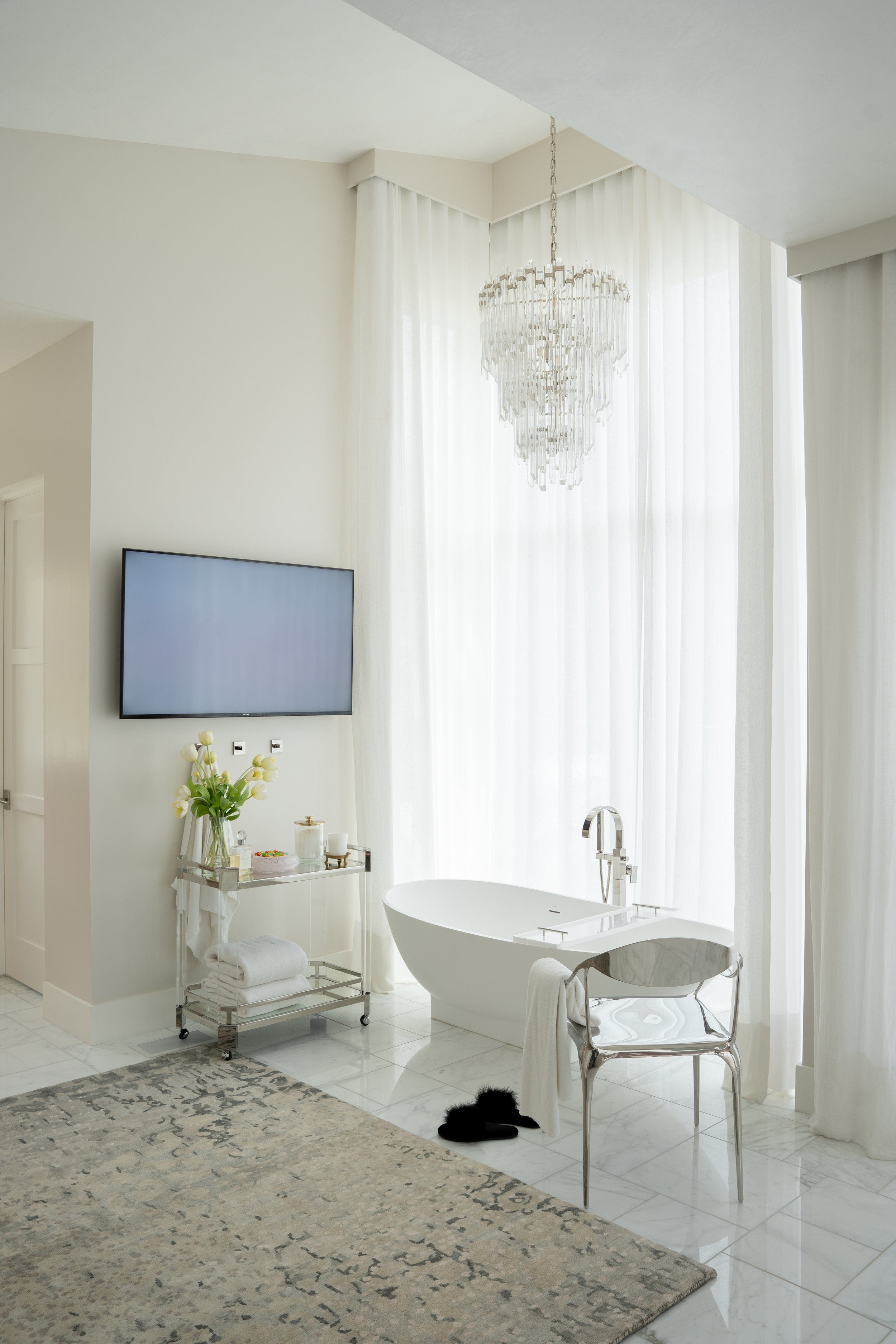
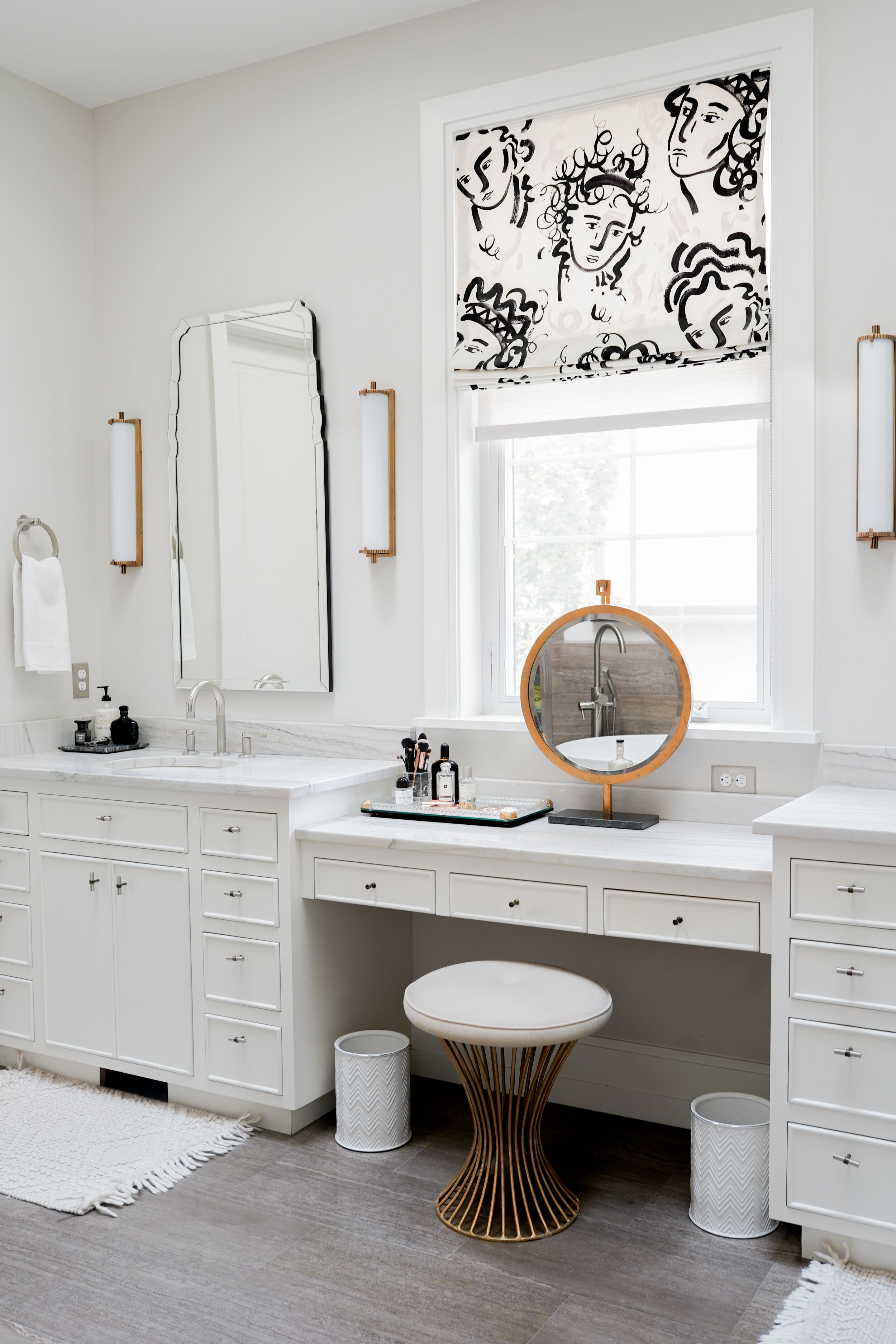
As empty nesters, a larger bathroom was a priority. We enlarged the space by taking over an adjoining guest room. Our main focus was capitalizing on the natural light, which was accomplished by a vanity in front of the window. The shower is a stunning black nero quartzite, a beautiful contrast to the rest of the space.

Bathroom Wall Paint - Egret White by Sherwin Williams

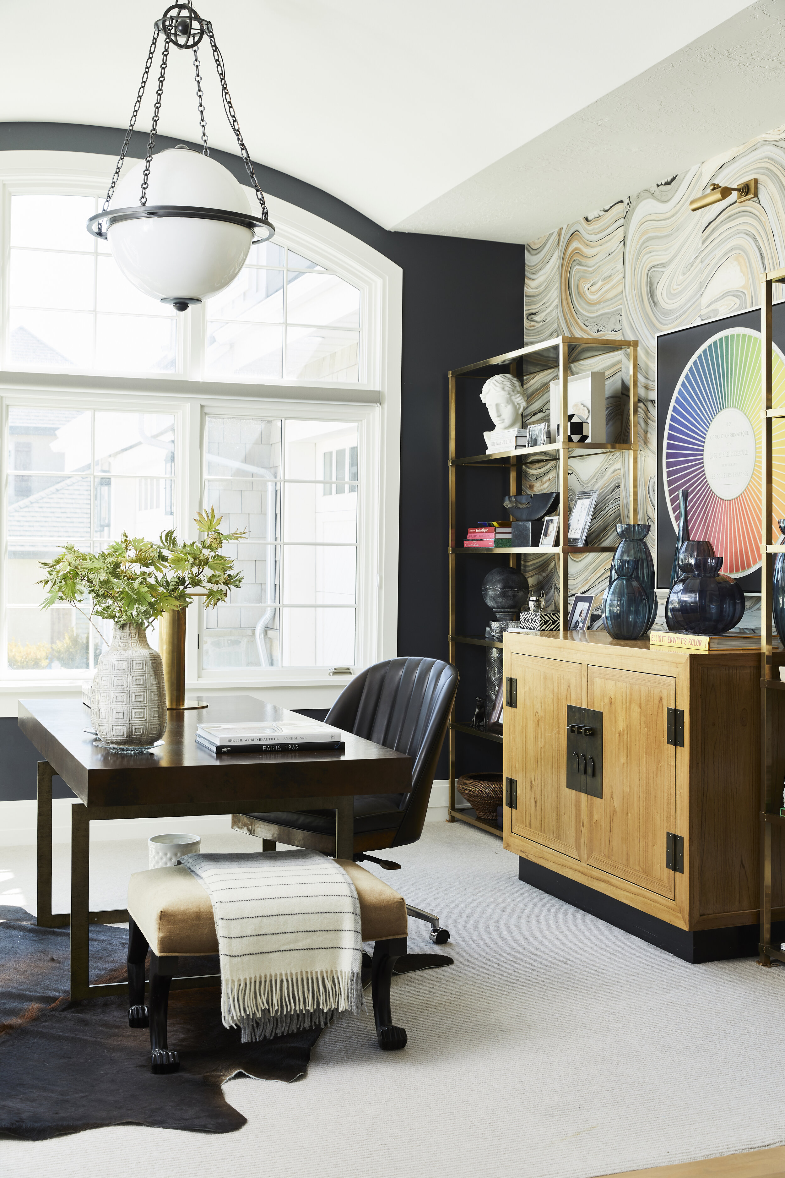
Creating a Command Center, we wanted to create a place that not only accommodated getting work done, but also included a place to relax. Custom-built cabinetry was the perfect solution. Simply slide the glass mirrors open to reveal a hidden television, perfect for viewing from the sofa.

Cabinetry Paint - Organ Trail by Sherwin Williams
Wall Paint - Fog Mist by Benjamin Moore

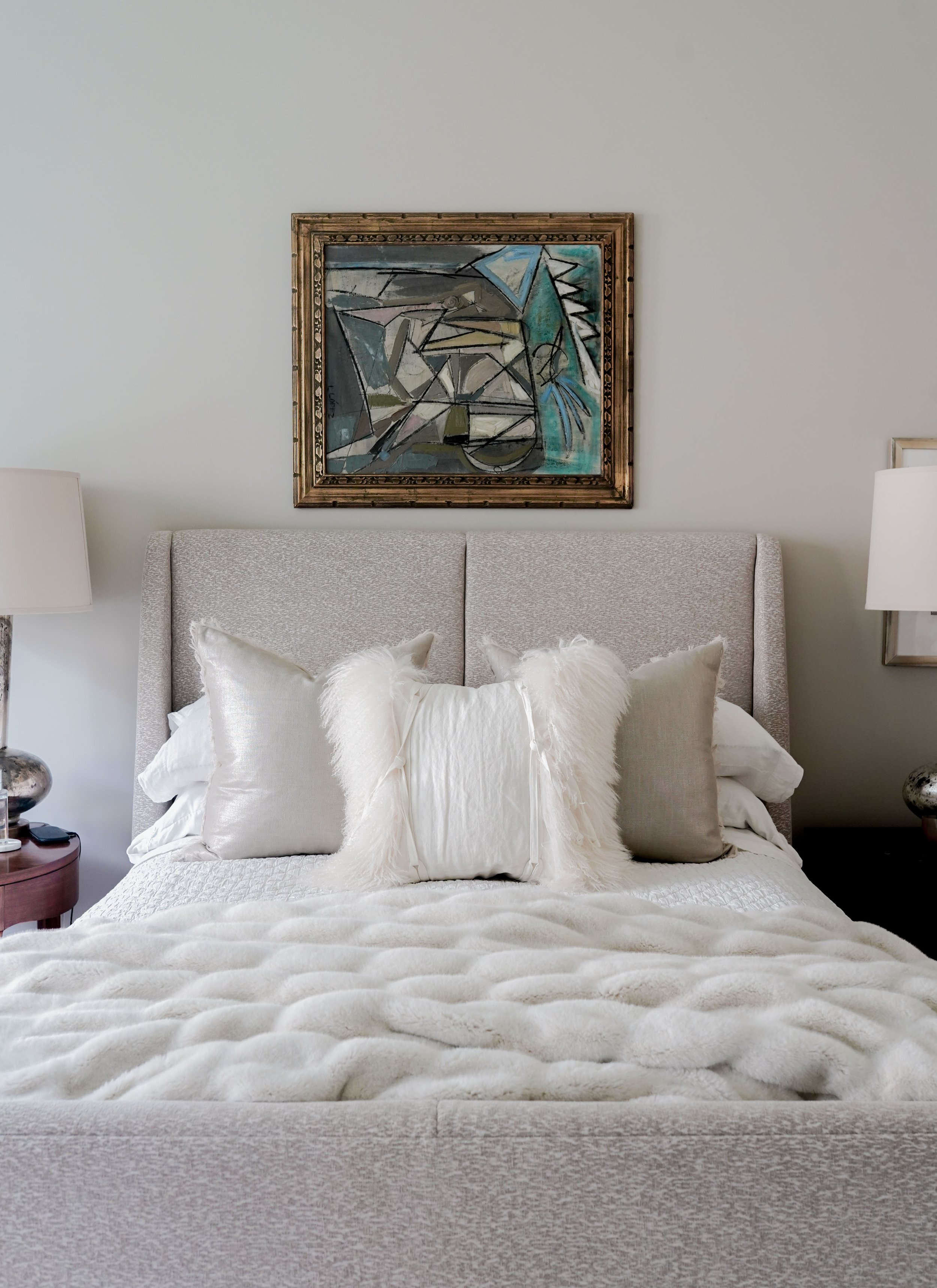
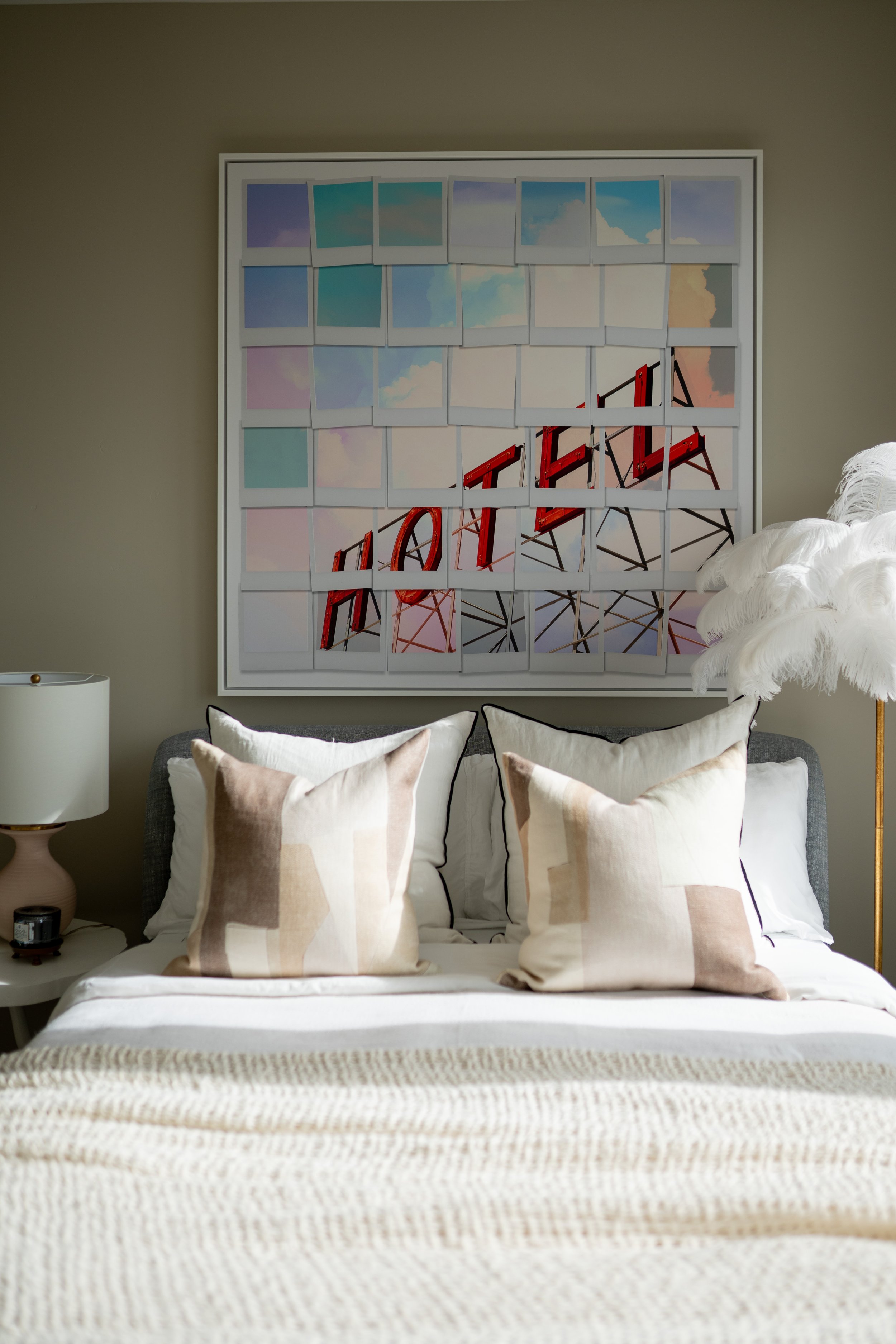
With color and drama being the focal point throughout the house, the primary suite is a more neutral reset. Perfect for relaxing and luxury, we layered rugs and went with a beautiful plum color on the walls.

Primary Suite Wall Paint - Beachcomber by Benjamin Moore

To see the full portfolio, go here.

Hidden Springs

Romantic and lush with a love for entertaining, come explore Hidden Springs Manor.

Wrapped completely in wallpaper, from wall to ceiling, his suite gives a handsome, moody feel. Complemented by dark woods, ochre accents, and comfortable seating, it is the perfect place to get away and relax.

Inspired by their four Savannah Cats, her bedroom focuses on a feminine feel. We included finish work around the ceiling for a beautiful, textural accent.

Continuing with the graceful feel, her office features a stunning mural enclosing the space, a workstation, and open shelving

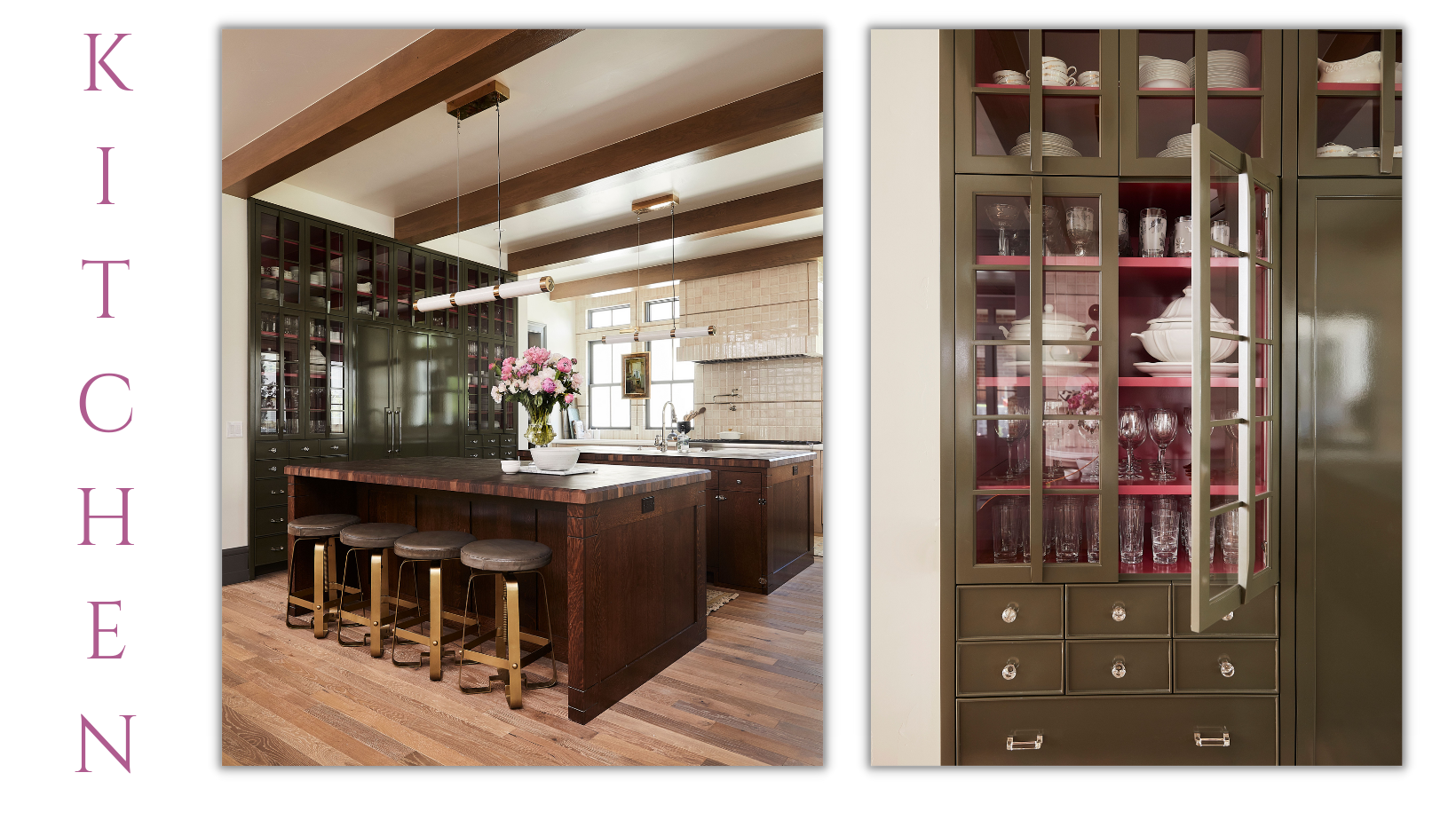
Next, a timeless white kitchen with statement backsplash tile and brass lighting for an incredible statement.

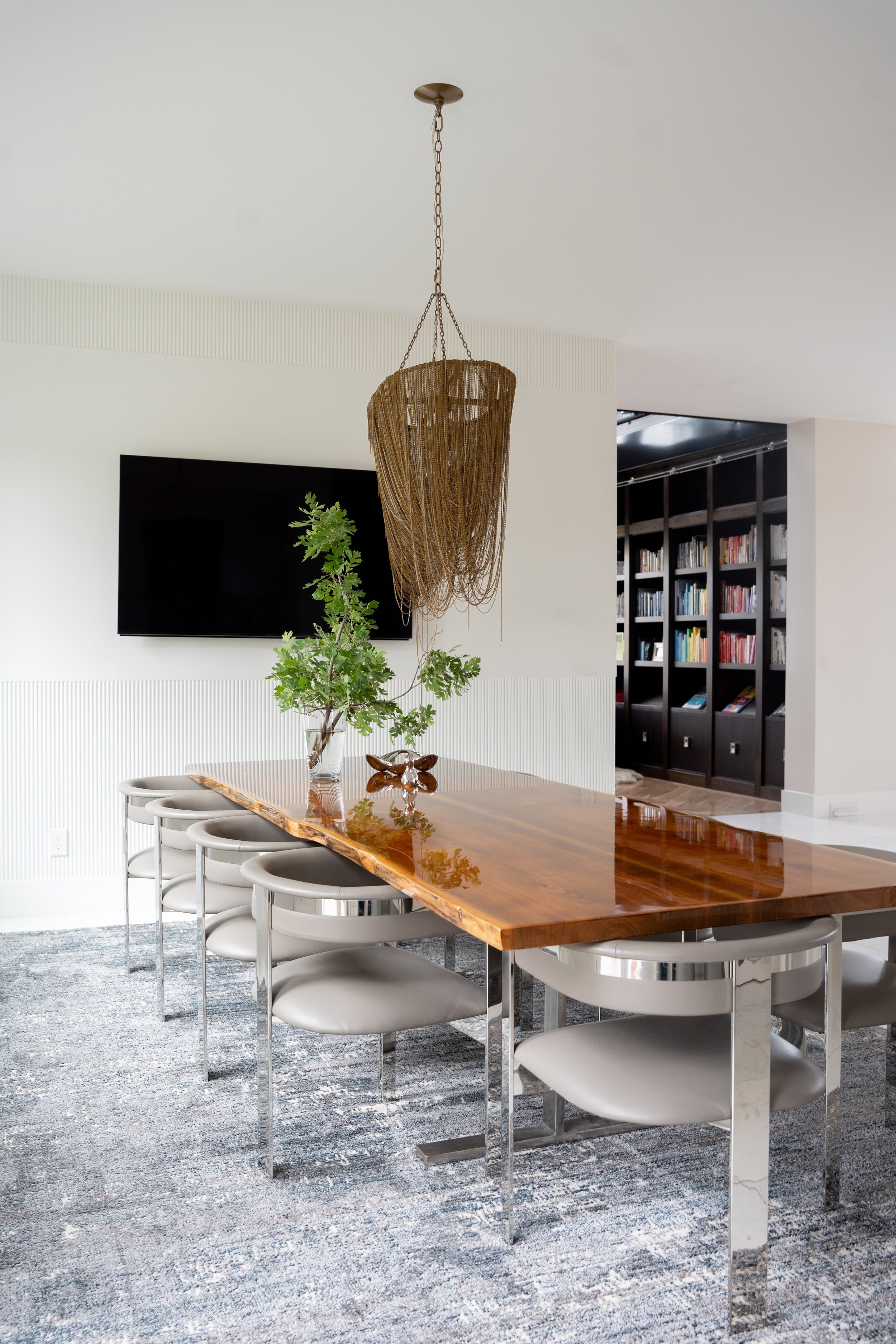
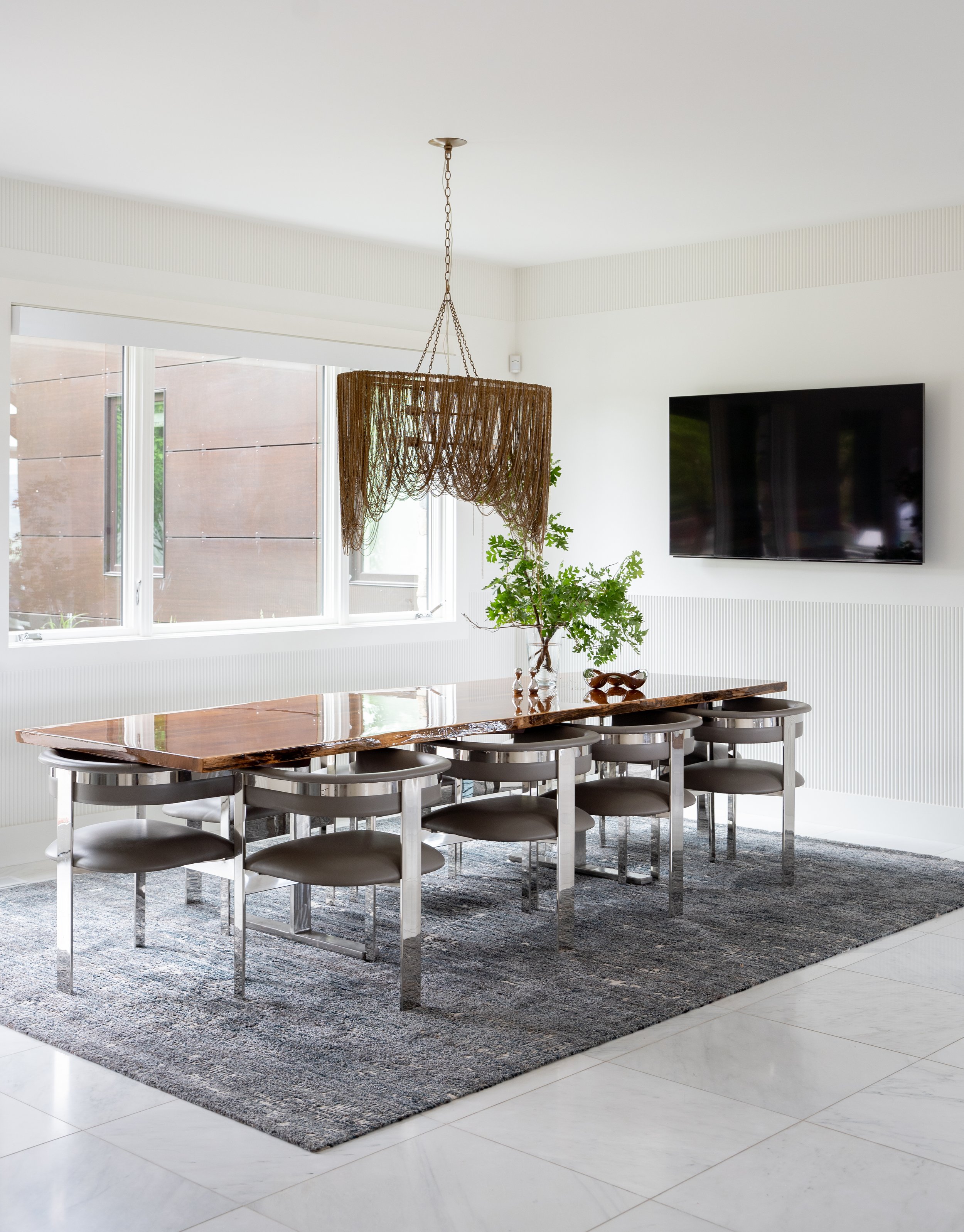
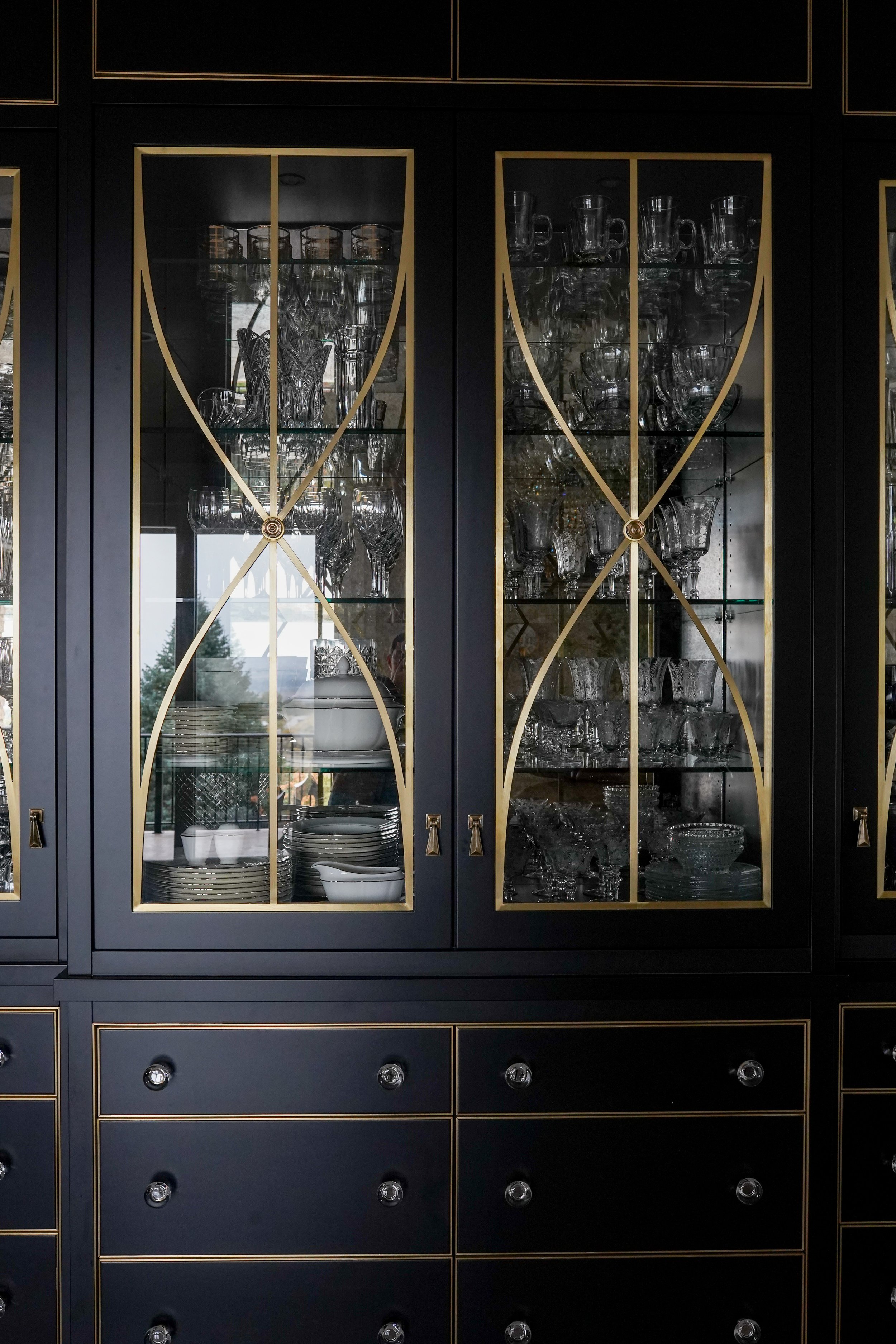
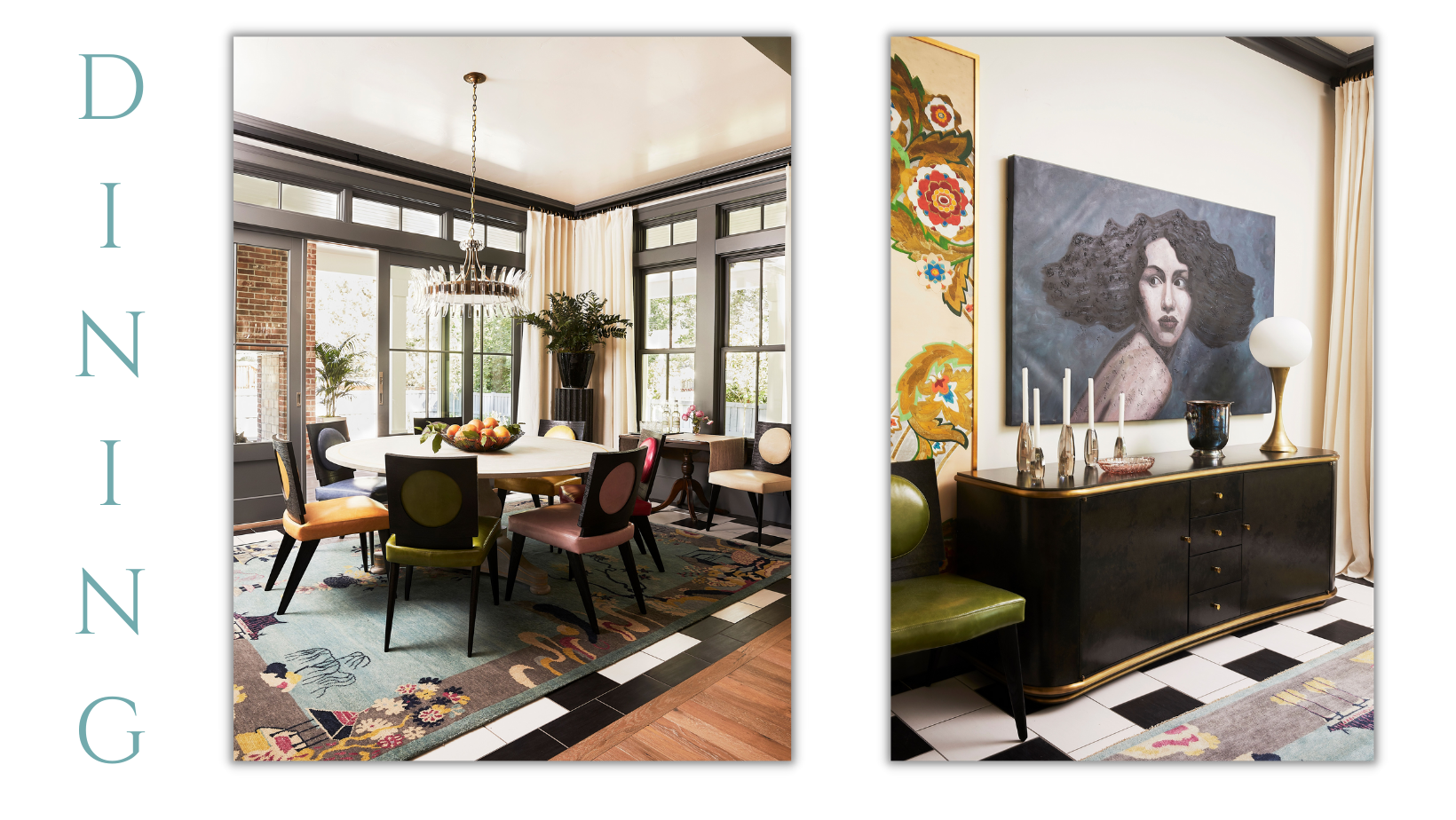
With a love for hosting, this basement dining area was created with entertaining in mind. The tabletop was saved from their previous kitchen and given new life with new chairs and an impressive Bar Cabinet. The plastered ceiling adds depth, providing further complements to the space.

Based of the original art, this formal dining area boasts Venetian plaster and a sophisticated look, easily hosting elevated dinner parties.

St. John's

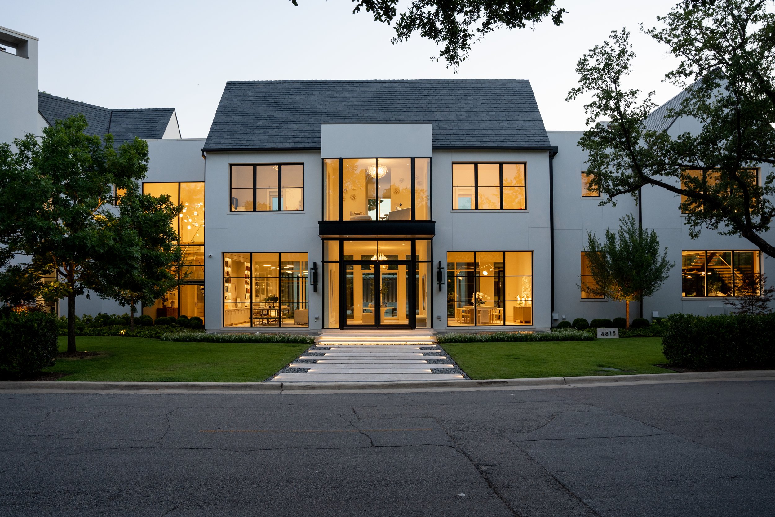
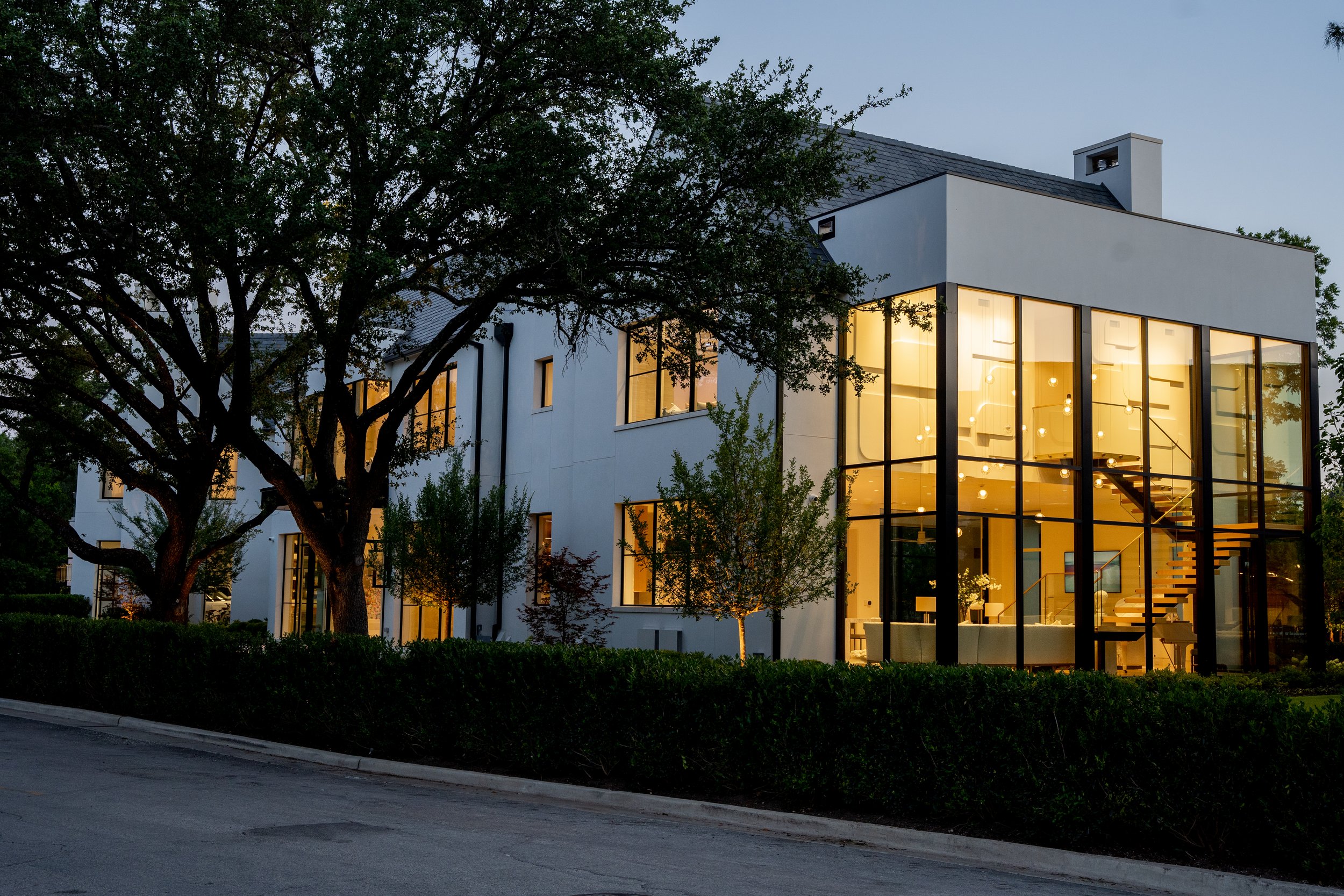
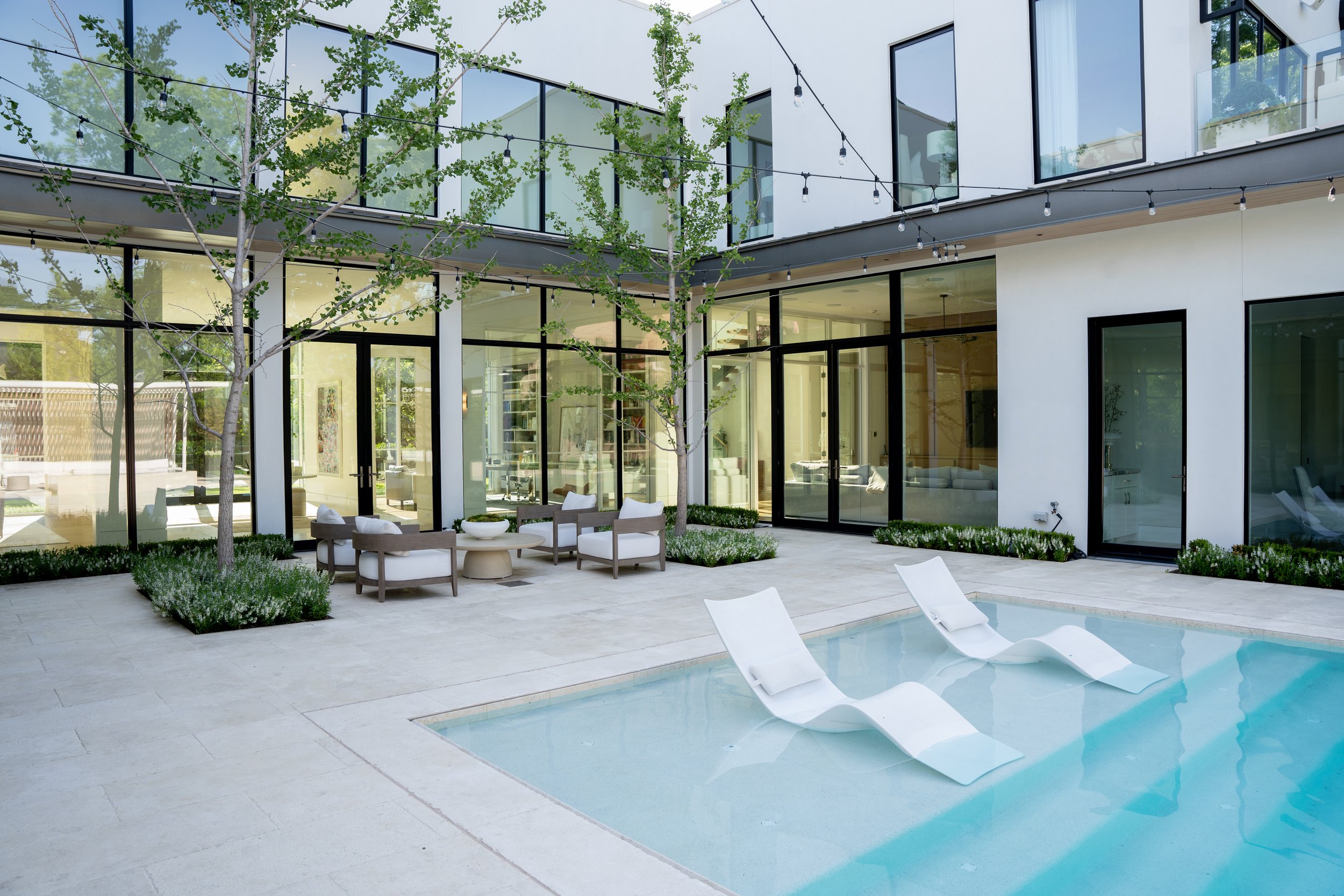
Located in Dallas, Texas, this breathtaking u-shaped home features large windows, statement architectural, and a neutral palette all curved around an outdoor pool. Inspired by calm, neutral textures and sculptures, we worked to create a place of tranquility and beauty.

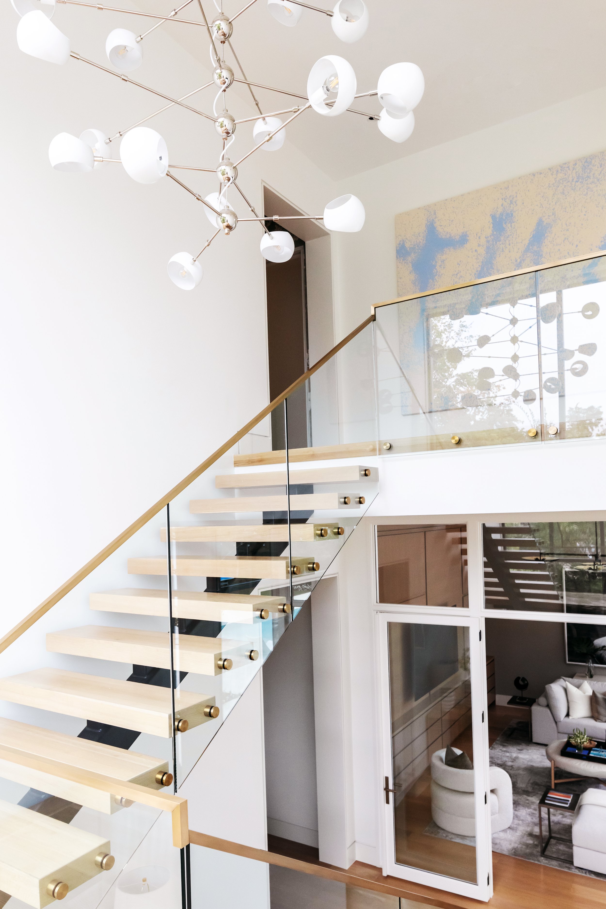
A common thread throughout the house is statement lighting. We wanted eye-catching fixtures with interesting designs to create powerful statements. Each light was thoughtfully picked, the perfect fit in every space.

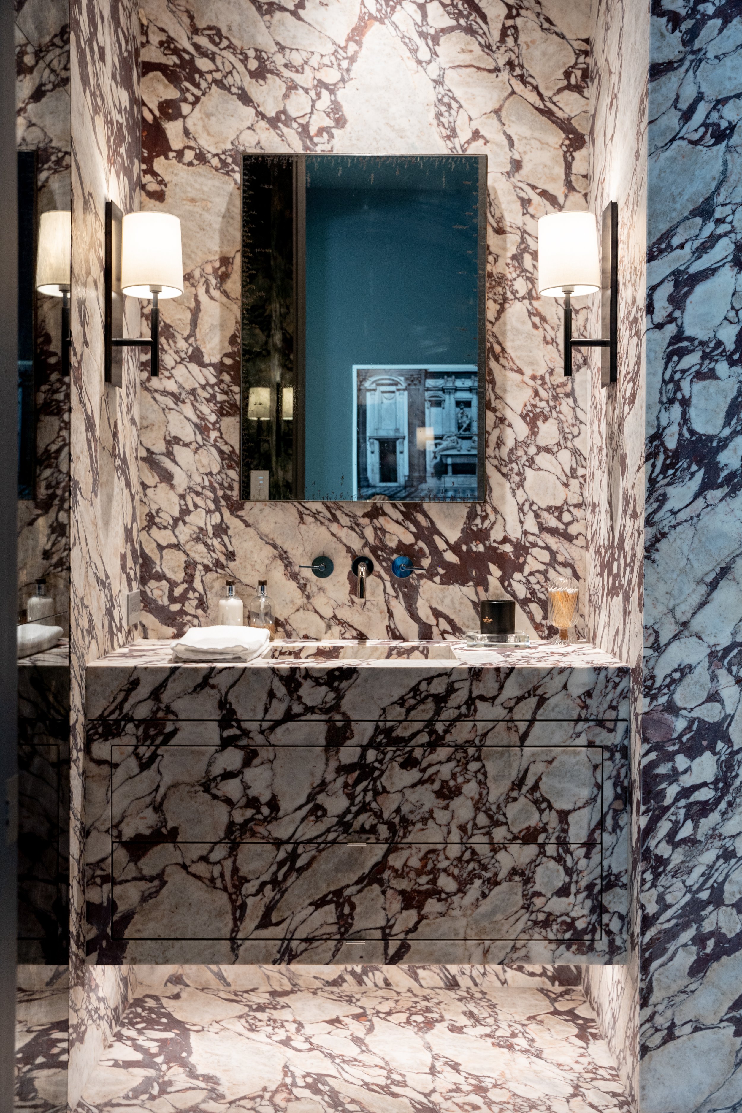
Inspired by creating a serene, peaceful refresh, beautiful marble is a luxurious feature throughout the house. The powder bath is clad entirely in marble, from the floor to walls to storage drawers. The master bath features an all-tile shower and floating cabinetry with marble continuing from the floor up.

In the Primary Suite, we wrapped the wall behind the bed in fine Italian leather, creating that subtle texture. Sculptural chairs in natural beiges and whites further add dimension, becoming a hero in the room.

One of our favorite features is in the office. We added see-through screens over the shelving for an interesting, almost softening addition. The panels roll, easily transitioning to covering the artwork as well.

To see the full portfolio, go here

Rachel Parcell's Basement

After many years in the making, we are thrilled to announce Rachel Parcell’s new basement! Drawing from modern inspirations while tying in traditional accents, Rachel wanted an all-new look. Come explore her beautiful, new spaces.

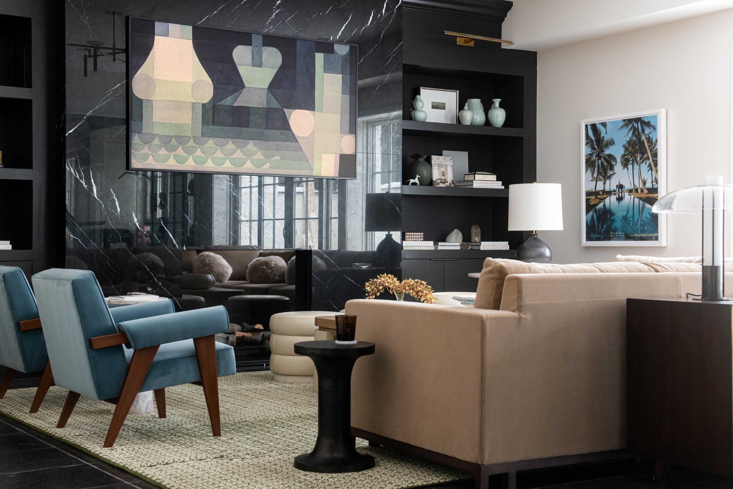
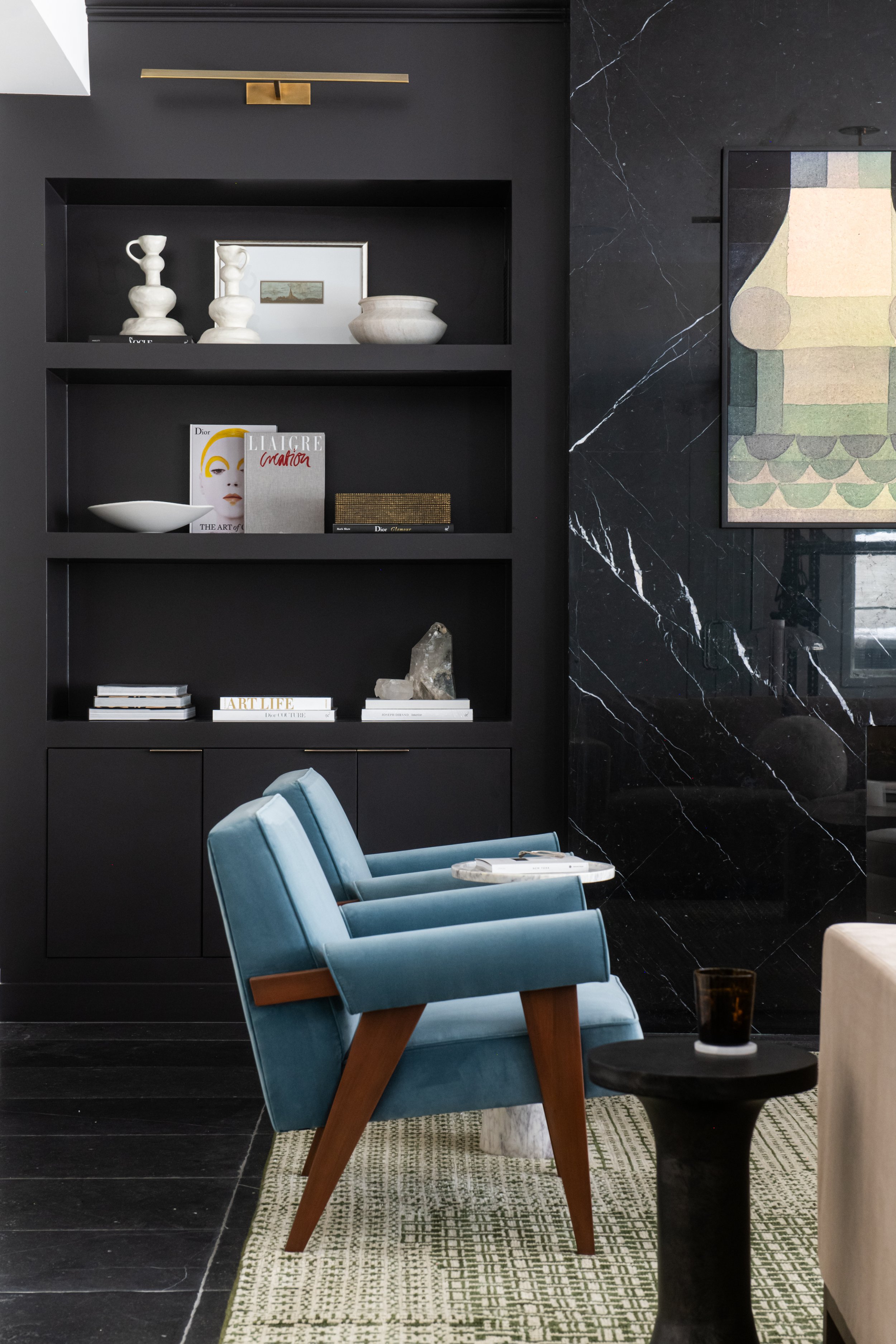
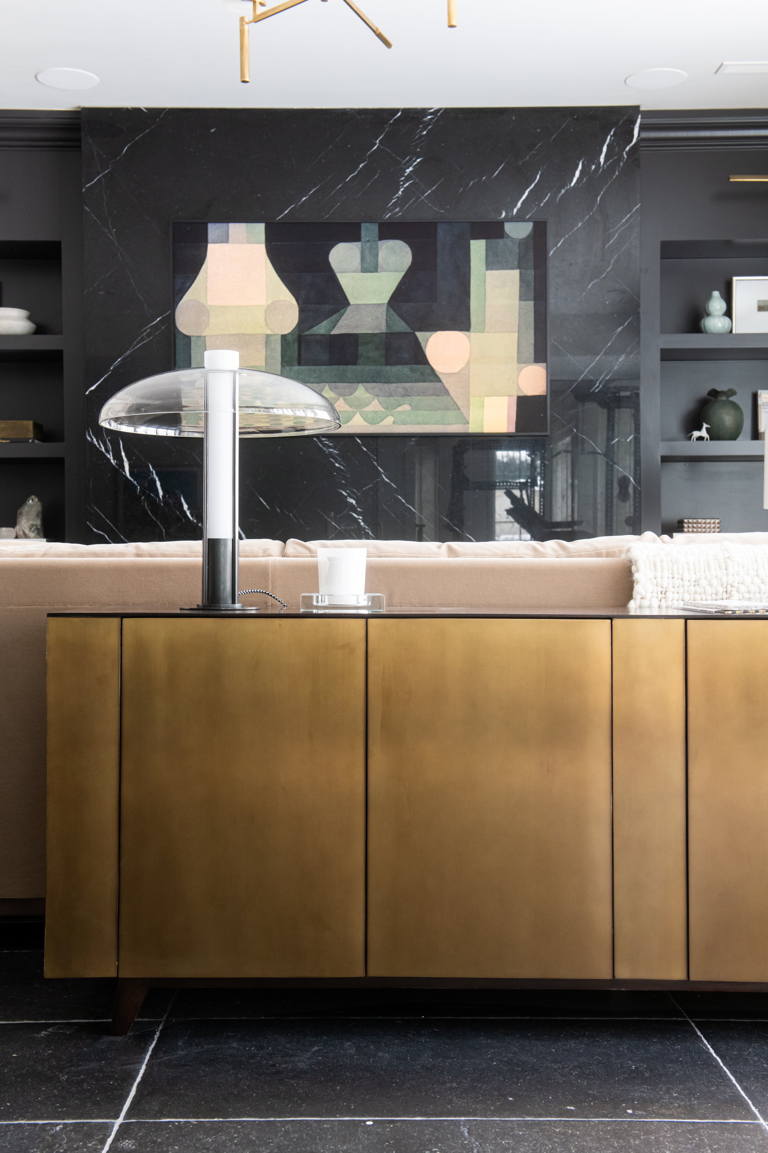
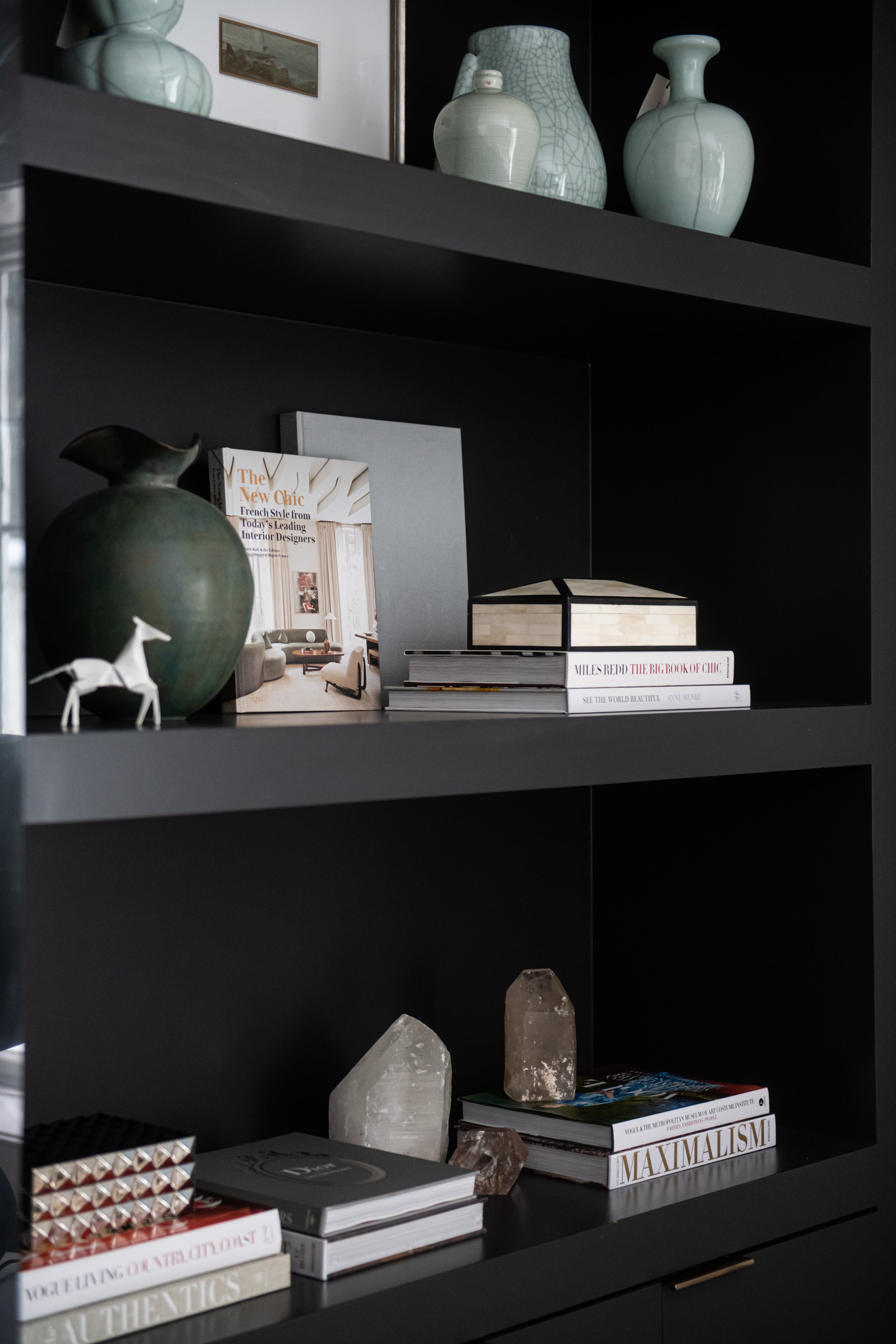
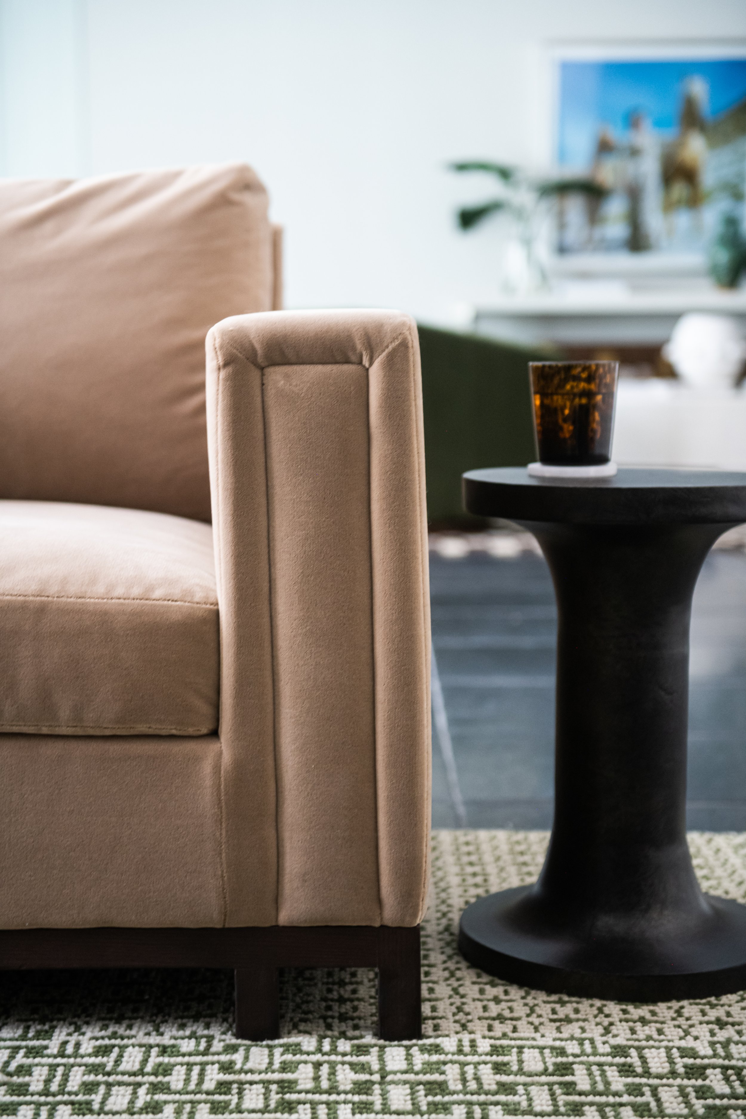
A stunning style piece, the all-black marble fireplace gives a modern, fresh look. Its natural veining adds visual texture, complemented by surrounding black built-in shelves. The room’s moody look paired well with our brand new Jude Lounge Chairs, Theo Sofa, and Ziggy Sideboard. Chic, minimal accents like the Vera Spot Table, Brass Horse, and Platinum Studded box complete the look.

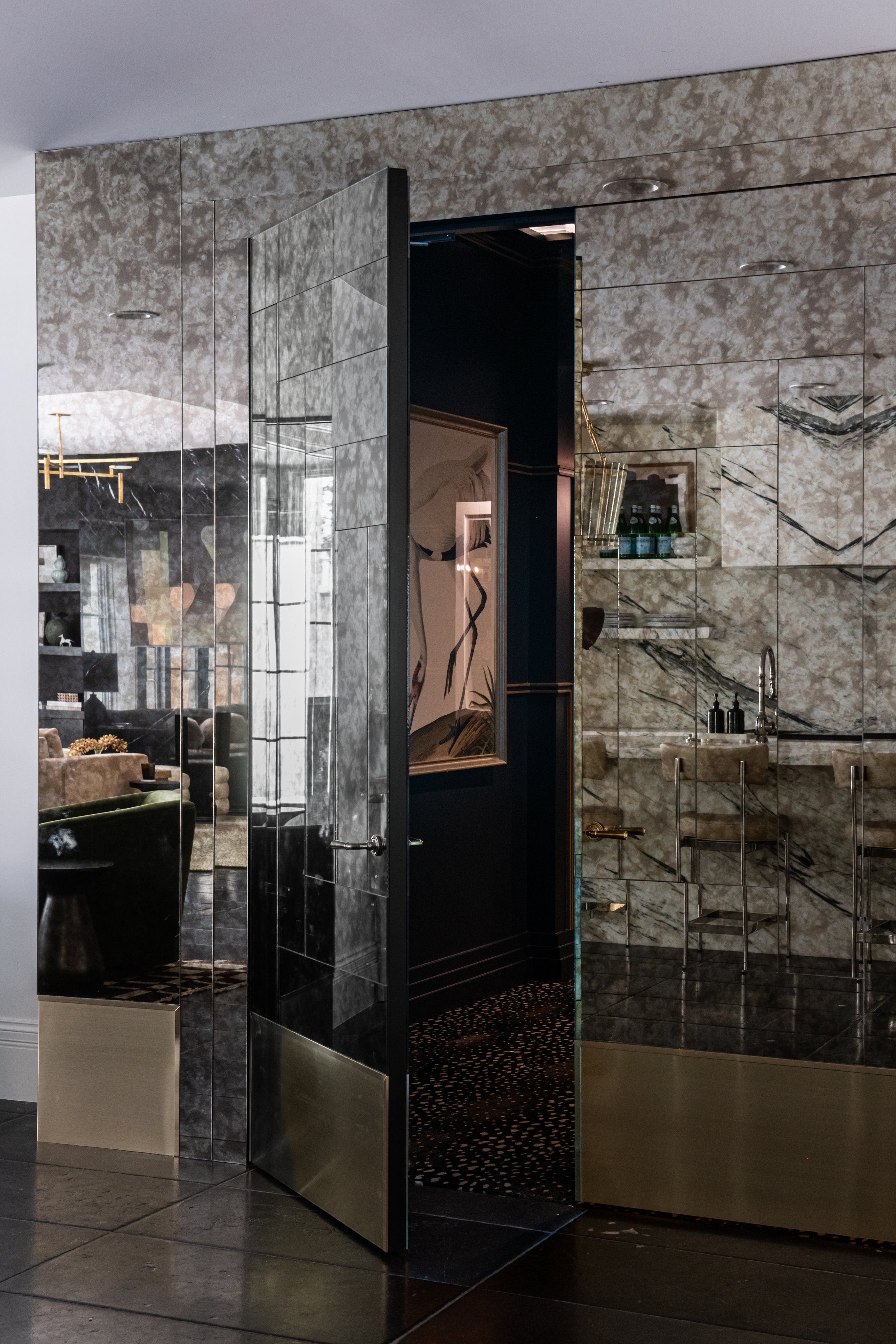
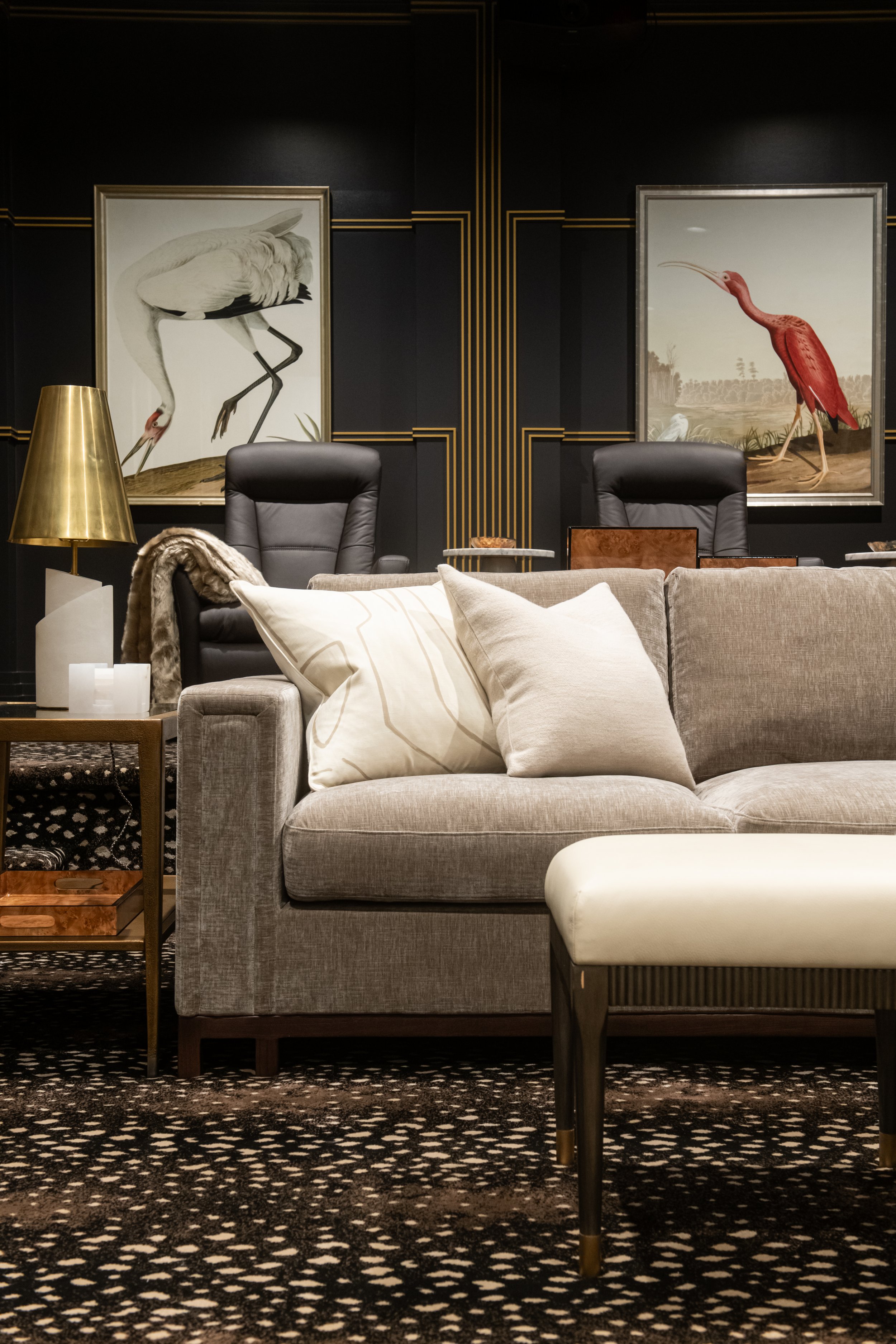
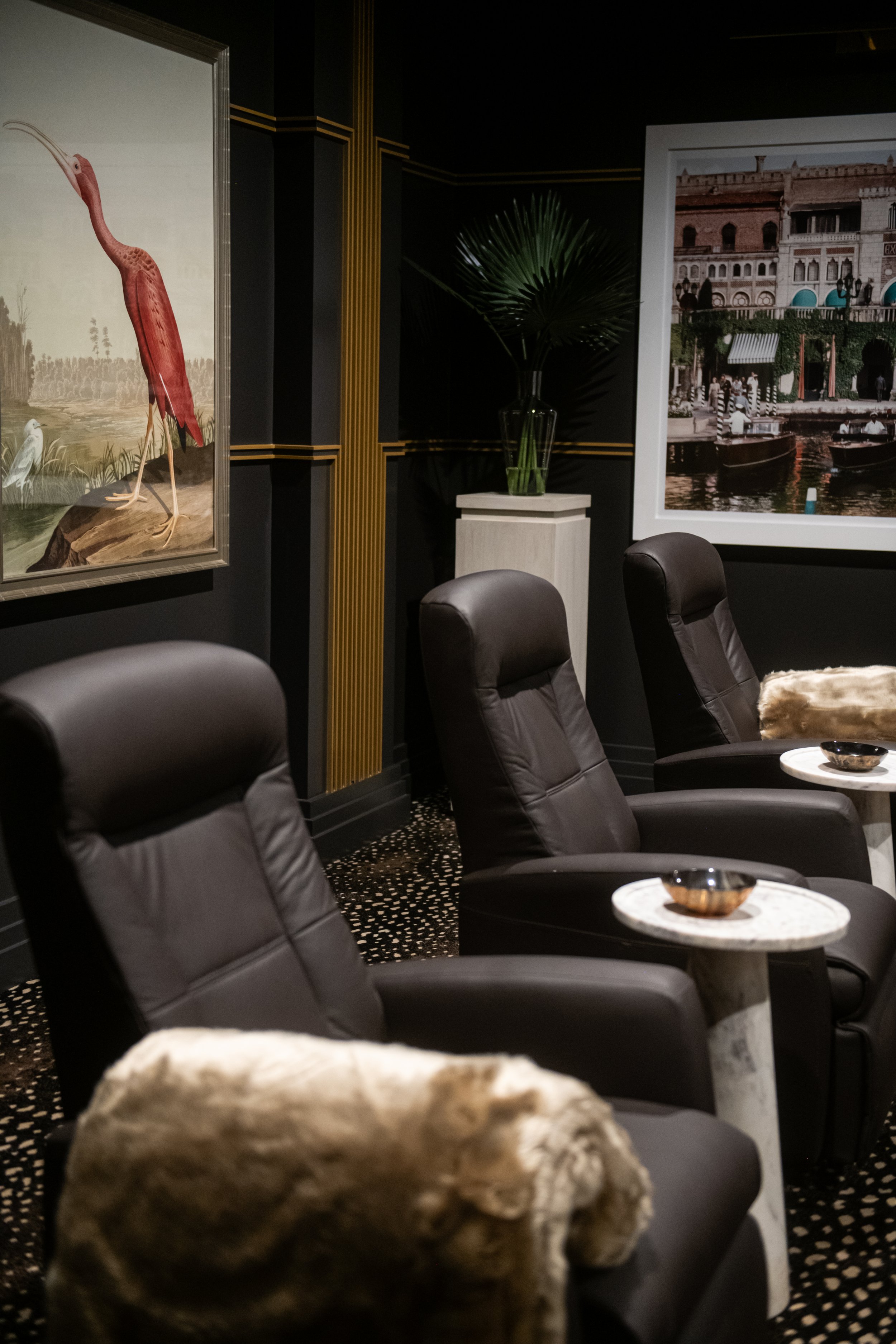
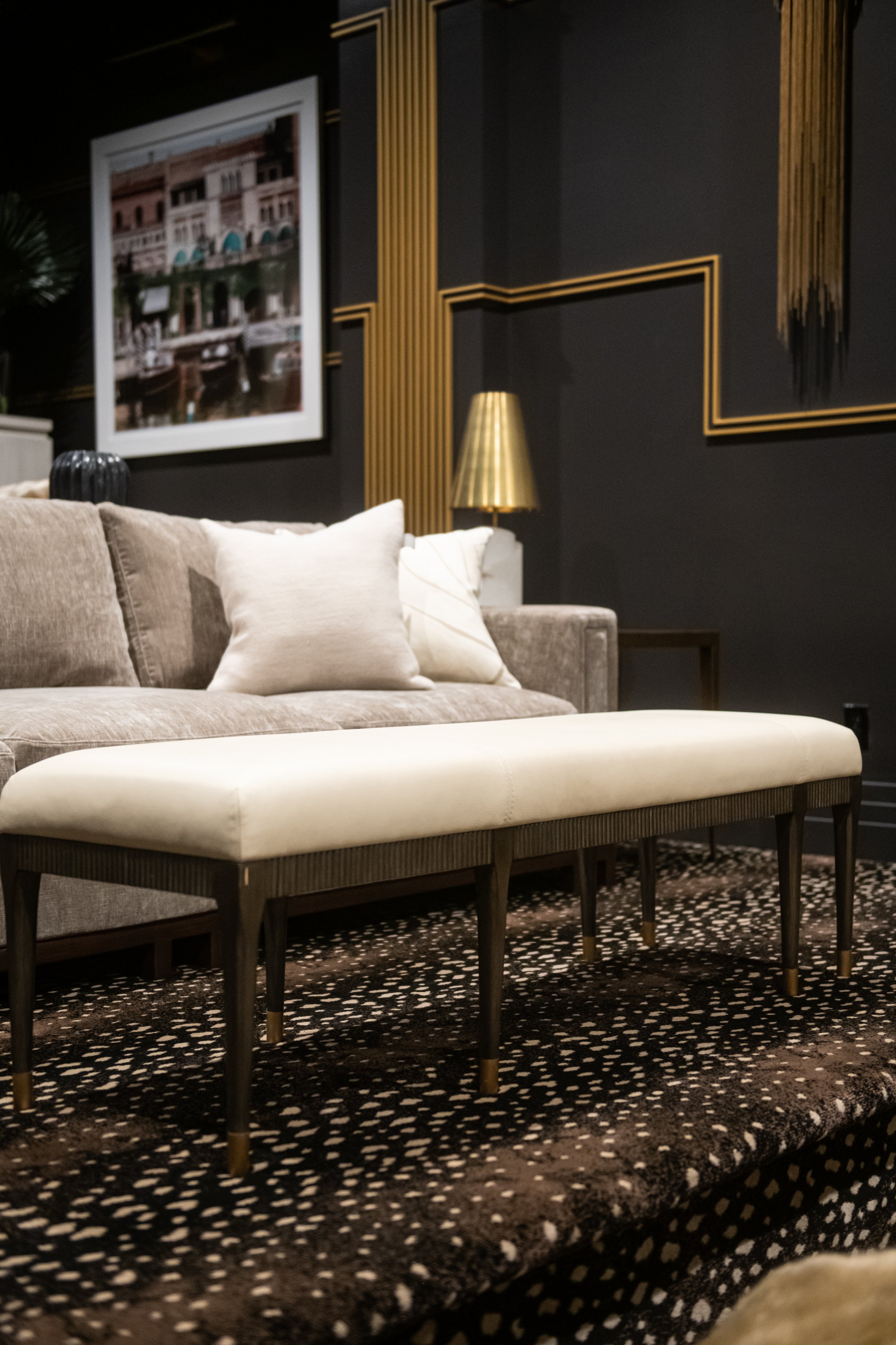
To access the theater room, the entry doors are completely covered in an antiqued mirror. It is a stunning statement. Inspired by Art Deco designs, the theater features plush seating, antelope carpet, dark colors, colorful art, and glamorous lighting.

Carrying on the beautiful marble, the kitchen features marble running up the wall and onto the hood. It creates a natural butterfly look, with stunning symmetry. The counter tops are gently curved with rounded counter stools for a modern touch.

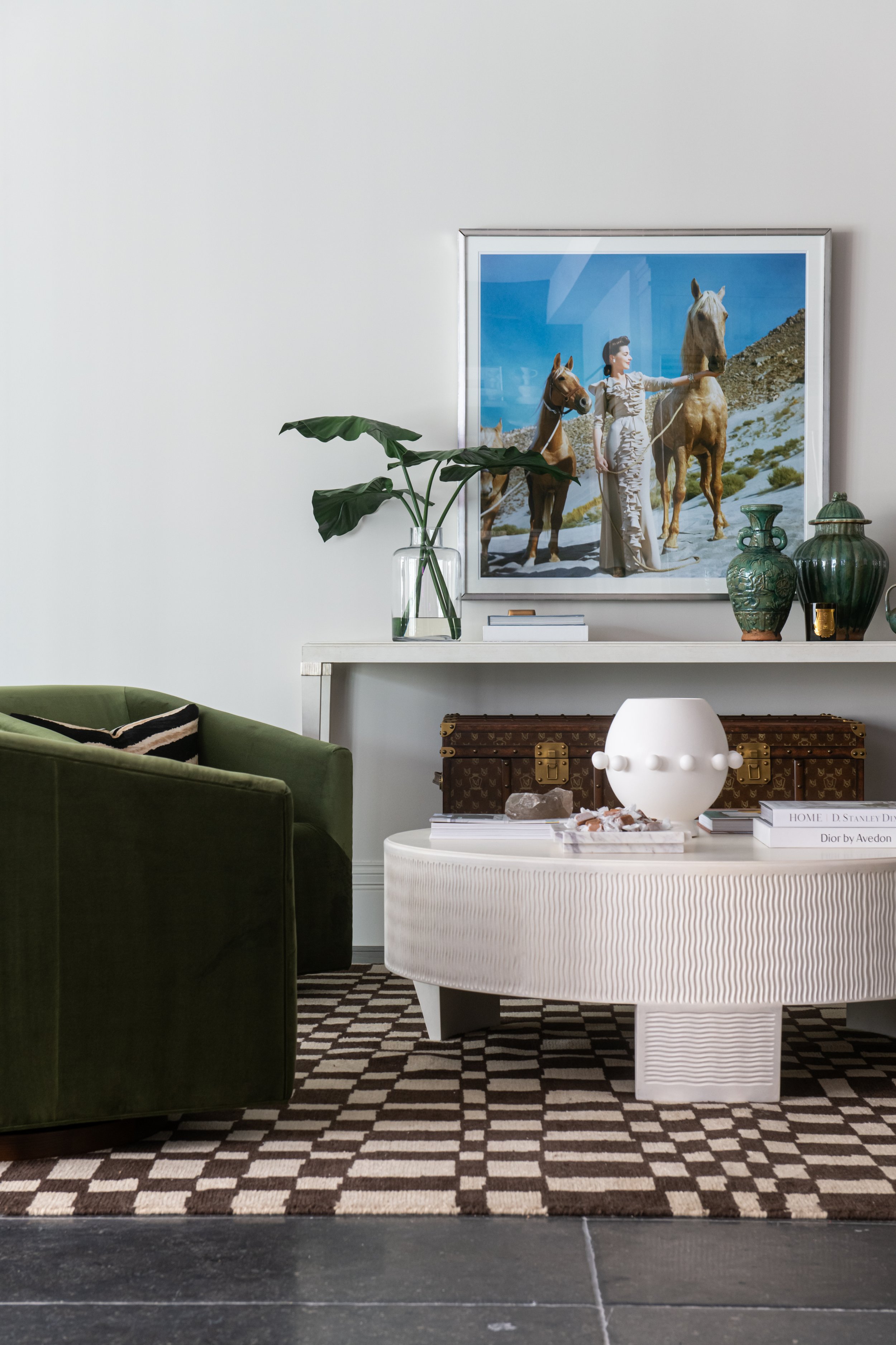
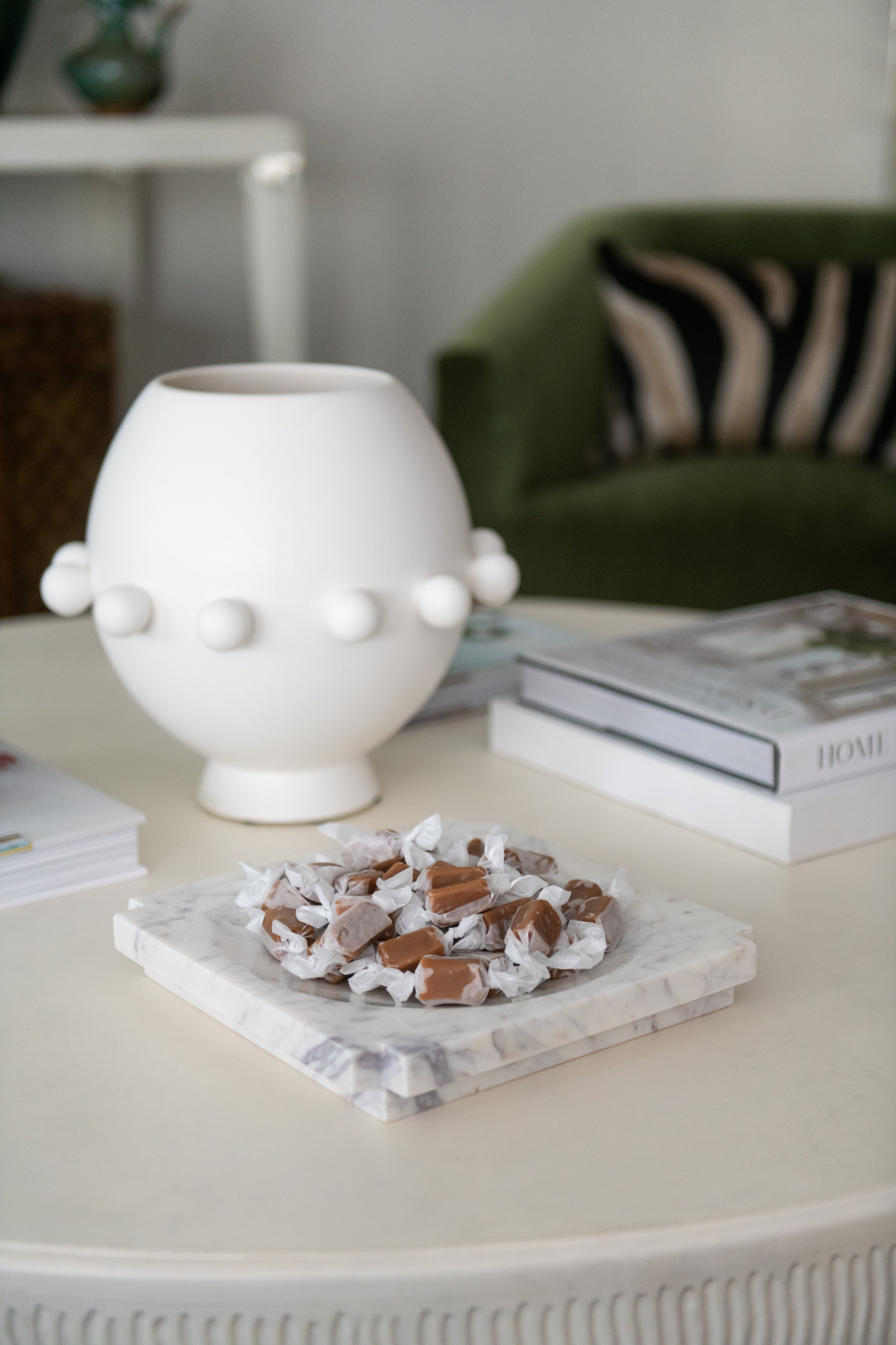
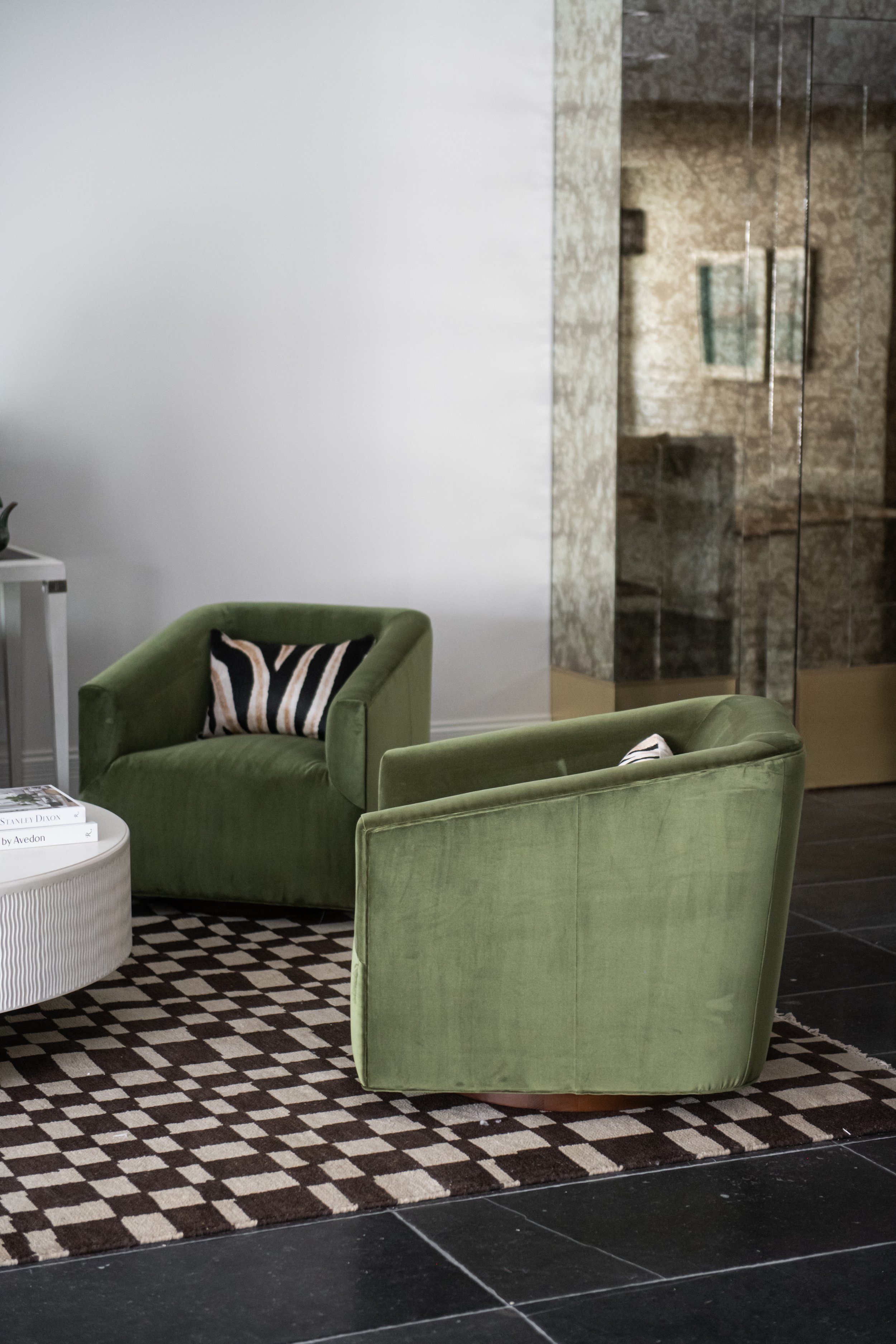
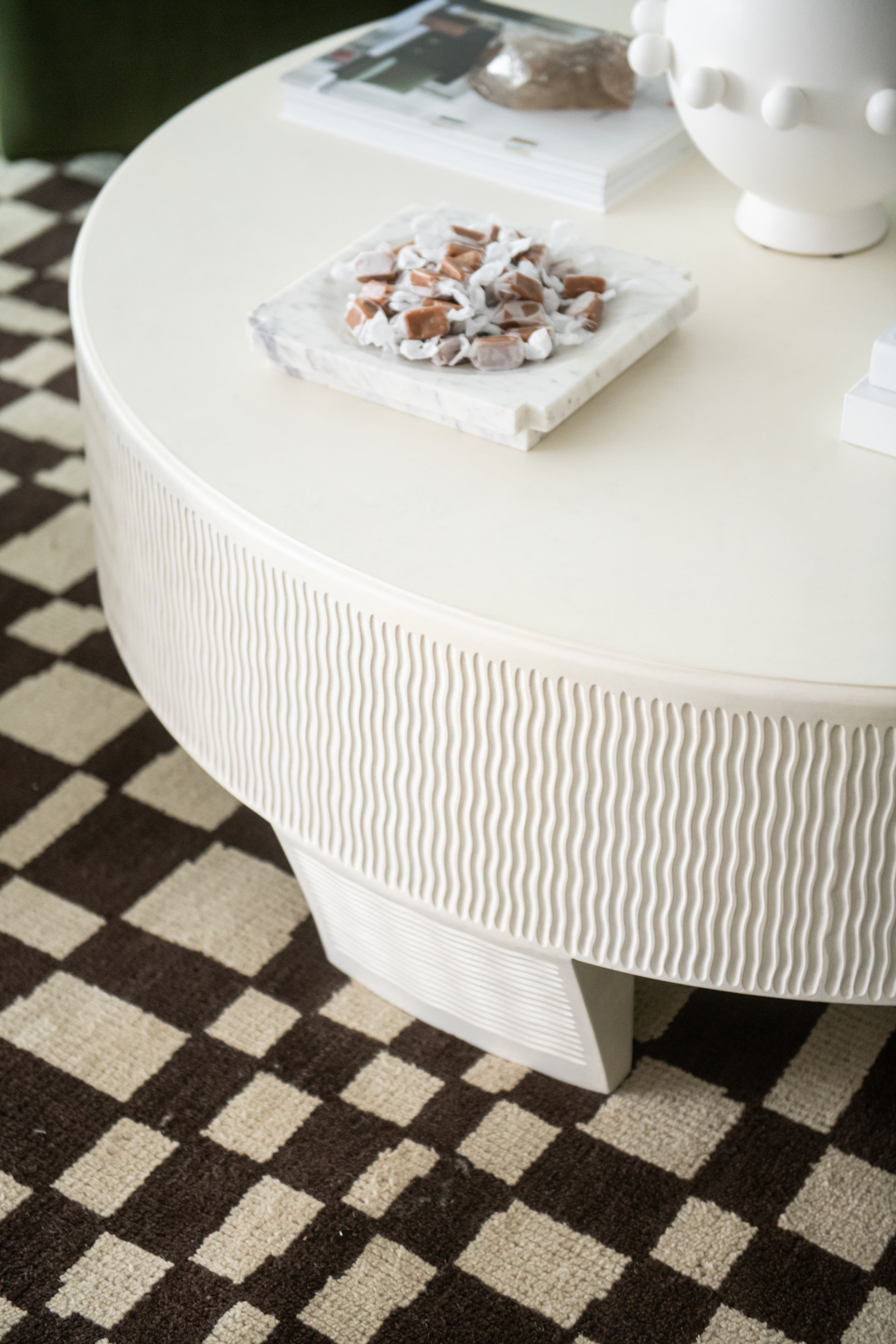
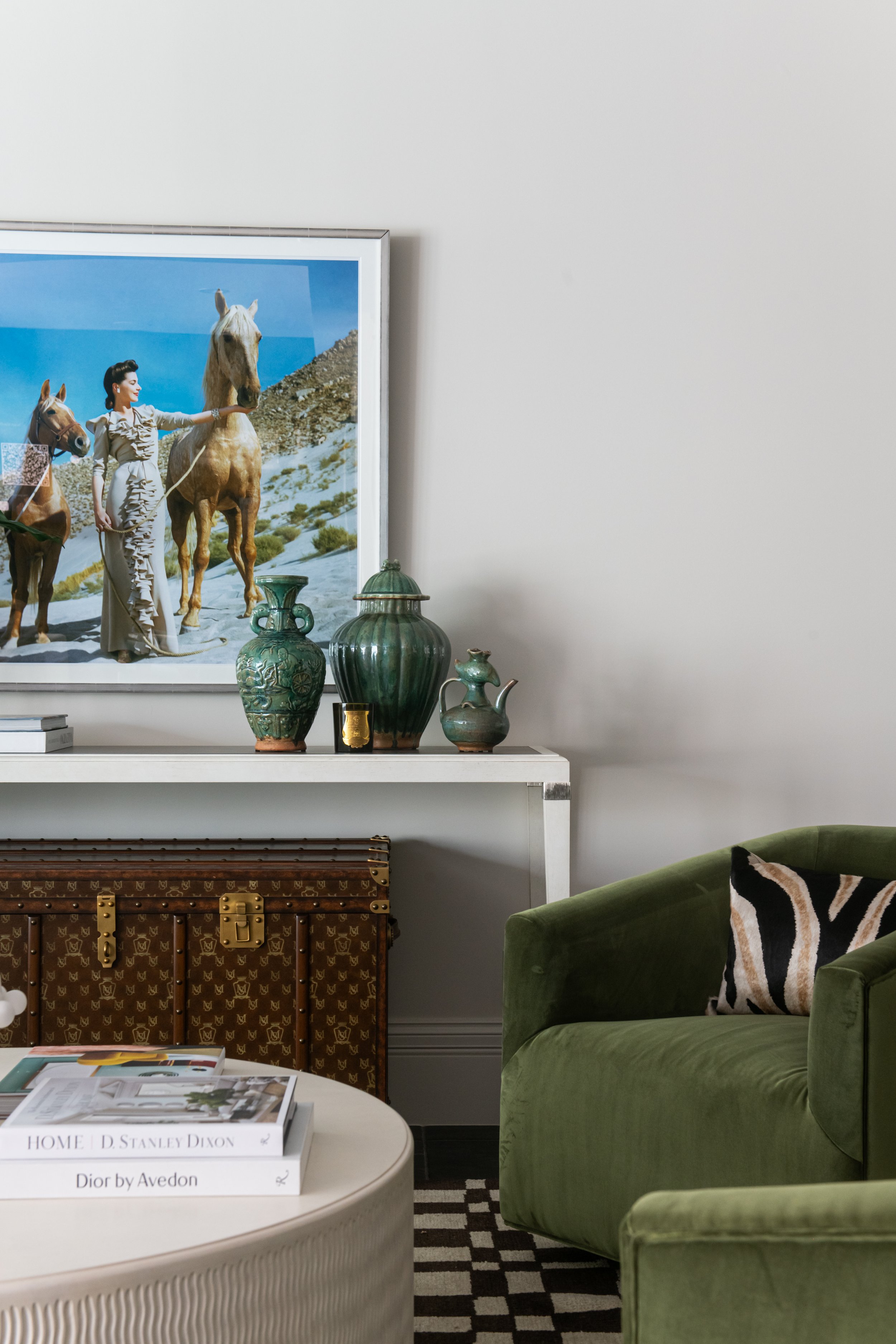
One of our favorite spaces showcases our new Harvey Swivel Chairs in a rich velvet Moss. Their chic green color perfectly complements the space, accentuated by vibrant art, antiqued vases, an asymmetric Chess Rug and our textured Lucca Cocktail Table. Inviting and luxurious, this is the perfect place for conversations and gathering.

Browse the full portfolio, go here. To shop her collection, go here.

Barbie Dreamhouse

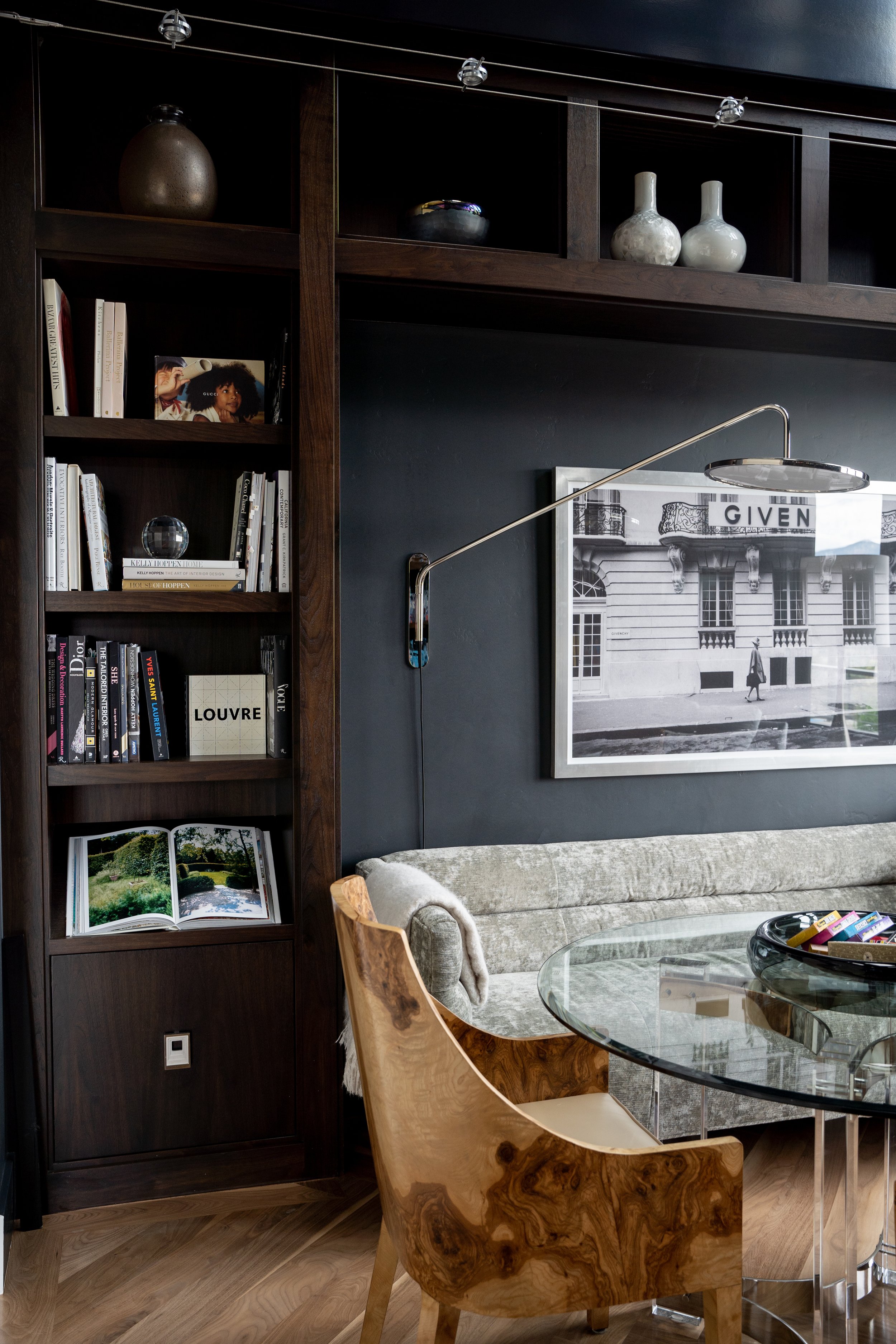
The Barbie Dreamhouse is located in a private, remote part of the desert in Utah. A total remodel taken down to the studs, designed to blend his and her styles, it was an exciting project to take on. The home features lots of glass and open spaces to showcase the sweeping desert views, giving the feeling you could reach in and play - just like a Barbie Dreamhouse.

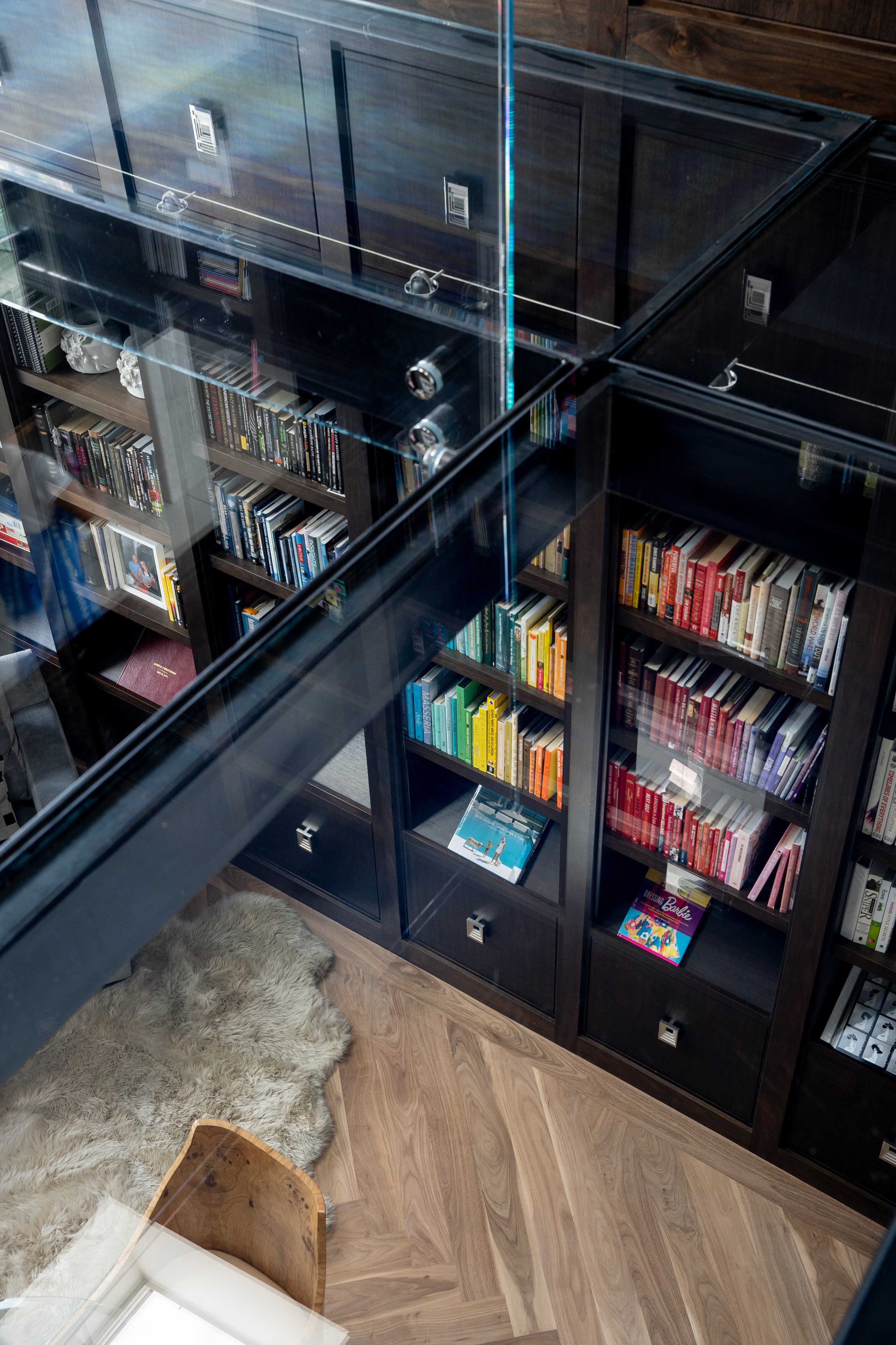
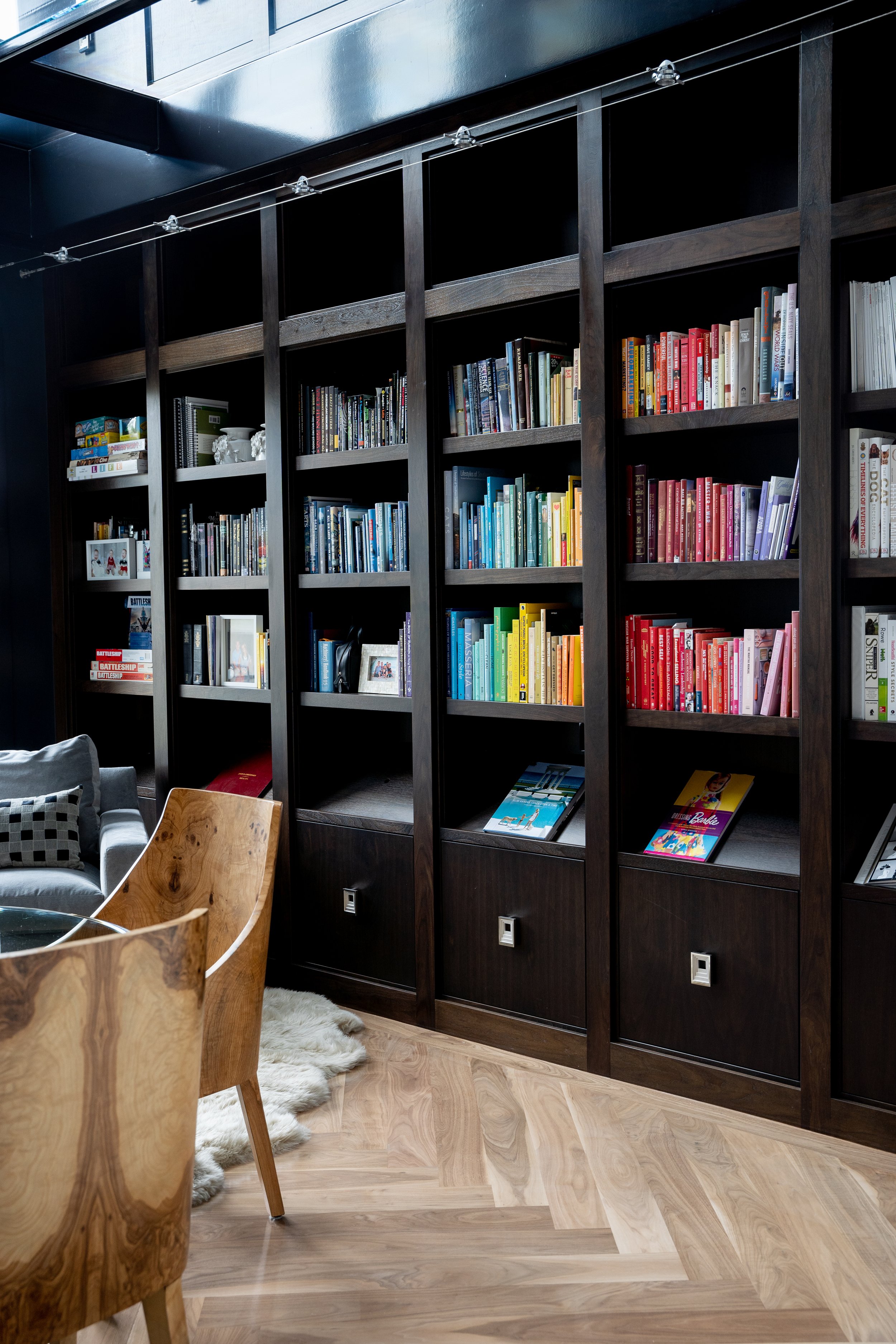
The Library. A beautiful, two-story library is a major showstopper. Featuring a solid glass floor, its see-through design is editorial. The result is an incredible way to display prized vintage collections.

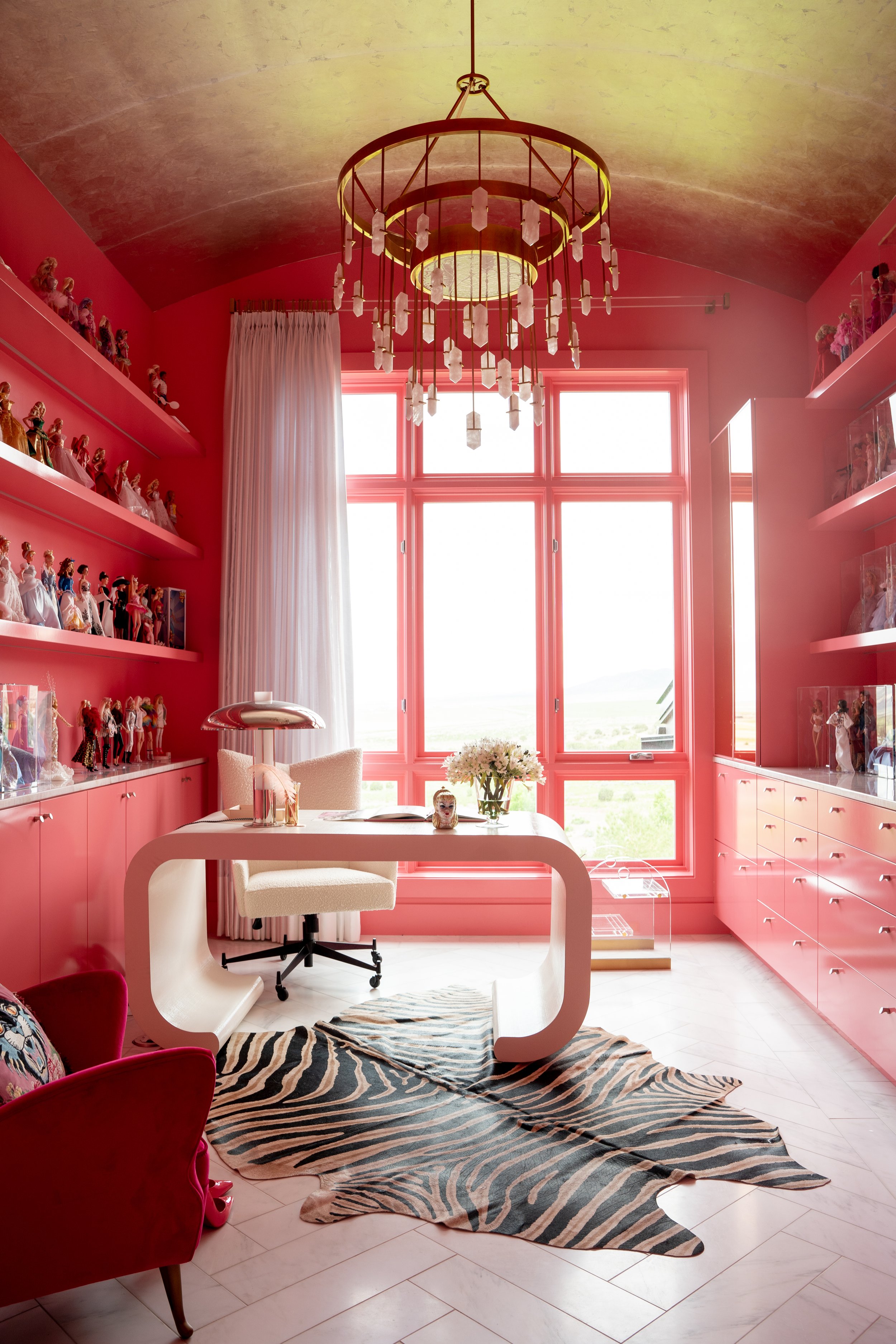
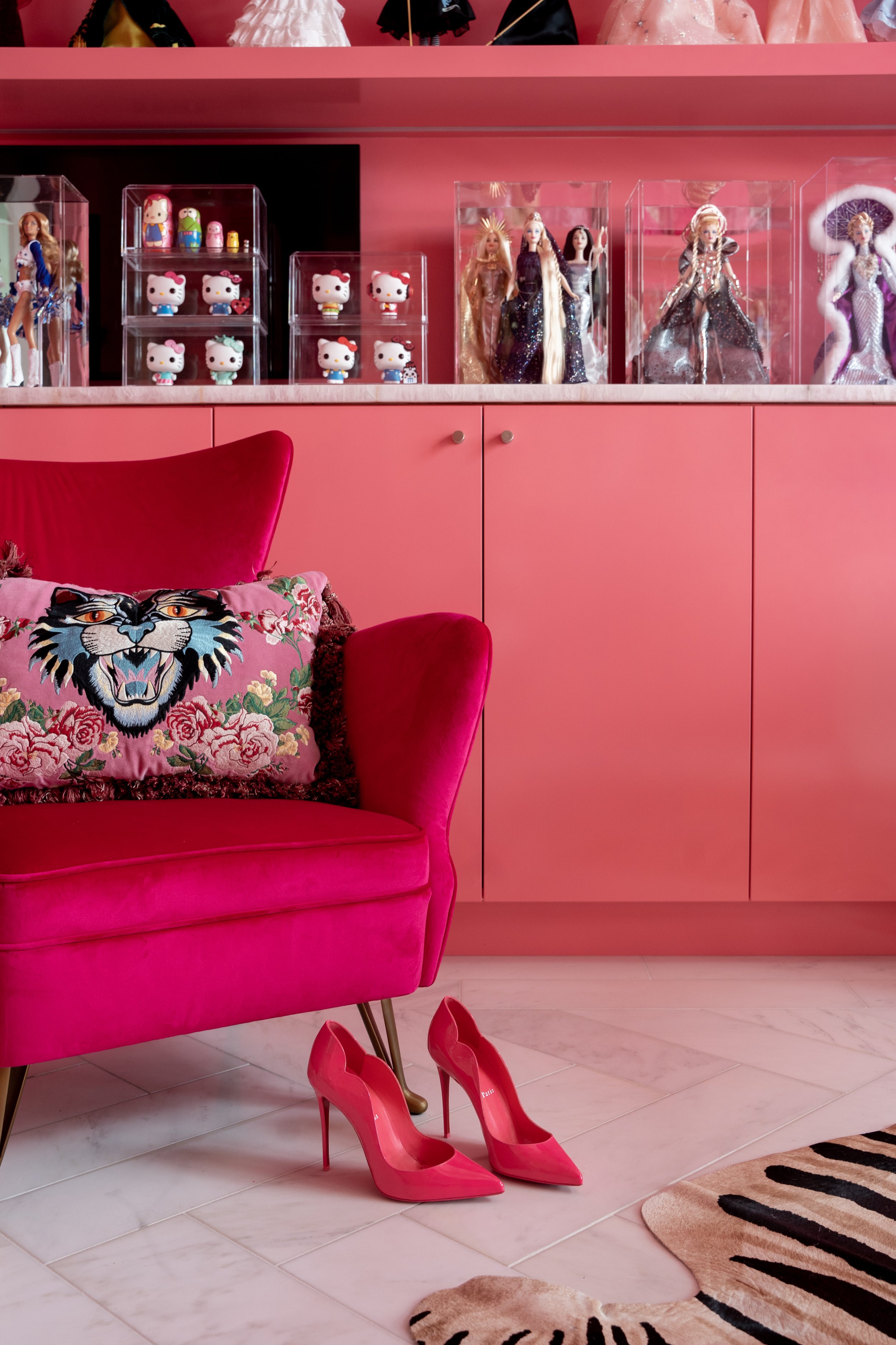
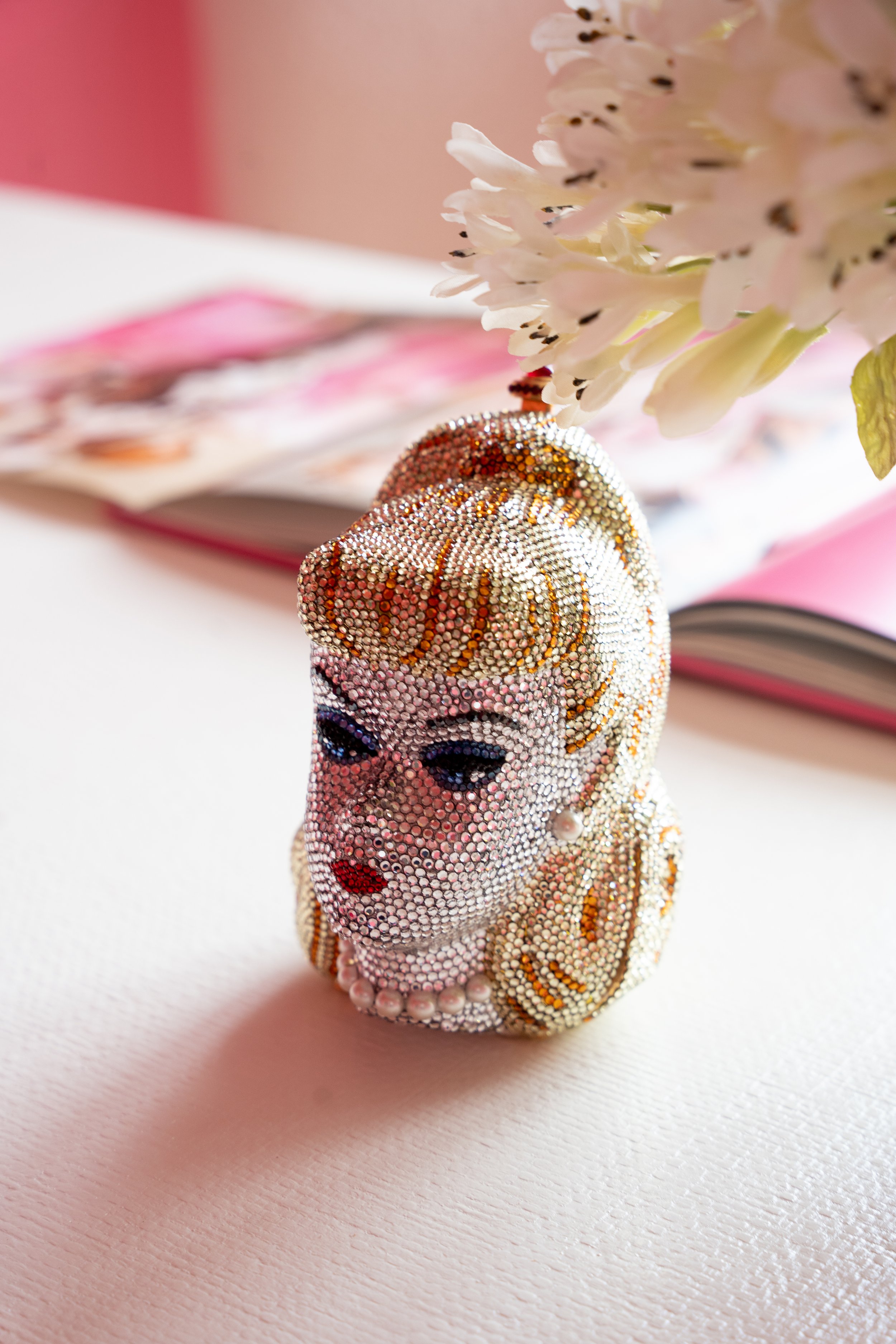
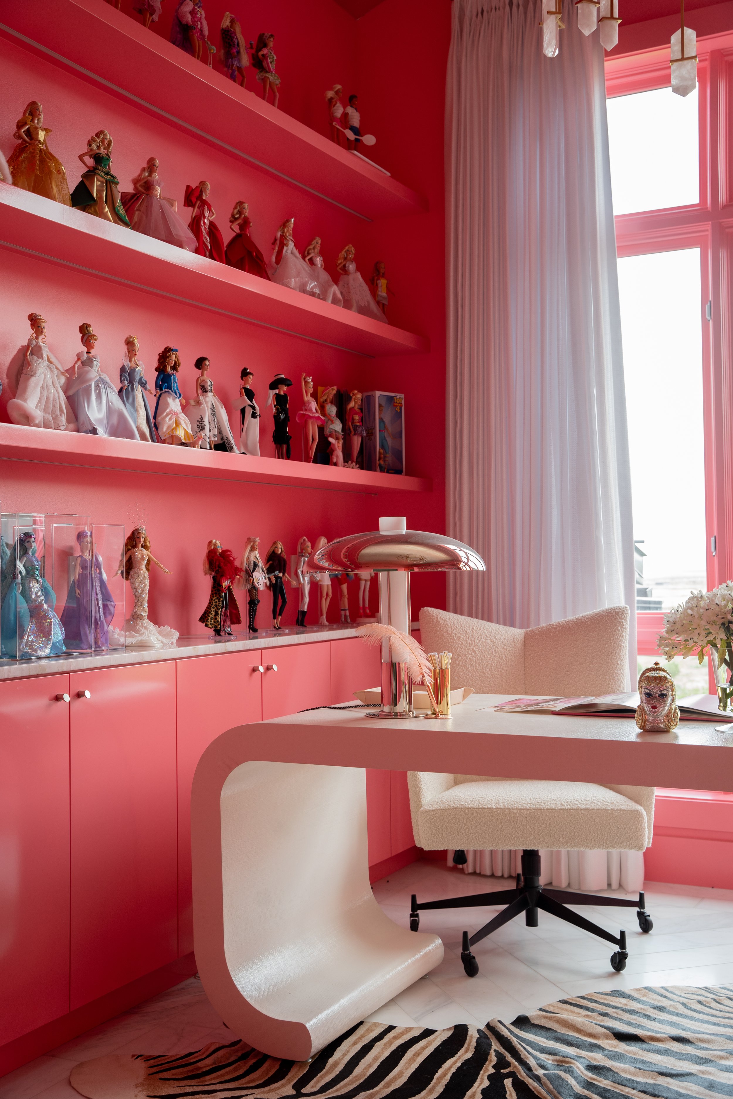
Her Office. Inspired by Louboutin Shoes, we matched the office to its well-known red bottom sole. We added a gold leaf ceiling, customized shelving with pink quartz countertops to showcase her timeless Barbie Collection, and built-in mirrors.

His Office. Dark and moody, this space is designed to feel like a Tom Ford office. It boasts a generous fireplace with tile that runs out to the floor, a textured mirror, reeded panels, and nickel and chrome detailing.

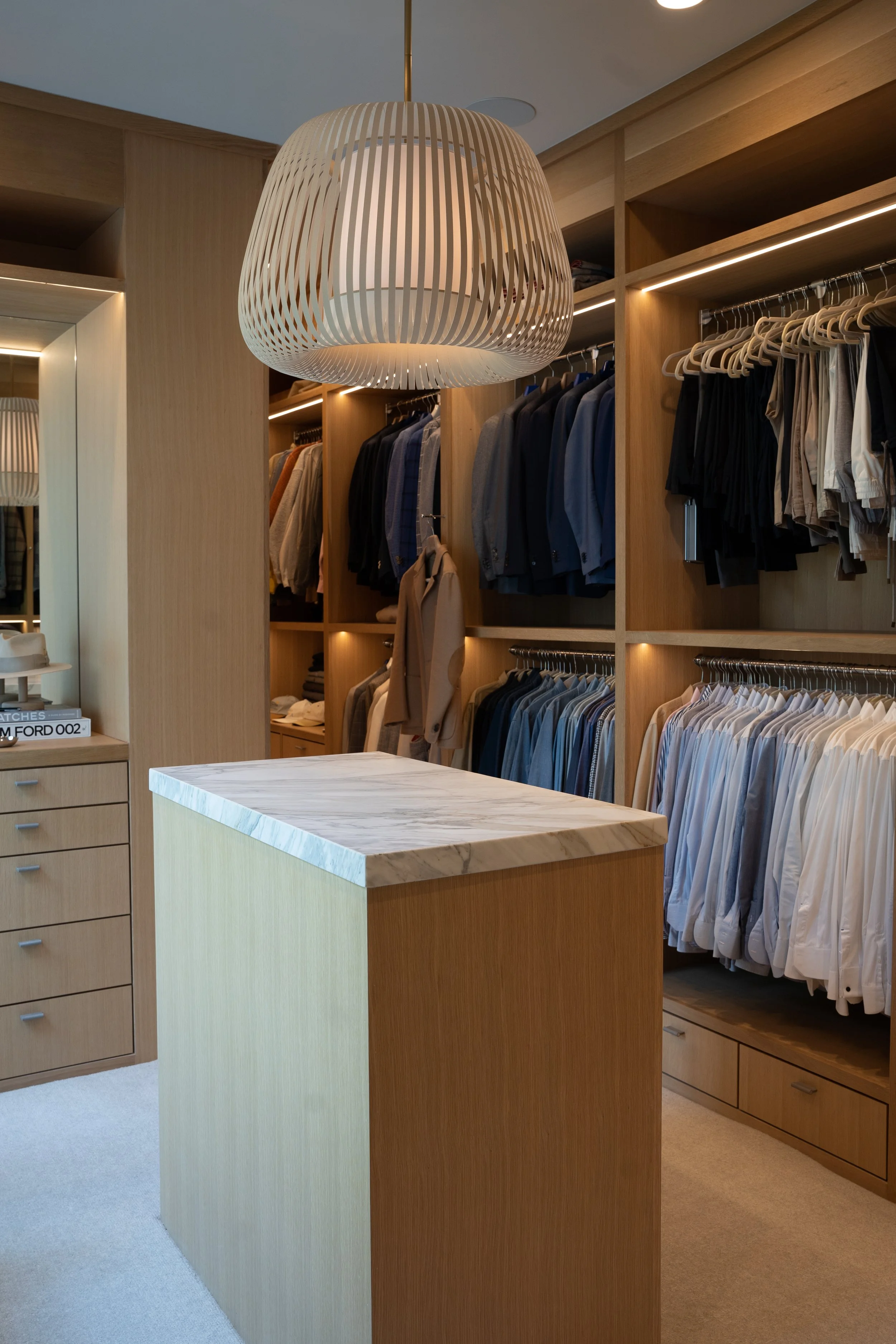
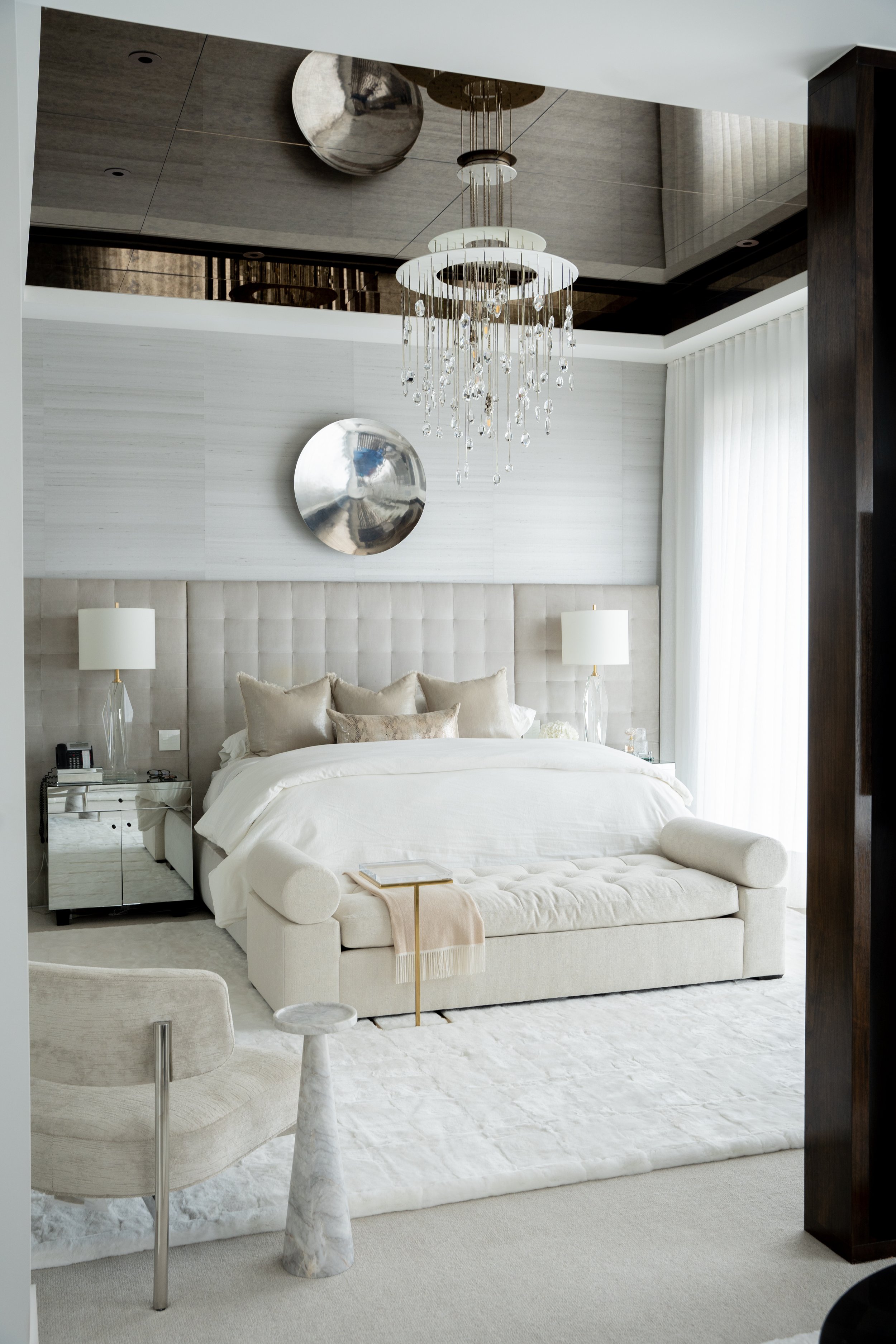
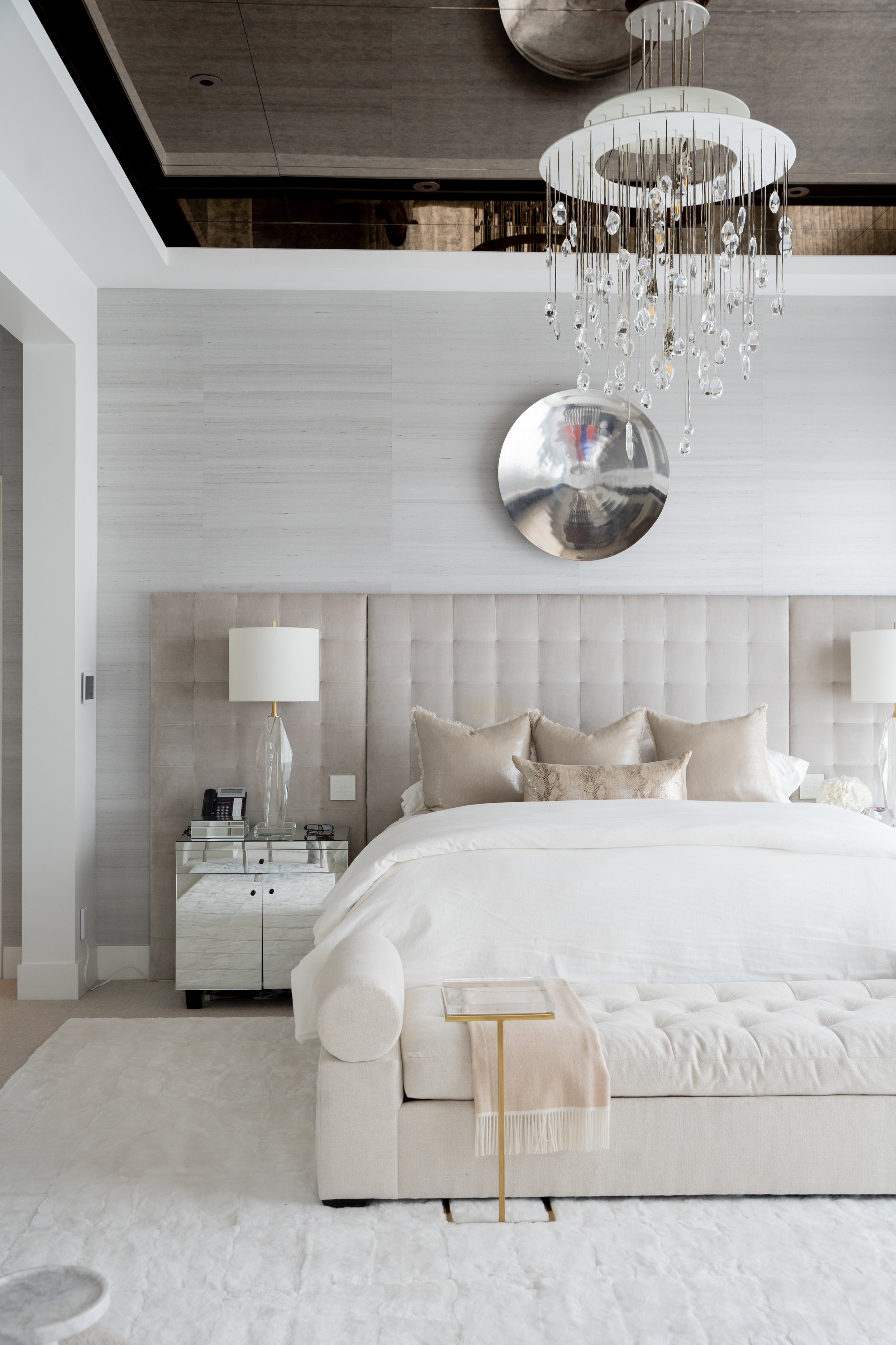
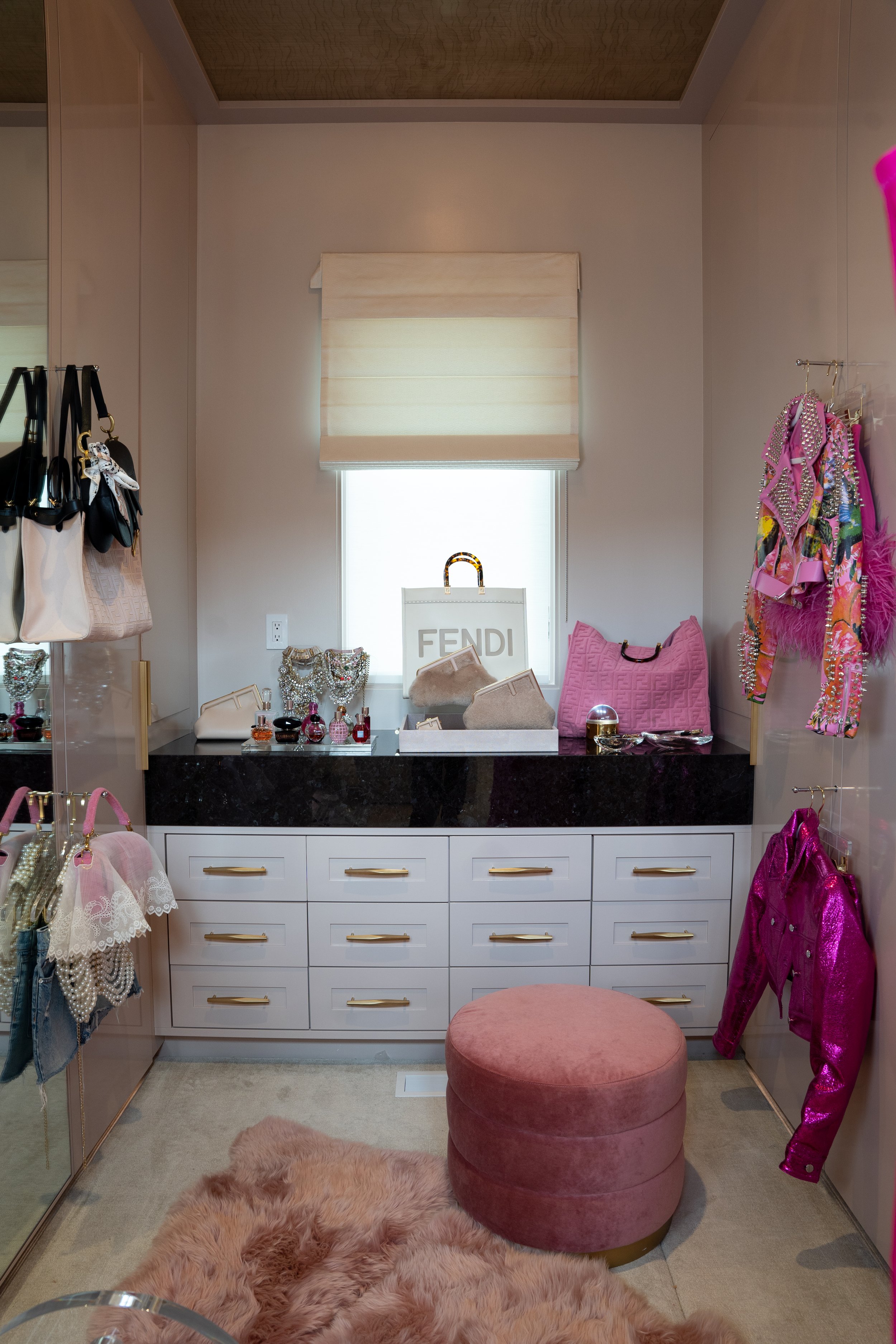
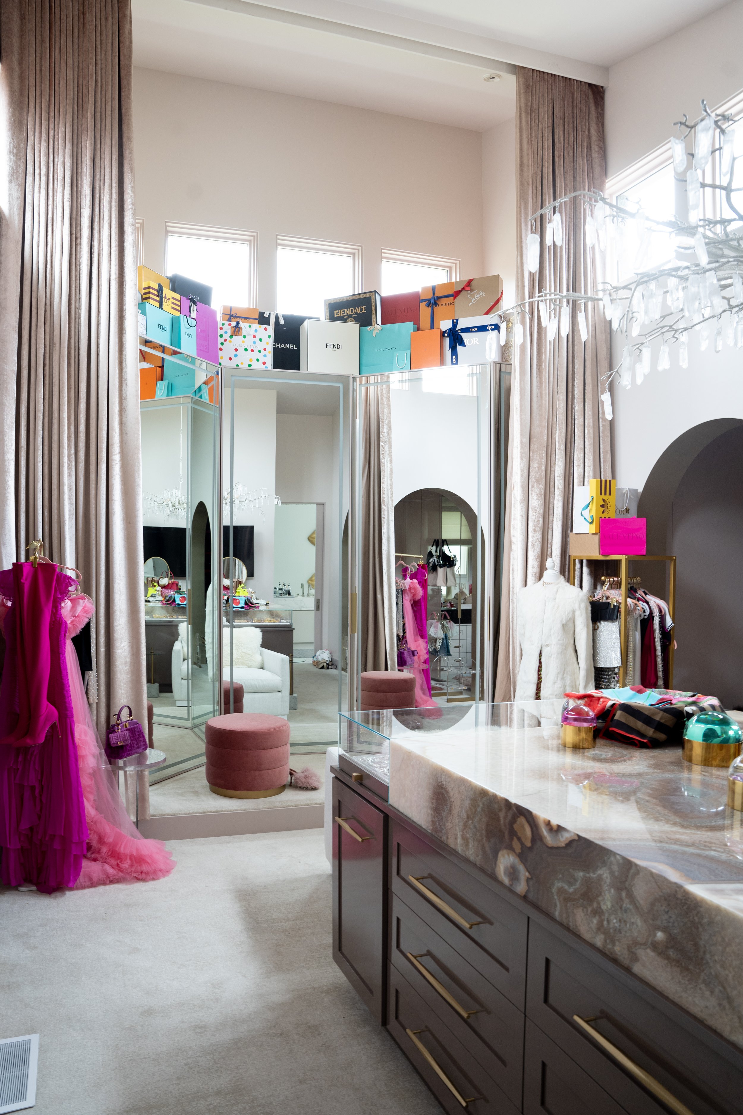
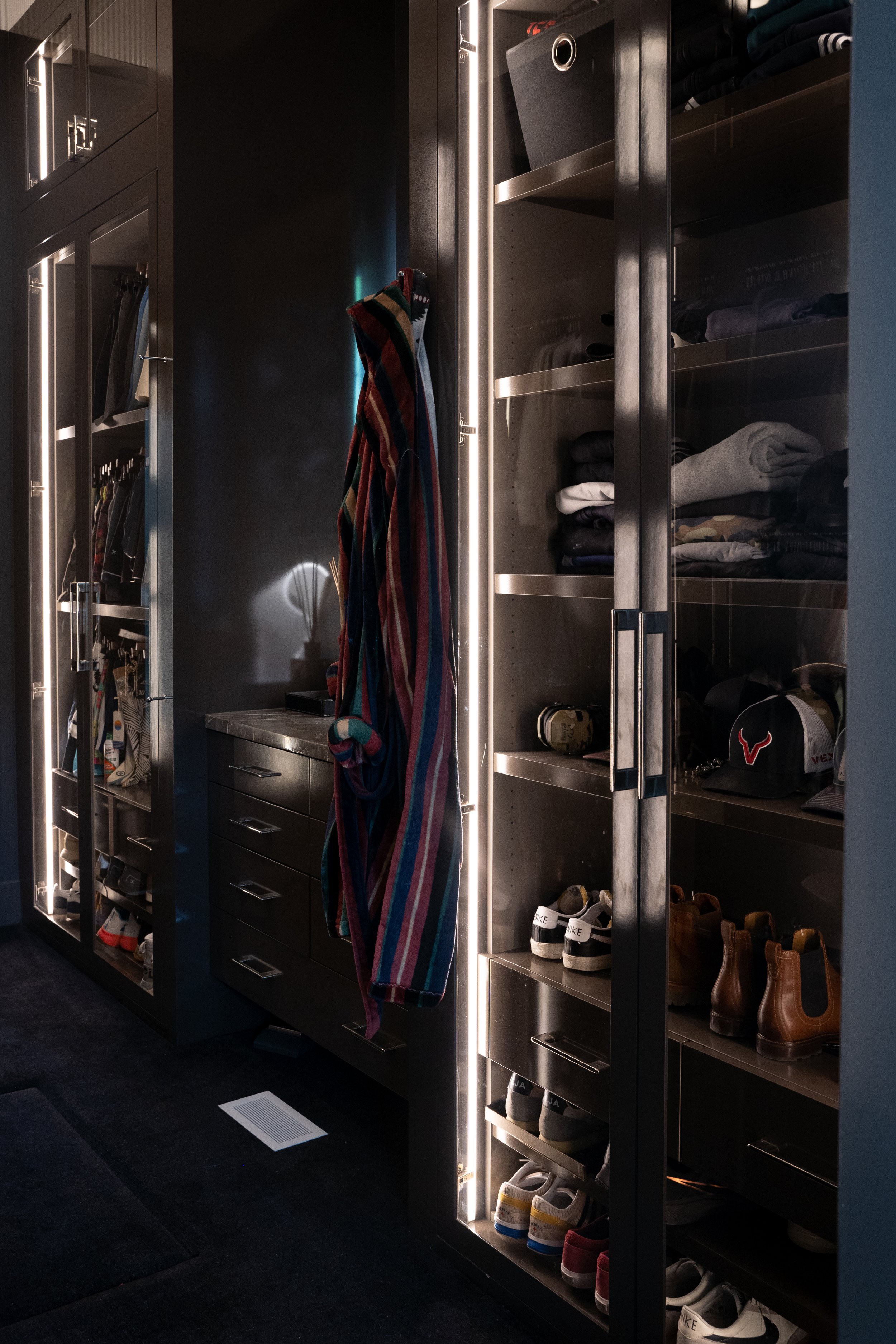
Primary Suite. The primary suite continues the editorial design with a stunning bronze ceiling mirror and a beautiful rabbit rug on the floor. This leads into a master bathroom with an incredibly generous 28' vanity. Her closet displays high-fashion designer bags, clothes, and shoes, so it needed an island with an onyx slab for a dark, glamorous touch. A three-paneled mirror with baby angel lighting light from behind is a focal point, beautifully highlighting any outfit. His closet boasts an entire display for his personal collections with smoky glass for added interest and mystery. A racing stripe along the ceiling and black carpet further complement its James Bond vibe.

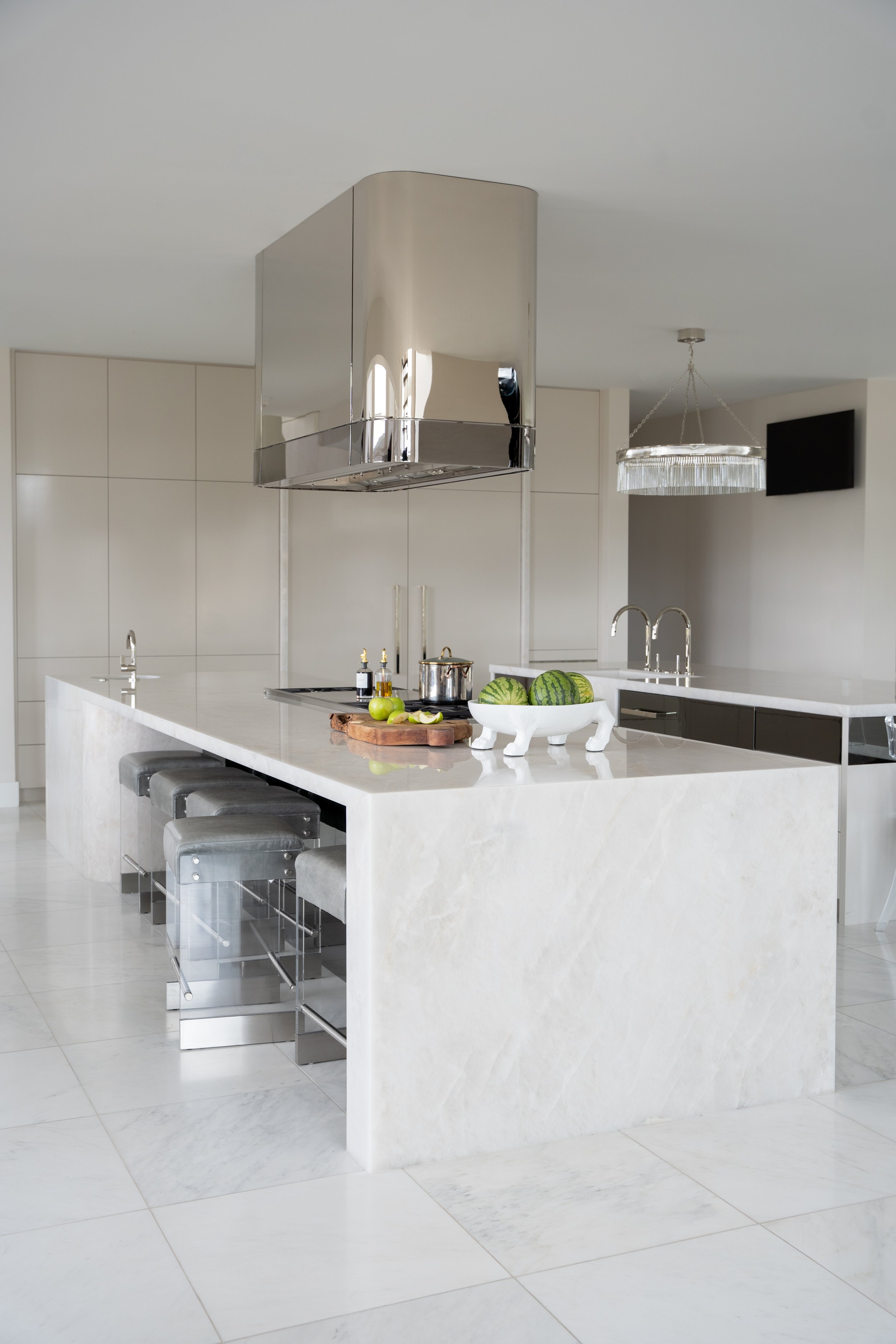
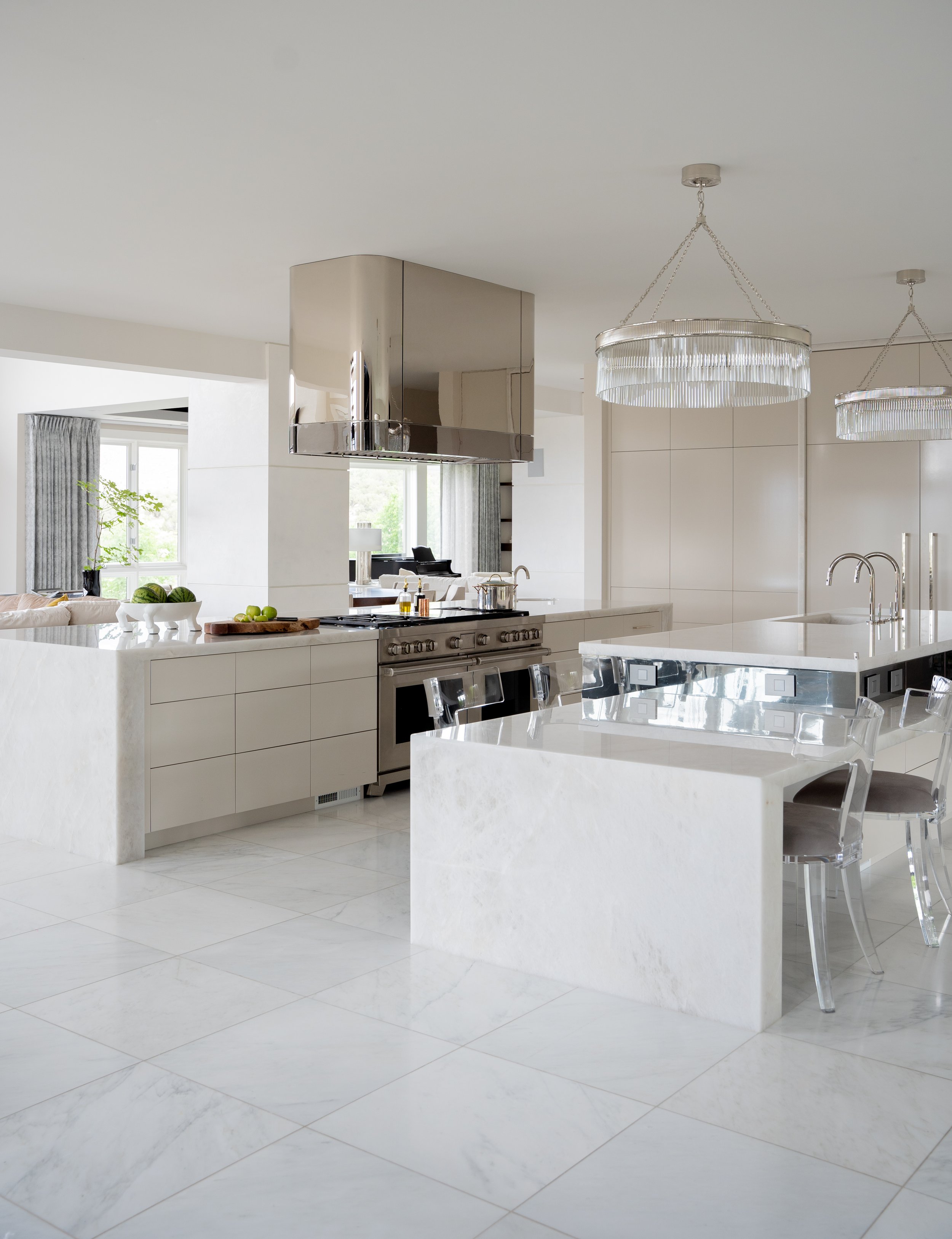
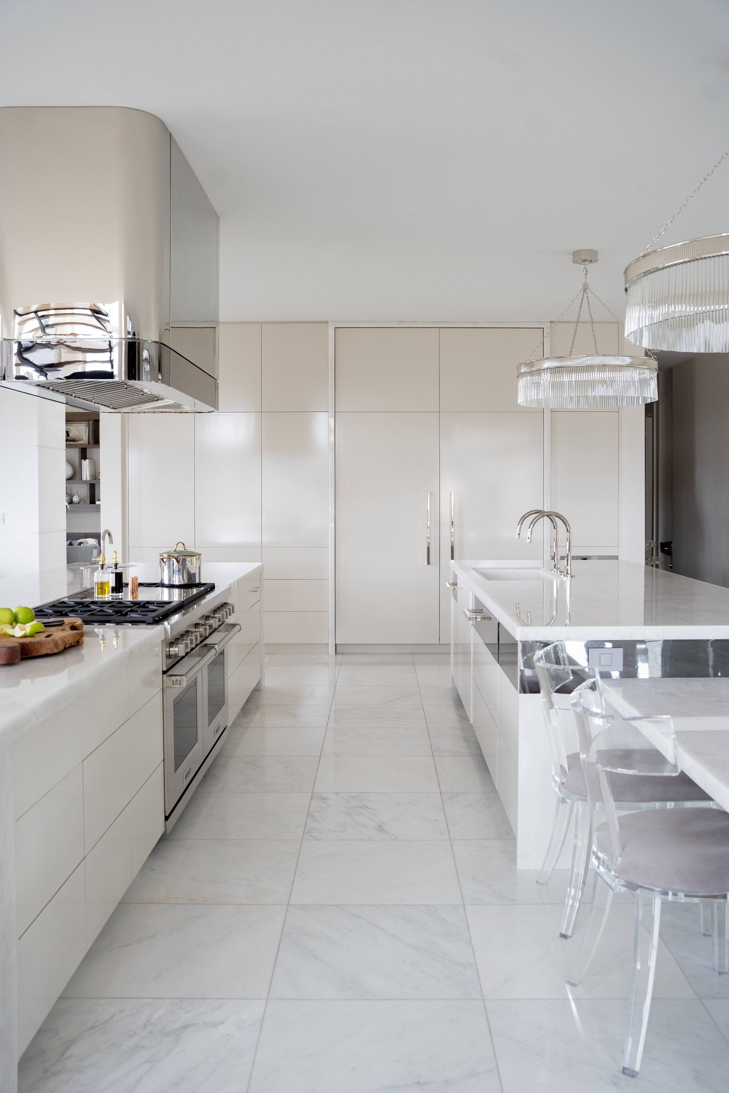
Kitchen. The clients love to entertain, so having a spacious dining space was a must-have. We styled lots of nickel with a polished black nickel hood for a chic, dramatic touch. The downstairs kitchen boasts a splurge-worthy purple marble slab for maximum impact.

To see the full portfolio, go here.

To shop the collection, go here.

Dear Alice | Bedding 101: How to Personalize Your Sleep

This week on Dear Alice, we interviewed the Brand Manager, Ashley Willis, from one of our favorite bedding companies, Malouf. We have been selling Malouf bedding for the last 5-7 years and we put it on pretty much every bed we are dressing for our clients or our showroom.

Bedding 101

How to Personalize Your Sleep

Jess loves a good linen for both winter for the weight and in the summer for the breathability. And Suz is sleeping on linen right now for the winter. It has a temperature equalizer that both she and her husband love. There is something so beautiful and timeless about a quality linen.

THREAD COUNT

It used to be the rule that the higher the thread count the superior the bedding. But there are many factors that contribute to a high-quality bedding other than tread count!

MATERIALS

Tencel - A very breathable material that dissipates temperature throughout the night. It is made in a very sustainable way and has a nice smooth feel.

Linen - Linen balances temperature. It has a unique feel, durable and lasts a long time. It gets softer with every wash. It’s has a relaxed look with more texture.

Bamboo - A great option for temperature regulating as well! It has a high quality at an affordable price point.

Cotton - Nothing is more classic than a cotton sheet set. It is naturally breathable and absorbent and has a nice crisp feel when you climb in.

DUVET FILLS

Down Blend - It’s a bit heavier and thicker which makes it a good choice for winter. It creates a beautiful loft with for that pillowy hotel look. Any duvet cover is going to look great on it.

Down Alternative - It’s a microfiber. It’s a lot lighter great for the hot summer months.

GETTING THAT MAGAZINE LOOK

Layering one of the best ways to create that magazine look. Layering sheets, a duvet, mattress topper, pillows, throw pillows, and a decorative pillow all give it that luxurious feel. A little tip we like to use is steaming our linens. It will help the bedding look crisp. Sometimes popping the sheets into a dryer for a few minutes can take the wrinkles out as well. When washing, set your duvet and sheets out to air dry. When they are almost dry, pop them into the dryer for a bit. This give them a fresh, soft look.

Styling Hack: We do put two comforters in a duvet if we want it to look super comfy and fluffy. It’s definitely warmer. But you can also achieve the fluffier look when you make your bed in a way that looks inviting.

PILLOWS

One of the key factors of a good nights sleep is a good pillow. You can go through so many different pillows. Jess takes her pillow wherever she travels!

Latex pillows: It has a very good bounce and is responsive. As soon as you take your hand away after touching it it will immediately recover.

Carbon cool: It has a layer of Omniphase technology on the top. It helps dissipate the heat at night and neutralizes temperature.

All three elements need to work cohesively to have a great sleeping experience. The mattress, sheets and pillows. You may have a great mattress but if you are sleeping on the wrong pillow you will end up with a headache or sore neck. And no one wants that!

Have any questions or podcast ideas? Email us at dearalice@alicelanehome.com we love hearing from you!

Dear Alice | 7 Tips to Transform a Small Space (and make it seem bigger)

This week on Dear Alice, we’re talking about how to make small spaces seem bigger. We have a lot of space expanding tricks we want to share with you! A small space can be cozy and inviting. We want to help you transform these spaces into something really idyllic.

1. COLOR

Some people say to make a space feel larger to paint it white. And it’s true, especially for those public spaces like the kitchen and living room. A trick is to paint the trim, walls and even floors all the same white. Suz used a satin white on her walls and her 8’ ceilings when she painted her space. By keeping the color consistent on the walls and running it along to the ceiling your eye doesn’t see a line. Suz also did the same thing in her bedroom, but in color. The color helps to express personality. She did the same thing for her boys room. She did the walls and the ceiling the same color. And then went a bit darker on the trim. Look a the pockets and where we can add color. The powder room, the dining room those are great spots to add color. You will expand it and make it feel larger by treating the walls, ceiling and trim as the same thing. It’s space expanding and uniforming so other things can shine like art and rugs.

Pro Tip: Whatever color you paint your ceiling it will darken automatically because of the plain it’s on.

2. SCALE

Go bigger! You’re going want to use bigger pieces than you think to make your home feel generous. Smaller furniture pieces tend to be on legs. Too many legs make a room feel nervous. If you do have something up on legs make sure the piece next to it has a lot of gravity.

Rugs: Use a large rug. Jess recommends at least a 10x10 rug. Go big. Do not get a 5x7 rug for a 10x10 room. Even if you have carpet, you need a rug.

Art: Large art will also help your room feel really big. Make sure it’s exaggerated. It’s a grand gesture to go big.

Lighting: When those ceiling lights are off and the lamps are on, that’s when you’re going to get that cozy cottage feel. Don’t forget to use a dimmer. Pay attention to the high of the lamp. A good size is 30” and pretty magical when the ceiling lights are off. Or incorporate a great chandelier, if your rooms aren’t tall then a fun trick is to use a wide semi-flush mount chandelier. It can be opinionated as much as you want and it doesn’t matter how small your space is.

3. Mirrors

Mirrors are a space expanding trick. they are going to bounce the light around and make the room feel bigger. It also makes it feel like another window depending on where it is.

4. Draw your Eyes Upward

Drapes: Hanging drapes all the way to the top of a low ceiling really pulls the eye up and makes the room feel really tall. Put that rod as close to the ceiling as you can.

5. Natural Light

In a small space hopefully you do have a window to help you out. Natural light will make the room feel bigger. Take the shutters off. Let the natural light shine and let it stream in. If you don’t have windows use lamps or chandeliers. Incorporate mirrors and let the light bounce around. Light is one of your best friends to make a space feel magical.

6. Pattern

Pattern can be a space expanding trick. We mean by laying your floors on a diagonal in small entryways. Something about those diagonal lines make the eye feel like it’s a bigger space. It’s such a cool mood and so unique.

Pro Tip: If you do hardwood flooring it does require 10-15% more material so make sure to keep that in mind when planning.

Any questions or podcast ideas? Email us at dearalice@alicelanehome.com we love hearing from you!

Dear Alice | The Power of Organization with SALT

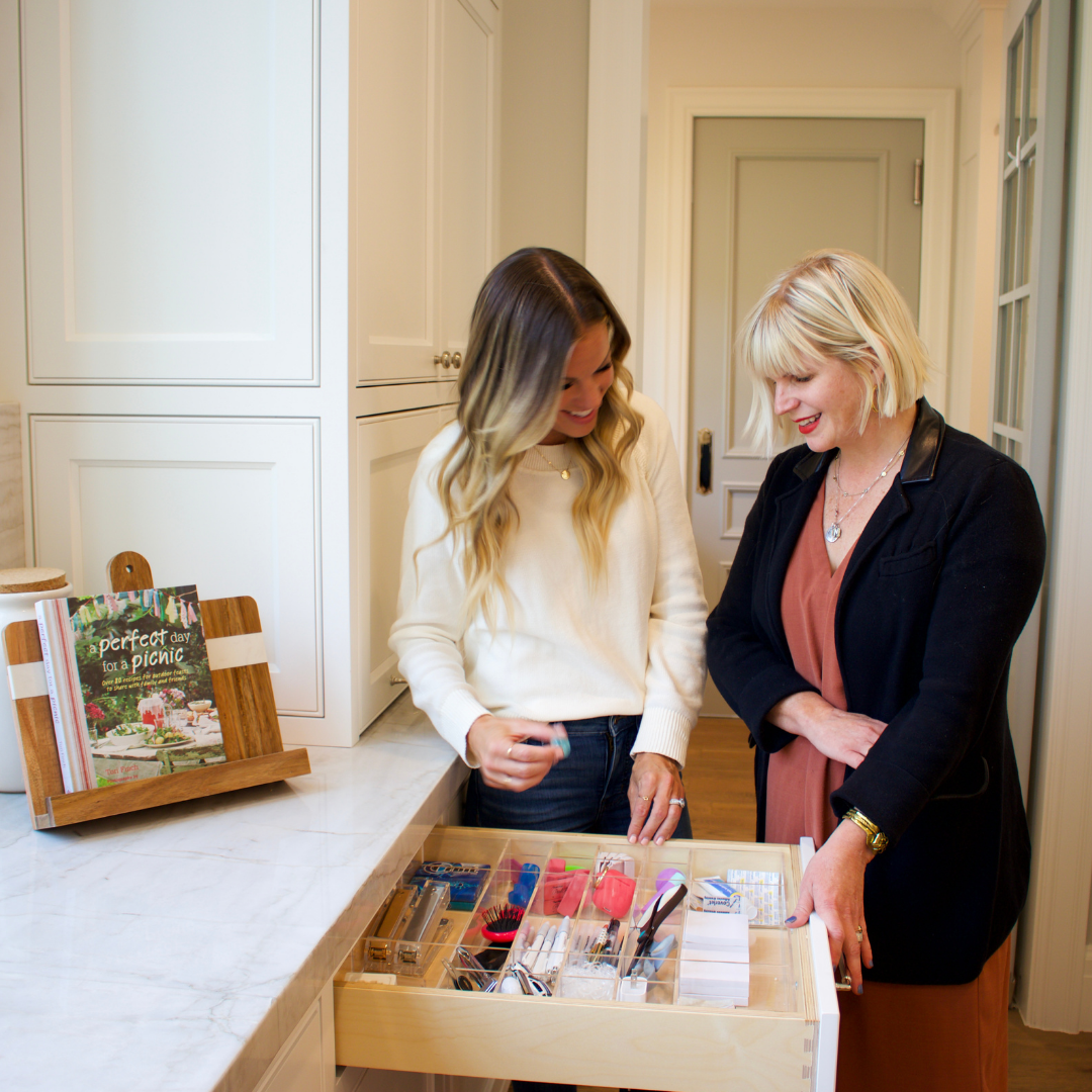
This week on Dear Alice, we’re talking to a dear friend, Sabrina. She founded the company, SALT. SALT features custom acrylic home organization drawer organizers that will change the way you organize your home. These are not your typical drawer organizers. These organizers are designed and built specifically for you. If you have a tape measure - that’s all you need!

Organization is very personal. The way you go about your day is different than you friend or neighbor. You need to do what works for you. In organization there are guiding principles, just as in interior design. Organization can be overwhelming so Sabrina created a 5 Step Process to help people narrow in on how to get started.

The Power of Organization

The 5 Step Process to Organization

STEP 1: ASSESS THE SPACE

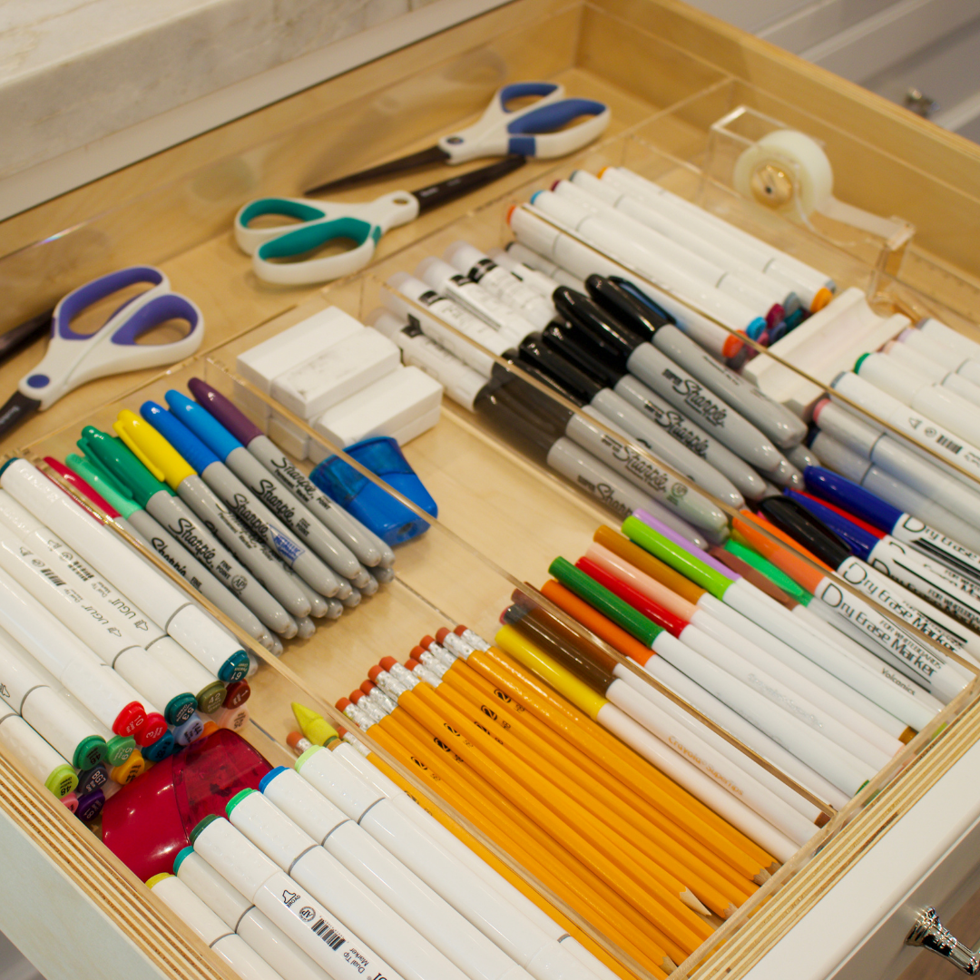
If it’s your kitchen you want to assess how you use the space. There is no right or wrong answer. For example, Sabrina has young kids that do homework, so she needs a homework drawer. This drawer has pencils and sharpeners and the things the kids need to get their homework done.

STEP 2: ASSIGN EACH DRAWER A PURPOSE

Give each drawer or cabinet a job. The drawer that is next to the stove will probably want the hot pads, kitchen utensils, whatever you need close at hand. When you give those drawers a purpose you will find it’s a lot easier to put it back. You know it has a function and what is best for you.

STEP 3: START FRESH

Take everything out of the drawer or cabinet. When you can start with a fresh pallet it’s so much easier and gives you the ability to emotionally disconnect with what is in there and look at the space with a fresh set of eyes. It gives you the opportunity to ask what it is you really need and what you use. When you get rid of things you feel lighter. When you can put in the right containers and the right tools to help us stay organized it helps us in the final step which is putting things back in the ideal way to utilize those items in the long term.

STEP 4: PUT ITEMS BACK THE IDEAL WAY

Things are so accessible and we do have a lot of stuff. It weighs us down because everything we have we have to maintain. Having a simplified life and pairing things down takes away things off our plate we don’t have to manage. It’s taking inventory of your life and things you have. Being organized will save you time and money. You will see you have that extra spice and you now know you don’t need to buy it again. You can move on and focus on other things during your day and your life.

For more ideas how to organize, listen to our podcast segment with Sabrina! You can find this episode of Dear Alice on Apple Podcast, Spotify, or Google Podcast.

Thanks for listening and following Dear Alice. We love hearing from you! Send in more questions or ideas by DM'ing us on social or emailing us at dearalice@alicelanehome.com.

Dear Alice | Entertaining with Rebecca Gardner

Coming into the entertaining season we thought it would be fun to have a special guest! This week on Dear Alice we interviewed Rebecca Gardner, party extraordinaire. Rebecca is the founder and creative director of House and Parties, a full-service event and interior design collective in Georgia and New York.

Entertaining with Rebecca Gardner

“A house is a party...and the purpose is to share it.”

HOW DID YOU GET INTO ENTERTAINING?

Rebecca started in the interior design business and does very select projects. She started getting into events and from there created an e-commerce sight about a year ago. The visuals that Rebecca has created for her site are above and beyond anything you could think of.

When Rebecca is designing a house, she thinks of the party in mind. She studied a Savannah Art and Design and while there she did events and collaborated with amazing artists. From there she found a passion in creating environments and working with artists.

WHERE DOES IT BEGIN?

Clients will come to her and will do parties of all sizes. Brands or fashion houses will come to her that want to celebrate a new collection or line and the parties she creates will create content and fabulous photos for them. Or they will do an anniversary party or a big non-profit event. The parties where there are 60+ guests because the scale is exciting and have a major adrenalin rush. But when you have these bigger parties you don’t get to move snails under a crystal goblet.

Rebecca loves to incorporate vintage and whimsical pieces into her parties. On her site she has a section called lagniappe. Lagniappe means ‘little extras’. No matter how fancy your table is and shows great beauty, you always have to have a bit of mischief wink tucked in. It encourages a wink and bad behavior which makes it a great party.

WHERE DO YOU FIND YOUR INSPIRATION?

When we design a party we start with the venue, occasion, or the client. Taking it to the next level you have to show off what you got. Take one of those things and celebrate it. Use what you have to work with and run with it. It’s like getting dressed for a party - show off what you got.

PLANNING THE PARTY

A short lead time or a long lead time shouldn’t deter anyone from having a party. Party favors aren’t necessary. A hostess gift is a nice gesture but the best gift is to get a thank you note promptly afterwards.

But a good playlist is. Rebecca shared her playlists here (Holiday, Cocktail, and Cocktail Party) , and here is ours!

Let’s Talk Hats

“You alway have to have a bit of a mischievous wink tucked in.”

The hats are incredible that Rebecca comes up with. She works with an amazing milliner in Tel Aviv. When she comes up with her collections, which are seasonal, she always includes a fantastical hat. The idea is that when you are a guest at a party you have a job. And you get to decide what your job is. You could be the sexiest woman. you could be the man that brings the expensive wine, you could be the best storyteller, the best dressed. But you have to come with something. Or you could just make people feel good because you have such great listening skills or you give great compliments. Rebecca thinks the best thing to bring to a party is to wear a great hat.

When you walk into a party wearing ones of these hats it shows you appreciate the hosts effort, you’re there to have a great time and you look good doing it too! Just like clothes in general, it just makes life more fun.

THE HOSTESS

The way the hostess feels is the feeling of the whole party. So if she’s nervous and still thinking about all of the little details then you feel nervous. Rebecca shares her tips on how to be a good hostess. If you are nervious or not comfortable entertaining, you decide what brings you joy and what you do relly well and then delegate the rest.

You don’t have to make it to make it happen. If you hate to cook, hire a cook. If you don’t like to do flowers, hire a florist. And if you don’t like to do either, make your famous magaritas. A party does have to have a sole and needs to have a bit of you in the party. And then let go and have a good time! There has to be some planned imperfection, anything to make people feel more comfortable.

One thing people fail to do most often is to make thoughtful indroductions. When Rebecca hosts parties she tends to go to the same people over and over. You’re more comfortable, they’re more comfortable but that’s not what it’s really about. Inviting a black sheep can be the best party trick ever. Or someone new, or different kinds of people. But once you do that you better make sure that person is comfortable.

HOW IS DESIGN A PART OF PARTY PLANNING?

Planning a party is design work. With all design work there is an element of practicality and an element of beauty. You could have mediocre pizza but serve it in a dulling piano bar with amazing architecture. Fun is the goal. If your goal or idea of the party is to impress people, you’ve already lost the game.

ESSENTIALS OF THROWING A GREAT PARTY

As designers we always try to hit the 5 senses - controlling the light, feel of the fabrics, scent, etc. For a party lighting is paramount. People leave their overhead lights on but Rebecca recommends to have dimmers on all of your lights. Low light is the most important. You need to think about what your table looks like in low light. Second to that is little elements of surprise, and delight and irreverence. Don’t forget that slap in the face.

PARTY TRICKS

Rebecca’s favorite party trick is parlor games. If there is a lull in conversation and you’re seated next to the man that brings the expensive wine and that’s his only get come up with a parlor game. Don’t ask what his favorite ice cream is or what is his passion. Ask instead, would you rather drive cross country in a mini cooper with no air conditioning or radio in the summer with a three-year old in the back seat. Or only eat martini olives for three months - just ask something bazaar. The better ones are inappropriate! To have a trick up your sleeve makes for a great party. It breaks the ice and makes the party less stuffy.

HOW TO CREATE AN ELEVATED SPACE | Whether your Taste is Dressy or Casual

You can always do it in great taste. Whether it’s one or the other you’ll look successful - like a great 3-piece suit. You’ll look confident and put together. And that is what we’re going to help you do!

You want your home purchases to last a long time and you want to feel confident in what you’re buying. This will help you with the correct discernment when you do come up with those choices.

A lot of clients aren’t sure what their taste is. Oftentimes we’ll ask them what’s in their closet and that tells us other purchasing decisions they’ve made. Another way to help distinguish our clients is how they dress when they come to sit down with us. We can understand how elevated they want their space to be verses how casual and comfortable they want it to be. And oftentimes there is a living room and a family room where you can have both of those styles. We help make those decisions and what to put in the home.

Designing a home is all so personal and you don’t want your client’s home to be something they are not. We don’t want to give them something that doesn’t feel like them.

The biggest thing we hear is “What can we do to like these forever?” We’ll give you the key basics to shape the shell of your home. Just know that just as you evolve, your home will evolve too. Causal or dressy - we want you to be the best you.

DRESSY

How do you know if you are dressy? Here are a few things we’ve observed:

When you are polished - most likely you press your shirts so everything is tip top tidy. You probably have a Chanel bag, and pearl earrings. People see these things and think timeless. You are timeless if you are dressy. You like shiny things verses things that are honed and more earthen and more causal. You love a shiny object. You’ll want your marbles polished and high contrast. People who are more dressy love the crisp, sharp whites. Blacks are inlayed with gold. You yourself probably wear heals.

How to incorporate DRESSY into your home:

Antiques: You usually like things that are higher up on legs, that have shiny hardware with an inlay. Mirrors are great because you look good in that pressed shirt and you want to see that reflection. It brings in the shine.

Wet Velvets: What is a wet velvet? It’s velvet that has a shine and luster to it. The sheen can be seen turning a corner from a seat to the arm. It’s also called the Queens Velvet. A dry velvet is like velcro for cat hair. There is no luster to them and not if you want a dressy look for your home.

Wallpaper: You love a wall paper with a lot of detail. We love using Gracie wallpaper.

Art: Original works of art and paintings create a very dressy and elegant space.

Color: You’ll see more jewel tones, which are navys, oxblood, garnet, emerald greens, reds - these add richness and formality. The entry has the blacks and whites. Like the black and white checkered entry. Rooms that are darker do have a bit for formality. Dark rooms are known to provoke creativity and depth. It puts your mind at ease to focus and be creative.

Hardware: Fluted and curvy make for elegant vibes.

Floors: Dark walnuts are elegant but a dark floor also means you’re always cleaning it. For rugs it’s the wools and silks that makes the room really dressy. It’s easy to find an antique rug because it wears so long. It’s hardwearing and so gorgeous to look at. It’s like looking at fine jewelry when you’re looking at this hand-knotted antique silk rug.

Drapery: You love a silk or formal velvet with the pleats and hardware. Incorporate heavy drapes with a finial and and tassels, tapes, garlands or all the above! Incorporate silk drapes instead of linen for your windows.

Lighting: In lighting you can really express your style. Incorporate crystals and which evokes a real dressiness in the space.

CASUAL

Are you more casual?

The client that comes in a great pair of jeans and a t-shirt with a fun bag and a great story to go with it us usually more casual. Most times the casual clients are ones that love a really great expensive pair of jeans with a Target t-shirt, or a blazer that’s cuffed up. They are more into the mix of casual. There is less hairspray and not everything has to be in its exact place.

Jess would say she is a more high-end causal person and Suz is a curated casual. Cori says he is definitely casual. We like to think he’s a cool-casual!

How to incorporate CASUAL into your home:

Causal homes are more earthy where clay tones are more prominent. These are the sunset colors - the rich brownish orangey red tones. These colors are more youthful. The entry would be a wood or limestone floor. It could be a lighter floor such as white oak instead of marble (like in more dressy homes). The floors won’t show much dirt and are designed for living in. The baseboards are not as curvy on a casual home but you would still have nice hardware, but don’t want it to be too fussy. Things won’t be as symmetrical. You appreciate the imperfection in asymmetry.

Fabrics: Open weave linen has a casualness to it but also a shiekness to it. It relaxes a space. To make it feel more authentic add some thickness to it and layer up.

Lighting: Your general spaces are more light and natural. It’s a little less expected and more organic.

Artwork: Incorporate a mix of different artworks - find pieces you love.

Rugs: A mixture of patterns and colors create a more causal space. Just be sure they are the right size for your space.

THE IN-BETWEEN

How do you walk the line between the two without the home going more eclectic?

Dressy or Casual there is still a practicality that goes into it. It’s where form follows function. If you have too many pillows you’re trying too hard and not functional. You just need to find the right amount of pillows that are just right. If you keep buying pillows and you find it’s just not working, take away all the pillows and find three that are awesome - and you’re done!

People try to overcompensate by adding and adding and it over complicates things. If you have a throw on one sofa arm you just need one pillow on that arm. And then add two pillows on the other arm to balance out that throw and pillow.

With a formal person they want things symmetrical. but we’ll add a ball pillow and make it asymmetrical.

It’s interesting age plays a factor - that’s not to say a women who is 55 doesn’t like Traditional. We’ve noticed that the 30-somethings want a traditional home because it makes them seem more successful and look established. The crowds that are in their 40’s are more contemporary because it makes them feel more youthful. They’ve already acquired all this great stuff and want to start pairing down and look edited. They don’t over buy at this point because they already know who they are and what they like.

Look at the successful designs and do what you can with it. You always want to look successful - make it feel look like a professional helped you and make it you. It’s making smart decisions and make it feel authentic to you. If it’s casual right now doesn’t mean you can’t add dressy elements into the mix. That’s the best kind of design we like to do!


Thanks for listening and following Dear Alice. We love hearing from you! Send in more questions or ideas by DMing us on social or emailing us at dearalice@alicelanehome.com. You can also find this episode of Dear Alice on Apple Podcast, Spotify, or Google Podcast.

Dear Alice | Layering for Winter

It’s getting colder here in Utah. The leaves are changing color and we’re feeling all the feels to make our homes fell more cozy. We’re in the mood to bake, light candles and snuggle up with a good throw.

On this episode of Dear Alice we are talking about layering our home for winter. We love making things heavy through accessories like pillows and mohair throws. Incorporating velvets and those deeper, rich layers will help get your home ready and feeling cozy for the cold months ahead.

Here are some areas that you can add that extra layer:

  1. THE PORCH

Changing up your DOOR MAT always feels like a refresher. It’s a time of year where company comes so it’s always a nice way to beef up that porch scene. The pumpkins are out and the mums are in full bloom. Incorporate these garden items to add a touch of a deep velvety color. Incorporate a bit of potato vines and you’ve created a nice transition from summer to fall.

Pro tip: Get a lot of pumpkins! Fill up that shopping cart and create a generous and abundant scene. Purple mums and white pumpkins felt a bit a typical. But just be generous about it! Let them trickle down the steps. Mums do tend to get fried so try to keep them in a more shady area.

LANTERNS are a nice touch. There are fantastic flameless versions out there or use real flames - if you dare. These give you that big hocus-pocus feel.

In winter take away the pumpkins and mums and replace them with a wreath. There’s something nice and traditional about it. You can do an evergreen so it can stay up all winter to help out those dull winters. Topiaries or big bushes are a classic go-to. Seasonal items can be added to them to make them more seasonal.

2. ENTRY

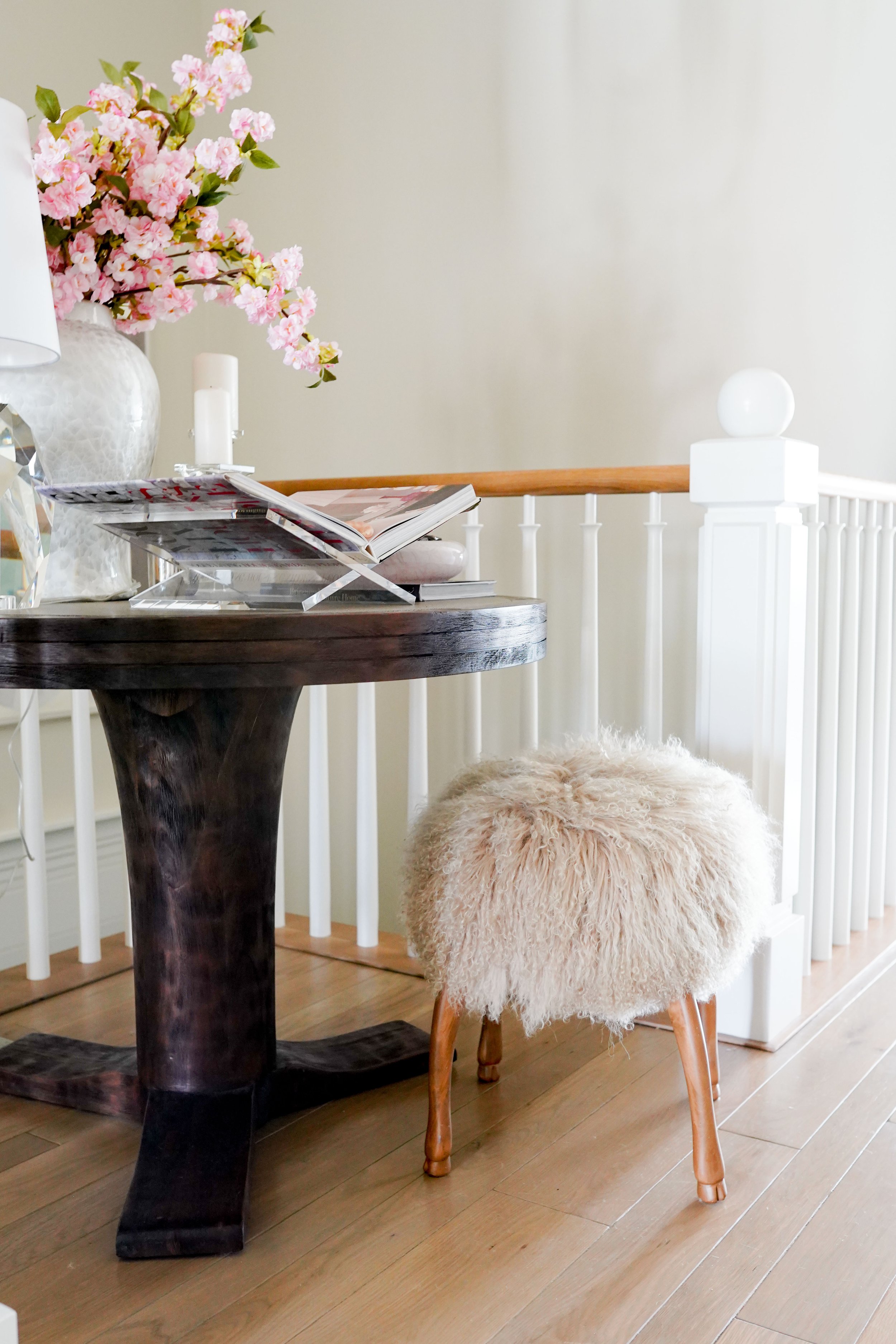
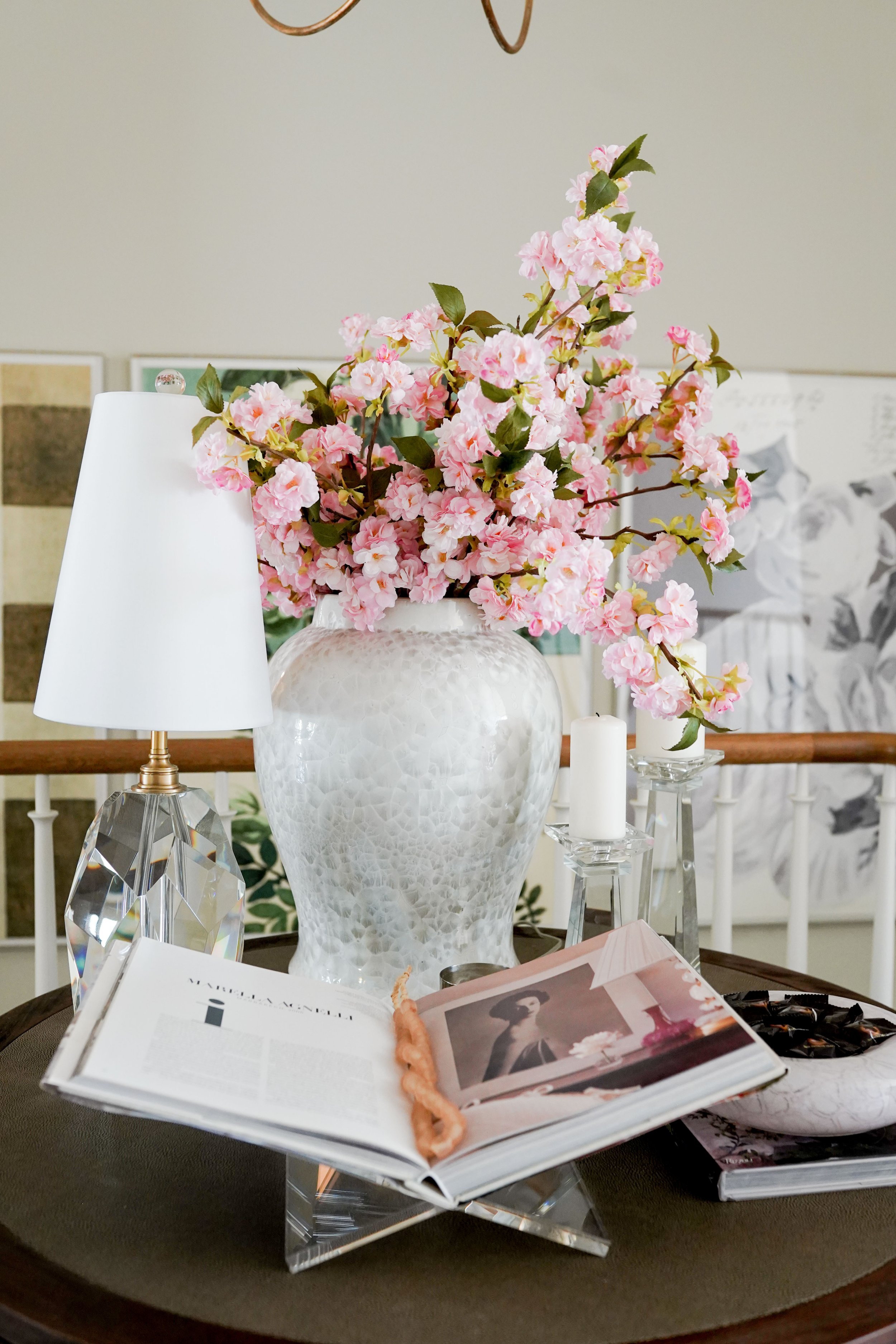
If you have an entry table we like using our favorite ginger jar. Branches, blossoms or evergreens can be switched out for a particular season.

Suz loves to go foraging in the mountains near her home - and in her front yard! Clip up a few branches from the mountains and create an arrangement for any kitchen island or entry or kitchen table. It makes a mood and height and immediately transforms your home. Put the cuttings in water and they’ll be good for a few weeks.

Pro tip: Keep a pair of snips in your trunk! Live cutting will always be the most beautiful and sculptural will create a great moment.

3. ACCESSORIES

Engage all the senses. The smell of a candle, the visual of a good picture book and music helps us to be present and in the moment.

CANDLES: A good candle always sets the mood and kicks off the season. We like the heavier, cozier scents. Our favorite is the Trudon candle. The candles have been made since 1653 in France and the only candle that has been made for the royal family. The handblown glass has a beautiful gold crest on the front and all the scents are a rich, deep smell that creates a luxurious moment. We love them on our crystal candle dish. The small dish fits them beautifully. We also have our elevated clawfoot dish that fits another of our favorite, the Lola James candle, beautifully.

BOOKS: Don’t forget to mix up your books for the seasons. Coffee table books are a great way to update your seasonal decor - and can be a source of entertainment for your guests. Use a book cradle and display those beauties on a coffee table or in the entry. We love using our Lucite Galerie book cradle or our Wood Galerie book cradle.

MUSIC: Don’t forget the music! Jess loves incorporating a playlist to events she hosts. We all know music sets a mood and can turn a dull dinner party into a memorable and engaging one. Music is powerful and can remind us of traditions. It can bring us back to our roots when we were children or create new memories with friends and family.

TASTE: Jess’s favorite hostess trick is having a little candy dish easily accessible to her guests. Her favorite is the Italian Blown Dish. Add a peppermint, caramel, chocolate, or anything wrapped that relates to the season.

4. SOFAS, BEDS AND PILLOWS

The winter whites, the neutrals, pairing down your colors, it all becomes a good backdrop for any season. If you’re into the classic red and greens and jewel tones for the holidays they can really pop when your base layer is neutral. Our Mohair Throw is so amazing. It’s a throw for your sofa and is just stunning. We love using it on the back of sectionals. It covers the seam and brings the two together. It puddles on the floor and creates such a mood. Mohair is made from goat and a course thick velvet. It feels so lux but also sturdy - especially if you have kids. Incorporating faux furs and velvets is a favorite of ours to create an added layer for beds, sofas and pillows. One thing we always like to say: Go big and make it feel abundant and generous and you can’t go wrong.

This podcast segment can be found on Apple Podcast, Spotify, or Google Podcast. Go have a listen!

Dear Alice | Lola James Harper - Scents

Dear Alice + Lola James Harper

An interview with Rami Mekdachi, founder of Lola James Harper

Today on our Dear Alice Podcast we had the privilege to sit down and interview Rami Mekdachi. Rami founded the candle company Lola James Harper in 2013 and has been creating memorable scents ever since then. Not only is he an incredible perfumer, he is also a world traveler, musician, photographer, film director and storyteller of the senses.

Rami and his family love travel and consistently find inspiring places. He takes notes and photos of these experiences and combines them into a candle to create a time warp into those memories.

Rami explains when you smell something you don’t smell just cinnamon - you smell a memory in your childhood or to what it is linked to. He wanted to go to those amazing places that inspire people so that when they have a moment they can go back home with that scent. You can’t see and touch it but yet a mystical element is created. When you talk about the a scent of a space it has to be a raw material. You smell the woods, earth and rain. The smell shelves and old paper from an old vintage vinyl shop. All his candles are very figurative. They create a certain place into your space and triggers a memory.

Rami says it would be a sin not to have a scent for a party. The great events of our lives have a scent to tie us back to that moment. Music as well is so powerful. These two combined create that romantic side of those memories. Having a great moment with your children or having a small link to nice moments. These candles are a chance to give people moments to relive those memories.

Rami Mekdachi

“Whoever, wherever, whenever and whatever we are, we want to be more. Yet we are already enough when we are together.”

Q: Where does the name Lola James Harper come from?

A: It was all from all of my travels with my family. I asked my daughter, who was 5 years old at the time, while having dinner. We were trying to come up with a name. There was no strategy. It is all about the journey and she said why not Lola James Harper?

Q: If you could go anywhere in the world tomorrow where would you go?

A: I would go anywhere but it would have to be with people I love.

Q: You don’t have a storefront. Why is that and tell people where they can buy your scents.

A: We love creating memories with others. You have to understand the culture and norms and you have to adapt your belief with their belief and you have to find a place where something comes together. Go towards things that are away and bring them close. Each time I work with different partners it is not that easy. We have our norms and they have theirs. This is how we all grow and learn what we want and what we need. I belive the more we grow up the more we are willing to change. I need to understand and to share. My point is to create a project together. When you know more people and open your understanding you’re not just physically growing old. You are learning more what is truth to other people.

Q: You’ve won awards for your film, With. Why did you decide to create this film?

A: I met a friend and in 2010. We began to play music and once a year we would compose songs. We traveled and filmed all the places and were begining to launch Lola James Harper. We began to sell the pictures we took of our travels. I was mixing a song at the time and talked about friendship and we began to create something nice. We realized by mixing all the songs and pictures it created a quietness. The movie happened through four or five years. The concept was everything I had gathered through these years. All my ideas and all the travels show symbolically how togetherness is created. It was a process. We showed at all of the festivals and we ended up getting a lot of awareness. It was good that I ceased that moment!

I just let things happen. My teammates have to be so flexible because you never know what is going on. When you come to an event or when you are traveling you see what is around you and give it a chance and some things come together. You cease that moment.

Q: What is your favorite scent?

A: Every candle is a favorite memory. So every candle is my favorite.

Q: What candle are you burning right now?

A: At home today I was burning First Morning. We came back from a road trop around Italy and I wanted something that felt like Spring and to reopen my sole.

Q: How would you describe Fall?

A: When you finally begin to be nostalgic and discover all the luck you have.

Q: We always ask people this question: How would you define luxury?

A: For me luxury is a different element. The first element of luxury is you that don’t need it. Second, you need it spiritually. It’s an element that makes you feel higher more refined and you feel more precious. It’s not precious items but rather it’s a feeling. You feel that it’s rarer. For me it the rarity element. What you are feeling is rare. Luxury is going to Rome and having a coffee. You buy the coffee bean and make it at home. It makes you feel that it is more of a rarity. Animals don’t have luxury. It’s not a concept for them. You need to have all those things that make you feel higher, better, more precious. To feel special is luxury. When going to a hotel, the way the people receive you - with flowers, the way the room is, the way the staff interact with their guests - it can make you feel special and precious.

Jess: The last quote you shared is so beautiful everyone should hear this.

A: Whoever, wherever, whenever and whatever we are, we want to be more. Yet we are already enough when we are together.

Jess: What a beautiful life philosophy to live by. And it is enough to be who you are. What a great feeling.

Thank you to Remy and his team for helping make this interview possible. It was truly one of our favorite interviews! We currently sell First Morning and Blitz Motorcycle candles online as well as many other scents in our showroom.

This podcast segment can be found on Apple Podcast, Spotify, or Google Podcast. Go have a listen!

Dear Alice | Drapery - The Next Level

This week on Dear Alice, we’re doing a Q&A on drapery! The segment can be found on Apple Podcast, Spotify, or Google Podcast. Go have a listen!


We’ve already done an episode on drapery, A Detail You Can’t Overlook | Window Treatments (January 23, 2020), but we felt like since we’ve had so many more questions on drapery recently we would go into more detail on this subject!

We answered questions that came in from our Dear Alice Podcast listeners, and hope this information is helpful to you! Thank you for sending them in! Let’s dive in!

Q: What is the best way to add drapery around an old school sliding glass patio door?

Some see these sliding glass doors as a utility and that they don’t need to dress these up or make them look special. But they can be gorgeous when draped! With any window we go from the casing and go out 12-18” so your door can still operate. We would suggest a panel and do it as tall as it could go and then drape the side and let a bit of that drapery interrupt the light.

If there isn’t room on one side or the other you could drape it heavily on one side but make it believable that you can close it all the way and it would completely close the window. It’s such a lovely look when the drapery is closed. And it sets such a mood.

Q: What fabric will hold up and what fabric will look beautiful?

Try to stay away from an all natural fabric. It’s beautiful, but it will receive sun rot and breakdown that natural fiber. If you can find a synthetic or polyester it will help it from disintegrating. If you do want to do a natural fiber we would suggest a liner with a UV rating which will hold up a lot better and protect that beautiful material.

Q: When do I use pattern on drapes?

This is so fun! It depends on your style. We did an old hotel bedroom suite style recently and took the drapery all the way to the top. Jess also has some pattern window treatments too. They have black brushstroke faces on them and feel a bit Roman. It makes the space feel a bit modern. She fell in love with the fabric immediately and knew it was something she had to have! She bought a bolt of it and didn’t know what she wanted to do with it but ended up making these drapes in her bathroom with it. She did this seven years ago and says she would still make the same decision. She loves the so much! The fabric has been discontinued and wouldn’t be able to get it again. It feels like an artist lives in her house. We love it!

Pattern is one of those things you’re going to know if you love it. Every time we have done a pattern it matches the people that live there. You’ll know you’ll love that pattern. There does need to be a backdrop. Analyze your room. If something is missing maybe you just need a pattern or a wallpaper in that room.

If you’re going to have a patten on your window treatment it shouldn’t be organized like a damask, trellis or a repeat. It should be irregular, natural or organic.

DSC05813.jpg

Q: How often do I change my drapes?

We love this question! Any time you’re going to redecorate your whole room you’ll probably reassess your window coverings. We’ve met clients that have invested so much in shutters and they feel like they don’t need to invest in drapes because they have the windows covered. But drapes live on the wall and shutters block your light or your view. We rarely do shutters in the history of Alice Lane for this reason.

Drapery is something that is going to bring light in and can give a more gracious feeling to the home. But also, if you don’t like them just take them off! And then take your time to find something you love. Permission granted.

Q: Budget

It’s the B word! What do we recommend? Where can we cut corners?

It depends on the custom level of the home. There is a good, better, and best.

BEST: You’re going to hire a custom workroom. You’ll choose your custom fabric, custom rods, the rings and clips. The entire process is a very custom experience.

BETTER: The other way to do a very good job is from one of our lines, Fabricut. They also offer drapery and a good turnaround. They have certain fabric selections to choose from and are comparable to RH or Pottery Barn. They are a really good catalog level drapery.

In our experience it’s been tricky for the end user to get them in, install them, etc. so if you do need help our Home Furnishing Design Team is awesome! Our team designs homes all over the nation and can figure out how many panels you need to make it look really luxurious. They can help determine how much you will need to order and walk you through that process!

DSC04995.jpg

Q: How to do drapery on an arched window

Good new people! Arches are back in style again! But if you just aren’t digging your arch we recommend taking the curtain rod to the top of the window so you barley see the arch. Take it as tall as the top of the window or as high as your ceilings and add drapes on both sides and layer the drapes nice and heavy. We don’t recommend going halfway where there is a break because you would just be accentuating the arch. We want to allow the other pieces in the room to be the hero!

Q: At what point in the designing process does drapery come in? At the very last? Before furnishing?

When we are designing we do consider the draperies at the beginning when we are designing a whole room because we don’t want it to be forgotten. Draperies are the poor lost child that gets forgotten at the end. And you need privacy! For the actual drapery consider it while you’re doing your furnishings or painting a room. If you’re looking at your room and thinking something is just not right or clicking we guarantee it’s the window coverings that you are missing. It makes the house somehow feel finished, like putting art on the walls. It makes the home have a soul and a softness to it. It’s like putting mascara on. If you forget your mascara your eyes get lost. It’s the same for window treatments. Don’t wait until the end.

But we know they are expensive! Most recently we’ve been going through some things like window treatments, wallpaper, etc. that we know you’re not going to want to live without and calculating and building these into the peoples mortgages so they aren’t forgotten!

Q: Are there rooms to cut costs in?

If you have secondary rooms or areas that are more utilitarian and don’t necessarily need privacy like a pantry, laundry, or a mudroom, these rooms are good choices to cut costs on. Those places don’t need to have window treatments. However, your primary bedrooms, places you occupy and are really living in, those would be our first priority. You do want some functionality and privacy for guests when they are visiting. At a minimum put rollers up so they can control the light and have privacy. When you do have means to do more go ahead and put those drapes in the more utilitarian rooms. This will just be the cherry on the top!

Q; What drapery goes with each style of design?

We do 90% of drapery in a white linen look. It’s everlasting, allow softness and lets light in but doesn’t interrupt too much of what’s going on in the space. And with French or Euro pleats at the top it gives it a nice clean look. This means they take three folds at the very top and pinch it by the ring which allows a nice hang and a beautiful fullness.

For a Contemporary look a sheer is always nice. It’s a beautiful, minimal, lightweight look. Transitional and Coastal we typically use a beautiful white linen with an open weave. This lets the daylight in and bounce around in it. Transitional to Traditional you’ll want more texture and a bit more weight.

Eclectic is when it’s fun to use patters or trims. Formal we always like to say ‘more is more and less is a bore’. You’ll have a tassel with formal. Let yourself go wild with this style! Glam we like to use linens with a hint of metallic or silk. It instantly makes the room feels elevated.

Whatever it is you decided to do there is a beautiful finish that comes from drapery. And at the end of the day, if you hate it take it down! And take your time finding what you love.

Thanks for the questions and for listening to Dear Alice! Until next time.

Dear Alice | 5 Ways to Add Charm to a New Build | Create Alluring Interior Spaces

This week on Dear Alice, we’re talking about one of Sue’s favorite topics: How to add charm to a new build. This week’s episode can be found on Apple Podcast, Spotify, or Google Podcast.

Anybody who isn’t following Sue Hall on Instagram needs to. It’s @HallaHall. Suz lives a beautiful, colorful life. She loves original art. She lived the last 13 years in an attic and made it the most lovely, charming place ever. Walking into it feels like walking into a hug. We are going to learn from the best today on how to add charm to your home!

Whether you are living in a brand new home, a new to you home, or just the home you are currently living in, we are going to prioritize the Top 5 Ways to Make it Yours.

1. Lighting

As designers we are often scanning to see what our budget is before we start a build. And for those with existing homes you might have what we call the ‘boob’ light hanging in certain areas of your house. Those are a really affordable way to light a room, but not the most extraordinary way or the charming way. Those are the things that you should first look at and decide which ones are giving you joy, and which ones you absolutely hate. Then piece by piece slowly find ones you really love. If you hate it, take it down! It’s a way to make your home feel higher end and completely custom.

Budgets: As far a budgets go, you could be a great shopper or find things in a thrift or estate sale, or Alice Lane! We will give you retail pricing on lighting. Typically for a 3,200 sq ft home average retail would be around $15,000 - $25,000. Suz recently moved into a 2,800 sq ft home and has spent around that. Some of her sconces were vintage. She had them rewired with a custom shade so hers may be more around $25,000 to $35,000 if she were to do it all really well.

Jess did a new build about seven years ago and spent around $60,000 on her lighting. Her home is around 5,500 sq ft. These lights are pieces that are not only functional but also create an atmosphere and makes your home feel more expensive and elevated.

Builders will typically budget around $8,000 for lighting for a 5,000 sq ft home. In order to make your house feel special, lighting is going to carry it home.

Lamps: Lamps also create a mood and a charm and can highlight pieces of art or a focal piece in a hallway. They can create warm pockets of glowing lamp light and a moody ambiance.

Can lighting: If using can lights be sure to use the right kelvins. That is the temperature of the light. There is one that is called natural light or bright white. You don’t want to do that. You want the warm glow. The warmest is the 2700 pocket. We like to stay in between the 2700 K and 3000 K. The coolest whites light is 5000 K. Make sure you can work with the temperature of your bulbs. For bathrooms and kitchens, 3000 K is great. Hallways and bedrooms can be more around 2700 K.

Lighting When to Use Can Lights.jpg

2. Space Planning

We are always studying space planning. When you are looking at pictures notice a space that draws your attention. Look at the way they place the furniture. The heights are a little bit different as you’re going through the different pieces of furniture. Try not to do a sofa in an L shape and two chairs opposite or push your furniture up against the walls. It becomes too generic. Try to mix it up. This will add charm to your space. We recommend referring to Architectural Digest and study the space planning. Small spaces add charm and become little characters layered on top of each other and hugs you.

“The imperfect and unusual details that might lead to problem solving can really inspire creative solutions.”

Other architectural accents like vaults and moldings and, can really add charm. Featuring some of those elements can really add a lot. Sunlight and shadows that bounce off a vault is really magical.

3. Walls

It’s all about the finishes on your walls. Most are made of gypsum and drywall and then adding a texture to it. You don’t want a lot of texture. We recommend wholly smooth texture or the lest amount of texture as possible. It’s harder to do because the imperfections can’t be hidden as well, especially on ceilings but it does create a better look.

There are different things you can add to the walls to make it charming. Certain rooms can have paneling or finish work, moldings, base work, can all add charm. Doing interesting things on your walls can add charm. The Tiger Oak entry, we paneled that whole area with additional finish work which add a mood and charm.

Wallpaper - we are a big suckers for wallpaper. Not wallpaper circa 1980, however. It can create such a vibe and a dream. Wallpaper murals can be magic and an amazing way to bring charm.

If you’re not ready to add wallpaper, do more saturation in a room. Rooms that you tuck away into or reserve for a special task, such as a library or an office, these are spaces that deserve saturation and a different persona. You gravitate to these areas differently. If you can’t paper it, paint it. It’s the cheapest way to change a space.

Don’t forget the 5th wall; the ceiling. It lifts the line and takes the tension away and helps create a charming space as well.

Art: It’s a must to hang art. It makes it feel like someone lives in your home and gives it a soul. It’s a game changer. Go bigger in spots and when the time is right, go small and intimate. Those are the charming details when you can contrast scale with your art. It’s a transportation to a more creative space. Collect art! It really is everything.

4. Flooring

Where you can, add design in tile or a hardwood floor. You can decide what direction you put your hardwood floor in. We are building a new store for Alice Lane and we are laying our floors in a diagonal. It does require about 10% more materials and a little more cost to lay it. But the line is space expanding. Herringbone floors are always great for libraries, or kitchens, or rooms that don’t have rugs. You get the payoff of hard work for incorporating patten. Historically they don’t do herringbone from baseboard to baseboard. There is usually a border that adds charm. There is also the concentric rectangle. We’ll do that in a lot of vestibules and little entry pockets.

We love to create a tile pattern. Wether that is a mosaic or you are created your own tile pattern, there is a myriad of options you can look at. Your tile can add so much charm. You don’t have to lay it straight.

If you don’t want to invest in new flooring, add a rad rug. They make such a difference. They ground and pull the room together. Make sure you go big on the rug and your room will feel expansive and give it a cozy feel.

Laundry Room.jpg
Patterns.jpg

5. Layering

When drapes show up it creates a layer of softness. You can get a cozy feel, contemporary or traditional feel with drapery. The rods and hardware also add charm. So pay attention to that. It’s like putting mascara on. It’s the layer that makes the room come alive.

Organic pieces will also help contrast the newness of your home. Usually in your travels picking up items is a great way to remember and support the local artists. Go thrifting or estate sales. That is where you can find a story to add charm to a house. Chairs are such character pieces. They are the artsy fashion moments a the side of a fireplace or at a desk. That add charm to a chair or add a stack of books on it. Add books. It says a lot about the person that lives there. It invites you to a scene. Plants or having a live tree in your house is so good and so charming. Add a fern to a pedestal. It takes it from sterile to charming. You can swap our your hardware. or heat registers, light switches. You can start at the main level and go from there.

You don’t have to rip everything out. Add the right layers and you can get the charm.

Any questions or podcast ideas? Email us at dearalice@alicelanehome.com we love hearing from you!

Dear Alice|Q&A with Home Furnishing Design Team | Finding Value in Your Style

This week, we’re discussing home furnishings with two designers from our In Home Design team and celebrating our 100th episode! This week’s episode can be found on Apple Podcast, Spotify, or Google Podcast.

A few notes:

  1. We are not sponsored, affiliates, or getting any kind of commission with any of these mentions or links.

AL Home Team.jpg

Jess: We are so excited to share our Home Furnishing Design Services team. This team as was born out of a need to help more people. We have a beautiful store in Salt Lake City, Utah but most of the work we are doing is virtually right now for our out of state clients.

This is a team of designers that work specifically on furnishing your home. They will do wall coverings, custom draperies, and even talk you through hanging your chandelier. It really is full service!  

With that we want to introduce Jenna!  

Jenna: Hi! Thank you for having me!

Jess: Of course! Jenna has been with AL for 3 year and was born and raised in Utah. She has a background in window coverings, lighting design, as well as fashion. She designed wedding gowns and has incredible makeup – you should see her face. She is so gorgeous!

Jenna: It’s a necessity. It’s who I am.

Jess: I’ll text Jenna on a Sunday and say, “Tell me how you do your brows.”

Jenna: I tell her – they just are. I can’t help! They just are.

Jess: Jenna knows all things makeup and is such a great a tastemaker – working in fashion and everything else she does - and she has fantastic glasses too!

Jess: And we also have Emily here. Welcome Emily!

 Emily: Thank you!

Jess: Emily started in 2010 at a design firm and has been designing for 11 years now. She is local and specializes in a more contemporary look. She went to Utah State and received her degree in Interior Design and Business. She’s worked with clients in Salt Lake on other projects until she came to Alice Lane. For the last few years, she has helped pioneer the Alice Lane team.

Jess: We are happy to have you both here to break down what your service is and what you’re doing, how you do it virtually, and how long it takes. There’s a lot of questions we’ll answer today!

Q: First up, what sparked creating the Home Furnishing Design Team?

Jenna: There was a need for this missing service. People weren’t necessarily doing their whole home or a new built but needed more than just a chair. They would come into our showroom and ask for help for their entire living room from the ground up except for all the construction was done. They just needed the fun stuff. So, to have a team to help with that and help to make a house and home without having to do a full new build. We started with a team of two and it has quickly grown. We have now have nice team members with plans to grove even more. It’s all very collaborative. You have a point person and will be getting a space that everyone on the team has looked at. It’s very fun and very hands on with our clients.

Emily: That is how we started – we had people who needed help with their homes. We took a few people working in the showroom that had design experience and give them the opportunity to design. The clients and their needs essentially have dictated where we took the service. And it’s become so popular. We have clients all over the US because we’ve figured out a way to do that successfully.

Q: Let’s talk about the clients for a minute. What does a client need to do before they make the call to us?

Emily: Hopefully they have a list of needs. The most important thig is you have one room you need help with. If it’s from the ground up that’s easier but if we need to include some of your existing pieces that’s great too. Some people have things they have inherited from grandparents or have things they’ve collected in travels and that’s good too. There needs to be a need of at least one space or a want to refurnish or a change and start there.

Fill out the form on our website under our Home Furnishing Design tab and someone will call you and tell you what is possible and what we can do for you. Answer questions about your space, budget, and timeline and then expect a call within a few business days.

Jenna: Just like Emily said, if you have any questions at all, fill out the form and we will talk to you about what is realistic about your space and what you can expect from us and what we expect from you in order to work with our team. The other thing I think is important is to have a vision for your home and how you want it to feel and how you want to use your space.

It is tricky sometimes if you have a client that doesn’t necessarily have that clear vision. We are willing and happy to work on that with you and make that clear.  If you don’t have that clear vision, we will still work for you and find that vision.

Emily: It could even be just a feeling that you want too. If your room is dark and damp but you want light and airy we can make that happen for you.

Q: Talk to us about home furnishings design service – what do you offer to clients? Or what is it that you don’t offer?

Jess: It’s really a wholistic experience. You could do an existing powder bath and bring in wall coverings and replace the mirror, fixtures, and hang art. You could do almost every part of it.

Emily: It’s everything but new build and new/remodeled construction. No hard surfaces or cabinetry drawings. But you could do a paint color for cabinets and pull that from the wallpaper to give that feeling Jenna talked about.

Emily: We don’t charge for our service. Our service isn’t to direct what you already have existing. It really is to bring new things into your home. 

Jenna: We’re here to help you shop and help you go through that. There are 100’s of vendors and 1000’s of products within those. We look at that all day. We are furniture encyclopedias and here to help you sift through all of that and present you with those things.

Jess: At Alice Lane we are mix masters to help you get the look. We haven’t been one to use the same brand for the dresser and the nightstands and the bed. We aren’t one collection. It’s also to get the look and it would be painful for the average person to shop that way. It’s like an easy button for them to get a collection of something. We are trying to curate this bespoke look out of all of the difference vendors we offer.

Emily: Something that came up that became a lightbulb moment for us what that our service helps our clients understand what they value.

Jess: Fascinating! Speak more about that.

Jenna: I would never spend money on a car but I would spend money on my hair. It comes down to the things you value.

Emily: Our clients would come in and will want to pay $2000 for a sculpture to put on their pedestal. But they don’t want to pay that for a chair. But I can’t guess what you value and don’t value. You have to tell me. And that’s what this discovery process is throughout program. It tells me what does this person value? And what is going to make this person love living in their home? What are they proud of? There is no wrong or right answer. It’s what is great about Alice Lane as a whole – we don’t say what is right or wrong – it’s completely curated for the client.

Jess: That is what is great about this process. It’s very personal.

Jenna: It’s completely curated for the client. And we are laughing because we will have clients too that what they value is beauty. And they will spend anything to get the most beautiful and unique home that speaks to them. And then we have other clients that value comfort over beauty. And they would rather have the comfortable chair that maybe is not the prettiest chair. And that’s okay too. We’re still going to make that work.

Suz: We’re still going to make it look as pretty as it possibly can be.

Jenna: Of course, make it look pretty with the way it’s dressed or styled. But maybe it’s not the $5000 chair.

Emily: It’s pretty to them. It’s what they want. But they are also trusting us to tell them and be the tastemakers and they lean on us to tell them what is good but the client will have to want it. We won’t show them a design and say this is what you get. Often times they are not going to want it because it has nothing to do with their values and what they want.

Jenna: Which is why we go piece by piece and room by room and focus on one space and start from the ground up. We show you individual pieces at a time. I’m never going to show you something that won’t look good in your space.

Emily: Jenna that’s when we are taking them out of their comfort zone. That’s when you know they are getting excited. They ask if they’re allowed to do that. And we tell them yes you are allowed! Absolutely! Please do it!

Suz: Everybody understand that there were so many options, but we narrow it down to their filter and what would look best with your space. There is a lot of legwork that goes into what we present you.

Jenna: Those options were what we were most excited about.

Emily: That is why it’s so important to get to know the client beforehand and really understand what they want so we aren’t guessing.

Jenna: We have a good conversation and consultation with each client to get a good understanding of what they value, their family, how they use the space and how they want the space to feel. When they are sending us inspiration photos, we can work through those as well and then we can start the design process. And I’m sure in our design center it goes the same way.

Q: Tell us about the timeline. When you first contact a person and they are ready to go, how long does it take to get something designed?

Suz: I know that we work at a really quick speed which is so incredible to so many people.

Jenna:  I’ve done designs that have been designed and ordered within 24 hours. It depends on the client how and how quickly they move. Most of the time, even busy season it usually takes about 2 weeks.

Emily: But most of it is collaborative and it’s us mostly being able to start the project with the client and making sure we can start their project which is most of the time asap. Because it’s so collaborative we are texting you the first week we meet and start sending you our ideas and options to gage what you do and don’t like. And that is when the ideas and opinions come out and the discovery process comes out and we become educated on what you want. It starts piece by piece and understand the function of the space and then we get to the beauty of the space. It depends on how fast the client responds.

Jenna: And then there are clients that want to go slow and that’s okay! We’ll break it down into phases. It’s tailored to you.

Jess: You do any size home. If you’re in an apartment in Chicago or a house on the hill. You guys can help no matter the scale.

Jenna: It’s all tailored to you and your space. The size doesn’t matter. It’s quality over quantity. It’s creating that space for you and getting it to the finish line.

 Emily: It’s what the client wants. That same client could have a condo in Chicago and a beach house in California and want the same quality of furniture in both. It doesn’t matter the size of the space. It’s the quality that is desired that we can provide and tailor.

Q: Why do you do one space at a time? Why do you think that is important?

Jenna: Because we move so quickly it can get overwhelming. Like we said, we are furniture encyclopedia. And when you walk into a store and you have this idea of I have to finish my whole house and you’re bouncing around, nothing is going to get finished.  You will maybe finish one room with just the furniture and everything else is going to feel spotty. And that is why we only work room by room and get it to the finish line or as finished as you want it.

I’ll have clients sometimes where we do the rug and the main furniture pieces. And then at the very end when all of the rooms have that completed, we will go in and do the accessories and drapery. It comes down to what you value.

Suz: It’s overwhelming. I think that everybody can look at their house and think this is a really big burger to eat. And just one bite at a time is how you tackle it.

Jenna: When you do your own home, do you bounce around and overwhelm yourself? I do!

Emily: Yes, but I shouldn’t.  And I think it’s the rhyme and rhythm of getting it done and it’s an emotionally grueling process. You’re making really personal decisions about how you’re going to live and your lifestyle. And especially post COVID people value being at home. We have clients that are more vested now than pre COVID. It takes a lot of looking inward and asking yourself what matters.

Jess: Speaking of working for yourself I think that when working on your own space it can be paralyzing. I know when I was building my own home, I would be wondering who am I Sue? And she would say, du, is the one on the left. But I feel like that is who you guys are for your clients. I think it’s great to work with an expert to know what’s available in the marketplace. Or designing something that’s not going to go out of style.

Emily: I wish I could see the future.

Jess: I know! And I agree.

Jenna: And if you love it, it won’t go out of style. It’s so you and you’ll love it forever.

Jess: And you all see what’s trending but also study extraordinary rooms over the days. And you know that there is so many scenes that you melt in to, and it might be 15 years old. It’s the quality of the furnishings that we’re selling that will last with you forever. And we’re helping guide you to make extraordinary decisions you’re not going to tire of. It’s going to be awesome quality and you’ll get props for having such great taste. But you’ve got this person, a phone-a-friend, at no cost to you other than to just purchase beautiful things. And they are here with you to help make those decisions.

Emily: There is no guessing game on either end. You will know our commitment to you and you to us because we will be texting you and you respond to us by asking us questions.

Suz: It’s appealing and why I ask that question is because you can pull something together quickly and get a result. I think that is so appealing for our audiences. We all want this instant gratification, but it is nice to have this avenue that you provide to get people answers to something that has probably been weighing on them.

Jenna: And sometimes when you are waiting for it to ship, as long as you know that it’s finished and it’s on its way, the hard part is over and now you just wait for it to come. And that will sneak up on you. It always does.  

Q: Speaking of custom things, can you give us some examples of custom pieces that you have worked on with clients?  

Jenna: I have a client and a favorite project that I’ve been working on since I started on this team. We’ve gone room by room. They live in this beautiful Mediterranean style home in Newport Beach.

Jess: What makes this a favorite?

Jenna: They are so sweet and very trusting.  We started with their primary bedroom, and we pushed them out of their comfort zone with color but the stye was there and once that was installed, they let me take off and become a creative director for their space. Right now, we are waiting for their dining table to be finished for their breakfast nook and it’s this beautiful hand carved marble 72” round dining table with a base and a top. And it has an inlaid lazy Susan in the center. It’s absolutely stunning. It’s honed marble. It’s going to be unreal. But we had to wait a year for it to be made to delivered. Everything else is ready to be installed and siting there waiting to be delivered. I cannot wait for this piece to be delivered. It’s such a wow statement. I’m hoping they will love and cherish this forever and that it becomes an heirloom piece.

Jess: I love hearing. It shows everything we do is specifically made for you. And it is very detailed and curated.

Emily: My favorite custom piece to date is anything mohair. I love textures and fabrics. I’ve done mohair sectionals, chairs, and we even have mohair throws now. Right now I have a client in Gig Harbor, Washington and she is just so fun to work with because she is so trusting. But she loves Gracie’s wallpaper. It’s expensive because they are hand painted panels and must be installed by an expert. We were starting her master from scratch. She had her own phases and priorities and her priority was Gracie’s wallpaper. She valued the mural so in Phase 1 we ordered the wallpaper and it’s so cool to be a part of that artistic vision. Let’s do what you value.

Q: Let’s go through the process. What can they expect and what does it look like if they are the client?

Jenna: Go to our website: Alicelanehome.com and fill out the form. Click on the Design Services tab and fill out the form. That connects you to somebody on our team and they will contact you within the next two business days and we will schedule a time for your initial consultation. That is where we will discuss you and your family, your project, where we are starting, what you value and what your vision is. That that is where we set the expectations for you such as sending us your inspirations images, the photos of your home and dimensions.

Q: What program do you use?

Jenna: We use CAD and ArcSite.

Jess: So these are down to the inch.

Jenna: Yes, we’re not making any mistakes. If you have house plans send those and I’ll still have my clients check a few measurements just to make sure it was built to scale. From there we start. We start with the floor plan and give you options with the way the room can flow and what will suit your needs best. Once that is approved we get into the really fun stuff and we get to go into the furniture selection and the rugs and all the pretty things.

Emily: We go piece by piece. We will send you a sectional and ask what do you love/hate about this? Is this the fabric you were imagining? Is this something you like?  And we start a conversation, and everything is built on those foundation pieces. When we get to the end you should be 100% satisfied and if you don’t like it then we missed something and we need to go back and see what we missed.

Jenna: Be honest with us. You’re not hurting our feelings. This is for you. Once the design is finished, whether that is a phase or a complete space, we hit the order button and we get everything ordered and on its way. Typically leads times vary based on the vendor, fabric we selected, whether that’s in stock etc. And once everything has arrived, we start the install process. We have white glove delivery here in Utah. And we also have it nationwide. White glove delivery services will come and help place your furniture, take the packaging away and when it comes to styling your accessories, we’ve given you a Photoshop image of where to place these items. You can also call us, and we will face time with you if you like.

Emily: We don’t give you the package and wish you good luck. That doesn’t help you and that doesn’t help us. We may also want to take pretty photos at the end for our portfolio.

Jess: For a free service it sounds like a design service. People are so lucky to get to work with you for the cost of nothing. What a gorgeous service you provide.

Emily: From our stylist to our designers working on the big build, the service doesn’t change.  You’re getting the same service but because we can do this for free it’s because you’re supporting purchasing Alice Lane items. You get the same quality and we’re sourcing amazing products for you, and you don’t have to pay for billable hours.

Q: How do you make it work for clients virtually? And how much is done virtual right now?

Jenna: I would say about 90%. During COVID and lockdowns we realized anything can be done virtually. We did it this way prior to COVID even. We did it based off photos clients have sent us. We are very communicative. We will text you all day long. We have some that Marco their clients. It’s how you prefer to communicate. We’ll do what’s best for you and so it feels like you’re here with us. And if you would rather feel the fabric in person we’ll mail you a sample. Or you could fly in!

 It’s fun and exciting to get to this point and to finish your space and help create it. We’re here to help you create that. We will send you screen shots and Photoshop images to really make it clear and give you a mockup so you can visualize it.

Suz: Don’t you think that once this layer is in, the furnishings, accessories, your art is on the walls, you can actually live your lives. It becomes your backdrop for your family. Which I think is our overall goal. We can have so many things I our head. Every person we go to they tell us to not look in this or that spot. There is this nagging feeling that’s been on your mind for so long and we’re here to help with that. We’re here to create this beautiful backdrop and you get to live this way and move on the next thing that’s important to you.

Jess: It really is life changing. You see yourself differently.

Emily: There is a reason we’re designers is because we care about humanity. We want people to live better.

Jenna: It’s interesting when you say that. When you think about people, people who are not using our service, when they have a baby and they put together a nursery they are nesting, and they are a creating safe, comfortable space for this new baby.  You are our new babies!

Q: What is your why? Why do you love doing home furnishings?

Emily: We discovered it’s because we are passionate about making peoples spaces better. We’re passionate about making our spaces better. And it’s not a said and done. Jess, you took 13 years to curate all of these handpicked vendors and we are very passionate about the furniture we use. We idolize some of these designers and have met them in person. We truly love them, and we want to share their creativity and help our clients to be creative. That is our why.

Jenna: And who doesn’t love pretty things? I love beautiful things. I love to walk into a space and feel envy for this home and to do this for other people feels so great. I love creating that beauty and little bit of heaven for them to have a perfectly curated space.

Emily: When it is surreal to them at the end when they call you and say I can’t believe this is my space! They we created this together and excited they get to live in it. That is my favorite client.

Jenna: I have a client in Texas, and she got so excited about the accessories and said they are more beautiful in person than she could ever imaging. That’s fun to hear. And it’s the biggest compliment.

Jess: It’s like real life just landed in a box.

Q: How do you stay inspired?

Emily: Travel for me – which has been hard this year. But most of my most inspirational travels have been with other cultures. And to see how other people live. And we in the US live so differently than in Europe. I like to see how they live differently. Most designs are not original, and they are sourced or taken from history. To have that history and travel component and to be in nature inspires me. I need to go swim in the ocean to cleans myself and see nature different and to see things differently.

Jenna: I like to immerse myself in media. I look at hashtags on Instagram or Pinterest. The things that are being hashtaged will come up on your feed as you’re scrolling. It’s stuff I’ve never heard of.

Q: What are your favorite hashtags Jenna?

Jenna:  Jean Royere, my favorite designers, and also places around the world. That sends you so many new images you wouldn’t otherwise see. The other thing I do is flip through every coffee table book I come across. Some people just place them. I read mine. I read the stories about the rooms and a hotel and how it was created and I study those pieces and I get these ideas in my head that I’m going to do this.

Q: What is your favorite coffee table book you’re diving into right now?

Jenna:  I just purchased The Authentics book. It has been fun to read everybody’s story, and tastemakers and their homes and how they’ve curated their own space. It’s fun to see each opinion and style because they are all eclectic and unique.

Q: One more question. How can someone access our services. How to they work with you?

Jenna: Fill out form online or call showroom and let them know you’re interested in the Home Furnishing Design service. They will set you up with the right person. It’s very easy and accessible to do.

Jess:  I love that you can do this and help so many people in a personal and special way. It’s an extraordinary team to get to work with at no cost. Just the cost of the room.

Q: Jenna, on our way out, why don’t you tell us what your favorite mascara is.

Jenna: Right now it’s this little $8 mascara from Ulta. The brand is ColourPop. It’s their only mascara. It’s volumizing and a little does a long way. But I think I found my Holy Grail mascara.

Q: Emily, do you have any pro tips for the people you can offer?

Emily: My biggest inspiration right now is finding local art and buy original art. You also create these connections with the artists as well which is fun. There is a story behind everything so finding a piece that speaks to you is great.

Jess: I love that. Thank you for sharing with us Jenna and Emily!

Thanks for being here!

Our Opinions Uncensored | 21 Questions with Alice > Part 2

We’re getting personal this week! Jess and Suz answer questions submitted by YOU - our beloved listeners and followers. This week’s episode can be found on Apple Podcast, Spotify, or Google Podcast.

Last May we did an episode where Jess and Suz answered questions from our listeners. It was a popular episode - and somewhat polarizing as opinions sometimes polarize! Have fun with us as we cover a new set of 21 questions!

A few notes:

  1. Sue and Jess weren’t given the questions in advance (Cori compiled everything). This means, that some details were sparse. But, we’ve done the homework and added those in (with links where possible).

  2. We are not sponsored, affiliates, or getting any kind of commission with any of these mentions or links. This is just our uncensored gift to you! Enjoy!

Q: Where do ya'll shop for professional dresses?

Jess: Probably Nordstrom. I love anything Vince. I’m not a super feminine dresser in terms of ruffles or puffy sleeves because they feel a bit like a costume to me. I prefer a more edited look. more straightforward. I have a hard time finding things I love love, so I’ll often order a bunch of sizes and shapes online to try it on in my own space and then return what doesn’t feel right.

Suzanne: Mine are pretty random. I love shopping vintage and I’m usually sparked by a pattern. I love color combinations and patterns that feel a little more outlandish. I usually stumble upon things and collect them as I go.

J: I can’t wear a pattern. I feel like the clothes are wearing me.

S: I’m totally cool with that!

J: I try! I’ll put on a dress with a pattern and Adam will say, “I can’t even see where your boobs are.” But, Suz, it’s 100% your personality. You’re an artist and and you look like art. I mean - it makes me feel sad that I’m sitting here in a white shirt and Suz is wearing a really colorful vest, fun red glasses, and blue nails. That’s what makes us such good friends.

S: The yin and the yang!

Q: What is your skincare routine?

S: I’m going to let Jess take that because she’s more dewy than I am. I compensate with a red lip.

J: Sue does have an awesome lip! She’ll often say, “My one true beauty is my lip.” You’ve mastered the lip in terms of what will stay on with a mask or through lunch. Why don’t you talk about your lip?

S: You’re avoiding the skincare question, but I will. I’ll talk about the lip. Okay, I just pulled out my makeup bag so that I could tell you the colors. I love NARS velvet matte lip pencil in the colors Dragon Girl and Riot. The matte doesn’t look too glossy and doesn’t wipe away. I’ll layer Dragon Girl and Riot (both great reds) with a bareMinerals long wearing lipstick in Saffron. I love the orangey tone because it makes me look less serious and I’m not a serious person. Is not business time, it’s fun time!

J: That’s really nice of you to share! Thank you! I can see in your makeup bag that you have about 17 pencils, so thanks for sharing the best.

S: Yeah, of course. People always say, “I can’t get away with that”, but you can. You just put it on your lip.

J: Well, you have a great set of lips.

S: Yeah, but there is no time like the present. You can get injections or whatever. And one pro tip for days when you’re really tired, is to throw on a lip. People will be so focused on your lip that they won’t pay attention to how tired you are. I can be a mess, but if I have a lip on, I feel put-together.

J: Speaking of injectables, have you injected your lips, Sue. I just have to ask for the people!

S: No. And, whatever people want to do to feel beautiful is up to them, but I love Iris Iris Apfel’s take on this. Shel was asked if she’d had any work done and she said, “Why would I do that? I wouldn’t look like me!” So, I’m taking that approach. I want to age like Iris.

J: Okay, so guys….you’re going to know how high-maintenance it is to have 45 year-old skin. If you want to take the extra steps to boost your glow, over-the-top, these products absolutely work for me. I need to say that I have medium to dry skin. I’m not a girl that’s ever had a pimple. I’m a lizard and I live in the desert.

  1. Peter Thomas Roth Rose Stem-Cell Mask

    This is like a gel and they said that if you put it in the fridge at night, you can wash it off in the morning. But, if I put it on in the morning for even 10 minutes, I feel glowier.

  2. Boost LED Face Mask by The Light Salon

    It’s crazy. You’re going to look like Hannibal Lecter. You’re going to velcro that sucker on the back of your head for 10 minutes and it will firm your skin, tighten lines, and makes you glow like a baby angel! It’s an investment at $500 USD, but I will tell you that this really helps me with where I’m at in my station in life. I mostly do this at night, but if I do it in the day, it’s like, GAME ON!

  3. Sea Buckthorn Oil by Living Libations

    This is a cleanser and moisturizer. It’s a beautiful orange liquid and it’s just a really lovely, natural oil. To use, you pump it 4 times on a cotton pad, rub it on your face, run that same cotton pad under water, and then wash your face with that same cotton pad. You will glow.

  4. SkinCeuticals C E Ferulic

    A vitamin C concentrate is great for lines and wrinkles. If there’s one thing to invest in, I would say it’s this.

  5. LUMIÈRE Illuminating Eye Cream by NeoCutis

    This is my favorite eye cream - it’s illuminating and tightening. I don’t really struggle with darkness under my eyes or puffiness, but it does tighten things up.

  6. Tan-Luxe THE FACE

    If I want to feel a little bit more tan in the fall and winter, I’ll use this product. I just put 2 drops in my moisturizer and put that on for a glow. I wear the light/medium and it’s not very dramatic. This is a great pro tip!

  7. Clarins Extra Firming Day Cream

    This is my daily and it has some SPF.

  8. Shiseido Synchro Foundation

    I love, love, love Shiseido. It’s Japanese and one of the oldest cosmetic companies in the univers. I use a lot of their stuff, but they have a foundation that is lifting and it’s amazing.

  9. Clarins Extra Firming Neck Cream

    Okay, one last thing. If you are aging, like me, Clarins has a product for your neck. If you feel like your neck doesn’t look very youthful (I was feeling really self-consious about mine). They have an extra firming cream for your neck and décolleté. This has been one thing that has just made my neck look so much younger.

S: I will add to that - Gold Bond actually has a really great neck and chest firming cream that’s awesome. I saw it online somewhere and bought it a few weekends ago. It’s been great. And that’s at your drugstore!

J: Sorry that was really long. Cori was rolling his eyes over here. Oh my gosh. So many steps. How embarrassing, but we do get asked that a lot!

Q: Where do you get your hats?

Cori: This one is for Jess because people always see you in hats.

J: Every time I’m in another city shopping (even if it’s Park City), I go into the hat shops. You have to try them all on. There’s not an easy answer to it. The one that people always ask about is one I got last winter in Palm Springs in a hat shop on old main street. It’s made by a brand called Scala and is probably under $100. But every time I go anywhere, I shop hats. I bought a hat in Boston that I had to pay a luxury tax on - it was like $250. Make it your thing if you want to wear hats to make it your take home. Also, I’m from the 90’s, so I love huge hair. Hats make me feel like I have huge hair.

S: And old, dapper men are always like,”Nice hat!”

J: Yes, older gentlemen love hats! They always compliment me. Such a great trick and it takes little effort.

Q: What is your favorite space in your home and why?

S: I love my living room. It’s so comfortable and I love my big pink rug. My old fireplace. My ceramic collection. And, it’s not a room, but I love my art collection. I can go around and stare at them all day.

J: I didn’t think about my own house. I was thinking about Suzanne’s house while she was talking. I love Suz’s bedroom. She has this brass shelf with clothes folded on it and boas, scarves, and hats hanging off the edges. It’s so romantic. They should shoot movies at Suzanne Hall’s house.

Okay, one of my favorite things about my home is the transition between rooms. I love sitting in my entry and looking at my office beyond. The way they transition is just pretty to. me. I have this moment at night when I go to turn off my porch lights and I feel like it’s a New York brownstone moment. I have this dark, old door and these old art glass side lights that I designed because it was something I always wanted. That one moment has a historical feel and is different from the rest of the house.

S: I love your kitchen! I love sitting at your banquette. It’s so comfortable and it’s prime real estate because you can see your entry, your family room, and the kitchen all in the same view.

Q: How did you know Interior Design was your calling?

S: Originally, I wanted to do Interior Design because my older sister wanted to do it. I looked up to her and thought she was so cool. She didn’t end up doing it and she lets me do it for her now. In High School, I took Art classes and Interior Design classes and loved them. I did internships and knew that was what I wanted to do, so I went to Utah State and into their Interior Design program. I was a hippie of a teenager and hung glow-in-the-dark stars from fishing line from my ceiling. I hung a hammock. And I loved how I felt in that space that was my own. It’s infectious.

J: Growing up in the 80’s, my mom would always let me help pick out wallpaper. And during that time, it was like a border that matched a striped one in the middle and another on the bottom. It was a lot. It’s amazing that we’ve all recovered and want wallpaper again. We would go to the wallpaper store and I would think, “that room can be anything!” I also loved whenever we moved because I got to see how the furniture fits in different spaces and reimagine that. I loved decorating the Christmas tree. Also, my job growing up was to dust the furniture. I would take everything off and then I got to put it all back on how I wanted it to look. My dad is an eye doctor, so I helped put together the displays of the glasses and props. I actually studied Advertising Design in college. Interiors became a calling. A lot of the same design principles applied, but it came out of frustration in helping a client that wanted great interiors. There was a real need.

S: Branding is kind of the same thing. Branding a company and branding individuals share a lot of the same skill sets. With both, you have to dissect and research what it is that makes them tick.

Q: Is there a trend that you jumped on and regretted?

S: Beaded curtain. Glow-in-the-dark stars.

J: There was this time in the 2000’s where this shabby chic trend. It was around the opening of Alice Lane in 2008. It was old things reclaimed as a coffee table. If it had reclaimed wood, everyone was listening. Before I had a store, I had a girlfriend that I loved and she wanted me to help her with her home. I didn’t have a ton of resources yet because I was still in advertising. So, I told her to go to TJ Maxx and pick out 2 different lamps. I said, “Just pick two. It doesn’t matter what they are.” Could there ever be worse advice? You guys - always match your lamps! And please make sure they are 30 inches tall. It does matter. Yeah, so I’m dying inside my head right now at all of the Interior Design sins that I’m thinking of in that vein.

S: I bought an old window at a yard sale and my dad made a coffee table out of it. Because of the memory I had with my dad, I don’t regret it. But, the reclaimed thing was big.

Also during that time, I picked the color “latte” for my wall.

J: Yes. If you look at the set of Friends, that’s what was in style.

S: Yeah! I had frames up on my wall without anything in them.

J: Let’s all promise each other right now to never go back!

Q: Favorite design trend right now?

S: Right now, I love that anything goes. Whatever you love, whatever your style, we can make it beautiful. I think that it’s whatever YOU love. I also love the Grandmillennial movement and combining that with Luxe Minimalism. The idea of pulling back and editing to really appreciate a sculpture.

J: I feel the same way. I love that we can express whoever it is that we’re working for in the most genuine, ideal way. And the relationships that we have with clients where they feel comfortable and safe telling us where they are at with the trends. They want timeless looks. We do this thing in Marketing called “Trend Crush” where we’ll post a trend we’re enjoying. We’re aware of what is trending, but we focus on finding a way to make it deeply personal.

Q: Is there a design trend or pet peeve that you would like to see go away?

J: Not matching your bedroom lamps.

S: I get frustrated when people don’t have their own style. Do a deep dive to find out what style you love. Don’t use someone else’s trend.

J: Do you know what I hate? The barn door. People still put it in design today. We did it right once. We put a huge piece of artwork on top of the door, so it’s like a sliding painting. And the hardware is extraordinary.

S: I did do my pantry door with a barn door. Going back to that trend we embraced.

Q: Who is your celebrity dream client?

J: I love that you’re asking this because each of our Design Center designers has a bulletin board above their desk with the celebrity dream client. We believe in manifesting! One of them has The Weekend. One of them has Dwayne Wade. Post Malone moved to Utah and we’d love to design for him.

S: Musicians are so fun. I just saw the Arch Digest with Adam Levine and his wife’s home in LA. There is such an underlying cool factor.

J: Yeah, Cori is a musician and we got to help him a little.

S: They’re just open minded.

C: Yeah, when you’re on stage, anything goes.

J: Professional athletes also have a flair for design. Rudy Gobert has such amazing suits and wanted an exotic look.

Q: What made you design your own product and pieces?

J: Awesome questions. We’ve been doing this for 13-14 years and nothing seems hard anymore with these custom homes. It’s fun to create a round fireplace, but that lives in only one home. So, we wanted to invent the wheel and make it available to more people. We wanted interesting pieces and the best dimensions. It also gives us a unique edge with our own projects because these pieces aren’t available to everyone. My stoked level is a 10/10 on this. We’re working really hard at it to be available in every category.

Q: What is your favorite product that Alice Lane has ever designed?

J: I would say the Lucca Side Table. The Lucca Coffee Table was a best seller for us and it’s so beautiful. The Lucca Side Table just came out and I can’t stop looking at it. We’re doing a Lucca Pedestal and a Lucca Dining coming up. So excited for those. I also love the Duke Cocktail Table. It’s so large and beautiful.

S: I love the Acrylic Book Stand and the Acrylic Easel. (Note: these are both SOLD OUT right now, but we’ll be getting some back in stock in November. They’re on their way!)

Q: What is the upcoming Alice Lane piece that you are most looking forward to?

C: Want me to tell you mine?

J: Yes! Cori is actually on this team in making sure our pieces get built and shipped.

C: It’s the Acrylic Stool.

J: Yes! That’s a hot damn! One of our designers, Kristina, who has been with us for long time and does glorious closets. We’re working on one of the most insane closets we’ve ever done right now. It has 4 different bays within it. If you want to make the best use of your closet, you have to go high. You have to put stuff up on shelves. So, you need a step stool and that’s why we created this stool. It’s acrylic and brass with etching on it. It’s like Wonder Woman’s glass.

Also, I’m excited about our lighting. Hopefully it gets executed in a great way, but the designs are so beautiful. 2022 is going to be even more juicy!


That’s it for today! Thanks for listening and following. We’re going to keep compiling your questions for future episodes. We love hearing from you! Send in more questions or ideas by DMing us on social or emailing us at dearalice@alicelanehome.com.

Dear Alice | Tiger Oak

This week, we’re discussing another listener request. They wrote in asking for more information on one of our most beloved projects, Tiger Oak. This week’s episode can be found on Apple Podcast, Spotify, or Google Podcast.

Tiger Oak is one of the most celebrated homes that we’ve designed. This home was in the Utah Parade of Homes in 2018 and swept the awards, including “Best of Show”. In 2019, it also won “Kitchen of the Year” in House Beautiful. The home is still attracting a lot of comments and questions from our listeners, followers and fans. It’s one of our favorites too, because it allowed us to flex our design muscles and include some lifestyle tricks. All that aside, the best thing about Tiger Oak? The clients were along for the ride! We loved collaborating with the homeowners on this space.

ABOUT THE HOMEOWNERS | Tiger Oak was designed for Susan and Christian Peterson and their 2 children. They are a Renaissance family! Susan is the founder, CEO, and Chairwoman of @freshlypicked. Freshly Picked is known best for the charming children’s moccasins. The brand is colorful, has tremendous craftsmanship, and has killer collaborations (Target, Nordstrom, Disney). Christian is an incredible cook (hence the incredible kitchen) and he’s also a drone racer! Such an interesting family!

This all started one evening when ALID’s Suzanne Hall was getting ramen with her family and ran into Susan. The two chatted about “building a house together” and the dream grew into Tiger Oak. Susan wears all black (usually with a stunning pair of sneakers), so we were curious about designing a living space for the family. At our first meeting, Susan blew us away by bringing a photo of the Gucci heron wallpaper (pink pattern). As soon as she put that in front of us, it was GAME ON! On another occasion, Susan sent a screenshot of an instagram post from @unapolageticdopeness of an outfit pairing bright pink fuchsia and olive green. You’ll see that we used that as inspiration in her kitchen. Susan’s mind and soul is in color. She pushed us and together we created a space with a lot of attitude - something remarkable.

OVERVIEW | Tiger Oak is a 10,000 square ft. home in Utah. It’s split into 3 levels and we won’t have time to cover it all, but we’ll hit the highlights.

The colors throughout this home are hard to describe. They change with lighting and have layers. The best colors do this! This home also features a lot of dark trim, mullions, casings. We love this because your eye will stop at light, but keep moving past dark colors. So, when you look through this home, you move past the trim and it makes the adjacent areas feel inclusive. This also happens because the floorplan is so open. When you are in the Entry, you can see through to the back of the house and the rooms build on one another with color and texture.

Each furniture piece is a hero. The details were thoughtfully curated. The team working on Tiger Oak has such a love for old, vintage, and antique pieces. You’ll see this throughout the space.

The home is opinionated, but so many people said, “This home is totally me.” It’s interesting because the home is SO SUSAN, unlike anything we’d done and not trending. More than 20,000 people walked through Tiger Oak and would come back through multiple times to really take in everything.

Let’s walk through some of the highlights…

PHOTOGRAPHY BY NICOLE GERULAT

PHOTOGRAPHY BY NICOLE GERULAT

ENTRY

The Entry is very hotel-like. The double story space is bright and welcoming with beautiful finish work and a soft marshmallowy color - Reticence by Sherwin Williams. The architect created this hotel moment by making the entry two-story, but keeping the footprint intimate.

Our design team did paneling around the whole stair rail, adding to the old hotel feel. The paneling is also nice for privacy because not everyone can see you coming down the stairs.

The ceiling beams communicate with the flooring. And the runner! It was a splurge, but that flame-stitched effect just brings out the shades of the tissue paper pink wall color.

PHOTOGRAPHY BY NICOLE GERULAT

PHOTOGRAPHY BY NICOLE GERULAT

PARLOR

Off of the Entry, you turn right into the Parlor and it’s an immediate shift. The Parlor pulls you in and the whole room hugs you. The furnishings are deep and moody and go with the wall color. Selecting that paint color was something we took time in doing. We went through so many before deciding on this tealy-olive color that just felt like Susan and helped us tell the story for the rest of the home.

One of the only pieces of furniture that the Peterson family brought with them from their previous home is the standing piano (not a baby grand) that’s in the Parlor. They wanted the Parlor to feel relaxed (not stuffy). The piano at an angle gives this space an approachable vibe and the custom fireplace is one to celebrate. It has a Narnia feel and cozies up the space. Our Lead Designer on the project had a dream about a round fireplace. When we took it to the builders (Robinson Home Builders), they were like, “Yeah, we can do that.” This rarely happens, so we were so excited!

The ceiling treatment is so rad! We have an art vendor that scaled that piece of art to fit the ceiling. The ceiling is so special, but the neon sign makes it even more magical. We had the neon sign crafted with something Susan always says to her kids - “DON’T LOOK AROUND, LOOK UP”. It just worked in this space! This personal touch is a message to her children. Having a family mantra on display, in such a rock-n-roll way, makes the room extra special and is an example of how you can include things you love in a beautiful way.

PHOTOGRAPHY BY NICOLE GERULAT

PHOTOGRAPHY BY NICOLE GERULAT

DINING ROOM

We wanted to Dining Room to feel a part of everything, but we also wanted to create definition. We cased it out so that it feels like it’s own cocoon. The Dining Table is a 72” Round with different, COLORFUL chairs. Each chair was its own color! Susan works in leather (ahem…moccasins). So, when we showed her a few of the chair colors, she got excited and wanted to see all the options. She ended up adding a hot pink leather that stuns. There was such magic in this collaboration and it was fun to play to her strengths. The other side of the Dining Room features an incredible credenza and a bold piece of art. We also included an antique drop-leaf table that one of our designers found at an antique store. This is where Susan eats her breakfast grapefruit every day.

PHOTOGRAPHY BY NICOLE GERULAT

KITCHEN

From the Dining Room opening, you enter the Kitchen. This Kitchen is tricked out in a very charming way and is actually how we got the name for the home. The craftsmanship in the tile work is incredible. And there are so many beautiful windows, so there aren’t upper cabinets. The lower cabinets are a warm putty color, which allows the display cabinet to shine. Next to the fridge, this beautiful cabinet showcases the stunning Depression Ware glass passed down from her mother. We originally had different colors picked out for this cabinet, but when Susan sent over that inspo outfit, we were inspired to change the colors to olive and fuchsia.

Tiger Oak was actually named after the wood used in the kitchen on the 2 islands and the gorgeous antique Hoosier Cabinet (def: A Hoosier Cabinet is a roll-top secretary with brass hardware). The Hoosier Cabinet made of Tiger Oak Wood had us all fluttery. So, we went big with it! This kitchen has 2 Tiger Oak islands - one topped with butcher block and one with marble. The marble top has grooves carved into it for a drying space and the butcher block top has a trash hole cut into it.

Other areas where there are special functions for this family are with the Soda station and service window. We put a soda station in because they love soda! And we made it beautiful. The ice machine opens up and there’s room for cups and lids behind the doors. The service window is so fun when they are making pizza or hanging out on the deck. They can open up the service window and it expands the space. These details make the room!

PHOTOGRAPHY BY NICOLE GERULAT

PHOTOGRAPHY BY NICOLE GERULAT

PANTRY

This is a favorite space for a lot of people because they haven’t experienced a pantry like this before! And neither had we. The whole pantry is painted this warm olive green, which contrasts the black and white square tiling. The tiling is an area where we pulled back on materials to stay within budget. This happens on builds. We decide where to prioritize spend. The Petersons actually cook, so they needed storage. The shelving is a fun angle and the opPainted the whole Pantry olive green. They are cooks, so they needed storage. We included rows of open shelving and cabinetry to meet their needs. One of our favorite features is the artwork. This piece is one of Susan’s first original pieces of art. It’s a moody still life and we framed it out in finish work to show it off in the space.

PHOTOGRAPHY BY NICOLE GERULAT

PHOTOGRAPHY BY NICOLE GERULAT

POWDER BATH

The Gucci wallpaper. Applause. This is the first time that we had seen it (in 2018) and we’re still seeing it today because it’s that good. And now there’s a green version. This wallpaper is just so much bigger than life. The panels each feature their own design with herons flying. It’s so much fun to customize and assemble. We also carried the wallpaper pink onto the ceiling. And who doesn’t look great in pink?

There’s more here than just the wallpaper though…The custom-built antique vanity and the pull flush toilet add so much to the charm of this space!

PHOTOGRAPHY BY NICOLE GERULAT

PHOTOGRAPHY BY NICOLE GERULAT

MASTER BATH

There are so many more rooms to cover, but we would be remiss if we didn’t touch on the Master Bathroom. After looking at the architect’s plan, we shuffled things around to work better for Susan and Christian. We learned about their routines. Susan is an early riser and gets up before Christian. She wanted to take a bath, grab a coke, and be on her way without disturbing her husband. So, we adjusted the flow and made it so that the Master Bedroom leads to the Master Bathroom, through the Master Closet, and into a Laundry Room. In the Laundry Room, we included a Coke machine for Susan. What a great way to start a day!

The countertops are tourmaline and there is an interesting integration with the stone along the whole vanity, with different levels. In learning more about the family, we realized that they needed a vanity and room for products MORE than they needed 2 sinks. There’s also not really a need for a mirror to brush teeth, so we put a window above the sink and then placed the mirror above the vanity table. The tub has its own moment. Putting it up on a platform really celebrates it and makes it feel grand!

We had so much fun with this home and with the Peterson family. And it was fun to talk more about and dig in with you. As always, if you have any question or ideas, email us at dearalice@alicelanehome.com

Dear Alice | Wallpaper - Fashion for Your Walls

This week, we’re discussing one of our favorite things that actually came in as a request from a listener. WALLPAPER! This week’s episode can be found on Apple Podcast, Spotify, or Google Podcast.

Those of you decorating homes in the 80’s are probably getting an itch right now and thinking, “I don’t know about wallpaper.” Or maybe you just finished taking down an outdated border. But, this is not your mama’s wallpaper! The wallpaper game has changed in a big way.

We’re thrilled to be able to talk about wallpaper. It’s one of our favorite topics right now. Wallpaper is art for your wall. There are so many types of wallpapers and so many spaces where wallpaper works! It’s an awesome way to make a space feel finished.

There are all kinds of papers - large patterns, small patterns, murals, textures, vinyls, and grasscloths. We’ll give tips for each one and where we use them.

MURALS

Everyone’s favorite right now is a mural. Gracie papers are extraordinary - each one is handpainted and creates a work of art. The Gracie family is in New York and their papers handpainted in France. These murals are an Investment for sure, but they create quite a scene. Gracie will send you a handpainted sample of it that you can approve. If nothing else, follow Gracie Paper on Instagram. It’s so beautiful to see all the rooms and scenes.

We also love Schumacher and Gucci (hello, herons!) for their murals and panels.

Gucci and Gracie are both going to give you bragging rights. And, Gucci actually ends up being fairly affordable (see Cori’s details below on his Powder Bath). This is a side note, but the Gucci packaging is the most beautiful packaging that we’ve ever seen! Each roll is in it’s own Gucci box - an off-white linen box with brown borders and a handle. It’s ridiculous. (Not sponsored (we wish). We’re just fans.)

Ordering murals is an experience. First, you select the pattern you like. When you go to order them, you’ll find about 25 different panels to choose from. It’s fun because then you can pick and choose your scene according to your space and what you want to feature.

Murals are an escape. These larger-than-life patterns are fun to get to use everyday and it will ignite you. It’s like Narnia - you open up a scene and gasp!

WHERE DOES WALLPAPER BELONG?

  • BEDROOMS. We love murals in Bedrooms. In Rachel Parcell’s house, we did murals in Rachel’s Master Suite and in Isla Rose’s Bedroom. It’s a larger-than-life experience and sets such a mood.

  • SMALL NOOKS AND CLOSETS. Potty Closets in primary bathrooms are small spaces and it’s fun to add a bit of interest here. We were looking at a rendering yesterday with a large pattern and it just makes that closet so magical. There’s also room here for small patterns and textures.

    Small spaces are a pocket square moment where a punch of pattern will dress up the rest of the space. Small, repeating, and geometric prints are so dynamic in these small spaces. You really feel the repeat. We just did a small pattern paper in Texas in a Butler’s Pantry. Our client is traditional, so the paper is a hand-blocked pattern so it isn’t overly dressy and works in the pantry. It’s like the inside of a designer box!

    House Beautiful recently highlighted the concept of a Party Pantry. The idea here is that you have a space for all of your entertaining items - all vases, platters, china, silver, tablecloths, etc. Michelle Nussbaumer ‘s kitchen was named the 2019 “Kitchen of the Year” by House Beautiful. She has a breathtaking arty pantry. It’s a cake for your eyeballs. The color of the cabinetry and level of detail is just amazing. If you love to entertain and have a space to transform or build, a party pantry would be a fun addition.

    Walk-In Closets are another space that most people don’t think to wallpaper. We especially love wallpaper in a child’s closet. We had a client that papered their child’s walk-in closet and it created a magical fashion moment. She loved to hang out in there!
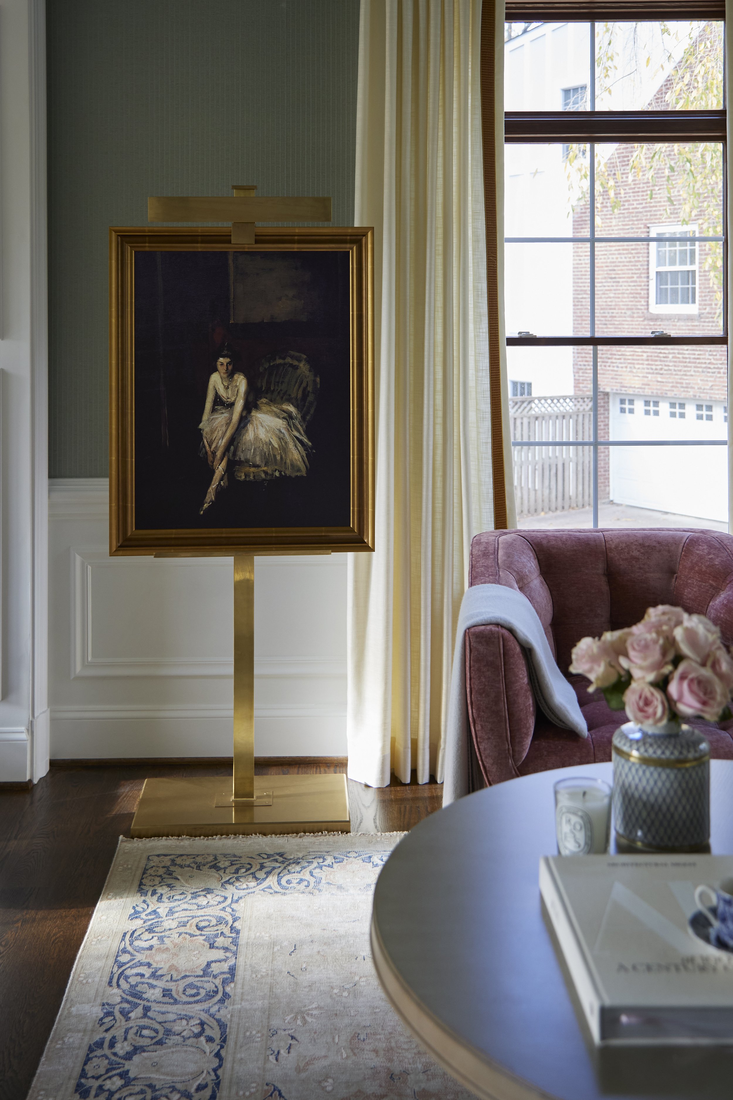
  • POWDER BATHS. Again, as a pocket square, Powder Baths are one of our top spaces to paper. If you are going to wallpaper a powder bath, make sure you paint the ceiling. The ceiling, trim, and doors need to be painted. If you’re going to go the distance of creating an atmosphere in a room, go all the way. Otherwise it will just look like wallpaper on a wall.

    We used a Gucci mural in our Tiger Oak Powder Bath. The pink herons are so fun in that space. And we did a Powder Bath in DC with the green version of the Gucci heron mural. It’s banana-pants. A really fun trick that we added here is a gyp door. A gypsum door is a door made out of the wall material, but there’s a handle so you can see where the wall actually opens. They have one on Stewart Little from the entry to a bathroom. Anyway, we did that to the Gucci crane. It’s so cool to open up what you think is a wall and see a field of cranes.

    Our boy, Cori, has Gucci in his Powder Bath. It’s the repeating tiger pattern and it only took 3 rolls for the space. Each roll was about $150 per roll (including shipping from Italy), so it’s not as unreasonable as you might think.

    Ashley Stark from the Stark kingdom (they make all those gorgeous carpets) used a Gracie in her Powder Bath. It’s a dark, dark navy and then she asked them to distress it a little bit so it feels like denim. You guys, that one has our heart! She has incredible taste! You should check out her home on Arch Digest.

  • BATHROOMS. Vinyls are a practical choice in bathrooms. They are great for any space where there is humidity or steam. Papers aren’t going to hold up as well and aren’t as washable. In Jess’ Powder Bath, there’s a Thibaut wallpaper that looks like painted linen. The look is almost as if the walls are upholstered. Jess says, “With all of my nephews that might miss the potty, I thought vinyl was a smart choice.” Vinyls really offer a lot of textures, including ones that look/feel like leather or ostrich skin.

  • DINING ROOMS. These are special places for wallpaper because they set a scene. Dining Rooms also usually have a start/stop point, which makes them work for papering. Grasscloths and textures are a great add to dining spaces because they soften sounds and create texture without overwhelming.

    With grasscloth, it’s important to point out that seams are a good thing! When you see grasscloth seams, it’s added texture and you know it’s real. It looks more expensive and adds a natural element and softness.

    We’re doing a Dining Room in Houston right now and using a Gracie mural. We also did a Gucci mural in a dining room in Holladay, UT. It’s more botanical floral and trees in pinks and greens. We can’t wait to share these with you guys!

  • LAUNDRY ROOMS. We were designing one this morning and we wanted to add some interest to all the function. It makes the space feel like less than a chore! Vinyls are a great choice for Laundry Rooms and these are also a fun place for some patterns and textures.
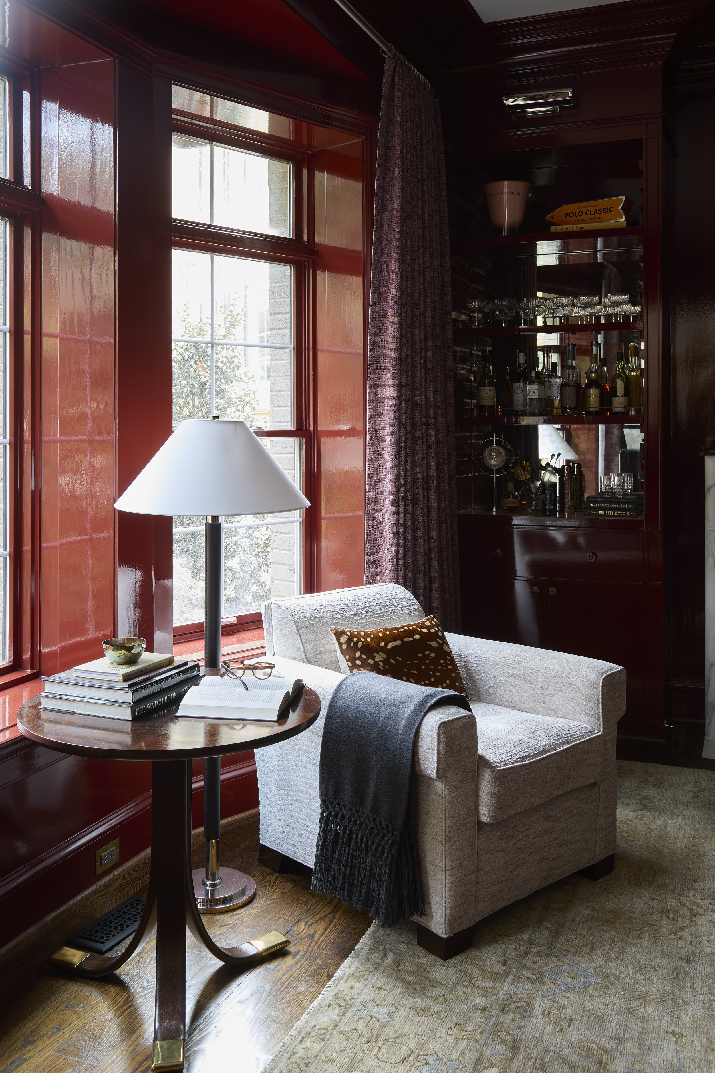
OUR TOP 6 WALLPAPER TIPS

  1. Clear Start/Stop. Go with wallpaper in a room where there is a clear start and stop. The idea is to be encompassed by the scene and you can’t create that if you are worrying about corners or openings into larger spaces. Some rooms have actual doors where it’s easy to terminate the wallpaper into the casing. An enclosed space creates separation and that pocket square feel.

  2. Wallpapering is a Professional Sport. If you’re going to do wallpaper, please make sure to use a professional to measure and tell you how many rolls to order. They calculate for waste as there are repeats and patterns to line up. If you are short a roll, you will have to end up paying extra in shipping and they dye lots may have changed. In addition to measuring, you’re going to want a professional to install wallpaper. This goes without saying, but it’s not the same as it was in the past with wallpaper soaking in the tub. We have such fond memories of all of the wallpaper books and the smell of paste. If the thought of that cost scares you, it’s worth just getting a quote or bringing them in for a small space and watching how they do it. They use laser levels, wallpaper tables, special paste, etc. You’ll quickly realize that it’s well worth the cost.

  3. Mind the Fine Print. Sell, ship, and price wallpaper differently. It’s confusing! Some are sold as a double-roll. Some are sold by the yard. Make sure that you talk to your professional and read the fine print.

  4. Pattern Play. For the most part, we try not to have 3 scaled patterns in a space - small, medium, and large. Unless, you’re a maximalist where everything is an all out pattern party.

  5. Custom Papers. Most of our art lines can output their art really large scale so you can use it on a wall or a ceiling. Unfortunately, they don’t sell to the public - they sell to the trade. In order to get access to that, you have to go through a Designer. Our To The Trade team can help you out with that. We have a Home Furnishing Design team that knows all of the Alice Lane resources and they connect you to our vendors. They have the keys to the kingdom.

  6. Wallpaper is Not Just for Walls. We love wallpapering the ceiling. The wallpaper on this theater room really expands the space. That wallpaper is one of our art lines - it’s a custom mural. The Tiger Oak Parlor ceiling is also an art mural ceiling. These are fun because they are not a scene with trees and flowers. They are more abstract. If you are going to wallpaper a ceiling, make sure to use a crown molding to give it a finish.

2020-06-19 ALH Craythorn9177-nicolegerulat.jpg

Papered Ceiling

This graphic wallpaper is a custom mural from one of our art lines. We think it makes the space!
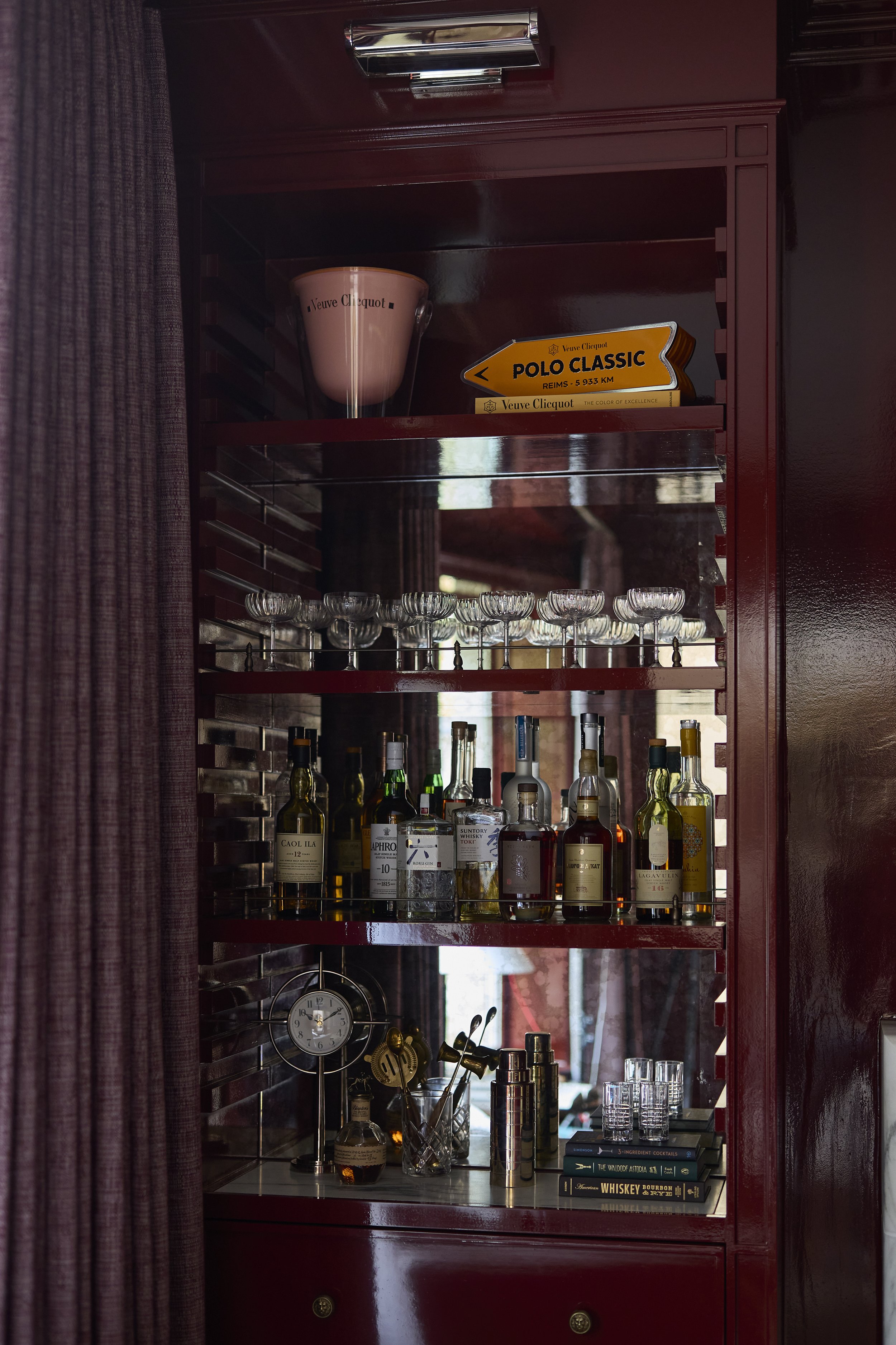
Wallpaper is having a moment right now. We’re including it in every home we design. And…we’re excited to announce that we’ll now be carrying a selection of papers on our website! This is huge for us and we’re so excited! Check it out and let us know what patterns, colors, or looks you’d like us to add to our selection.
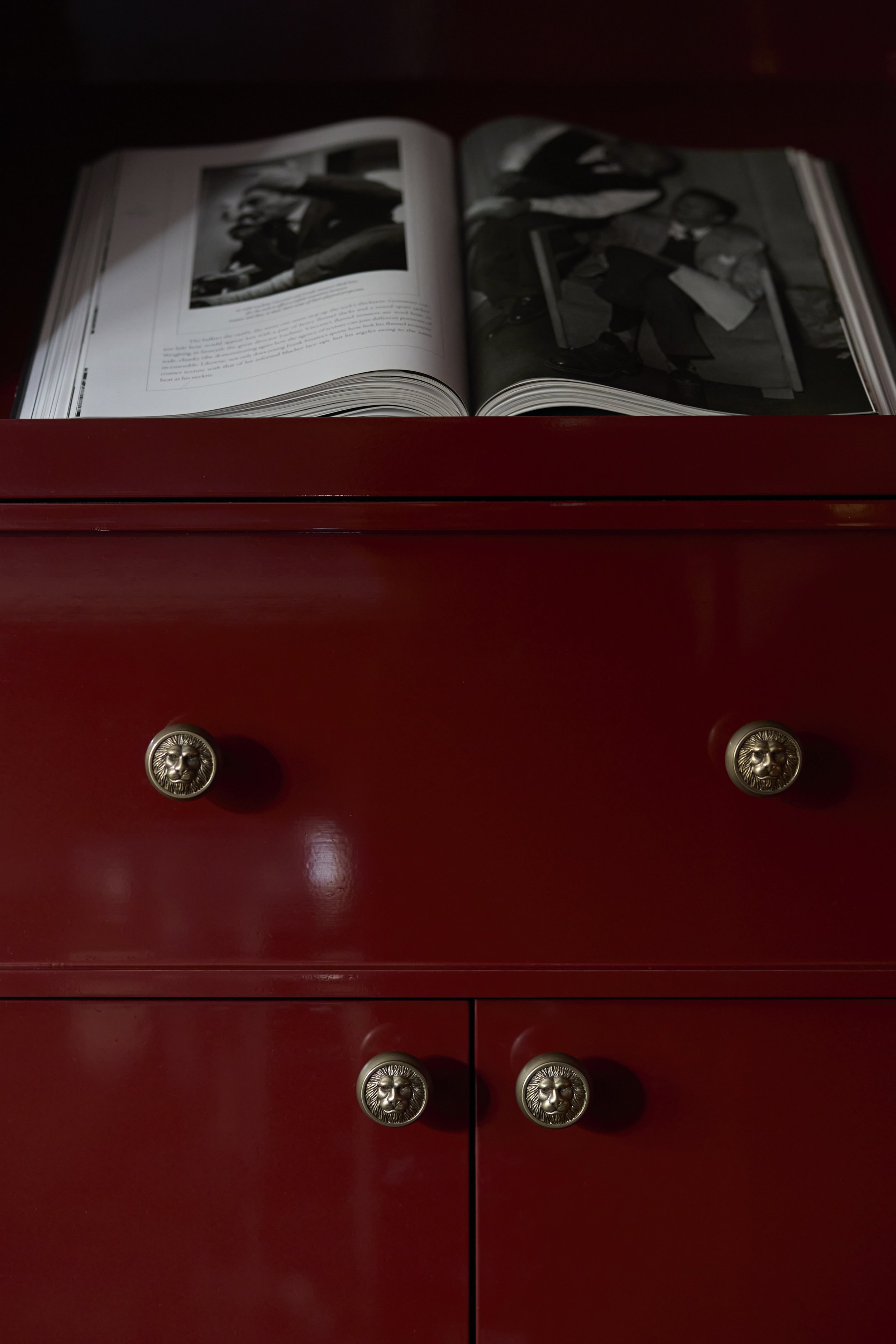
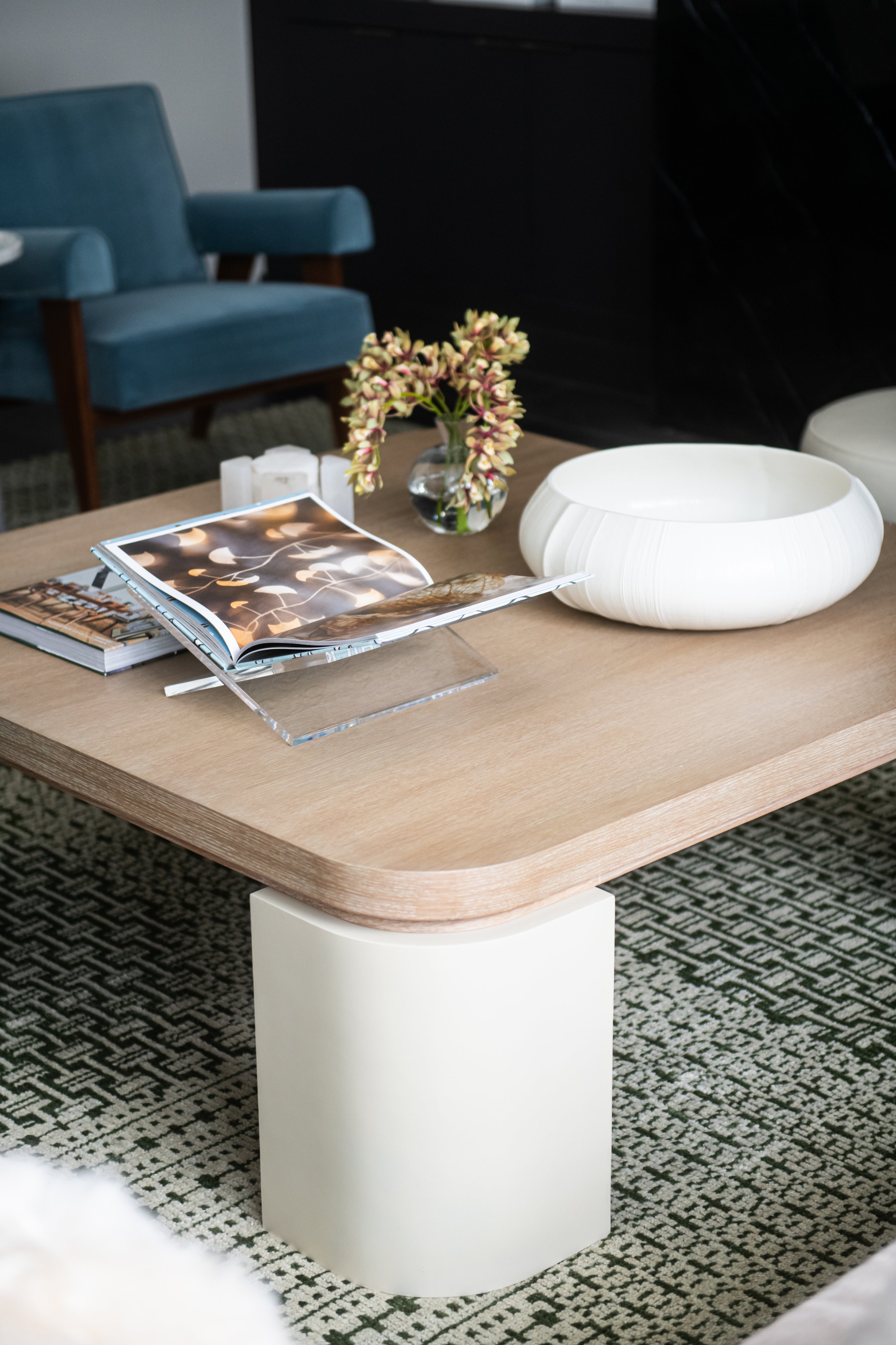
Any questions or podcast ideas? Email us at dearalice@alicelanehome.com