Dear Alice | Tiger Oak
/This week, we’re discussing another listener request. They wrote in asking for more information on one of our most beloved projects, Tiger Oak. This week’s episode can be found on Apple Podcast, Spotify, or Google Podcast.
Tiger Oak is one of the most celebrated homes that we’ve designed. This home was in the Utah Parade of Homes in 2018 and swept the awards, including “Best of Show”. In 2019, it also won “Kitchen of the Year” in House Beautiful. The home is still attracting a lot of comments and questions from our listeners, followers and fans. It’s one of our favorites too, because it allowed us to flex our design muscles and include some lifestyle tricks. All that aside, the best thing about Tiger Oak? The clients were along for the ride! We loved collaborating with the homeowners on this space.
ABOUT THE HOMEOWNERS | Tiger Oak was designed for Susan and Christian Peterson and their 2 children. They are a Renaissance family! Susan is the founder, CEO, and Chairwoman of @freshlypicked. Freshly Picked is known best for the charming children’s moccasins. The brand is colorful, has tremendous craftsmanship, and has killer collaborations (Target, Nordstrom, Disney). Christian is an incredible cook (hence the incredible kitchen) and he’s also a drone racer! Such an interesting family!
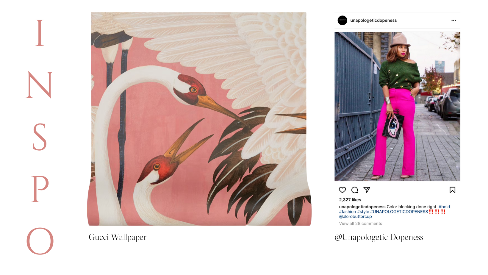
This all started one evening when ALID’s Suzanne Hall was getting ramen with her family and ran into Susan. The two chatted about “building a house together” and the dream grew into Tiger Oak. Susan wears all black (usually with a stunning pair of sneakers), so we were curious about designing a living space for the family. At our first meeting, Susan blew us away by bringing a photo of the Gucci heron wallpaper (pink pattern). As soon as she put that in front of us, it was GAME ON! On another occasion, Susan sent a screenshot of an instagram post from @unapolageticdopeness of an outfit pairing bright pink fuchsia and olive green. You’ll see that we used that as inspiration in her kitchen. Susan’s mind and soul is in color. She pushed us and together we created a space with a lot of attitude - something remarkable.
OVERVIEW | Tiger Oak is a 10,000 square ft. home in Utah. It’s split into 3 levels and we won’t have time to cover it all, but we’ll hit the highlights.
The colors throughout this home are hard to describe. They change with lighting and have layers. The best colors do this! This home also features a lot of dark trim, mullions, casings. We love this because your eye will stop at light, but keep moving past dark colors. So, when you look through this home, you move past the trim and it makes the adjacent areas feel inclusive. This also happens because the floorplan is so open. When you are in the Entry, you can see through to the back of the house and the rooms build on one another with color and texture.
Each furniture piece is a hero. The details were thoughtfully curated. The team working on Tiger Oak has such a love for old, vintage, and antique pieces. You’ll see this throughout the space.
The home is opinionated, but so many people said, “This home is totally me.” It’s interesting because the home is SO SUSAN, unlike anything we’d done and not trending. More than 20,000 people walked through Tiger Oak and would come back through multiple times to really take in everything.
Let’s walk through some of the highlights…
PHOTOGRAPHY BY NICOLE GERULAT
ENTRY
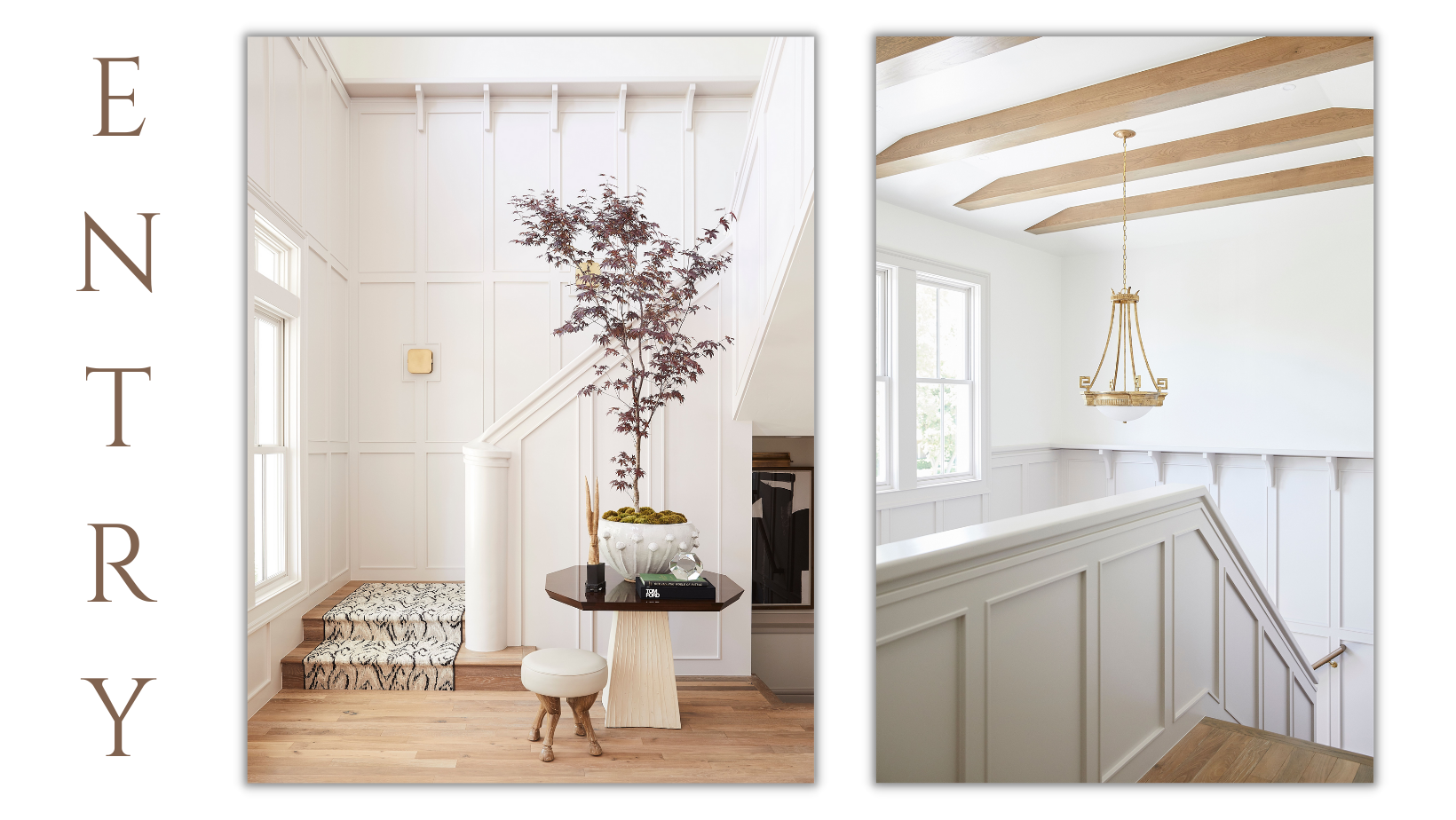
The Entry is very hotel-like. The double story space is bright and welcoming with beautiful finish work and a soft marshmallowy color - Reticence by Sherwin Williams. The architect created this hotel moment by making the entry two-story, but keeping the footprint intimate.
Our design team did paneling around the whole stair rail, adding to the old hotel feel. The paneling is also nice for privacy because not everyone can see you coming down the stairs.
The ceiling beams communicate with the flooring. And the runner! It was a splurge, but that flame-stitched effect just brings out the shades of the tissue paper pink wall color.
PHOTOGRAPHY BY NICOLE GERULAT
PARLOR
Off of the Entry, you turn right into the Parlor and it’s an immediate shift. The Parlor pulls you in and the whole room hugs you. The furnishings are deep and moody and go with the wall color. Selecting that paint color was something we took time in doing. We went through so many before deciding on this tealy-olive color that just felt like Susan and helped us tell the story for the rest of the home.
One of the only pieces of furniture that the Peterson family brought with them from their previous home is the standing piano (not a baby grand) that’s in the Parlor. They wanted the Parlor to feel relaxed (not stuffy). The piano at an angle gives this space an approachable vibe and the custom fireplace is one to celebrate. It has a Narnia feel and cozies up the space. Our Lead Designer on the project had a dream about a round fireplace. When we took it to the builders (Robinson Home Builders), they were like, “Yeah, we can do that.” This rarely happens, so we were so excited!
The ceiling treatment is so rad! We have an art vendor that scaled that piece of art to fit the ceiling. The ceiling is so special, but the neon sign makes it even more magical. We had the neon sign crafted with something Susan always says to her kids - “DON’T LOOK AROUND, LOOK UP”. It just worked in this space! This personal touch is a message to her children. Having a family mantra on display, in such a rock-n-roll way, makes the room extra special and is an example of how you can include things you love in a beautiful way.
PHOTOGRAPHY BY NICOLE GERULAT
DINING ROOM
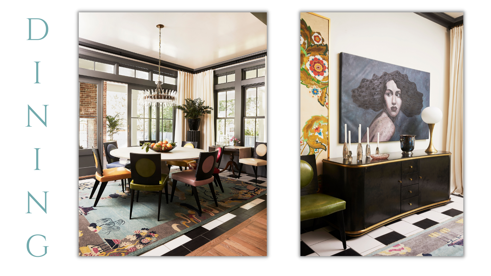
We wanted to Dining Room to feel a part of everything, but we also wanted to create definition. We cased it out so that it feels like it’s own cocoon. The Dining Table is a 72” Round with different, COLORFUL chairs. Each chair was its own color! Susan works in leather (ahem…moccasins). So, when we showed her a few of the chair colors, she got excited and wanted to see all the options. She ended up adding a hot pink leather that stuns. There was such magic in this collaboration and it was fun to play to her strengths. The other side of the Dining Room features an incredible credenza and a bold piece of art. We also included an antique drop-leaf table that one of our designers found at an antique store. This is where Susan eats her breakfast grapefruit every day.
PHOTOGRAPHY BY NICOLE GERULAT
KITCHEN
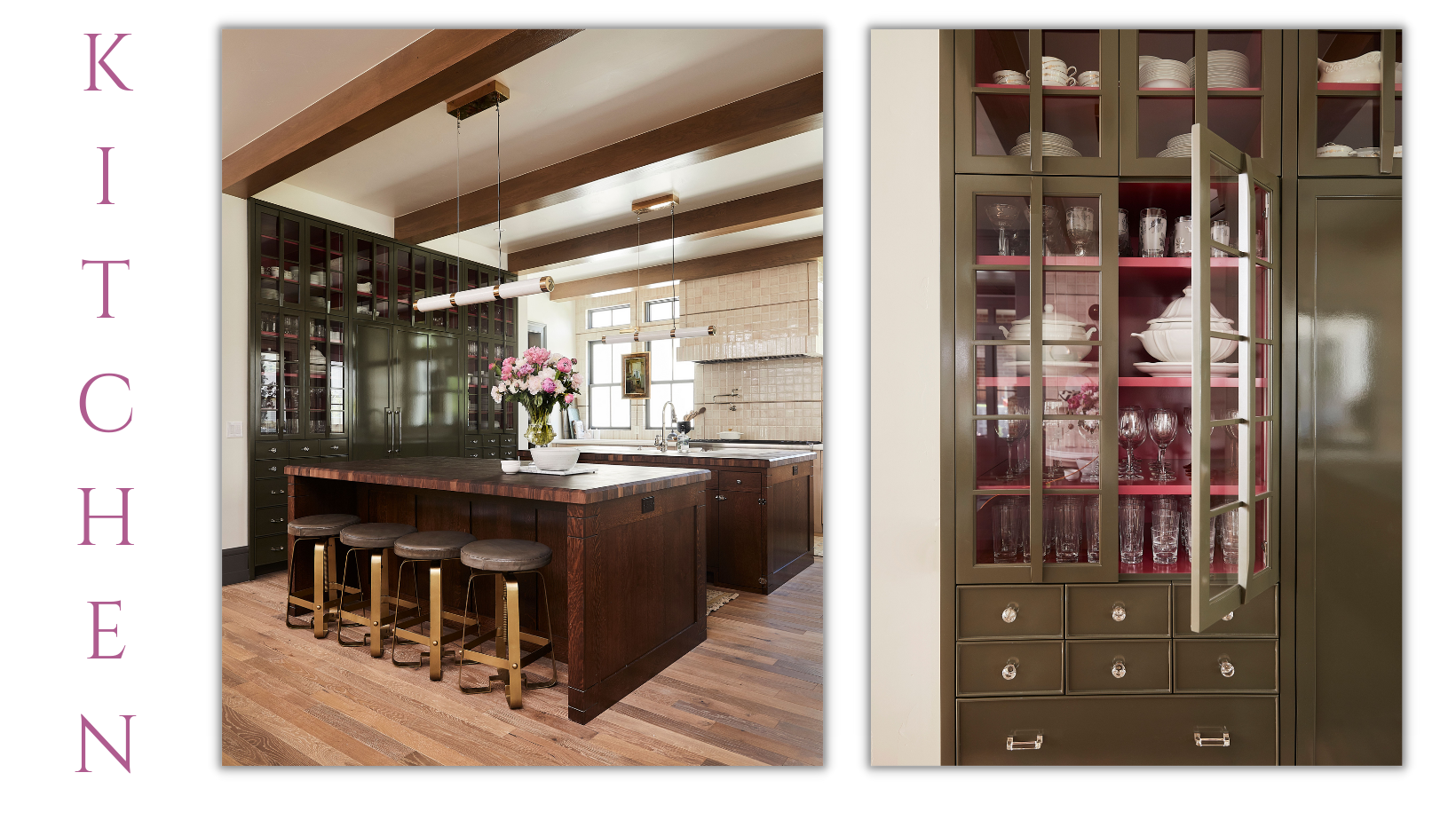
From the Dining Room opening, you enter the Kitchen. This Kitchen is tricked out in a very charming way and is actually how we got the name for the home. The craftsmanship in the tile work is incredible. And there are so many beautiful windows, so there aren’t upper cabinets. The lower cabinets are a warm putty color, which allows the display cabinet to shine. Next to the fridge, this beautiful cabinet showcases the stunning Depression Ware glass passed down from her mother. We originally had different colors picked out for this cabinet, but when Susan sent over that inspo outfit, we were inspired to change the colors to olive and fuchsia.
Tiger Oak was actually named after the wood used in the kitchen on the 2 islands and the gorgeous antique Hoosier Cabinet (def: A Hoosier Cabinet is a roll-top secretary with brass hardware). The Hoosier Cabinet made of Tiger Oak Wood had us all fluttery. So, we went big with it! This kitchen has 2 Tiger Oak islands - one topped with butcher block and one with marble. The marble top has grooves carved into it for a drying space and the butcher block top has a trash hole cut into it.
Other areas where there are special functions for this family are with the Soda station and service window. We put a soda station in because they love soda! And we made it beautiful. The ice machine opens up and there’s room for cups and lids behind the doors. The service window is so fun when they are making pizza or hanging out on the deck. They can open up the service window and it expands the space. These details make the room!
PHOTOGRAPHY BY NICOLE GERULAT
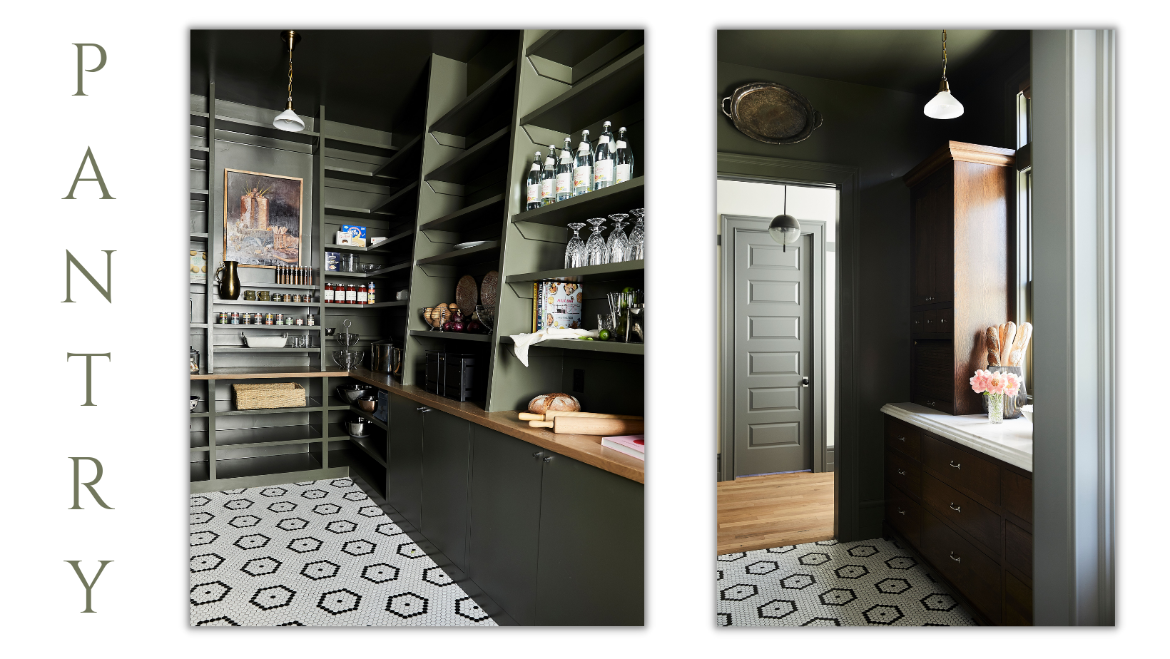
PANTRY
This is a favorite space for a lot of people because they haven’t experienced a pantry like this before! And neither had we. The whole pantry is painted this warm olive green, which contrasts the black and white square tiling. The tiling is an area where we pulled back on materials to stay within budget. This happens on builds. We decide where to prioritize spend. The Petersons actually cook, so they needed storage. The shelving is a fun angle and the opPainted the whole Pantry olive green. They are cooks, so they needed storage. We included rows of open shelving and cabinetry to meet their needs. One of our favorite features is the artwork. This piece is one of Susan’s first original pieces of art. It’s a moody still life and we framed it out in finish work to show it off in the space.
PHOTOGRAPHY BY NICOLE GERULAT
POWDER BATH
The Gucci wallpaper. Applause. This is the first time that we had seen it (in 2018) and we’re still seeing it today because it’s that good. And now there’s a green version. This wallpaper is just so much bigger than life. The panels each feature their own design with herons flying. It’s so much fun to customize and assemble. We also carried the wallpaper pink onto the ceiling. And who doesn’t look great in pink?
There’s more here than just the wallpaper though…The custom-built antique vanity and the pull flush toilet add so much to the charm of this space!
PHOTOGRAPHY BY NICOLE GERULAT
MASTER BATH
There are so many more rooms to cover, but we would be remiss if we didn’t touch on the Master Bathroom. After looking at the architect’s plan, we shuffled things around to work better for Susan and Christian. We learned about their routines. Susan is an early riser and gets up before Christian. She wanted to take a bath, grab a coke, and be on her way without disturbing her husband. So, we adjusted the flow and made it so that the Master Bedroom leads to the Master Bathroom, through the Master Closet, and into a Laundry Room. In the Laundry Room, we included a Coke machine for Susan. What a great way to start a day!
The countertops are tourmaline and there is an interesting integration with the stone along the whole vanity, with different levels. In learning more about the family, we realized that they needed a vanity and room for products MORE than they needed 2 sinks. There’s also not really a need for a mirror to brush teeth, so we put a window above the sink and then placed the mirror above the vanity table. The tub has its own moment. Putting it up on a platform really celebrates it and makes it feel grand!
We had so much fun with this home and with the Peterson family. And it was fun to talk more about and dig in with you. As always, if you have any question or ideas, email us at dearalice@alicelanehome.com

