Dear Alice | Wallpaper - Fashion for Your Walls
/This week, we’re discussing one of our favorite things that actually came in as a request from a listener. WALLPAPER! This week’s episode can be found on Apple Podcast, Spotify, or Google Podcast.
“Those of you decorating homes in the 80’s are probably getting an itch right now and thinking, “I don’t know about wallpaper.” Or maybe you just finished taking down an outdated border. But, this is not your mama’s wallpaper! The wallpaper game has changed in a big way. ”
We’re thrilled to be able to talk about wallpaper. It’s one of our favorite topics right now. Wallpaper is art for your wall. There are so many types of wallpapers and so many spaces where wallpaper works! It’s an awesome way to make a space feel finished.
There are all kinds of papers - large patterns, small patterns, murals, textures, vinyls, and grasscloths. We’ll give tips for each one and where we use them.
MURALS
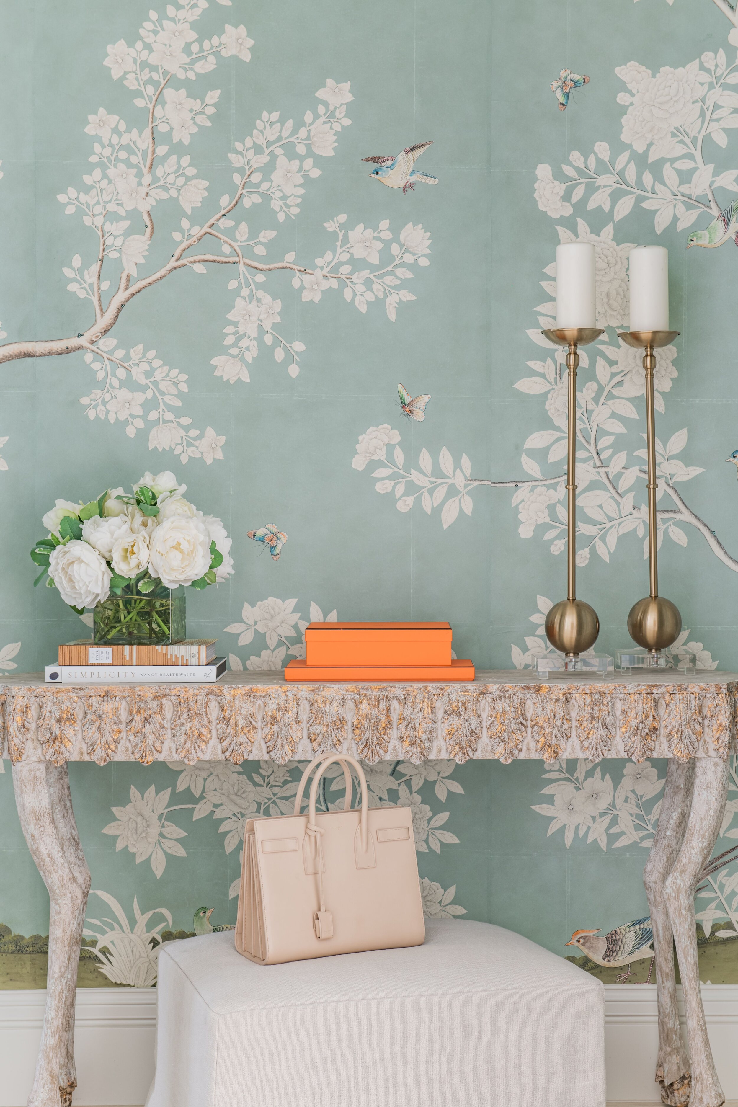
Everyone’s favorite right now is a mural. Gracie papers are extraordinary - each one is handpainted and creates a work of art. The Gracie family is in New York and their papers handpainted in France. These murals are an Investment for sure, but they create quite a scene. Gracie will send you a handpainted sample of it that you can approve. If nothing else, follow Gracie Paper on Instagram. It’s so beautiful to see all the rooms and scenes.
We also love Schumacher and Gucci (hello, herons!) for their murals and panels.
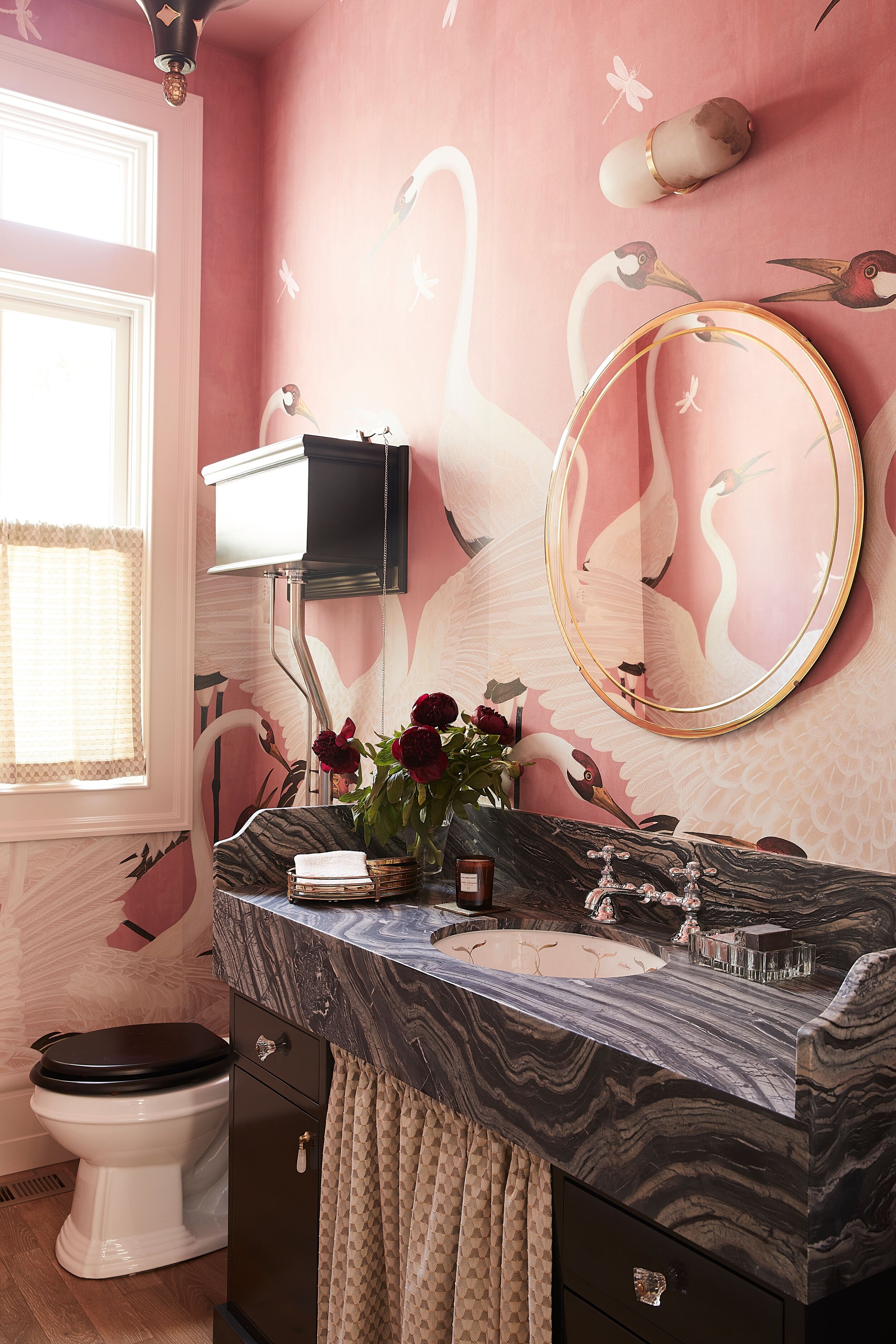
Gucci and Gracie are both going to give you bragging rights. And, Gucci actually ends up being fairly affordable (see Cori’s details below on his Powder Bath). This is a side note, but the Gucci packaging is the most beautiful packaging that we’ve ever seen! Each roll is in it’s own Gucci box - an off-white linen box with brown borders and a handle. It’s ridiculous. (Not sponsored (we wish). We’re just fans.)
Ordering murals is an experience. First, you select the pattern you like. When you go to order them, you’ll find about 25 different panels to choose from. It’s fun because then you can pick and choose your scene according to your space and what you want to feature.
Murals are an escape. These larger-than-life patterns are fun to get to use everyday and it will ignite you. It’s like Narnia - you open up a scene and gasp!
WHERE DOES WALLPAPER BELONG?
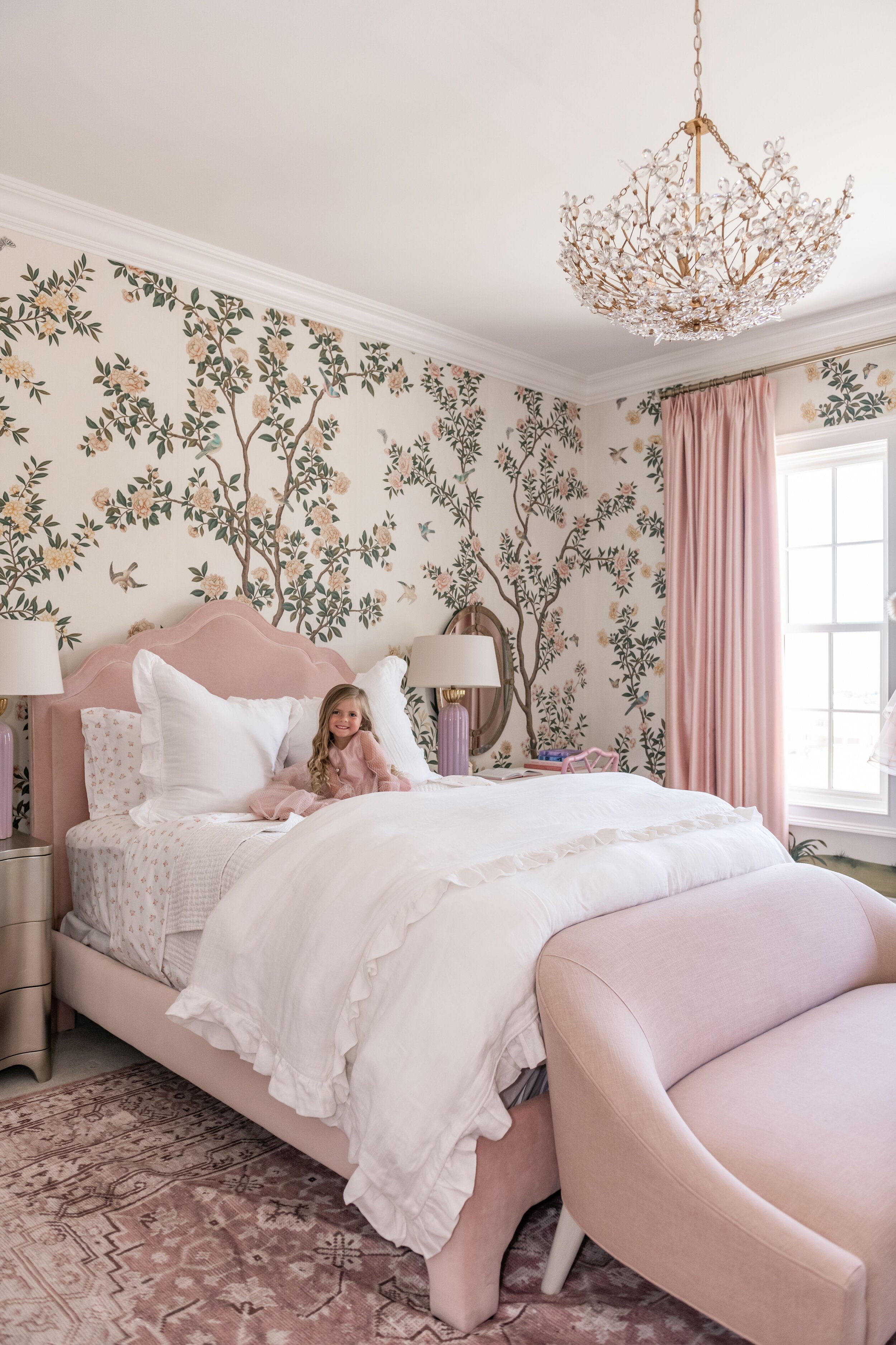
BEDROOMS. We love murals in Bedrooms. In Rachel Parcell’s house, we did murals in Rachel’s Master Suite and in Isla Rose’s Bedroom. It’s a larger-than-life experience and sets such a mood.
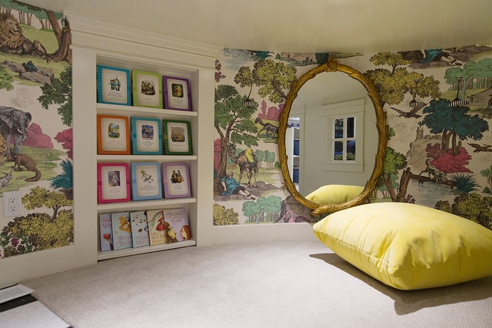
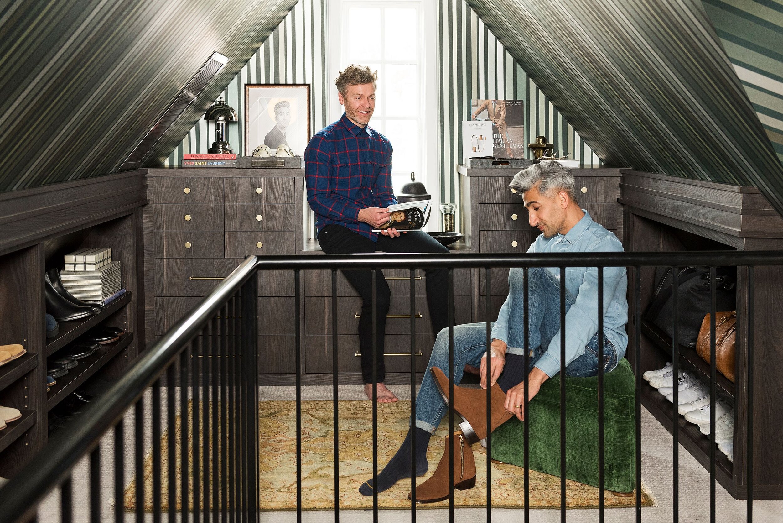
SMALL NOOKS AND CLOSETS. Potty Closets in primary bathrooms are small spaces and it’s fun to add a bit of interest here. We were looking at a rendering yesterday with a large pattern and it just makes that closet so magical. There’s also room here for small patterns and textures.
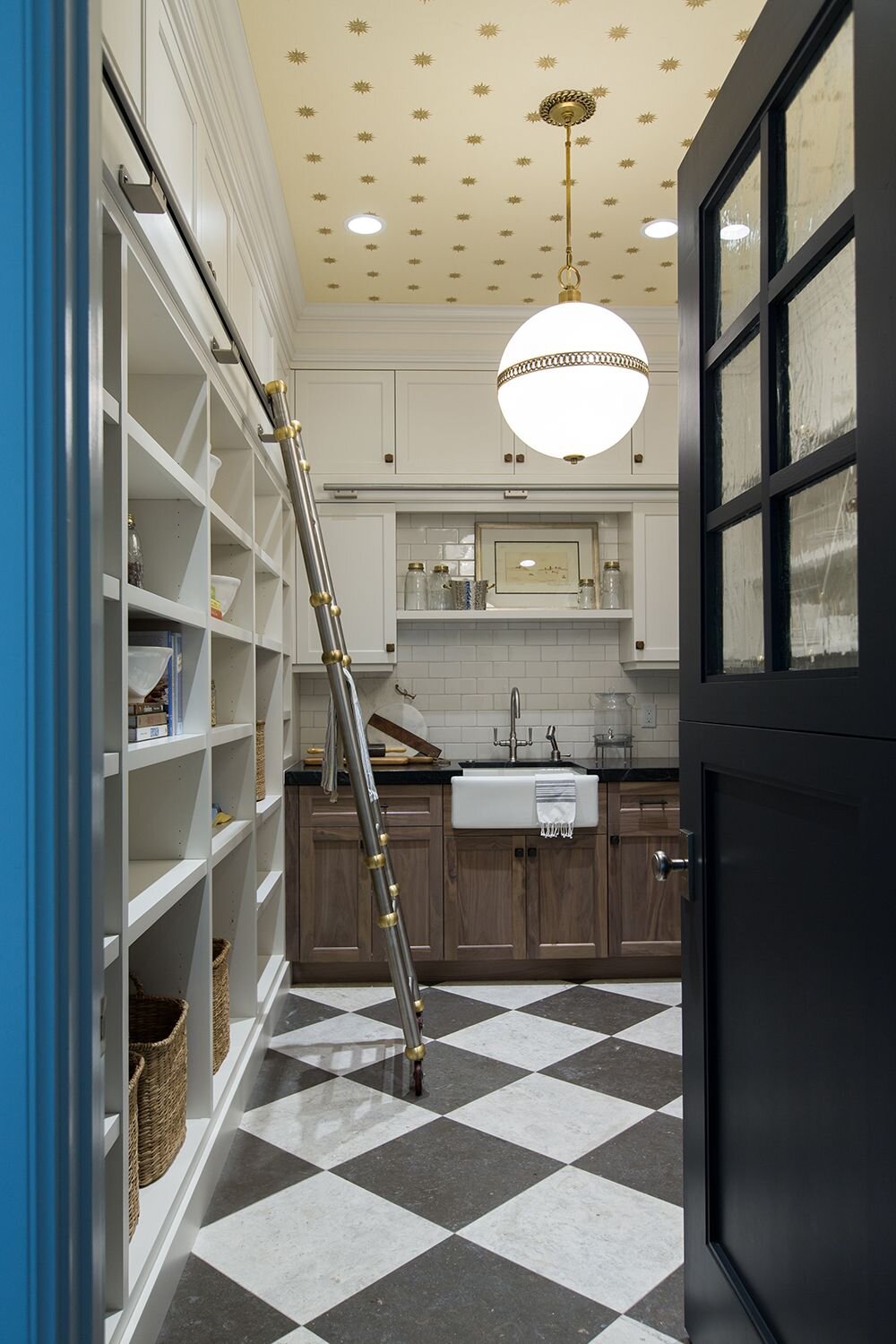
Small spaces are a pocket square moment where a punch of pattern will dress up the rest of the space. Small, repeating, and geometric prints are so dynamic in these small spaces. You really feel the repeat. We just did a small pattern paper in Texas in a Butler’s Pantry. Our client is traditional, so the paper is a hand-blocked pattern so it isn’t overly dressy and works in the pantry. It’s like the inside of a designer box!
House Beautiful recently highlighted the concept of a Party Pantry. The idea here is that you have a space for all of your entertaining items - all vases, platters, china, silver, tablecloths, etc. Michelle Nussbaumer ‘s kitchen was named the 2019 “Kitchen of the Year” by House Beautiful. She has a breathtaking arty pantry. It’s a cake for your eyeballs. The color of the cabinetry and level of detail is just amazing. If you love to entertain and have a space to transform or build, a party pantry would be a fun addition.
Walk-In Closets are another space that most people don’t think to wallpaper. We especially love wallpaper in a child’s closet. We had a client that papered their child’s walk-in closet and it created a magical fashion moment. She loved to hang out in there!
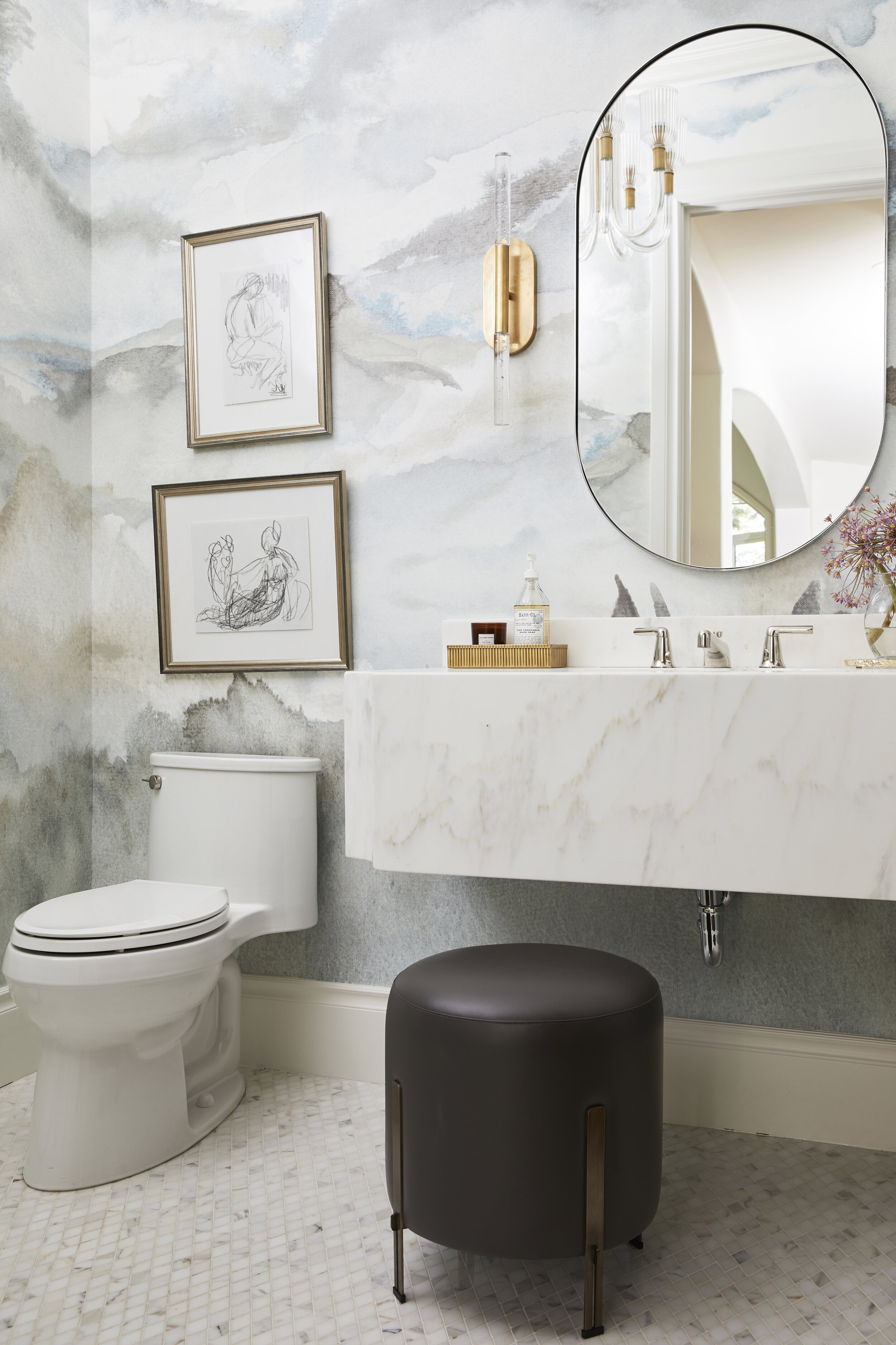
POWDER BATHS. Again, as a pocket square, Powder Baths are one of our top spaces to paper. If you are going to wallpaper a powder bath, make sure you paint the ceiling. The ceiling, trim, and doors need to be painted. If you’re going to go the distance of creating an atmosphere in a room, go all the way. Otherwise it will just look like wallpaper on a wall.
We used a Gucci mural in our Tiger Oak Powder Bath. The pink herons are so fun in that space. And we did a Powder Bath in DC with the green version of the Gucci heron mural. It’s banana-pants. A really fun trick that we added here is a gyp door. A gypsum door is a door made out of the wall material, but there’s a handle so you can see where the wall actually opens. They have one on Stewart Little from the entry to a bathroom. Anyway, we did that to the Gucci crane. It’s so cool to open up what you think is a wall and see a field of cranes.
Our boy, Cori, has Gucci in his Powder Bath. It’s the repeating tiger pattern and it only took 3 rolls for the space. Each roll was about $150 per roll (including shipping from Italy), so it’s not as unreasonable as you might think.
Ashley Stark from the Stark kingdom (they make all those gorgeous carpets) used a Gracie in her Powder Bath. It’s a dark, dark navy and then she asked them to distress it a little bit so it feels like denim. You guys, that one has our heart! She has incredible taste! You should check out her home on Arch Digest.
BATHROOMS. Vinyls are a practical choice in bathrooms. They are great for any space where there is humidity or steam. Papers aren’t going to hold up as well and aren’t as washable. In Jess’ Powder Bath, there’s a Thibaut wallpaper that looks like painted linen. The look is almost as if the walls are upholstered. Jess says, “With all of my nephews that might miss the potty, I thought vinyl was a smart choice.” Vinyls really offer a lot of textures, including ones that look/feel like leather or ostrich skin.
DINING ROOMS. These are special places for wallpaper because they set a scene. Dining Rooms also usually have a start/stop point, which makes them work for papering. Grasscloths and textures are a great add to dining spaces because they soften sounds and create texture without overwhelming.
With grasscloth, it’s important to point out that seams are a good thing! When you see grasscloth seams, it’s added texture and you know it’s real. It looks more expensive and adds a natural element and softness.
We’re doing a Dining Room in Houston right now and using a Gracie mural. We also did a Gucci mural in a dining room in Holladay, UT. It’s more botanical floral and trees in pinks and greens. We can’t wait to share these with you guys!
LAUNDRY ROOMS. We were designing one this morning and we wanted to add some interest to all the function. It makes the space feel like less than a chore! Vinyls are a great choice for Laundry Rooms and these are also a fun place for some patterns and textures.
OUR TOP 6 WALLPAPER TIPS
Clear Start/Stop. Go with wallpaper in a room where there is a clear start and stop. The idea is to be encompassed by the scene and you can’t create that if you are worrying about corners or openings into larger spaces. Some rooms have actual doors where it’s easy to terminate the wallpaper into the casing. An enclosed space creates separation and that pocket square feel.
Wallpapering is a Professional Sport. If you’re going to do wallpaper, please make sure to use a professional to measure and tell you how many rolls to order. They calculate for waste as there are repeats and patterns to line up. If you are short a roll, you will have to end up paying extra in shipping and they dye lots may have changed. In addition to measuring, you’re going to want a professional to install wallpaper. This goes without saying, but it’s not the same as it was in the past with wallpaper soaking in the tub. We have such fond memories of all of the wallpaper books and the smell of paste. If the thought of that cost scares you, it’s worth just getting a quote or bringing them in for a small space and watching how they do it. They use laser levels, wallpaper tables, special paste, etc. You’ll quickly realize that it’s well worth the cost.
Mind the Fine Print. Sell, ship, and price wallpaper differently. It’s confusing! Some are sold as a double-roll. Some are sold by the yard. Make sure that you talk to your professional and read the fine print.
Pattern Play. For the most part, we try not to have 3 scaled patterns in a space - small, medium, and large. Unless, you’re a maximalist where everything is an all out pattern party.
Custom Papers. Most of our art lines can output their art really large scale so you can use it on a wall or a ceiling. Unfortunately, they don’t sell to the public - they sell to the trade. In order to get access to that, you have to go through a Designer. Our To The Trade team can help you out with that. We have a Home Furnishing Design team that knows all of the Alice Lane resources and they connect you to our vendors. They have the keys to the kingdom.
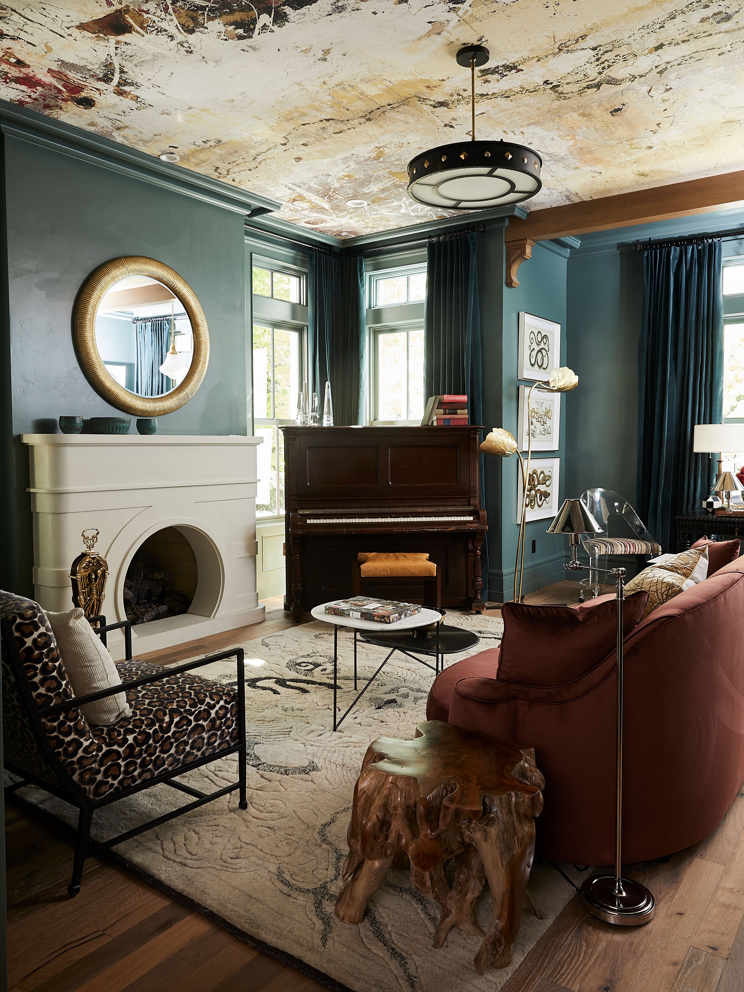
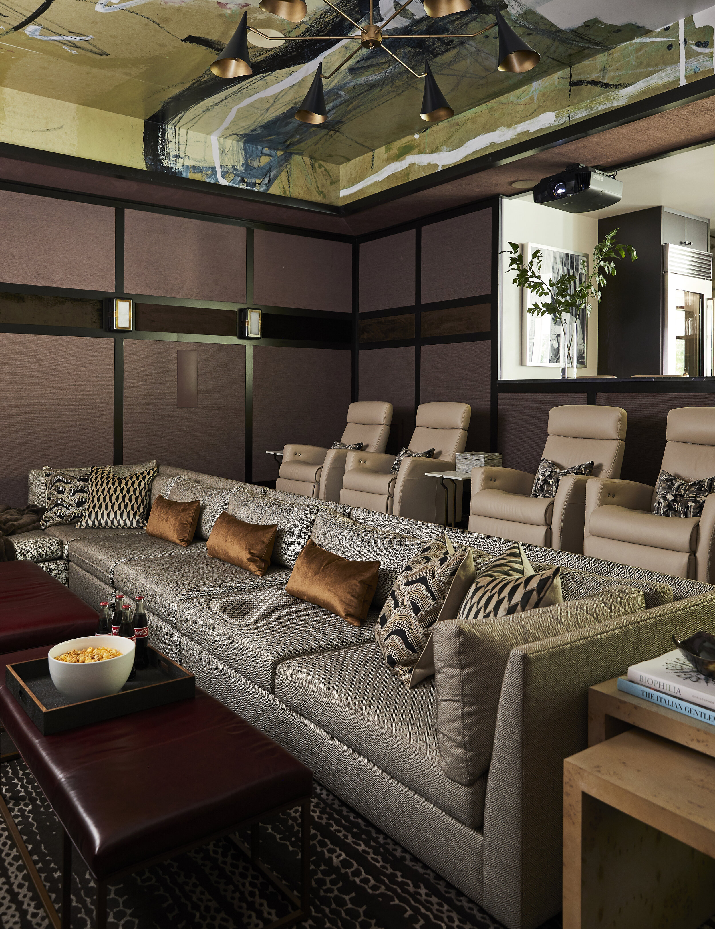
Wallpaper is Not Just for Walls. We love wallpapering the ceiling. The wallpaper on this theater room really expands the space. That wallpaper is one of our art lines - it’s a custom mural. The Tiger Oak Parlor ceiling is also an art mural ceiling. These are fun because they are not a scene with trees and flowers. They are more abstract. If you are going to wallpaper a ceiling, make sure to use a crown molding to give it a finish.
Papered Ceiling
This graphic wallpaper is a custom mural from one of our art lines. We think it makes the space!
Wallpaper is having a moment right now. We’re including it in every home we design. And…we’re excited to announce that we’ll now be carrying a selection of papers on our website! This is huge for us and we’re so excited! Check it out and let us know what patterns, colors, or looks you’d like us to add to our selection.
Any questions or podcast ideas? Email us at dearalice@alicelanehome.com

