Design Mistakes and How to Avoid Them: Part 2
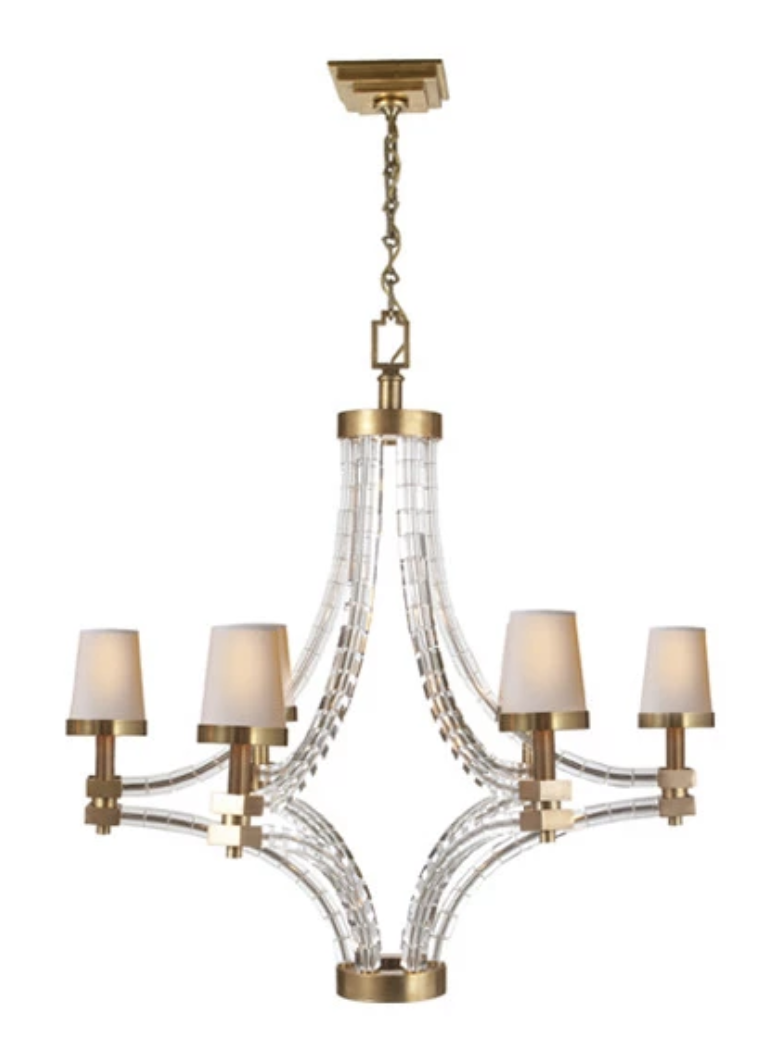
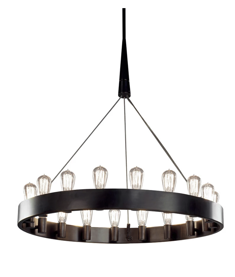
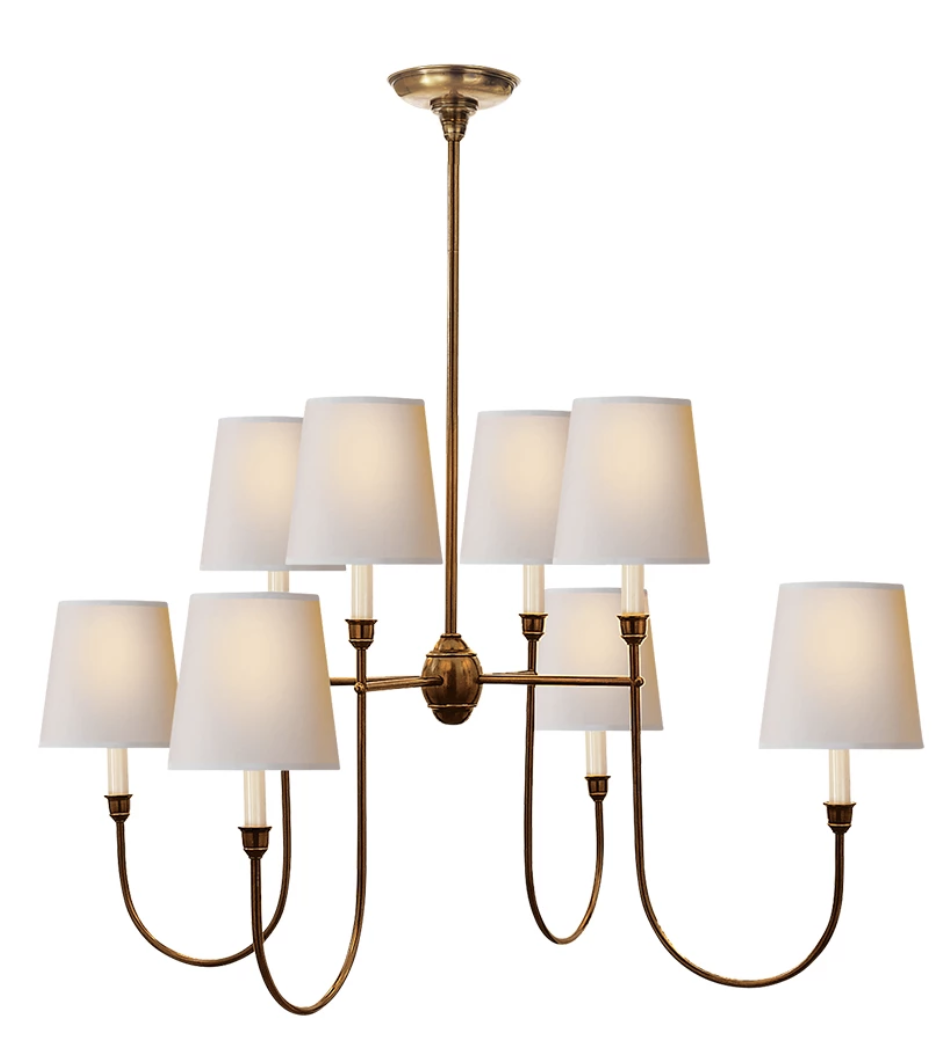
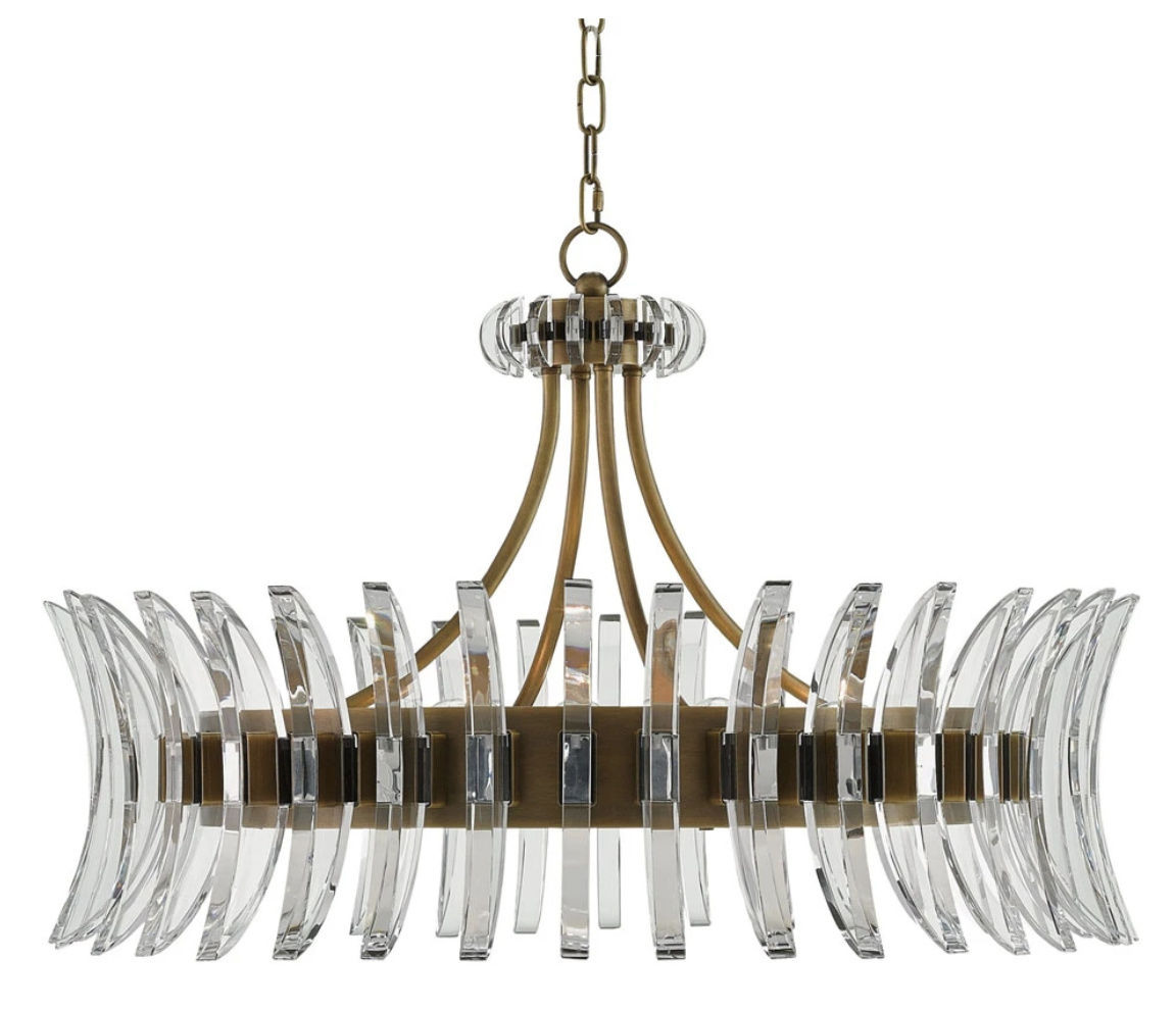
/Design mistake number 2 is all about lighting. We always say that lighting is the jewelry of a room and it can really make or break it. To make the most out of your lighting, you want it to be substantial and to feel balanced with the rest of the space. Luckily, adding or updating your light fixtures is an easy way to finish your space and add a refreshing update. First things first: if you have a boob light (you know the one) it’s time to switch it out with something bigger and better ;)
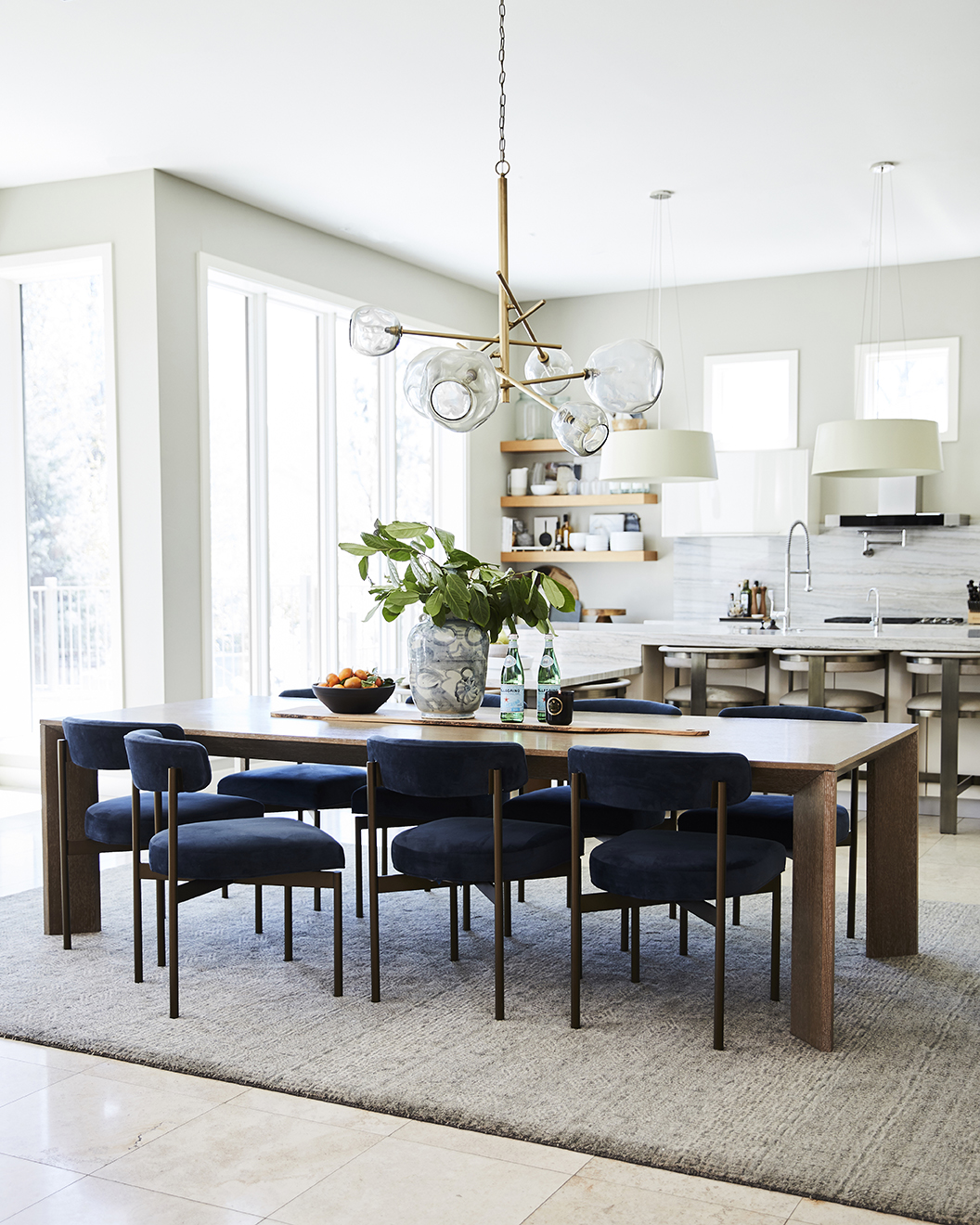
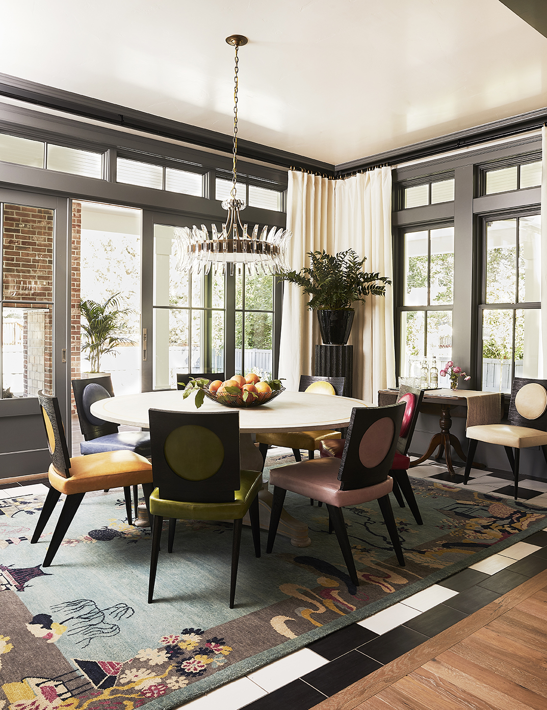
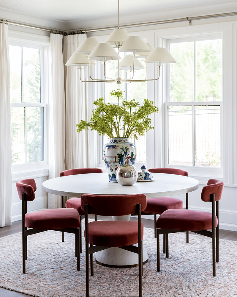
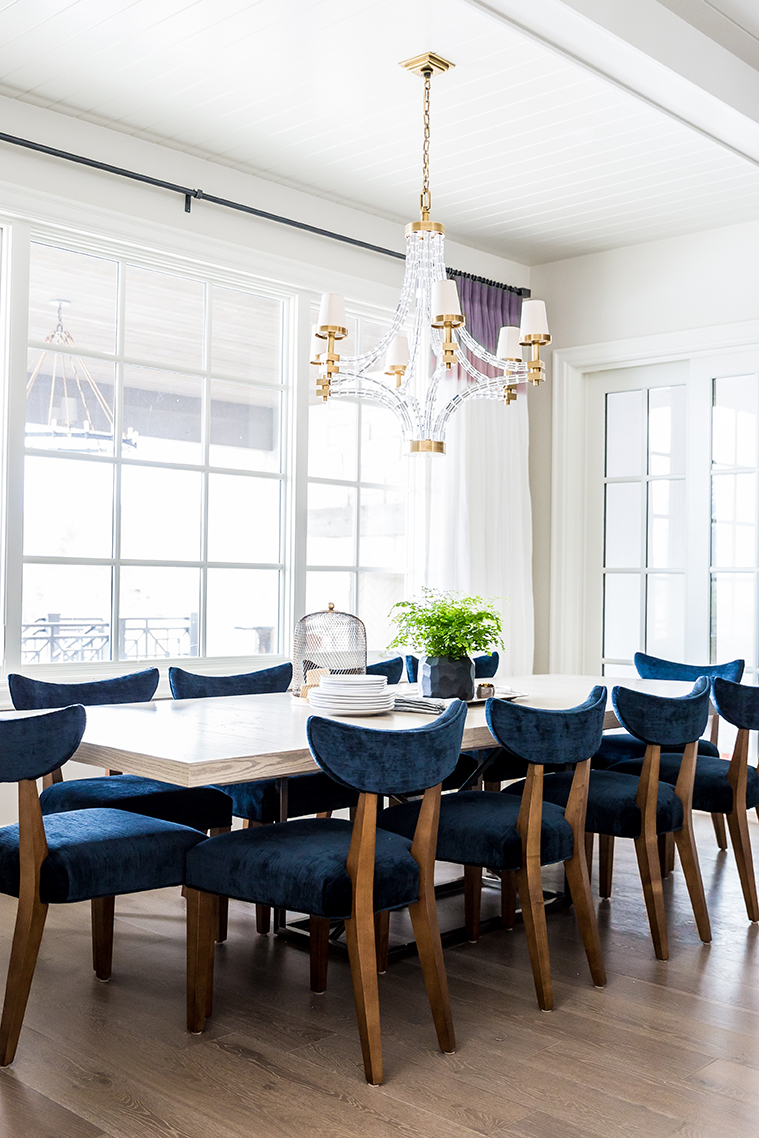
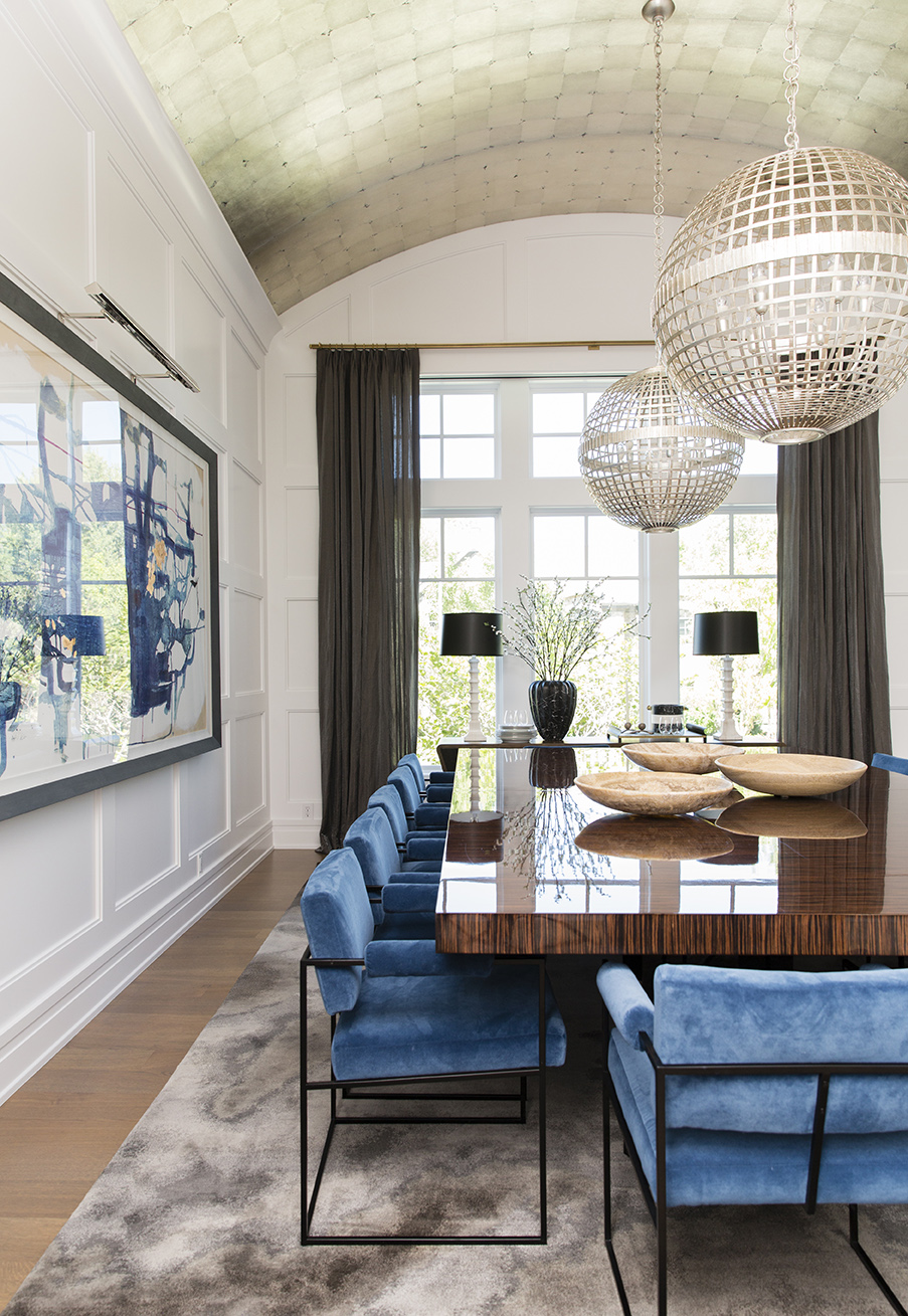
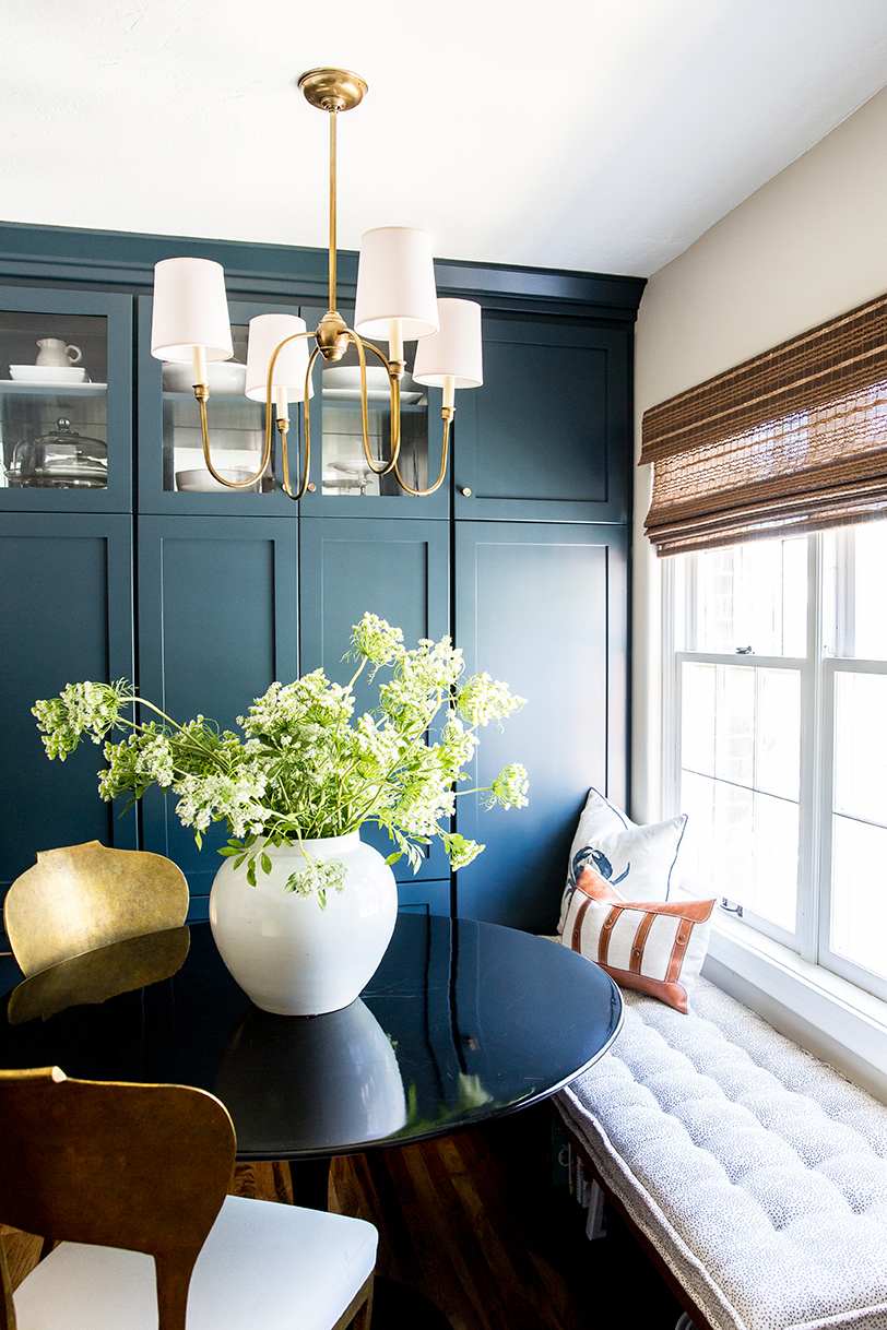
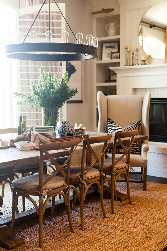
When it comes to lighting, we typically see these two mistakes: It’s hung too high and/or it’s too small for the space. Here’s how to fix all your problems: Light fixtures above a dining table, kitchen island or other surface should have 36”-38” from the bottom of the fixture to the top of the surface. If you have a double story dining room or super tall kitchen ceilings, take that in to account when you’re finding the right lighting. You’ll most likely need to buy additional chain or extension rods and have your lighting wired to hang a bit longer. It may see like a pain but trust us, it will be worth it.
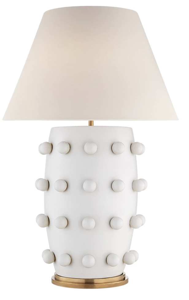
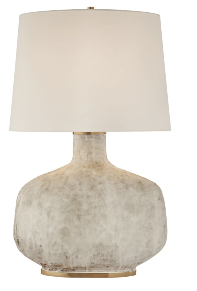
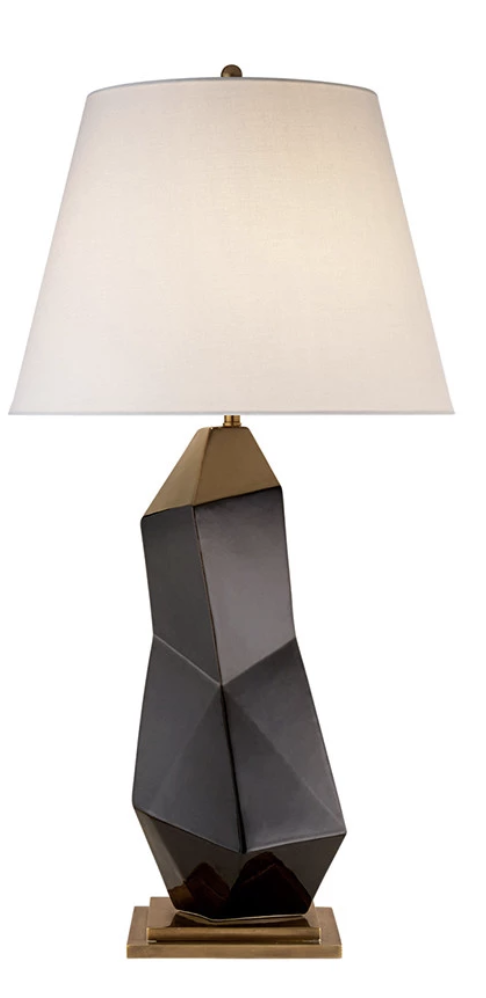
Now, scale. This is a concept that is forgotten about 99% of the time when people are styling their home. You know when you walk into a room and something feels a little off but you can’t quite put your finger on it? It’s probably that something in the room is too small. When you’re shopping around for lighting, you should always go bigger than you would initially think, especially in tall open rooms. This goes for chandeliers, pendants, table lamps and floor lamps. Having the right size lighting will pull everything together and your room will feel sophisticated and luxe.
So, where are you going to start in your home?


