The Parcell Entryway

The Parcell Entryway

Making an entrance is a designer’s dream, especially when your client is taste maker and influencer, Rachel Parcell. She is known for her beautifully fashioned looks that she has shared from her entry selfie mirror for years now. In her new home we created a few photogenic scenes in the entry where she could take snaps of her lifestyle and where her guests could be welcomed in for one of her picture worthy events. Here is a peek into her beautiful new home, where she lives with her husband Drew, two darling kids and their pup, Dash!

This gracious space boasts tall ceilings, custom finish work and intricate floor design. We really wanted to evoke Rachel’s love for high fashion and small details from top to bottom. To get the inside scoop, we sat down with…

Read More

Show N' Tell — Suite Escape

Show N' Tell — Suite Escape

When we approached Emily Jackson of Ivory Lane about her dream bedroom, she had one request: "I want it to feel like a spa." As designers, we put our minds together to create a calm, inviting space where Emily could relax (especially with twins on the way!). We designed the room to make it feel like an outfit Emily would wear—refined silhouettes, sophisticated color palettes, traditional with a modern twist.

We've fallen head over heels for this master suite ... but can you blame us?

One of the ALID designers on the project recently spilled the beans on our design process for Emily's room, including the challenges we encountered and some favorite aspects of the space. Read more below!

Read More

Show N' Tell — Historic Avenues Art Scene

Show N' Tell — Historic Avenues Art Scene

Love it or leave it? After seventeen years of living in their 1895 two-story Avenues home, owners Dean and Tiffani Peterson faced this dilemma. “I’ve lived in the Avenues for thirty years,” says Dean, CEO of Harmon’s Neighborhood Grocer. “I love that it’s close to the city and in a walkable neighborhood. At first, Tiffani and I thought, maybe we should fix up the house to sell. Then, we concluded: ‘No, let’s fix it up to stay.’”

Read More

Show N' Tell - Emily Jackson's Family Room

Say hello to stylish, opinionated and cozy. We believe that great design is functional, fits the way you live, and is a reflection of you. When we set to work on Emily Jackson’s family room, we wanted to accomplish just that. We spent months designing a space that matched her fashionable flair with comfort, function and ease.

To begin the process, we sat down with Emily to discuss her vision. We weren’t surprised when she gave us her simple criteria for the space: comfortable, chic and kid-friendly. Although Emily is a fashion blogger and devotes a good portion of her time surrounded by the dernier cri, her dream was to create a family room with usable space—space for games, toys and fun. A gathering space for her entire family.

We approached the room with both her kids and key fashion-forward pieces in mind. Other than over-scaled built-ins, the space was a blank canvas. We thought of the built-ins as light blue denim and asked ourselves: What might Emily pair with light denim jeans?

Maybe an acid wash jacket and vintage purse?

Easy enough.

We searched for a rug with an acid wash feel to it. When designing, we always start from the ground up so it was important for us to find a rug that stayed true to Emily’s contemporary taste. We splurged on a hand-knotted, soft-like-silk, 10-by-14 foot stunner that wasn't too young, too trendy or too obvious. It was perfect.
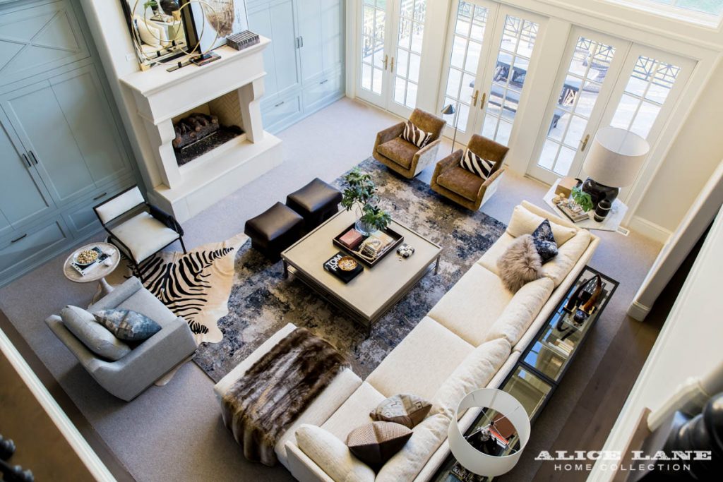
From there, we lent our time to upholstery. We wanted to find fabrics with a vintage flair that paired well with the color of the rug. We found our happy place in '70s-inspired hues, including brown sugar swivel chairs—the supernovas of the space—and a biscuit-colored sofa.

Due to the space’s large footprint, we knew we had to scale the sofa perfectly for it not to look like dollhouse furniture. We pushed together two sectional halves to create a super sofa—more than 13 feet of paradise. It’s deep and designed with enough room for her entire family to curl up on.
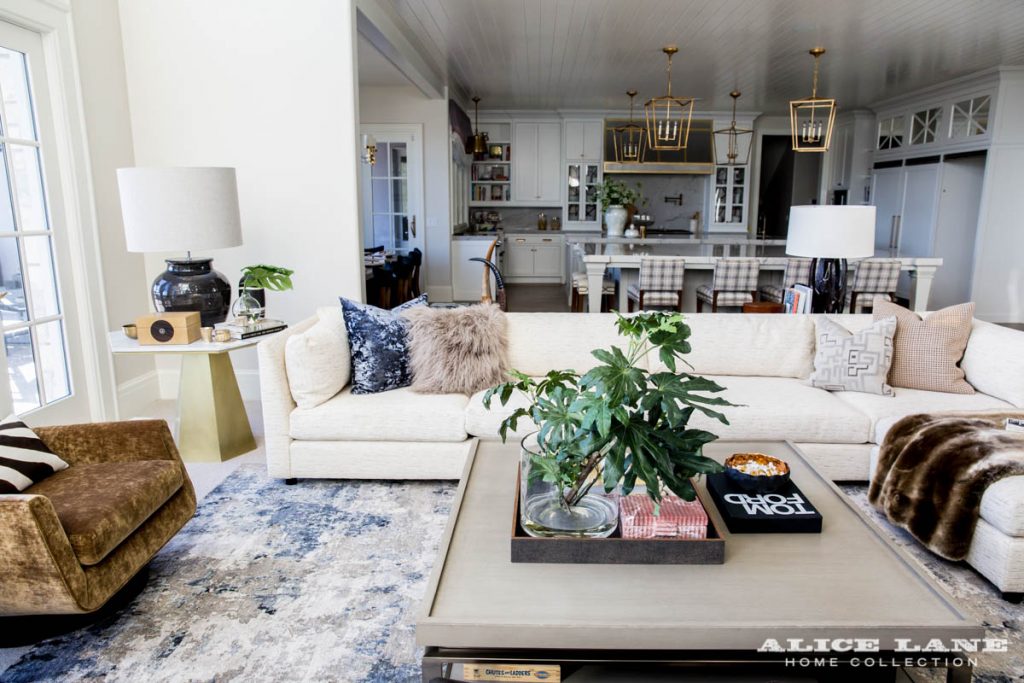
The volume of Emily’s family room is double story, meaning we needed to tone down the grandeur and let every piece hang out at a lower altitude. We kept all the furniture at a lower height—the sofa, ottomans, side table, consoles and cocktail table—so one piece isn’t more proud than the other. Our takeaway? You don’t need to do tall, grand things in tall, grand spaces in order to create a wow moment.

Once we had the groundwork laid with the right furniture, we began layering—what fashion is all about. It’s no different for a room.

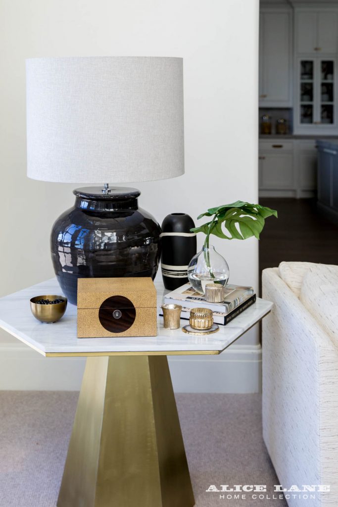
We topped Emily’s side tables with fashionable accessories and earthy-toned lamps; filled her consoles with books on fashion and hidden storage for kid’s books and toys; mixed up the sofa and chairs with a different texture and pattern on every pillow; adorned her mantel with fun artwork, brass rings and a massive faux horn mirror that took three men and plenty of elbow grease to install. We made everything count.

We love taking someone’s needs and transforming them into a beautiful space with layers of practicality. The ultimate goal was to create a family room that accommodated Emily’s entire family and still felt leisurely, off-duty chic. What’s your favorite aspect of the space?

lindsaysalazar-com-76

Design Principal Jessica Bennett and Emily Jackson

lindsaysalazar-com-72

Kristina Kellett, Emily Jackson, Jessica Bennett

Shop Emily's family room here and hop on over to read Emily's take on the space here.

We’ll be delving into the details of Emily’s family room over the next few weeks! See you back here next week!

Show N' Tell - Modern Glass House

Well, it's been a few weeks since we've posted here on the blog, and what better way to say hello again than to share one of our most recent projects. We actually wrapped this project up earlier this year, but it's been under wraps until it's recent debut in Utah Style & Design magazine's Fall issue. We were thrilled to have it featured there this month! But in case you missed it (or maybe you just want a another look!), we'll be revealing the whole project today on the blog. It's very rare when a husband and wife have the same exact taste and want the same exact things. This was not one of those rare moments! In fact, the homeowners of this warm contemporary home were quite the opposite in their styles. He wanted minimalist modern. She wanted classic and cozy. They entrusted us to help them find the perfect mix. And that we did! We used a warm walnut throughout the home to keep the rest of the homes stark cool tones in check. Large paneled walls brought depth and interest, but by reversing the moldings it gave it a contemporary spin. Little ying and yang tricks like this made it all possible!

glass-house-modern-entry-designed-by-alice-lane-home-collection_2 glass-house-modern-entry-designed-by-alice-lane-home-collection_3 glass-house-modern-entry-designed-by-alice-lane-home-collection_4

Thanks to the homes genius layout, the entire backside of the home is nearly floor to ceiling windows. And while the pictures don't do it justice, the view of the valley outback is amazing! We really want to highlight that feature and make sure our designs didn't obstruct that view. Upon entering the home you find yourself staring at a large open staircase. You can almost see right through those floating runs and open railing...refocusing you back on the incredible views.

glass-house-stairwell-designed-by-alice-lane-home-collection_1 glass-house-stairwell-designed-by-alice-lane-home-collection_3 glass-house-stairwell-designed-by-alice-lane-home-collection_2While we typically would say a home's entry sets the tone for the rest of the house, we must say this one gives you a bit of a surprise upon entering the living spaces. The real "wow" factor comes when you see the massive 20 foot wall of marble surrounding the asymmetrical fireplace. It's not until that moment that you reeeeally get it. We chose a combination of modern and classic silhouettes to furnish this space, giving you all the comfort and visual interest you could ask for.

glass-house-modern-family-room-designed-by-alice-lane-home-collection_2 glass-house-modern-family-room-designed-by-alice-lane-home-collection_1 glass-house-modern-family-room-designed-by-alice-lane-home-collection_5 glass-house-modern-family-room-designed-by-alice-lane-home-collection_4One of our favorite design features in the kitchen is how the oak hardwood floors ricochet off the kitchen island. It's a bit of an optical illusion really, but smart and well played. Again, we combined both modern and classic styles in the kitchen, with the grain-matched cabinets and the massive porcelain onyx hood surround. They just work so well together!

glass-house-modern-kitchen-designed-by-alice-lane-home-collection_4 glass-house-modern-kitchen-designed-by-alice-lane-home-collection_1 glass-house-modern-kitchen-designed-by-alice-lane-home-collection_2 glass-house-modern-kitchen-designed-by-alice-lane-home-collection_6 glass-house-modern-kitchen-designed-by-alice-lane-home-collection_7 glass-house-modern-kitchen-designed-by-alice-lane-home-collection_8 glass-house-modern-kitchen-designed-by-alice-lane-home-collection_5

The mural wall was a special request from our client. The wife is a photographer and has a love for abstract photography. We loved the idea of turning that wall into vortex or sorts...making that TV almost completely disappears!

glass-house-modern-dining-room-designed-by-alice-lane-home-collection_1 glass-house-modern-dining-room-designed-by-alice-lane-home-collection_2 glass-house-modern-dining-room-designed-by-alice-lane-home-collection_3

The master bedroom is definitely a slice of heaven. It's cool, crisp, and refreshing AND it's practically drowning in sunlight. So that's a win! We opted for simple window treatments here and throughout the home to once again highlight the views and minimize any obstructions. Don't be fooled by their simplicity though...each window is cased in walnut making them just as thoughtful and important.

glass-house-master-bedroom-designed-by-alice-lane-home-collection_2 glass-house-master-bedroom-designed-by-alice-lane-home-collection_1 glass-house-master-bedroom-designed-by-alice-lane-home-collection_3 glass-house-master-bedroom-designed-by-alice-lane-home-collection_4 glass-house-master-bedroom-designed-by-alice-lane-home-collection_6 glass-house-master-bedroom-designed-by-alice-lane-home-collection_7

Be sure to check out our online shop for many of our favorite pieces that we used throughout this home!

shop-this-look_alice-lane-modern-glass-house

1 | 2 | 3 | 4 | 5 | 6 | 7 | 8 | 9

photos by Lindsay Salazar Photography

Show N' Tell - A Neutral Nursery

Usually the first thing we ask our clients when designing a nursery is, "Are you having a boy? Or a girl?". So when our dear friend and client Natalie Hill Jensen told us she wasn't going to find out we were floored! How do you not find out!? We soon realized though that this nursery would be a special retreat for the mamma, and regardless of what gender the baby was this space was really designed for her! We started by picking gender neutral furnishings and finishes that could later be pulled in either direction once the baby was born. After the arrival of sweet little Lucie, we threw in a few extra pink accessories that easily tipped the scales for the perfect little girls room! Neutral Nursery + Designed by Alice Lane Home Collection-2

Natalie had just a few requests for us, one of them being she wanted items that could easily transition from one phase of life to the next. She also wanted a hint of a moroccan flare, a rocking chair that would work with both her short petite frame and her husband 6'8" build, AND a place to display her growing collection of children's book.

Neutral Nursery + Designed by Alice Lane Home Collection-6

We selected this exquisite wood and bone inlay chest (our Everly Dresser) for the changing table. It's the perfect height and added that eclectic moroccan vibe she was looking for. We topped it off by adding some perfectly pink accessories where Natalie could stash her everyday baby essentials. Those blooms really gave this space a feminine touch!

Neutral Nursery + Designed by Alice Lane Home Collection-7 Neutral Nursery + Designed by Alice Lane Home Collection-5 Neutral Nursery + Designed by Alice Lane Home Collection-4

The rug played a major role in the design. It's subtle rainbow of blue and pink was exactly what we needed! It could easily go either way, by playing up the blues or choosing to enhance the pink. It was fun to see the pink really come to life once we added all the extra accessories into the room. And of course, another moroccan touch with that nude leather pouf!

Neutral Nursery + Designed by Alice Lane Home Collection-8 Neutral Nursery + Designed by Alice Lane Home Collection-14

We kept the walls their original greige and then painted the ceiling a pale blue/gray. It's the perfect "lid on top" to the whole design. And don't you just LOVE this chandelier. Natalie instantly fell in love with it because it reminded her of the dressing room lights from of her Broadway days in NYC.

Neutral Nursery + Designed by Alice Lane Home Collection-3

For this project, we reached out to our friends at Oilo Studio to help us find the perfect crib bedding. We selected their charcoal and gray linen bumper and Finn crib skirt because it was perfectly neutral! With the rug and the art already adding so much color and movement, we wanted the bedding to be soft and relaxing on the eyes. It's exactly what we needed.

Neutral Nursery + Designed by Alice Lane Home Collection-9 Neutral Nursery + Designed by Alice Lane Home Collection-11 Neutral Nursery + Designed by Alice Lane Home Collection-10

This wall of books really acts as a piece of art! Seriously...they make the cutest children's books these days, and Natalie owns all of them! This is definitely the happiest little corner in the whole room with its vibrant colors and playful imagery. It always works out so well when you incorporate everyday objects into design.

Neutral Nursery + Designed by Alice Lane Home Collection-12We're not sure what it is, but there's something extra special about working on miniature spaces for miniature humans that get's us all gooey inside. It was a real treat to work on this sweet little space for Natalie and baby Lucie, and we can't wait to see how it grows with her in time!

SHOP THIS COLLECTION HERE

photos by nicole gerulat

Show N' Tell - Emily Jackson's Entry

Good morning and hellooooooo beautiful! We're thrilled to show you another chapter (and shop-able collection!) that we've been working on with the stylish Emily Jackson from The Ivory Lane. Her entry way! As you well know by now, we've been helping Emily put all of the final touches together in her new home (check out her kitchen and closet here). A home's entrance is so important because it gives you just a taste of what is to come. A bit of an appetizer, if you will. It should set the stage and give your guests that "wow" feeling that will make them want to see more. And since we believe you should always put your best foot forward, that's exactly what we did in Emily's entry. It's warm and welcoming, but still says "I'm bold and chic, and you're going to love me."

Emily Jackson's Entry + Design by Alice Lane Home-50 Emily Jackson's Entry + Design by Alice Lane Home-54 Emily Jackson's Entry + Design by Alice Lane Home-51

We chose to incorporate this modern art to add a bit of contrast to the space, and because we loved how it played so well with the curved paneling in our Elisabeth Buffet. It also brought out that bit of "edge" that we see in Emily's own personal style from time to time. So chic!

Emily Jackson's Entry + Design by Alice Lane Home-53 Emily Jackson's Entry + Design by Alice Lane Home-59 Emily Jackson's Entry + Design by Alice Lane Home-55 Emily Jackson's Entry + Design by Alice Lane Home-60 Emily Jackson's Entry + Design by Alice Lane Home-61

This subtle snake-skin rug was the perfect fit for her entry. We needed something large and with impact to help fill in the space between her front door and staircase, and we knew this would do just the trick. We love how this space turned out, and so does Emily! No doubt her guests will love it just as much from the second they walk in.

SHOP COLLECTION

Show N' Tell - Emily Jackson's Closet

As it turns out...we really love designing closets! Especially in the homes of high-end fashion bloggers such as Emily Jackson from The Ivory Lane. We've been working with Emily ever since she finished building her new home last year, when she asked us to help add all the finishing touches that would transform her house into a home. We started with her kitchen and dining area (see that post here) and then moved into one of the most important rooms in her house...the closet! When your job is to dress up in gorgeous clothes every day and take beautiful pictures, a well designed closet is a must! Emily had the bones of her closet in place, but felt it lacked that "fashion forward edge" that matched her own personal style. It's always fun to design for someone who's already so well immersed in fashion and design. It allows us to really push the envelope and be bold in our design choices. Luckily for us, Emily was all in and loved that we chose to enhanced her moody undertones into a full blown fashion-forward closet.

Emily Jackson's Closet + Design by Alice Lane Home-46

The new island is a major focal point in this design. Emily needed to the functionality of a large storage solution in her closet, but we made sure it packed just as much style as it did space. A-symmetrical drawers, mismatched hardware, vintage modern millwork, and the most gorgeous inset marble counter tops you ever did see! This baby is a show-stopper! Really, everything else sort of fell into place once we had the island design squared away.

Emily Jackson's Closet + Design by Alice Lane Home-16 Emily Jackson's Closet + Design by Alice Lane Home-24 Emily Jackson's Closet + Design by Alice Lane Home-20 Emily Jackson's Closet + Design by Alice Lane Home-1 Emily Jackson's Closet + Design by Alice Lane Home-3

Now...who wouldn't love a whole shoe wall! That is, as long as you have a few pair of Valentino heels to show off. We felt like this space needed to be more than just a place for Emily to stash her shoes...those puppies were practically begging for a little spotlight! We lined the backs of the shelves with some metallic cork wallpaper and now every shoe looks like it's on its own personal runway. Our Piper Stool was the perfect addition to this shoe corner. A place where Emily could quickly sit to put on her shoes and complete her outfit for the day. Just check out her Instagram feed...she really does use it!

Emily Jackson's Closet + Design by Alice Lane Home-23 Emily Jackson's Closet + Design by Alice Lane Home-42 Emily Jackson's Closet + Design by Alice Lane Home-43 Emily Jackson's Closet + Design by Alice Lane Home-2 Emily Jackson's Closet + Design by Alice Lane Home-32 Emily Jackson's Closet + Design by Alice Lane Home-38

Emily was so trusting of us, and that really makes the design process so much easier. Our creativity can just flow when there are no restrictions or hesitations, but it's always good to get a list of some "must haves" from our clients. For Emily, her "must haves" were privacy and a working space. Although that beautiful bay of large windows brings in the most gorgeous natural light (perfect for selfies), it also posed a little bit of a privacy issue. We had some custom designed roman shades made to fit inside each window. The marble-like veins on that fabric is our absolute favorite! As for the "working space"... it might seem odd to the rest of the world that you would put your office inside your closet, but when you're a fashion blogger it's practically perfect. In every way! We butted our Sofia Desk right up against those beautiful large windows, making it the perfect spot to work with a view.

Emily Jackson's Closet + Design by Alice Lane Home-44 Emily Jackson's Closet + Design by Alice Lane Home-28 Emily Jackson's Closet + Design by Alice Lane Home-34 Emily Jackson's Closet + Design by Alice Lane Home-37 Emily Jackson's Closet + Design by Alice Lane Home-29 Emily Jackson's Closet + Design by Alice Lane Home-39 Emily Jackson's Closet + Design by Alice Lane Home-8

Emily Jackson's Closet + Design by Alice Lane Home-53Emily Jackson's Closet + Design by Alice Lane Home-51We say it all the time, but pay day really comes when we see our clients living in and enjoying the spaces we design. With Emily, we get the chance to see it on the daily! We certainly hope you've enjoyed touring our latest closet design as well. Be sure to check out Emily's blog for more on this project and how she's utilizing her newly designed space. Also, be sure to check out our online shop where you can shop this entire collection!

SHOP EMILY JACKSON'S CLOSET COLLECTION

photos by Lindsay Salazar

Show N' Tell - Historic Ivy Flat Remodel

When a client comes to you and says they want to remodel their historic 20th century condominium in the heart of downtown Salt Lake City, you jump at the opportunity! That cliche saying of "they don't make 'em like they used to" became all too true when we first visited this home, with its large ornate moldings, arched doorways, and paned glass windows. Our client's main request was to keep the original charm and historic elements of the condo intact, while modernizing the space with better design and function. You'll notice from this "Before & After" that we kept most of the original finish work in the home - because how could we not! From the vintage tiles on the fireplace surround to the beautifully aged oak floors, this little flat had a lot going for it. But we must say...the "afters" will certainly make you fall in love with the space even more.

BEFORE: Ivy Flat Remodel_BeforeAFTER: Ivy Tudor Flat + Designed by Alice Lane Home-14Ivy Tudor Flat + Designed by Alice Lane Home-10Ivy Tudor Flat + Designed by Alice Lane Home-7Ivy Tudor Flat + Designed by Alice Lane Home-8 Ivy Tudor Flat + Designed by Alice Lane Home-9

While the kitchen needed a full overhaul, we kept the layout and design of the space true to its time and brought in some of those same historic elements, like the aged brass hardware, classic white subway tiles, and lamp shade chandelier. We LOVE the way this quaint dining space turned out, and we're all heart eyes for those moody teal blue cabinets.

Ivy Tudor Flat + Designed by Alice Lane Home-4 Ivy Tudor Flat + Designed by Alice Lane Home-3 Ivy Tudor Flat + Designed by Alice Lane Home-2 Ivy Tudor Flat + Designed by Alice Lane Home-19 Ivy Tudor Flat + Designed by Alice Lane Home-18 Ivy Tudor Flat + Designed by Alice Lane Home-5 Ivy Tudor Flat + Designed by Alice Lane Home-20 Ivy Tudor Flat + Designed by Alice Lane Home-6Ivy Tudor Flat + Designed by Alice Lane Home-1This teeny-tiny room was the perfect place to let loose and pull out the blush pink paint! Often times are clients are dumbfounded with what to do with these quirky little spaces in their home (and historic houses are notorious for having plenty of them!), but you'll find that if you work with them, instead of against them, they can turn into something really special. Turns out this one makes the perfect little office...a place where creativity can flow and inspiration comes from every turn.

Ivy Tudor Flat + Designed by Alice Lane Home-12 Ivy Tudor Flat + Designed by Alice Lane Home-11 Ivy Tudor Flat + Designed by Alice Lane Home-13

We're leaning more and more toward designing spaces with high contrast, and this bedroom is the perfect example of why this look works so well! Even though it's a small space, the deep navy walls make everything in this room pop! Softened with a vintage inspired rug and plush white linens, it became the perfect retreat for this historic home.

Ivy Tudor Flat + Designed by Alice Lane Home-16 Ivy Tudor Flat + Designed by Alice Lane Home-17

Shop This Look_The Ivy Flat

1 | 2 | 3 | 4 | 5 | 6 | 7 | 8 | 9

Show N' Tell - Waterside Reno

The majority of our clients right now have us working on new build projects, and while we love working on a home from the ground up sometimes it's refreshing to get that instantaneous satisfaction that comes from working on a remodel. Not just because the turn around is so much faster, but because the sheer high that comes from seeing what a home used to be to what it is now is simply just unbeatable! BEFORE: Waterside Reno_Before 3

AFTER: Waterside Reno + Designed by Alice Lane Home-13

Our clients of this kitchen renovation are young and energetic, and their home is in the dreamiest neighborhood overlooking Utah Lake. When they came to us with their request for an updated kitchen we couldn't wait to get our hands on it and make the space as hip and stylish as they are!

Waterside Reno + Designed by Alice Lane Home-11

Waterside Reno + Designed by Alice Lane Home-4

The kitchen they had been living with had some interesting angles, which was only amplified by an angular and choppy island that we just couldn't wait to change. We moved a wall to soften the angles in the room, squared up the island, and reoriented the appliances to establish a better work triangle.

Waterside Reno + Designed by Alice Lane Home-5 Waterside Reno + Designed by Alice Lane Home-3 Waterside Reno + Designed by Alice Lane Home-9

The stunning custom hood, made of satin nickel and antique brass, is the crown jewel of this space! It creates the perfect focal wall to add the balance that the room was lacking. We chose to use a fresh and classic white for her cabinets, while using a contrasting navy (custom color mix) on her island. We love how the navy on the island and in those bistro bar stools complement each other perfectly!

Waterside Reno + Designed by Alice Lane Home-12 Waterside Reno + Designed by Alice Lane Home-6 Waterside Reno + Designed by Alice Lane Home-7 Waterside Reno + Designed by Alice Lane Home-2

We chose a fabulous white subway back splash with a unique shape and hand-poured texture. It gives it that high end look you would expect from only the most gourmet of kitchens. While our client loved the look of marble, it just simply was not realistic with her two little kids. We opted to go for something low-maintenance that also had the most gorgeous veining similar to marble: Macaubas Quartzite.

Waterside Reno + Designed by Alice Lane Home-1 Waterside Reno + Designed by Alice Lane Home-8 Waterside Reno + Designed by Alice Lane Home-14

The best part about this project was receiving a photo from our client of her baking cookies with her kids in her beautiful new space. That's the real pay-day for us! She is in love with her kitchen and it functions just the way it should.

Shop This Look_Waterside Reno2

1 | 2 | 3 | 4 | 5 | 6

Show N' Tell - Summer Hideaway

Summer is in full force and things are heating up around here! While Utah is full of grand adventures to be had in the great outdoors, sometimes you just need to escape the heat and lay back in a nice, cool, dark basement to binge watch the latest season of New Girl. We're about to show you the perfect spot to do so....our Summer Hideaway project. Hilltop Haven + Designed by Alice Lane Home-17This was a fun little project we got to work on for a client who needed our help in transforming her unfinished basement into the perfect hang-out spot for her kids. It also needed to serve the dual purpose of a "pool house" -- a place where the kiddos could dump their swim gear after endless hours of fun in the pool out back and clean up. Can you even think of a better place to spend your summer days? Hilltop Haven + Designed by Alice Lane Home-15

We designed the space to be kid-friendly and relaxed, but also mature and sophisticated. The custom designed built-in fireplace helps to not only give the room a focal point, but also sets the stage for modern sophisticated living. We love the combo of the deep veined marble and the grain matched cabinetry.

Hilltop Haven + Designed by Alice Lane Home-20

The kitchenette is the perfect place to stop for a quick snack, or to lay out a full spread during those pool parties. The horizontal planked island has got to be one of our favorite elements of this design. Topped off with our favorite Hicks pendants...this is one stylish little kitchenette.

Hilltop Haven + Designed by Alice Lane Home-21Hilltop Haven + Designed by Alice Lane Home-18Hilltop Haven + Designed by Alice Lane Home-26Hilltop Haven + Designed by Alice Lane Home-13

The basement is pretty spacious for it's size and we were able to section off the open living room to accommodate their different needs. Here we created the ultimate kids corner, perfect for gaming, lounging, and all kinds of play. We mirrored the planked cabinetry on the opposite end of the room with this modern ship lap wall.

Hilltop Haven + Designed by Alice Lane Home-14

Hilltop Haven + Designed by Alice Lane Home-3

And here's the "pool house." It sits right off the back entrance of the house and is the perfect spot to filter all the traffic coming in and out from pool. We used a faux hardwood tile to keep messes at bay. The same tile flows straight through to the kitchenette, making clean ups a breeze.

Hilltop Haven + Designed by Alice Lane Home-2 Hilltop Haven + Designed by Alice Lane Home-1 Hilltop Haven + Designed by Alice Lane Home-4

Let's all take a second to swoon over these wall sconces, shall we? We kept the design of this bathroom classic, with black and white tile wainscoting and octagon floor tiles. It's a simple pallet, but timeless and dreamy. We decided to use extra large subway tiles on the bottom that transition to a narrower subway higher up. A great trick for basements with shorter ceilings to keep the eye moving up!

Hilltop Haven + Designed by Alice Lane Home-5 Hilltop Haven + Designed by Alice Lane Home-6 Hilltop Haven + Designed by Alice Lane Home-7Hilltop Haven + Designed by Alice Lane Home-25

The bedroom in the basement serves as the perfect guest suite. Just look at how much sunlight pours into this room! You'd never know you were in a basement. We kept the furniture in here comfortable and functional, including a bench at the end of the bed with a small accent table for guests to sit and work if needed. We opted to use open nightstands, which really helps to keep the room open and airy (plus there's really no need to have to hide your junk in a guest room!).

Hilltop Haven + Designed by Alice Lane Home-10

Hilltop Haven + Designed by Alice Lane Home-11Hilltop Haven + Designed by Alice Lane Home-12

Fuscia & White Peony | Globas Vase |  Animal Sculptures | Peony Gardenia Diffuser | Barr & Co Soap | Barr & Co Lotion

Paint | Hardwood Tile | Bathroom Wall Tile | Fireplace Surround - Zebrano Marble | Lighting & Furnishings can be ordered through us - Email support@alicelanehome.com

Alice Lane Designers: Matt Dickamore & Lorri Cerva Photos by Lindsay Salazar Photography

Show N' Tell - Emily Jackson's Kitchen

It's here! Our new website is finally live! We couldn't think of a better way to welcome you all to our new site than by sharing this beautiful kitchen we helped furnish and style for the power-house woman behind The Ivory Lane fashion blog, Emily Jackson. In yesterday's post we shared our design inspiration behind this project and how we planned to transform Emily's newly built kitchen into her dream come true (check that out here if you missed it). The exciting thing about this kitchen reveal is how you can actually shop everything from this space right here on our website. Pretty neat, huh?! So be sure to check out the shopping section when you're done oohing an ahhing over these pics.

Now...let's get to it, shall we? As mentioned in yesterday's post, Emily's kitchen was beautiful to begin with, but she asked us to add a little more personality and put all those "finishing touches" in place. While all of the accessories did a lot to pull the space together, it's actually the finer details we added that (we feel) made the biggest impact.

Ivory Lane Kitchen + Designed by Alice Lane Home-17

Ivory Lane Kitchen + Designed by Alice Lane Home-21

Ivory Lane Kitchen + Designed by Alice Lane Home-22

Remember those over-the-knee burgundy suede boots of Emily's we mentioned yesterday? Well they just so happened to inspire a lot of what you'll see in this space. These custom made roman shades and draperies add just the right amount of color to her kitchen. The way the fabric ombre's from that deep burgundy down into a soft white gives it that bold-yet-subtle look we were going for.

Ivory Lane Kitchen + Designed by Alice Lane Home-2

Ivory Lane Kitchen + Designed by Alice Lane Home-9She had a lot of open-shelving throughout the kitchen, so we made sure that every shelf served a specific purpose. After all, your kitchen should be just as functional as it is beautiful. We turned this little nook next her kitchen sink into a cookbook library, complete with a lighted cookbook stand (it's really an art easel...but isn't this a genius application!?). There's something about cookbooks that just makes a kitchen feel homey. Don't you think?

Ivory Lane Kitchen + Designed by Alice Lane Home-10

Ivory Lane Kitchen + Designed by Alice Lane Home-13

We took a few tips from Emily's own fashion sense and lined these glass-front cabinets with the most amazing Kelly Wearstler wallpaper. It's like that pocket square or hidden lining of a jacket that sneakishly hides in the background, but is full of color and life. And just look at how those white dishes now pop against the background! Major win.

Ivory Lane Kitchen + Designed by Alice Lane Home-14Ivory Lane Kitchen + Designed by Alice Lane Home-11

Ivory Lane Kitchen + Designed by Alice Lane Home-16

Ivory Lane Kitchen + Designed by Alice Lane Home-12

This particular section of shelves is dedicated to all things baking. When Emily told us she and her daughter frequently bake together, we knew we needed to design a space that was full of all things petite, colorful, and bake-worthy. Her daughter has already named this her "baker acre"...adorable!

Ivory Lane Kitchen + Designed by Alice Lane Home-6

Ivory Lane Kitchen + Designed by Alice Lane Home-15

Ivory Lane Kitchen + Designed by Alice Lane Home-8

Ivory Lane Kitchen + Designed by Alice Lane Home-7

In the dining room we started fresh. A new light fixture, new window panels to match the kitchen, new dining table, and the most stunning art to offset all the white. We're a little bit obsessed with those dining chairs, too! Because this is her only dining space in the home, it needed to function for every day dining, but also sophisticated enough to host a dinner party now and then. Mission accomplished.

Ivory Lane Kitchen + Designed by Alice Lane Home-23

Ivory Lane Kitchen + Designed by Alice Lane Home-18

Ivory Lane Kitchen + Designed by Alice Lane Home-19

Last, but certainly not least, is this beautiful Butler's Pantry. It too had great bones for us to work with. The navy cabinets inspired us to curate a collection of smokey and glamorous serving ware that certainly puts on quite a show. We love how this room is like the hidden jewel of the whole kitchen. It's the perfect spot to display those more "unique" pieces and really make them feel special. Swoon.

Ivory Lane Kitchen + Designed by Alice Lane Home-1

Ivory Lane Kitchen + Designed by Alice Lane Home-3

Ivory Lane Kitchen + Designed by Alice Lane Home-4

Ivory Lane Kitchen + Designed by Alice Lane Home-5

We hope you love how this space came together as much as we do! If there's something that caught your eye, but sure to head on over to our new online shop and get it for yourself! You can shop each area of this kitchen online here:

Kitchen Dining Room Butler's Pantry

Show N' Tell - Taste Chocolatier

If you read the latest issue of Utah Style & Design magazine and found yourself getting a weird craving for chocolate around page 36, we don't blame you! It was an absolute treat to see the chocolate shop we designed for Coleman & Davis Artisan Chocolate featured within the beautiful pages of the magazine. We thought we'd share more of that project here on the blog and give you the full tour of the most delicious little shop in downtown Provo, UT. It was just over two years ago that we literally jumped at the opportunity to partner up Coleman & Davis to help them create their first new-concept store and chocolate parlor - TASTE. Although it was the idea of gourmet chocolate that had us initially intrigued, it was this beige box that really had us salivating from the mouth! Oh how we love a project that starts as a blank canvas!

BEFORE:

Taste_Before

AFTER:

2015-08-19 ALH Taste12528-Nicole-Gerulat_Edit

The once-was art gallery, although simple, had some incredible bones to work with. From the hand carved wood floors to the beams in the ceiling, this space had a lot going for it. Of course, it took a lot of creativity to pull it all together. Everything in the space was designed with one thing in mind...chocolate. Our clients wanted a space that made you feel like you'd been transported to a authentic chocolate shop off the streets of Paris. We pulled inspiration from the movie Chocolat, and even shopped antique stores to find some authentic pieces to incorporate into the design. Vintage chocolate molds and an antique mercantile scales were just a few of things that helped us pull the design together.

2015-08-19 ALH Taste12486-Nicole-Gerulat_Edit

2015-08-19 ALH Taste12493-Nicole-Gerulat_Edit

2015-08-19 ALH Taste12469-Nicole-Gerulat_Edit

2015-08-19 ALH Taste12459-Nicole-Gerulat_Edit

2015-08-19 ALH Taste12601-Nicole-Gerulat_Edit

That handsome fellow is Phil Davis, the chocolate enthusiast behind Coleman & Davis Artisan Chocolates. Together with partners Morgan and Char Coleman, they run this little shop. If you've ever met the talented team, than you know that everything they do is really about quality. Luckily for us, they already owned a large collection of high-quality original artwork. We incorporated some of those pieces into the decor, which really gives the space some history, as if they were slowly collected over time and added to the walls decade after decade. And let's not forget the floors! It was almost mind-damaging to get the design and scale just right on the floors. Using a stencil, the original wood floors were hand painted to perfection. A true labor of love right there, but by far one of the most eye-catching elements of this design.

_Z2A9331-Nicole-Gerulat_Edit

2015-08-19 ALH Taste12458-Nicole-Gerulat_Edit

_Z2A9319-Nicole-Gerulat_Edit

2015-08-19 ALH Taste12522-Nicole-Gerulat_Edit

2015-08-19 ALH Taste12511-Nicole-Gerulat_Edit

_Z2A9310-Nicole-Gerulat_Edit

We designed these extra-large banquettes to seat large groups of people, perfect for their chocolate tastings which are truly a unique experience. The curved arms and tufted backs gives them a timeless and classic look. We hung a collage of porcelain china above each banquette, some of which were heirlooms of the owners and others we found at local antique shops. Set against the pale blue walls, it's perhaps one of our favorite little details in the design.

2015-08-19 ALH Taste12464-Nicole-Gerulat_Edit

_Z2A9311-Nicole-Gerulat_Edit

_Z2A9297-Nicole-Gerulat_Edit

_Z2A9339-Nicole-Gerulat_Edit _Z2A9299-Nicole-Gerulat_Edit

2015-08-19 ALH Taste12614-Nicole-Gerulat_Edit

2015-08-19 ALH Taste12630-Nicole-Gerulat_Edit

So do yourself a favor and go check out Taste by Coleman & Davis, and may we recommend the Iced Chocolate from their menu. It's heavenly! And hopefully you enjoy the beautiful atmosphere we helped create! It's truly a little piece of Europe right here in Utah.

Designed by Jessica Bennett & Matt Dickamore | Photos by Nicole Gerulat

Show N' Tell - Domo Headquarters

Here at Alice Lane we traditionally work on residential design projects. And while we've really tried to establish ourselves as leaders in that field, we can't tell you how good it feels to also stretch our wings into the world of commercial design. Awhile ago we had the opportunity to design the headquarters for DOMO, a vastly growing business solutions company based in American Fork, Utah. The thing we love about commercial design is it forces you to think outside the box and allows you to explore some rather unconventional design. wc_AliceLaneHome_Domo_20150829_0928_Edit

wc_AliceLaneHome_Domo_20150829_0945_Edit

Our design objective with this project was to keep a bit of that "start up business" feel while incorporating sophisticated design that the company could grow into (which they certainly have). Even with its big boy pants on, you still get that fun and youthful vibe that's a direct reflection of who they are.

wc_AliceLaneHome_Domo_20150829_1082_Edit

wc_AliceLaneHome_Domo_20150829_1098_Edit

The furnishings were kept clean, simple, and modern. This allowed for some of the other design elements to really stand out, like the blue gallery wall that boasts the logos of some of their more prestigious clients.

wc_AliceLaneHome_Domo_20150829_1136_Edit

wc_AliceLaneHome_Domo_20150829_1148_Edit

wc_AliceLaneHome_Domo_20150829_1091_Edit

And how rad is this tech wall? It's not every day that we're challenged with the task of fitting 30 screens onto a wall. In fact, most the time we're trying to hide and conceal our client's TV screens. Needless to say, this was liberating!

wc_AliceLaneHome_Domo_20150829_0971_Edit

wc_AliceLaneHome_Domo_20150829_1277_Edit

wc_AliceLaneHome_Domo_20150829_1280_Edit

wc_AliceLaneHome_Domo_20150829_1313_Edit

You'll find that in just about every space there is something that reflects the quirkiness of DOMO. Whether that be a giant mural of Smokey and the Bandit, or a gallery wall full of their notorious billboards, every square inch of this office space was designed to embody the fun and upbeat culture they've created.

wc_AliceLaneHome_Domo_20150829_1317_Edit

wc_AliceLaneHome_Domo_20150829_1212_Edit

wc_AliceLaneHome_Domo_20150829_1232_Edit

The executive offices were comfortably furnished to make them feel a little more at home. After all, the majority of one's day is spent in the office. We used soft upholstery pieces and natural wood tones to really warm up the spaces. Can't you just imagine Don Draper from Mad Men making himself right at home in here?

wc_AliceLaneHome_Domo_20150829_1194_Edit

wc_AliceLaneHome_Domo_20150829_1182_Edit

wc_AliceLaneHome_Domo_20150829_1181_Edit

wc_AliceLaneHome_Domo_20150829_1022_Edit

wc_AliceLaneHome_Domo_20150829_1015_Edit

wc_AliceLaneHome_Domo_20150829_1038_Edit

wc_AliceLaneHome_Domo_20150829_1069_Edit

wc_AliceLaneHome_Domo_20150829_1051_Edit

We carried the natural wood tones throughout our design and one of our favorite applications was on the separation screens in the employee break room. All of the natural light that streams into this space is beautiful! And to top it all off, how rad is the bike rack room?!

wc_AliceLaneHome_Domo_20150829_1283_Edit

wc_AliceLaneHome_Domo_20150829_1288_Edit

wc_AliceLaneHome_Domo_20150829_1265_Edit

We loved everything about working on this project. So, here's to flexing those commercial design muscles more! If you're in need of commercial design or know someone who is, we'd love to hear from you.

Designed by Jessica Bennett & Natalie Ellis | Photos by Weston Colton


Show N' Tell - French Moderne Manor: Part VIII

Today we're taking you into the basement of the French Moderne Manor. Yes, if you can believe it, this well-lit space is a basement! Each floor of this home really has it's own purpose, and the basement is all about entertainment and fun. Whether it be the culinary masterpiece of a kitchen or the home theater that's even more glamorous than old Hollywood, this basement has everything you need to entertain a crowd. Perhaps some of the most modern details of this home present themselves in the basement...like this vintage modern console table behind a low-back chichester sectional in the lounge. We also incorporated a lot of modern art, which really sets the tone for this casual space.

20150625_AliceLaneHome_ModerneManor-0036_Edit

20150625_AliceLaneHome_ModerneManor-0006_Edit

20150625_AliceLaneHome_ModerneManor-0040_Edit

Not every basement kitchen gets an 8 foot long iron range hood...but this one sure did! Our clients love to entertain and host family and friends regularly, so having a space where they could cook and entertain at once was important. Only steps away from the home theater, indoor gymnasium and racquetball court, kids playroom, and lounge... this kitchen is literally central to every party!

20150625_AliceLaneHome_ModerneManor-9972_Edit

20150625_AliceLaneHome_ModerneManor-9967_Edit

The keeping area overlooks the indoor gymnasium making it a great spot for adults to relax and keep an eye on the game below. Designed for relaxation and conversation, it could almost pass for a true gentlemen's club!

20150625_AliceLaneHome_ModerneManor-9977_Edit

The woodworking details in the home theater are UN-real. Inspired by old Hollywood art deco, the wall panels and columns were trimmed out in a stained oak. Counterbalanced by a modern and geometric wallpaper on the ceiling, this space is a real glam-slam. And let's just say that the lighting really knows how to set the mood!

20150625_AliceLaneHome_ModerneManor-0427_Edit

20150625_AliceLaneHome_ModerneManor-0385_Edit

20150625_AliceLaneHome_ModerneManor-0417

20150625_AliceLaneHome_ModerneManor-0421

20150625_AliceLaneHome_ModerneManor-0425

Show N' Tell - French Moderne Manor: Part VII

If only you could be five again and live in a bedroom that was head-to-toe pink! Right? Today we'll let you dream for a minute or two as we give you a tour of the kids bedrooms in the French Moderne Manor. They're perhaps the sweetest rooms of them all! Being fairly young, we wanted to create spaces that the kids could grow into and love through each phase of life. In fact, at first glance you might not even categories these as "kids rooms," but you'll soon pick up on the subtle touches here and there that make these rooms as youthful as they are beautiful. 20150624_AliceLaneHome_ModerneManor-9381_Edit

20150624_AliceLaneHome_ModerneManor-9403_Edit

20150624_AliceLaneHome_ModerneManor-9399_Edit

20150624_AliceLaneHome_ModerneManor-9384_Edit

20150624_AliceLaneHome_ModerneManor-9414_Edit

20150624_AliceLaneHome_ModerneManor-9389_Edit

20150624_AliceLaneHome_ModerneManor-9426_Edit

20150624_AliceLaneHome_ModerneManor-9433_Edit

20150624_AliceLaneHome_ModerneManor-9342_Edit

20150624_AliceLaneHome_ModerneManor-9353_Edit

20150624_AliceLaneHome_ModerneManor-9157_Edit

20150624_AliceLaneHome_ModerneManor-9135_Edit

20150624_AliceLaneHome_ModerneManor-9285_Edit

20150624_AliceLaneHome_ModerneManor-9295_Edit

20150624_AliceLaneHome_ModerneManor-9289_Edit

20150624_AliceLaneHome_ModerneManor-9298_Edit

Senior Designer: Christy Klomp Designers: Kristina Kellett & Kendra Stephenson

FINISHES GIRLS ROOM: Wallpaper – Dusty Lilac Durham Dot by Thibaut | Carpet - Summit Source Pewter Gray by Cori Brown & Assoc. | Lighting & Furnishings available through Alice Lane Home GIRLS BATHROOM: Wall Color – Benjamin Moore Gray Mist | Flooring – Carrara White Triangular Mosaic by Daltile | Countertop - Carrara Marble | Hardware - Hawthorne Handle by Anthropologie | Lighting & Furnishings available through Alice Lane Home BOYS ROOM: Wall Color – Benjamin Moore Gray Mist | Carpet - Summit Source Pewter Gray by Cori Brown & Assoc. | Lighting & Furnishings available through Alice Lane Home BOYS BATHROOM: Wall Color - Benjamin Moore Gray Mist | Countertop - Carrara Marble | Lighting & Furnishings available through Alice Lane Home KIDS LOFT: Wall Color – Benjamin Moore Gray Mist | Cabinets Color - Benjamin Moore Sea Pearl | Carpet - Summit Source Pewter Gray by Cori Brown & Assoc. | Lighting & Furnishings available through Alice Lane Home

photos by weston colton

Show N' Tell - French Moderne Manor: Part VI

It's baaaaack! We're thrilled to finally pick up where we left off with the tour of our French Moderne Manor project. As you may know, it was recently featured in Utah Style & Design magazine where it even made the cover! Because we wanted that feature to really be something special, we held off on showing more pictures of the home here on the blog. Just imagine how much restraint we had to have! But the chains are finally loosed and we're ready to show off more of this beauty. To welcome you all back, we thought we 'd start with the entry. I believe this is what they call a "Grand Entrance." We designed this eye-catching floor pattern in CAD and used 3 variations of stone tile to achieve this look. Sooo worth the head-banging calculations it took to get this right!

20150624_AliceLaneHome_ModerneManor-8917_Edit

20150624_AliceLaneHome_ModerneManor-9274_Edit

Immediately upon entering the home you walk into the living room where these massive windows frame the most beautiful views out back. A traditional limestone fireplace stands as a major focal point, and a large mirror reflects the shimmering chandelier that hovers overhead. While our clients wanted the majority of their home to feel comfortable and casual, this was one space we really stepped things up a notch. Every detail and accessory in this room exudes luxury.

FrenchModerneManor_LivingRoom4

FrenchModerneManor_LivingRoom2

FrenchModerneManor_LivingRoom1

FrenchModerneManor_LivingRoom6

FrenchModerneManor_LivingRoom3

FrenchModerneManor_LivingRoom5

FrenchModerneManor_LivingRoom7

The den is a bit of a surprise with it's dark and moody design. It's masculine, bold, stylish, but most of all... jaw-dropping. Our client's one request for this room was the fish tank. We decided to build it into the bookshelves were it acts as a live piece of art for the space. The flooring from the entry continues into the den and we love the high-contrast between the floors and the smokey walls.

FrenchModerneManor_Office2

FrenchModerneManor_Office3

FrenchModerneManor_Office1

FrenchModerneManor_Office4

Senior Designer: Christy Klomp Designers: Kendra Stephenson & Kristina Kellett

FINISHES ENTRY: Wall Color – Benjamin Moore Glacier | Door Color - Custom Mix | Door Hardware – Mack Entry Set by Rocky Mountain Hardware | Flooring – First Snow Elegance Marble, Zebrano Marble, & Absolute Black Granite by Daltile | Lighting & Furnishings available through Alice Lane Home LIVING ROOM: Wall Color – Benjamin Moore Gray Mist | Flooring - Summit Source Grey Limestone by Cori Brown Assoc. | Fireplace - Cast Limestone | Lighting & Furnishings available through Alice Lane Home Office: Wall Color – Custom Mix | Flooring – First Snow  Elegance Marble, Zebrano Marble, & Absolute Black Granite by Daltile | Lighting & Furnishings available through Alice Lane Home

photos by weston colton

Utah Style & Design Feature

I dare say there was no better way to ring in the New Year than to see our French Moderne Manor smack-dab on the cover of the newest issue of Utah Style & Design. Not only is it a dream to see our work front and center, but the issue boasts 11 full pages of the home inside. You could say it's a major pay-off for all the hard work we put in in 2015! IMG_5421

We're pretty proud of this home. The French Moderne Manor was showcased in the 2015 Utah Valley Parade of Homes this past summer (big shout out to our partner McEwan Custom homes!), where it was voted not only Best Home, but also Best Interior Design, Best Kitchen, Best Master Suite, and swept many other categories. Ah! That still makes us giddy to think about.

We know many of you have anxiously been waiting for us to share more of this home with you, so now you can finally go pick up your own copy of Utah Style & Design and delve into it's beautiful pages! Or, head on over to our Press page (here) to read the full article online and our Portfolio page (here) for a complete tour of the home. We're also working on a series of "Show N' Tell" blog posts that will give you a further look into the home, so stay tuned for that! If this is any indication of what's to come...2016 is going to be our year!

Show N' Tell - French Moderne Manor: Part V

Today we're taking you back inside the French Moderne Manor for a tour of the casual and sophisticated living room. Yep...this is casual comfort at a whole new level my friends. I mean really, that 13 foot long sofa is practically begging you to come sit on it (or lay on, sleep on, jump on...whatever). This room is flooded with natural light throughout the day, which automatically makes it a crowd pleaser. But our personal favorite is the wall to wall book shelves that are styled to perfection. 20150625_AliceLaneHome_ModerneManor-9851_Edit

20150625_AliceLaneHome_ModerneManor-9874_Edit

20150625_AliceLaneHome_ModerneManor-9857_Edit

20150625_AliceLaneHome_ModerneManor-9867_Edit

20150625_AliceLaneHome_ModerneManor-9861_Edit While good design typically doesn't need too use a whole lot of "smoke and mirrors"...that's exactly what we did in this hallway powder bath. Literally. The end result is so dramatic!

FrenchModerneManor_HallPowderBath

You might even notice one reoccurring theme throughout the home...circles. They're incorporated in the balusters, hallway pillars, mirrors, and light fixtures. It really ties everything together and brings the design full circle (pun-intended), don't you think!?

20150624_AliceLaneHome_ModerneManor-8934_Edit_wm

20150624_AliceLaneHome_ModerneManor-8948_Edit_wm

20150624_AliceLaneHome_ModerneManor-8952_Edit_wm 20150624_AliceLaneHome_ModerneManor-8957

Senior Designer: Christy Klomp Designers: Kendra Stephensen & Kristina Kellet Jr. Designer: Griffin McCabe

FINISHES FAMILY ROOM: Wall Color - Gray Mist by Benjamin Moore |  Carpet  - Gray Limestone Summit Source | Fireplace Surround - Marble | Lighting - Available through Alice Lane HALLWAY: Wall Color - Gray Mist by Benjamin Moore | Flooring - White Oak w/ Medium Stain | Lighting - Available through Alice Lane POWDER BATH: Wallpaper - Nuvolette by Anthrolpologie | Flooring - Ark Nero Marquina by Daltile | Pulls - Flute Cabinet Pull by Rocky Mountain Hardware | Knobs - Flute Cabinet Pull by Rocky Mountain Hardware | Cabinet - Custom Made | Counter Top - Carrara Marble from Daltile | Lighting - Available through Alice Lane

photos by weston colton