The Parcell Entryway
/Making an entrance is a designer’s dream, especially when your client is taste maker and influencer, Rachel Parcell. She is known for her beautifully fashioned looks that she has shared from her entry selfie mirror for years now. In her new home we created a few photogenic scenes in the entry where she could take snaps of her lifestyle and where her guests could be welcomed in for one of her picture worthy events. Here is a peek into her beautiful new home, where she lives with her husband Drew, two darling kids and their pup, Dash!
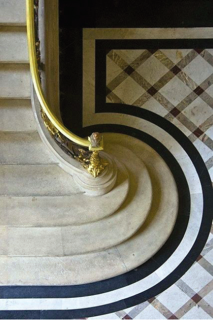
This gracious space boasts tall ceilings, custom finish work and intricate floor design. We really wanted to evoke Rachel’s love for high fashion and small details from top to bottom. To get the inside scoop, we sat down with our senior designer, Kristina Kellett, and asked her a few questions about the entry.
Q: Where did you start when designing the entry?
A: The first thing we designed in this space was the floor tile. Finding inspiration from old French hotels, we designed a large scale marble pattern using a mix of honed marbles: Corinthian Beige Marble, Calcutta Tucci Marble and Wallace Creek Brushed Marble.
Q: Did you try any new design tricks in this space that you’ve never tried before?
A: Yes! The reeded finish work along the curve of the staircase was a concept we came up with after being inspired by various reeded chests and cabinetry. We’ve never seen it done on an entire wall but we love how it turned out, especially wrapping around a curved wall like that—it’s so dynamic. Another great design trick we did was framing her oversized Hermès scarf. It’s such a fun element that adds another level of dimension that traditional artwork lacks.
Q: Did Rachel or Drew have any specific requests?
A: The antelope stair runner and custom railing balustrades were a must. Rachel loved the animal print carpet in her previous closet and wanted to use something similar for her new home. The combination of the runner and railings are just the right amount of contrast to break up this otherwise all white space. The gorgeous crystal chandelier and the butterfly sculpture that sits perfectly atop the Windsor Smith center hall table were two other things that landed at the top of Rachel’s list once we showed her them. It was love at first sight.
Q: Were there any challenges to overcome while designing the Entry?
A: The biggest challenge was getting the rhythms just right with the finish work to break up the space on those grand double story walls. It took a lot of math and measuring twice to get it just right. Another tricky part was the railing design. We all really wanted that outside mount on each balustrade. We had to go back and forth with the railing fabricator to make it happen but it was so worth it.
Q: What tricks did you use to fill the double story walls?
A: The first thing we did was analyze the CAD drawings and mock up the elevations to see what we were working with. We studied the architecture of the room to see how it all lined up and used a combination of moldings and millwork to bring it all together. We also adjusted the size of the windows above the door, making them larger and more gracious. Last, we had to make sure we found the perfect light fixture with the right scale. The size of the chandelier was essential—this is one of the biggest light fixtures we’ve ever used and is the cherry on top that completes this whole space.
Q: Tells us about the powder bath.
A: In the powder bath, we started our design process with the wallpaper which is made up of millions of tiny embossed feathers. Since it’s on the main level near the entry, we wanted this space to also feel high fashion and we were inspired by Rachel’s own style—traditional and feminine. The charcoal painted base, case and ceiling paired with a marble pedestal sink atop brass legs by Stone Forrest, make this bathroom feels like something you’d find in a French chateau.
Q: Last question, if you had to pick one favorite part of the entry, what would it be?
A: The chandelier. There’s a certain time of day when the sun hits it just right and it sparkles all along the walls. It’s so magical.
To see more or Rachel & Drew’s new home, click here and follow our hashtag for behind the scenes: #parcellhomexalicelane
Photos by Rebekah Westover


