Design Mistakes and How to Avoid Them: Part 3
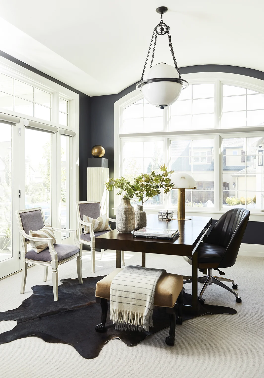
/The last design mistake in this series is one that even we have fallen for, so if you see this mistake in your own home, don’t dwell on it, fix it. ;) Design mistake #3 is the accent wall. Doing an accent wall is like getting into the pool one toe at a time. If you’re going to do something bold, go all the way, don’t stop at one wall. An accent wall is distracting and your eye tends to stop abruptly at the wall instead of gliding through the whole room taking in the beauty.
If you love blue and want to paint your entire room blue, go for it. Adding custom millwork in your home? Do it on each wall in the room. Want to add some wallpaper? Cover every wall with it. This goes for the 5th wall, the one that is often forgotten but can really change the mood of the room: your ceiling. This is where we’ve made the mistake. Instead of just going for it and painting her whole office (including the ceiling) black, Jess Bennett will tell you she still kicks herself for not committing 100% and painting the ceiling, too. The space is still beautiful but a black ceiling would elevate it to the next level. Lucky for her (and you if you have an accent wall or bare ceiling), it’s an easy fix, just go in with the paint and add that extra bit of drama.
Here are our favorite “all in” rooms from our portfolio
Pro tip: instead of buying more wallpaper for the ceiling, paint in using the foreground color of the wallpaper as a color guide. It will give the same continuation of color effect without the extra cost $$


